Save
Error messages seem like an unimportant and incredibly boring part of crafting a user experience. But the tonality of error messages can swing the experience around from an almost certain abandonment to a conversion.
Some years ago, while checking in at the airport in Stockholm on my way to the U.S., I asked the woman at the counter if it would be possible to get an upgrade to business class. Her response: “I’m sorry, but that’s not possible. You would have to pay extra for that.” Checking in for the return flight, I tried the same thing again, but this time the answer was: “Of course, sir! How would you like to pay for that?”
So even though the seat availability and possibility for an upgrade was the same, I got two completely different answers: one “yes” and one “no.”
The reason this happened is partly due to the general American “yes we can” attitude and sales-oriented business culture. I’m also pretty certain that it didn’t happen by chance. Airlines put great effort into training their staffs to give customers positive service experiences. Part of this training is dedicated to the handling of exceptions—what happens if the customer asks for this, complains about that, refuses to do this, etc.
As a result, over the past few decades, airlines and other large service-oriented organizations have accumulated a huge body of knowledge dedicated to handling customer service exceptions. But then these organizations shifted more and more of their services to digital touchpoints, and all this customer service knowledge went into the trash bin.
Instead of ensuring the transition of great customer experiences from the physical world into digital interfaces, the service pros left it to the IT people to figure out. And those IT people seemed to have spent 99% of their effort on what happens when everything goes as planned. Some intern was given the task of writing error messages in the unlikely event that something would go wrong.
Let’s look at some examples:
If I forget to fill out the departure date field when booking a trip on BA.com, I get this:
If I try to log into FedEx.com without providing a username, it tells me:
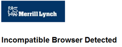
And when I go to Merrill Lynch’s website, I get this message when I arrive:
The commonality among these three examples is they start with a very negative word: “Error,” “Incorrect,” and “Incompatible”. This is the equivalent of the “no” I got from the Swedish airline agent when I asked her about upgrading. It’s basically a slap to the user’s face.
How to Write Error Messages that Say “Yes!”
Writing error messages that carry a positive tone isn’t rocket science. Just follow a few simple rules:
- First, get rid of tech lingo such as “incompatible.” Most users won’t know what this means. Speak to them in their own language and not the language of your developers. For example, “incompatible” translates to “does not work together” in plain English.
- Don’t use negative words like the ones I’ve pointed out.
- Clearly identify the error so the user knows what to correct.
- Give the user a hint of how the problem can be solved.
- Put the blame on yourself, not on the user.
The examples earlier in this article each break most of these rules.
For example, both BA and FedEx failed to accurately tell me what went wrong. They told me that the format and data that I entered was incorrect, but the real problem was that I didn’t enter any data.
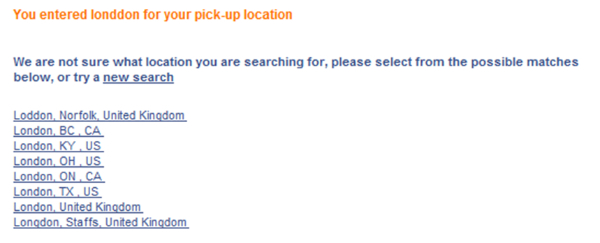
Budget.com, on the other hand, does a great job with error messages. I entered “Londdon” as my pickup location and got this error message:
First they told me what I did wrong: “You entered Londdon…” Then they put the blame on themselves: “We are not sure what location you are searching for…” Finally, they gave me a list of ideas for what I could try instead.
What BA, FedEx and Merrill Lynch Should Have Done
Now that you’re armed with some new ideas, let’s try rewriting the bad error messages.
BA
“Oops, you didn’t enter a departure date. Please use the calendar to select a date for your departure flight.”
Note: If you want to live by rule #5 (take the blame), then a something like “We couldn’t figure out the departure date” would be better than “you didn’t enter a departure date,” but in this case it would be misleading and give the user the idea they actually did input something. In this case I would prefer giving an accurate error description over taking the blame.
FedEx
“Oops, you didn’t enter a username. Please fill in your username, or click here if you’ve forgotten your username.”
Merrill Lynch
“Our site works best with browsers other than the one you’re using. You can download a different web browser here. You can continue using this browser, but be aware that some features might not be available. We apologize for this inconvenience.”
Use a Customer Service Number as a Final Point of Recovery
When we reviewed the error messages of one of my clients, we found there were some errors that could not be recovered from online. The user would have to get in contact with the call center to find a way out.
Most of the messages for these errors made no mention of that. Some did, but the reference to customer service was general and vague: “Please contact our customer service,” for example.
The revised messages we develop had a call-to-action and the call center telephone number explicitly stated in the message: “Sorry, but we’re unable complete this request. Please call 1-800-XXXXXX immediately and we will do our very best to help you.”
Getting Great Error Messages In Place
I believe the shortcomings in this area are largely an effect of the “Digital Divide” between sales/marketing and IT. Sales and marketing have no insight into how, when, or where these messages occur. IT doesn’t understand the importance of shaping them correctly.
So in order to get it straight, sales and marketing must start taking an interest in the issue. A good starting point is for them to “take their own medicine.” I usually tell all my clients to fill out all their own forms on a regular basis with all kinds of stupid inputs just to see what happens. Put yourself in the shoes of your visitor and ask, “Would this seem friendly and relevant to me at this point?”
As well, IT must let sales and marketing into the game and understand that they can have very valuable input into crafting a positive customer experience.
So get together, and get on the road to giving your users positive and useful messages when something goes wrong. Because things do go wrong, no matter how hard you and your users try.
John Ekman is the founder and CEO of Conversionista! He is regarded as a Swedish authority on Conversion Rate Optimization. According to John, a Conversionista is someone deeply and crazily passionate about improving Conversion Rates. John has a long history in the optimization of online businesses going back to 1996. John will be presenting a session on “What Have E-tailers Learned from Retailers? Absolutely Nothing!” at Conversion Conference West 2012, March 5-6, in San Francisco, California.


