In the early years of Apple‘s surge in the market, the App Store was the only game in town, and developers came to the platform in the thousands. Since early 2010, around the release of the Google Nexus One, the Android platform has been a competitive option in the smartphone market thanks to improved platform maturity. Initially, the number and variety of apps in the Android Marketplace did not make for a compelling experience, but developers have slowly made their way to the platform, which now has over 250,000 apps available.[*] Many apps on the Android Marketplace are reproductions of iPhone apps, and there are more and more apps making the jump to the platform. The App Store’s days of total market dominance are numbered, but this can cause problems: when an app is pushed from platform to platform, the experience can take a few knocks on its way over. This article will show the differences in apps for multiple platforms, and explore ways to create a consistent user experience in mobile apps.
Platform Differences
Take, for example, the Facebook app for both iPhone and Android. They claim to have identical functionality, but depending on your device and operating system version, the app can have major differences. On Android 2.2, the home screen only shows the news feed, friends, photos, inbox, profile, and notifications; on the iPhone, it shows all of those as well as places, groups, events, chat, and notes on a second screen, with the option to customise it. The Android 2.3 version is closer to the iPhone experience, yet uses different icons for notifications, and labels messages as the “inbox.” These differences may not seem so big on the latest hardware, but over 60% of all Android users are still using version 2.2[*] and the iPhone version of Facebook has had all of the functionality since version 3.0 in 2009.
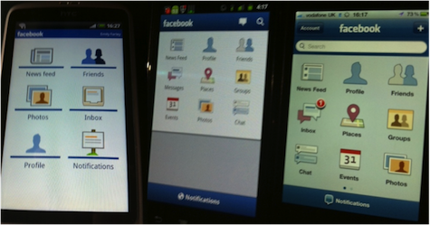
Facebook on Android 2.2 (left), Android 2.3 (center) and on iPhone 4.3 (right)
When developing apps across mobile platforms, there should be no devices left with a poorer user experience. The Android platform is rapidly eating into the iPhone’s market share, and this will continue as devices become cheaper. What this means for developers is that Android may become the primary focus of many mobile development houses. Nokia’s support for Windows Phone 7 may help it gain significant market share, but it is unlikely to be many developers’ first choice platform for apps.[*] There are, of course, other platforms: RIM‘s BlackBerry, HP’s WebOS and MeeGo, as well as the feature-phone operating system Symbian. These platforms should not be dismissed and if a product wants maximum reach, it should have an app for all of these platforms.
There’s really no reason why experiences should be different across any of the platforms. Each is now mature enough to meet the needs of the user, and developers now have well-tested tools to create these apps. Every platform can list items in a table, but the Kindle app for Android has a different, more beautiful look-and-feel because of its use of the iconic Kindle image in the table’s background. Transitions are smoother than on the iPhone and icons for books are larger and more legible.
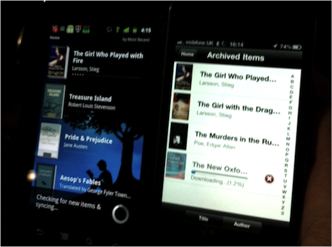
Kindle on Android 2.3 (left) and iPhone 4.3 (right)
Apps do not have to look exactly the same across all platforms. For example, Foursquare for Android has tabs at the top of the screen, rather than at the bottom as on the iPhone. This is taking cues from the native experience and building upon learned patterns to produce a natural user experience for users of that platform.
Levelling the Playing Field
As a developer, I can see two ways to create a consistent user experience across mobile apps:
- Invest more time and effort into matching functionality and experience for the different platforms. This may involve redesigning some screens to fit with the platform’s styles and unique features and to bring them to life.
- Develop the app as a web app. The Web is a great leveller on mobile devices; all major platforms (apart from Windows Phone 7) come preinstalled with browsers based on WebKit. They all support the latest HTML5 features such as app caching and local storage for creating web apps that work completely offline, and are beginning to make use of hardware acceleration for transitions, canvas, and SVG graphics. All of the latest mobile browsers now have basic support for touch events so gesture-based experiences can be created.
Web apps also have a discoverability problem, as they are not available through native app stores for the different platforms. This is a key part of the customer experience of an app; having to download an app from somewhere other than an app store is not consistent with expectations for apps. But there are ways around this; PhoneGap, for example, is a web app packaging solution for native apps, but it doesn’t support all major devices at the moment. The W3C is working on a widget packaging specification, which creates downloadable archives of web applications that can run offline. RIM have implemented this in their WebWorks platform and Opera in their browser extensions platform, though it is clearly not ready for large-scale use as Mozilla and Google have both implemented different specifications for their browser extension stores.
For app equality, HTML5 and the mobile web are a great step forward. As technology develops, and feature-enabling standards are ratified , true user experience equality between native apps and the Web can be attained. After that, for a great experience, the choice is mobile web.
My thanks go to Emily Farley and Emily Toop, whose phones appear in the images used in this article.