Save
When we think something is cute, why do we feel that way? What is “cute”? What is it inside of all of us that is inexorably drawn to puppies, stuffed animals, and garden gnomes? We all know that we think things are cute, but few of us can explain why, or for what purpose.
When we think something is cute, why do we feel that way? What is “cute”? What is it inside of all of us that is inexorably drawn to puppies, stuffed animals, and garden gnomes? We all know that we think things are cute, but few of us can explain why, or for what purpose.
Before I get much further, I’d love to reference and give credit to Aarron Walter’s excellent post on Emotional Interface Design. To summarize, Aarron discusses how our digital lives have become more public, and that “as users let their humanity show online, frontiers of communication are opening for web designers.” He also speaks to the deeper needs of users, advising us to not simply be satisfied with “usable,” but to provide an experience that touches our users on an emotional level. While I agree wholeheartedly with Aarron, I think it goes even deeper than emotion to a place that we as humans cannot control. It’s in our DNA, and understanding why that connection affects and influences us is the key to successfully and meaningfully reaching our users.
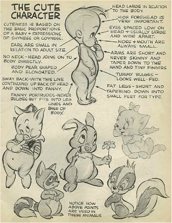
I recently stumbled across the answer to my initial question: Disney. Yes, that Disney. More specifically, something Disney animator Preston Blair discovered long before I was born: we can’t deny cute.
You may have seen this before, but I think many underestimate just how profound this illustration is:
We are magnetized by anything that meets these characteristics—we simply cannot help ourselves. It’s in our very makeup as humans.
This mysterious force is why so many formulas and principles such as the Golden Ratio, the Fibbonaci numbers, the rule of thirds, and grid systems attract us to well-designed products. Throughout history, we’ve even seen ancient cultures use these principles to, without modern tools, craft history itself into stone. These principles have been described as the “mathematical formulas for beauty.” They’re proven, meta-emotional blueprints to visual captivation.
It’s also not just about cuteness. Advertisers have worn the sole thin on the adjective “sexy” when it comes to describing products. Why have so many car commercials aired featuring this word? Why are products described as “gorgeous,” “beautiful” and “hot“? The most effective tactic of marketing and sales professionals wield is to play on human emotions. This includes (non-sexual) physical attraction, even to products. People often become infatuated and connected to these items to a point that they begin to refer to them as if they were living things. They genuinely love these products.
Aesthetic pleasure is in fact an emotional need that is met by appealing to what Don Norman calls the “visceral” layer of emotional design. I’d add that beauty is a function. Fun is a function. Something that is attractive or enjoyable to us makes us want to find any excuse we can to use it or be around it. This is why we want to use beautiful products, and why we love “cute” things. We’re actually fulfilling our own emotional needs. As experience designers, this concept is the foundation of understanding our own behavior and, more importantly, the needs of the people who use our products.
We tend to label the people we’re designing for as “users,” but I fear the term is distancing and a little too clinical. It removes us from them, creating a subconscious, indirect “us vs. them” attitude. The truth is that we’re all human, and we need to admit that we’re all at least a little bit guilty of judging on appearance. While this can have varying consequences in social situations, designers can take advantage of this to make compelling first impressions with their products.
This aesthetic layer is the first point of emotional contact with our users, like a first date. We don’t dress for function when we’re meeting someone for the first time. Otherwise, we’d have napkins built into our pants and cushions sewn on for optimal movie-watching comfort. We want to look as attractive as possible.
To be truthful, I typically won’t use a poorly designed product unless it works for a very specific task (think FileMerge). It’s purely utilitarian and based on whether or not it can get the job done. I will close an ugly app as soon as I’m done with it, but I’ll leave an attractive one such as TextMate open for days, even when I’m not using it.
I love TextMate because of its simple but powerful UI and its remarkable level of readability. I want to find any excuse to open it. It’s beautiful, but I don’t love how it functions in the contexts in which I want to use it. That doesn’t stop me from launching it when I want to view a readme file. It’s unassuming, yet elegant. I’d rather deal with its shortcomings and be able to experience its design.
Good design makes people happy, which is an emotion. Bad design frustrates people, which is also an emotion. Good visual design can make us overlook flaws in the way attractive things behave, much as we do with people. Aarron Walter mentions this in his article:
Babies create bonds with their parents through an interesting feedback loop. When they cry their parents respond by soothing them, which releases calming neurotransmitters in their brains. As this cycle repeats, the baby begins to trust that their parents will respond when they need them.
A similar feedback loop happens in interface design. Positive emotional stimuli can build a sense of trust and engagement with your users. People will forgive your site or application’s shortcomings, follow your lead, and sing your praises if you reward them with positive emotion.
The lesson here is not that we should ignore usability in favor of cosmetic benefits when we design experiences. Rather, it’s that beauty promotes usability, but not necessarily by making your product more useful. It promotes usability by influencing users to want to interact with it.
Don Norman also reminds us that the design of products serves as the vehicle through which we emotionally connect and communicate with those in our lives:
Our attachment to those objects is entirely shaped by memory. Because past experiences are no longer recoverable except through recollection, we value objects by the emotions they provide rather than their intrinsic worth. It’s why the memories surrounding them often transcend everything else about them.
But creating a product with emotional resonance does not require Jonathan Ive and his band of merry pranksters, or a team of German automotive engineers. It is not about technology or elaborate styling. Our love of objects is not even about the objects themselves. It is always about us. We grow to love the objects that connect us to other people, create meaning, and remind us that we’re alive.
That last sentence is what drives this concept home. On a genetic level, we strive to enjoy as much beauty and cuteness as we can in our lifetimes because they “remind us that we’re alive.” To me, being human is about making connections with people, learning, and loving. These are all things that make us alive. When we create emotional touchpoints in our products, we are providing people with moments in which they can feel alive, connected, and reminded of the beauty in their own lives and those closest to them. They may not even realize why they feel the way they do about your product, but they will remember it.
Comprehending these principles of functional aesthetics, and understanding why the “faces” of the things we make need to appeal to, and even go beyond human emotions, is how truly great products are born. Beauty and cosmetic interest serve the purposes of visual enticement and emotional draw.
With strong roots in user interface, interaction, and experience design, Kevin approaches usability from a holistic, 'big-picture' perspective. Ranging anywhere from information architecture, to performance optimization, to hand-crafting UIs for mobile and TV, Kevin's deep fascination with the way people communicate with technology is what drives him to make things "the way they should be."
In the past few years, Kevin has been a part of developing engaging content and contextual applications for brands like Pepsi, Honda, Procter & Gamble, and several major medical and higher-learning communities.
An accomplished author, Kevin served as a Technical Reviewer for the Flex 4 Cookbook, was a reviewer for Learning ActionScript 3.0 (2nd ed), was a featured author for O'Reilly Media's InsideRIA, and is currently a contributor here at UX Magazine.
Kevin is an Adobe Community Professional, and speaks at a number of the top conferences in the industry including Flash and the City, FITC, 360Flex, and OSCON. He’s received numerous accolades, including being listed among the "Top Presentations of the Day" and having the "Most discussed presentation on Twitter" by Slideshare.
Follow Kevin on Twitter (@kevinSuttle), on Quora, and KevinSuttle.com for more.


