Save
Acquisition is about acquiring new users, this is a fairly daunting task given the number of apps exploding in the app stores. Effective user acquisition strategies are of great importance and vital to success.
Onboarding is the process of familiarizing people with a new system. It’s like a tour guide, helping new users get started by providing a sense of direction using tips, instructions, defaults, etc., so they can quickly engage with the product. Justin Singer emphasizes the importance of onboarding and key points to consider when designing for it:
Onboarding is the process of turning a first-time user into a repeat customer during the user’s first interaction with your product. It’s what occurs in the time between when a user registers for your product and when a user passes judgment on it. A successful onboarding session will convince a first-time user to become a repeat customer by:
- Explaining how to use the product,
- Demonstrating the product’s value, and
- Being emjoyable.
Wunderlist provides a simple and user friendly task management experience which can be synchronized across PC and most tablets and smartphones. It has an excellent user experience and is a good example of best practices when designing a cross-platform onboarding experience by utilizing the strengths and context of use of each channel while keeping the design as consistent as possible.
Acquisition Process
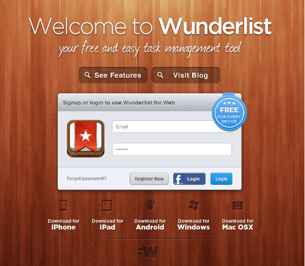
Let’s look at how Wunderlist focuses on acquisition of new users once they reach the landing page.
Wunderlist’s landing page seems focused on improving conversion rates by avoiding any unnecessary content. It just introduces the product and calls on the user to act. The high visual contrast between the signup form and the rest of the page makes it easy to understand the strengths of the product and the action that Wunderlist expects. They even emphasize the key benefit of the product (“free for every device”) clearly on the form itself, which provides impetus to sign up. They also provide social login for people who are a little uneasy about setting up yet another account with yet another service.
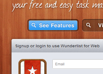
The other links come alive with colors when you hover over them, so as to only focus on the things the user is interested in while downplaying the rest.
Mobile
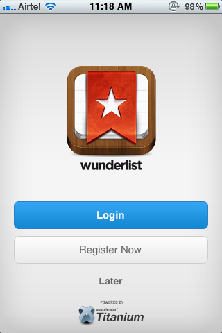
The mobile version of Wunderlist has the same key ingredients of white space and laser-focus on login and registeration, but with a slight difference. Mobile users are usually more hurried than desktop users, and they may feel that registering for a new service is a bit too much. So Wunderlist gives them a “Later” button, which allows people to try out the product without the hassle of immediately registering for a new service.
It’s very smart thinking to understand the context of use of mobile users and provide options tailored to their needs, but in this case I think this problem could have been easily solved by a social login button as in the PC version. Besides, if people start using the product using social login on PCs, they’ll be confused by the lack of that option in the mobile version. Having registered on a PC and then tried to use the mobile version, the only way I could login was to do follow the “Forgot password” to have a password sent to my email address, which was very odd because I never had to use a password in the PC version.
Takeaways
- Have a laser-sharp focus on the primary thing you would like the user to do. Use contrast to keep secondary items subdued, highlighting them only when the user shows interest. As Aaron Walter describes in his book Designing for Emotion:
Page simplicity also helps potential customers to perform a basic cost-benefit analysis, a regular activity that our brains engage in after contrast scanning. The short time needed to fill out the form is a low cost to pay for the potentially large benefit of the service, making conversion highly likely.
- In cases of limited real estate, drop the secondary items so the focus stays on key components.
- Understand the context of use in different channels and adapt accordingly.
- Provide the same login options across channels so users don’t get confused if they don’t find a login option they used when they shift devices/channels.
- According to a survey by Janrain, registrations seem to be driving away a majority of customers, and three in four users believe social login should be offered, so provide social login options where possible.
Onboarding Process
Let’s check out how Wunderlist goes about familiarizing the newly acquired users with the app.
PC
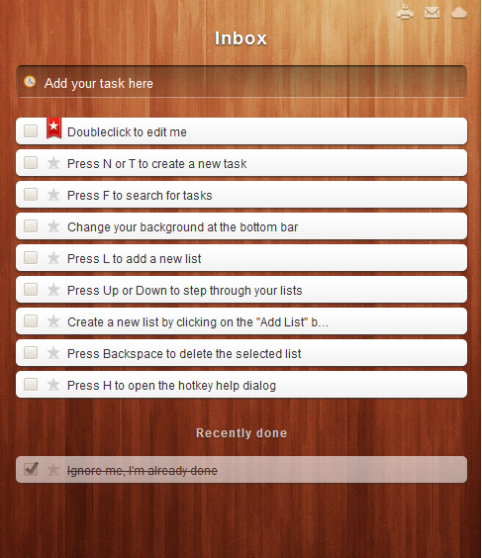
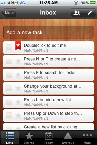
After users log in, the next onboarding goal is to familiarize them with the product. Since Wunderlist is a task management tool, the first thing users see on logging in is a list of the tasks they can do with the product. This makes the orientation aspect of onboarding a matter of going through the task list one-by-one, completing each and moving on to the next just as you would with your own tasks. By providing these pointers in the ordinary context of how the app would actually be used makes it much more natural and engaging to go through them. It also makes excellent use of the strengths of the PC platform and provides hotkeys as shortcuts to common tasks.
Mobile
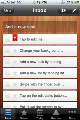
The mobile version utilizes the same concept as the PC version, but adapts actions to taps and swipes instead of keyboard shortcuts to suit the touchscreen paradigm when you sign up from the mobile.
One issue that I found was that when I signed up for Wunderlist on a PC and then logged into the mobile version, the orientation tasks that were relevant to the PC experience were carried forward to the mobile experience, where they made no sense.
I think the product should carry enough context across channels that it remembers the tasks it created to educate the user on one channel and adapt them accordingly when the user shifts channels.
Takeaways
- Highlight the steps that help familiarize the user with the available features.
- Try to inject a fun element so the process of getting oriented doesn’t seem like a burden.
- Provide intelligent defaults that can be changed after the user is set up.
- Keep the overall experience consistent while adapting the UI to utilize the strengths of each channel.
Further Reading
Here are a few posts about the onboarding process and some good examples:
- Onboarding: The First, Best Chance to Make a Repeat Customer by Justin Singer
- Onboarding: Designing Welcoming First Experiences by Whitney Hess
- 5 great onboarding examples by Abby Ricarte
- Which websites have the best onboarding process and why? on Quora
I lead Accenture Studio for Experience Design. With a diverse background and passion for the many ways people interact with technology, my expertise lies in creating intuitive and desirable experiences that utilize deep insight into user behavior and psychology.
Say hi on Twitter @sachendra


