While I was doing research for a virtual user interface I was creating in 3D, I spent some time looking at some of the virtual UIs that have come out of Hollywood. A lot of money and thought goes into their development, so I figured they would make good reference material for my project. While you can’t take the virtual UIs in movies at face value, they do contain some nuggets of information on what the future might hold.
Complexity
I’ve noticed that UIs in feature films are continually getting more elaborate and complex. Meanwhile, though, real-world interfaces are getting more simple and intuitive. It seems an odd contradiction that the futuristic UIs we dream up for movies follow one path, while real world ones are heading down another path.
But the reason for this is simple. Complexity conveys the impression that a system is very robust and advanced, and a character’s mastery of a complex system is more impressive than it would be if the system were simple and intuitive. No matter how complex the system gets, the hero can always operate it expertly, leaving the audience dazzled by the UI and the character’s skill. In the real world, though, users are more often like Mr. Magoo than like Tony Stark or (as in the clip below) an MI5 agent. So while high-aptitude, heavily trained users might be the fantasy world for UX professionals, it’s not the world we live in. The trend toward complexity in movie UIs doesn’t give us much of a preview of the world to come.
Gestural UIs
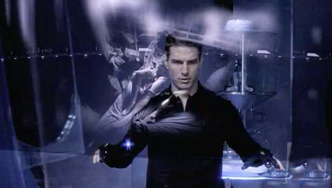
The most notable use of gestural UIs that I can think of was in Minority Report. It’s impressive to see Tom Cruise moving his arms around to call up and manipulate video. But the large and intricate motions he makes wouldn’t work in actual practice. Our arms get tired, and it is hard to make such intricate motions with precision without any form of tactile feedback. Another issue with this method is that all of the commands Tom Cruise employs are completely memorized. Systems that don’t show commands rely completely on memorization and training. This is faster for an expert but takes a long time to master. Recalling commands, especially when stressed, can be very challenging.
Gestural UIs will be a part of our future. They are already present in several devices such as the iPhone and some video game systems, and they’re in development for televisions. In order to be successful these UIs will have to be supplemented with menus or be extremely intuitive. If they are to be a major part of the overall interface they will need to be driven by lazy or small motions that won’t tire out a user. The exception here would be something like the Wii where the gestures are more engaging and getting tired is part of the game.
The XBox Project Natal is a new gaming system that will be gesture driven. Unlike the Wii (which uses a remote with an accelerometer to capture movements), Natal will use a camera to detect motion. This may not go over well with users as it doesn’t provide any sort of feedback. Holding a prop steering wheel as you would with the Wii feels more engaging than an imaginary one as you would with Natal.
Eye Tracking UIs
This concept can be seen in the movie Iron Man. Tony Stark accesses various widgets just by looking at them. This concept is universal (cross-cultural)—just look at something to activate it. My concern is how the system knows the difference between someone glancing over an item and intentionally focusing on it.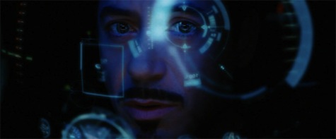 The idea of “hover intent” isn’t as applicable since the human eye doesn’t scan across a UI and come to rest on a particular spot like a mouse. Our eyes dart from spot to spot with temporary pauses as they pass over a screen. This could be worked out by having timer trigger based on the eye movements. Another issue would be temporary distractions that cause us to look away from the UI would potentially close applications we were working on. Interactive billboards will be a very likely candidate for this technology; in fact, a few of them already exist.
Voice Activated UIs
Probably the most famous incarnation of this is Star Trek. The ship’s crew can issue almost any command verbally and the ship complies. This technology is already present in most cell phones, some cars, and computer programs. If you own any of these systems you may already know some of the current technological pitfalls. The systems struggle when you speak fast or issue long commands. They also rely heavily on you speaking with the proper inflection (which is hard to do when you are panicked, distracted, or sick) and they user must have commands memorized. I often only use a couple commands in my car because they are the only ones I can recall while flying down an interstate full of cars. The only other alternative is asking for a list of commands that is lengthy and distracting.
Hacking Hollywood: The Star Trek Enterprise
On the other hand, these systems are extremely useful when you can’t use your hands or have a handicap that prevents you from interacting with the system normally. The key here in the future will be an easy method of retrieving commands and keeping voice commands short and simple.
Stereoscopy / Holographic UIs
Most recently, you can see these in the movie Avatar and District 9. In Avatar, human brains are projected in 3D allowing the doctor to look around at all parts for any abnormalities. ![]() In District 9, the alien ships are piloted with holographic UIs, something that is especially useful in navigation. These are a great idea as they help separate content from UI, and separates what is important at the moment and what isn’t. This can be faked in 2.5D systems as is done now, but with full dimensionality the effect is enhanced as well as allowing the user to create better groupings and spatial mappings. One trick to this system will be locating the right uses of this technology. Novelty will not be a good reason to make a UI 3D. Dealing with geography, multiple dimensions, and multiple axes will be good reasons.
In District 9, the alien ships are piloted with holographic UIs, something that is especially useful in navigation. These are a great idea as they help separate content from UI, and separates what is important at the moment and what isn’t. This can be faked in 2.5D systems as is done now, but with full dimensionality the effect is enhanced as well as allowing the user to create better groupings and spatial mappings. One trick to this system will be locating the right uses of this technology. Novelty will not be a good reason to make a UI 3D. Dealing with geography, multiple dimensions, and multiple axes will be good reasons.
While the keyboard and mouse work just fine as 2D inputs, these UIs will benefit greatly from other forms of 3D input such as multiple cameras comparing imagery to locate users in 3D space, manipulating a device in 3D that contains an accelerometer, or perhaps other current methods of 3D motion capture used in films and games today. In any of these methodologies, feedback will be important. Users will need to feel some sort of resistance to know they have pushed a holographic button. A simple visual indication won’t be satisfying enough. Perhaps a glove that provides feedback will be the solution.
Transparent UIs
Many of the movies that have come out lately feature transparent UIs. They are very visually stimulating and work for something like a HUD in a jet fighter since you need the UI laid on top of the elements behind it. However, it doesn’t work for a typical screen. It provides too many distractions when you add the elements on the screen with the complex visual scene and motions occurring behind it.
Large Fonts
Jakob Nielsen included the use of large fonts in his list of top 10 movie UI bloopers. I don’t agree with him on this one. His reasoning that fonts are unnecessarily large so that people in the audience can read them is sound. However, our culture of computer users is going from a “leaning forward” posture to a “laid-back” one. As we buy larger monitors and find more UIs on our television screens combined with wireless input devices, we’ll need those larger fonts to read the screens from farther away. Instead of sitting at a desk to interact with a computer, we are doing it more and more from our couches.
Adaptive UIs
The only really good adaptive UI I can think of is the Omega widget in Tony Stark’s final Iron Man suit. In the movie, the Omega widget is a single widget that contains all of the information from the previous widgets. However this one only shows information and options that are currently pertinent.
The easiest UIs are ones where each command has a unique button, but the number of buttons shown is limited to only the current options. This methodology allows for a tremendous amount of information and commands to be available, but without cluttering the user’s screen. Adobe is utilizing this currently in Catalyst and I’ve seen it in sneak previews of Adobe Rome.