Save
Regardless what time of day it is or what task I am trying to complete, a lightbulb goes off in my head and I immediately open my Amazon prime app to shop. Do I actually need the items I’m shopping for? The short answer is No.
Amazon Prime is a paid subscription program from Amazon that gives users access to additional services otherwise unavailable or available at a premium to regular Amazon customers. Services include same, one or two-day delivery and streaming music and video. Wikipedia
I know I’m not the only one with an Amazon addiction, but after diving into to some research, I found some of us are in real deep. Statistics show, 71 percent of Americans are Amazon Prime members, and about 46 percent buy something once a week from the site.
So, Why is Amazon so Addictive?
Studies show there are many psychological reasons one can get addicted to shopping such as anonymity, the convenience of not having to go to a store and the variety of products available. One other important point to consider is — Amazon Prime is a predictable, expected and usable product.
Learnability
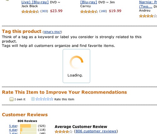
Let’s dive a little deeper on some characteristics of the app. When it comes to visibility and feedback, as per the loading icon below, Amazon does a great job implementing elements that clearly communicate activity to the user in a simplified manner.
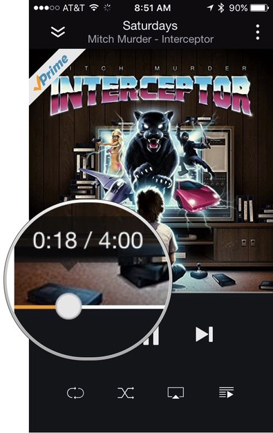
One among many mapping examples in the application I came across was being able to control the scrubber bar by moving my finger left or right in order to rewind or forward parts of a track.
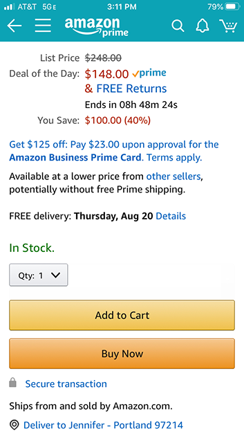
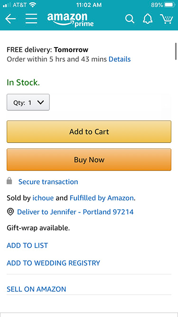
When it comes to affordances, Amazon is winning. One great example is the “add to cart” and infamous “buy it now” buttons. The buttons are slightly raised to let the user know they should be pressed like a button would be on a non digital product.
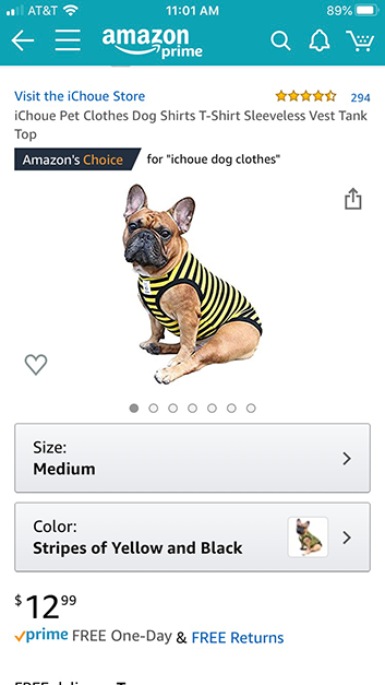
While shopping for apparel for my French Bull Dog one day, I noticed unavailable sizes being immediately greyed out. This quickly told me not to waste further time on that particular style and is one of many examples of Amazon having constraints in place.
Although I do find the prime application to be very user friendly, there is help and documentation, such as a customer service section in the navigation menu.
Memorability
As seen in their product page below, the visual design elements and principles create a streamlined memorable flow. Objects, actions, and options are clearly available allowing shoppers to easily navigate their way while shopping.
Satisfaction
Amazon sends simple surveys to its customers on a regular basis. They do this to measure levels of satisfaction. This helps to establish communication with customers, improve their loyalty and improve retention.
Inclusion
“Amazon’s vision is to be Earth’s most customer-centric company, and we’re working hard to make it easier for customers with disabilities to enjoy everything Amazon has to offer across our devices, services, and more. This page is the gateway to accessibility features that can improve your Amazon experience”.
The Amazon website is quite accessible as is, but the company has also extended considerable efforts to make the shopping experience less daunting for visually impaired users. The app is not quite as screen-reader friendly as the accessible website. However, the mobile app has adopted other accessible features such as a voice search option, one-button access, instant alerts and direct links for amazon call backs that usually only take a few seconds.
Dark Patterns
Although I’ve never directly witnessed a dark pattern on the app, Amazon has been called out for some sketchy choices. One particular example that stood out while conducting some research, was when a verified user tried to leave a bad review on a broken product and amazon denied the request. The user claimed she wasn’t able to leave the feedback because the item was an “amazon choice” product.
It’s so often I see obviously fake / low effort reviews posted on Amazon. All of the recent reviews are 5 stars and full of useless praise.
These patterns may not be affecting the the giant tech company as of now, but if they don’t work on eliminating them, brand trust will be hard to gain back.
References
https://.netinstructions.com/amazon-dark-patterns/
https://trydesignlab.com/academy/information-architecture/2/lessons/usability/slide/1
Hi, I’m Gen. My goal is to design aesthetically beautiful products that enhance user experiences. I am currently enrolled in the UI/UX program @Designlab.


