Save

Everything is an input and everything is an output. What if you could browse ALL your things in ONE fluid interface?
AI’s like my 4-year-old nephew. Every week, he wants to be something new when he grows up…
One day it’s a soccer pro. The next day it’s an astronaut. Now, he just wants to be a garbage man.
AI’s similar. It has a ton of different narratives right now.
Human clone. Stalker. World domination. You name it.
Here’s exactly where we are today:
Conversational UX/Chat-styled interactions are what everyone’s making.
Some tasks that are possible through conversational UX are:
- Fire-and-forget tasks like “play music”.
- Specific trivia queries like “weather” and adding To-Dos.
- A conversational partner like an AI girlfriend.
But there are many problems with conversational UX:
- People land on an empty screen and then try to decipher what can be done.
- People use apps that keep track of their state.
- Editing: whether it is a video, audio, or article, you need to store the draft version to come back to later on.
- Travel planning: tracking what places you’ve seen and which bookings you’ve already made.
- Researching: opening 50 tabs to keep track of the different directions you’re exploring.
So the next question is obvious: What’s after ChatGPT? Are we meant to be prompt designers, prompt engineers, or prompters?
Here’s where we are headed in 2030:
There are 4 AI innovation trends that are taking place under our noses:
- Dynamic Interfaces
- Ephemeral Interfaces
- aiOS ← today’s post
- Screen-less UX
The other three trends are for another time 😉
A look into aiOS: What is it?

There are many definitions of the term ‘aiOS’, but the most basic one is an operating system powered by AI.
Seems obvious, right?
Jordan Singer, doing something with AI Figma, described it as a UX controlled only by conversations.
But conversations are just one medium.
There can be other ways of interacting within aiOS.
The pull-to-refresh type of intuitive interaction is still TBD.
Irrespective of the interaction, the underlying values for aiOS are going to remain the same. Let’s dive into the 4 major aiOS values:
1. You don’t go out; it comes to you

It’s about bringing everything to you, as a user.
- At the app level, it can be through chatbots.
- At the inter-app level, it can be through Adept, ideally just explaining in a chat what you want to be done, and the AI does it for you.
- At the browser level, it can be through Arc Search; you just search, and the browser browses for you.
- And now, zooming out further, how would it look at the OS level?
- And now, zooming out further, how would it look at the hardware level?
2. Interoperable apps
Apps that can communicate with each otherLet’s say you’re a freelance copywriter starting your ⛅️ Monday morning.
> You start by listening to a podcast that you’d scheduled last night.
> You take notes on the side.
> You open your emails, ready to send out an important email to your client.
> You leave the email mid-way to get a coffee to freshen up.
> You open your calendar to put in some time with another client.
> You pause the podcast.
> You open your email app to continue writing the mail.
> You get a notification on Teams. You respond with a file.
> You respond again with a link to the file.
It’s lunchtime.
Phew, a lot of switching between apps. Now, what if you could browse ALL your things in ONE fluid interface?
The answer? Itemized workspaces.
All apps are items or features.
You can drag and drop your podcast episode into your Notes app. Not as a reference, but the episode itself. You can drag and drop your half-written email into your notes to come back to again. You can drag and drop the flight you want into your calendar, and it’s booked.
Any app or item can be pulled into any other app or item.
It’s all intuitive, much faster, and clearer.
2.1 Built-in OS-level solutions
Bringing apps to the OS level has been happening since the beginning of time. When the app store was launched, its basic features were stand-alone apps.
For example, the flashlight apps.

Similarly, Grammarly or ChatGPT that help us write better (with auto-correct or text prediction) don’t need to be at the app level, right? It could easily be at the OS level, built into the keyboard.
3. Context is foundational
The problem with current AI applications (read: conversational AI-UX) is that they aren’t in the same context as the user.
In MS Excel, the chatbot doesn’t have the complete context of what you’re working on, what’s your working style, or even your completion deadlines.

A simple application of this in the traditional setting (apps and websites) would be: What if websites had the context of how many times you’ve visited?
You can adapt the UI based on the visits.
Now imagine scaling this at the OS level.
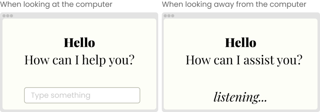
A good example of this is what if your input method is determined by how you’re positioned with the device?
- > If you’re looking at your laptop, the input is via keyboard.
- > If you’re looking away or standing away from your laptop, the input is via audio.
A lovely demo by the cofounders of New Computer shows just this!

Adding context for the user from outside the bounds of the app or website makes the user experience much more intuitive and faster.
4. Everything is an input
You might have guessed this one. It overlaps with the above value.
AI has hacked the operating system of a human being—language.
~ Yuval Noah Harari
And because AI can understand language, essentially conversations, it also understands all the mediums of communication, i.e., voice, visual, and text.
So now everything is an input, and everything is an output.
You can input text and get an output as a visual—without having to choose if that’s the best medium, AI does that for you.
Have you checked out ChatGPT’s voice-read-aloud feature? It. is. so. freaking. real 🤯 It pauses, breathes, and speaks just like a human. You gotta try!

And that’s it; those are the 4 values being considered to create aiOS. So what do you think…
…is AI-powered OS the next big thing?
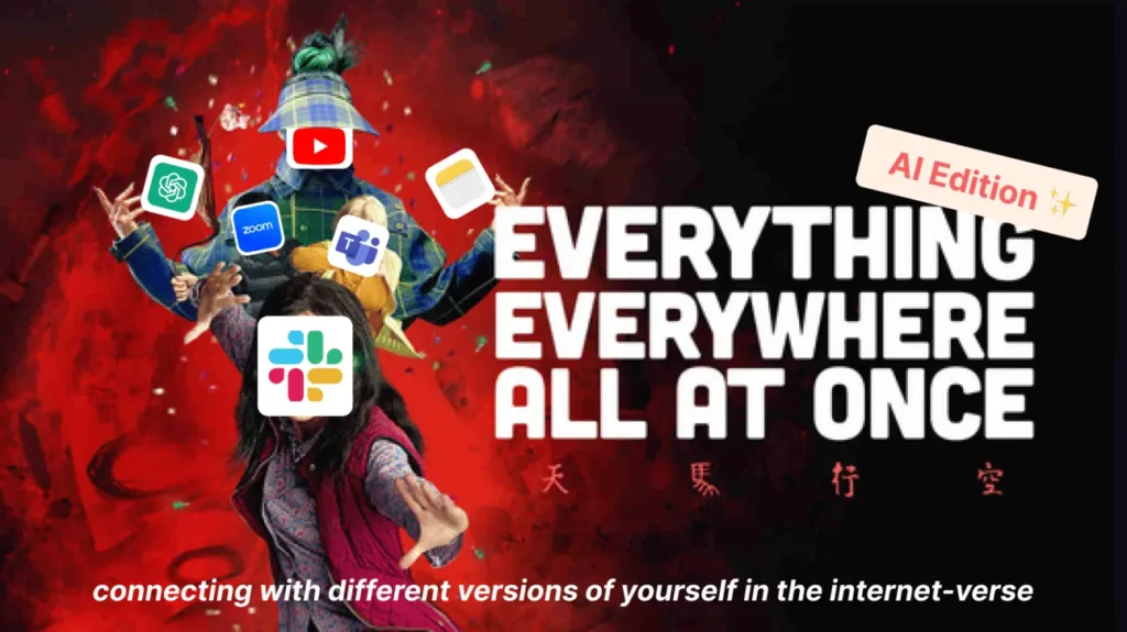
On a completely random note, if aiOS was a movie:

You can find more of the author’s articles on Voyager, a blog about AI and design.
The article originally appeared on Medium.
Featured image courtesy: Mika Baumeister.
Kshitij Agrawal
A designer exploring the AI-UX universe. I created aiverse.design for designers and innovators, featuring a collection of 100+ AI-UX interactions from companies designing for AI. I'm currently exploring the bridge between AI x Design and publicly sharing my learnings.
- The article explores the concept of an AI-powered operating system (aiOS), emphasizing dynamic interfaces, interoperable apps, context-aware functionality, and the idea that all interactions can serve as inputs and outputs.
- It envisions a future where AI simplifies user experiences by seamlessly integrating apps and data, making interactions more intuitive and efficient.
- The article suggests that aiOS could revolutionize how we interact with technology, bringing a more cohesive and intelligent user experience.


