It’s often said that every single part of an app or website is another opportunity to make someone happy, but that just isn’t true. Looking at design in this way risks reducing the role of UX creatives to a binary — either creating things for the sake of it, or for mindless profit. Instead, we should be solving real-life problems for real people and allowing happiness and success to flow from that.
In this article I’ll outline how the liminal space between meaning and emotion came to be, and explain how designers can beat it by focusing on users.
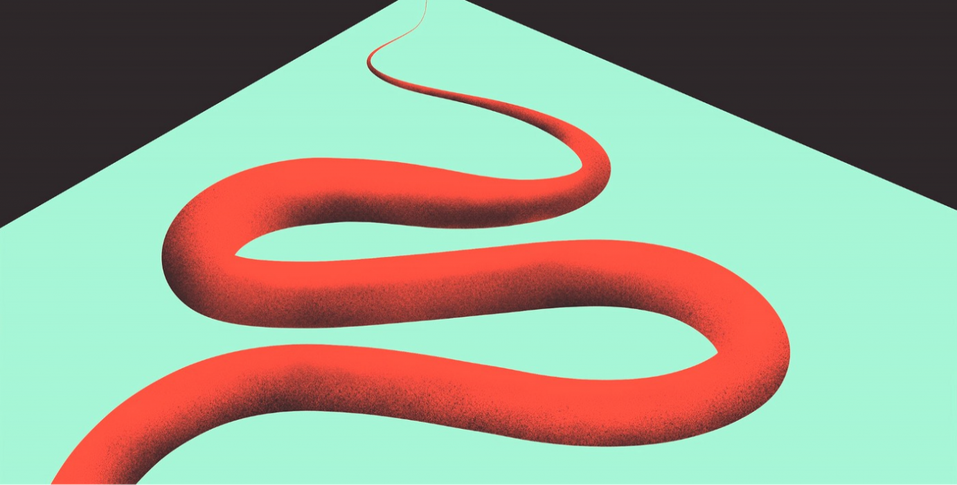
What Do We Mean by Liminal Space?
The word liminal comes from the Latin word for threshold — limen. It describes a place of transition, uncertainty, and a state of being in between. There are lots of examples of liminality in UX design, from time spent waiting for an app to load through to the way streaming platforms appear before you’ve chosen a movie.
There can also be a liminal space of sorts between conceptual ideas. This is what I mean when I talk about the gulf between meaning and emotion since both concepts have many facets and subsets. As UX designers, it’s our task to find a balance between the many different strands of meaning and emotion whilst trying to interpret them in a useful way.
Misunderstood Meaning
Just as lifestyle gurus encourage people to find the ‘why’ in their lives, UX designers search for ways to help brands meaningfully interact with consumers. Often that means connecting a product or service with something that really matters to people. Facebook is a great example of this quest for meaning, particularly since their 2018 refocus from news and advertising to posts from family and friends — which Mark Zuckerberg billed as a way to “feel more connected and less lonely [for] long term measures of happiness and health.”
The truth is that not everything we create needs to have such a grand purpose. The important thing is that we design to make lives better at least in some small way. Misconceptions about meaning can prevent us from achieving this goal, and perhaps even misdirect our efforts entirely.
Solution
True innovation is about searching for meaning (the ‘why’) before finding a solution. Businesses in today’s fast-paced commercial environment can easily be pushed towards finding solutions quickly without taking time to step back and think about the meaning of their brand and products to consumers. This can lead to them diverging from their ultimate purpose — begging the question of whether they’ve actually solved anything at all.
The decision of Netflix to change their rating system from X/5 stars to a simple thumbs up or down score is a good example of this. While the company has reported increased engagement with the streamlined rankings, they may have undermined their ability to accurately suggest content in line with user preferences by using an oversimplified system.
In contrast, the Scandinavian watch brand Skagen managed to maintain the core functionality and purpose of a timepiece when they first create a smartwatch. Opting for a simple design that still told time in the traditional way, they managed to innovate without needing to reinvent the wheel.
Put simply, designers shouldn’t search for solutions but rather for meaning. By focusing on the things that users really need, you’re sure to stumble upon ways to provide for them.
Submission
Efforts to find and pursue meaning can also be derailed by pressure from competitors and the wider market. This is exemplified by the choice of WhatsApp, a privacy-driven messaging platform, to introduce story sharing functionality à la Instagram. While such sharing features may have become the norm for social media platforms, that doesn’t mean that users want that same functionality mirrored across all of their apps.
The aforementioned Skagen smartwatch project ran into the same trap when adding new features that complicated its minimalist design. Rather than improving the overall utility of the accessory, it instead pushed it closer to competitors such as the Apple Watch.
This goes to show that while it can be tempting to default to the mass market appeal of your competitors, it is often better to think of unique ways to serve users. Remember that behind each of your design choices is a decision to either attract consumers through superficial means or engage them by solving real-life problems.
Misunderstood Emotion
Emotion is viewed as both the vehicle by which we drive user interactions and the outcome of them. It is also widely misunderstood, and can lead designers away from finding ways to enrich users’ lives by encouraging them to view emotion as a means to an end.
Manipulation
The aim of UX design is to review and plan how people will interact with a product or brand. Above all else, it requires designers to predict human behaviour — so much so that Robert Hoekman Jr once described it as “the application of psychology to the design of technology.”
Just because we are predicting how users will respond to an experience doesn’t mean that we should manipulate them, however. Rather than using psychological stimuli to draw users into products and brands, we should instead motivate them to engage by providing useful tools that they actually want.
This problem is epitomized by the ‘like’ button used by Facebook and other social media platforms. Its effect has been described by its creator as “bright dings of pseudo-pleasure” that push people to touch, swipe and tap their smartphones thousands of times a day without offering any tangible benefit to their lives.
Beauty
Similarly, beauty is often conflated with emotion. While it can evoke feelings of contentment and happiness, it shouldn’t be the core goal of design efforts.
Some of the world’s most successful apps are packed with useful features which are then enhanced by a beautiful design. R/GA’s work for the digital bank Bradesco is a good example of how this can work in practice. By combining everyday tasks (such as booking travel) with banking, their app created a truly useful experience that was made even better by an attractive interface.
The lesson is that it’s better to beautify real features than to polish superficial ones. So long as you focus on providing real value, you can still concentrate on the aesthetics of your design without giving in to tokenism.
How Designers Can Cross the Threshold
Few designers would admit to misunderstanding or ignoring meaning and emotion, but it’s easy to fall into the liminal space between these concepts. Fortunately, there are ways to cross back over that threshold and concentrate on the needs of users — but these require strategy and planning.
To put the user back at the heart of experience design, we need to stop creating stories and instead aim to create real worlds for users to step into and interact with. This approach is known as storyscaping, and distils the value, meaning, and emotion behind a brand or product into an organising idea.
In storyscaping, the user is the hero and the brand a mentor that provides them with the product or service they need to solve their problems. This process allows you to bring all the elements of design together to facilitate a user’s experience. It creates a story for them to live, rather than one to simply be told.
Creating Stories to be Lived, Not Told
It’s easy to see where UX design has gone wrong in the past, but bringing it back towards a more user-centric focus requires planning. There’s an inevitable need to step back and reassess how design can be used to create happiness and contentment while still satisfying business priorities.
By stepping back and taking the time to understand what consumers want and need, it’s possible to cross the threshold of liminal misunderstanding and adopt an altogether more positive approach to meaning and emotion. By joining the dots between them we can create better products and more emotive brands that sell more and solve real problems.