Save

Over the years as a user experience designer, my career has evolved through various areas of design such as; print design, digital graphics, videos, web design and user experience. But one thing has remained constant throughout was – my passion for solving problems. As UX practitioners; each one of us, regardless of discipline — do just that! We look at a website or application, we evaluate it and find out the problems. Then we try to solve them. Through design!
I would say UX is not always about creating heavy or massive products. Rather it can be solving simple problems to achieve great results. But before you can solve a problem effectively, it must be properly understood and defined. As some experts say “A problem is not simply an unwanted situation or a matter that deviates from the norm. For designers and creative problem solving, a problem is an unmet need that, if met, can satisfy the user’s purpose”
There are a few simple specific tactics we can use to ensure that our products are designed for solving the right problem for its users.
Primary or secondary, “research” matters
Research is a great way to set your product or service up for success. Human-centered design requires research to understand how that product or service fits into the user’s life. The more we understand what makes people tick, the more we can avoid unintended bad experiences.
For companies operating on a limited budget, pushing out a working product may be more important than quality UX research, but not taking the time to do useful research may have negative effects on the success of your product or service.
In the old days, in order to conduct adequate research, companies had to go out into the field to collect data. Now, there’s an entire world of research information available at your fingertips. If you want to get a head start on user research, bypass traditional primary research and look for secondary research.
So, start small, test often with your users, revisit them if you have to, and validate your assumptions — then build on them.
Keep asking “Why?”
If we don’t ask the right questions, we won’t ever be successful in our work because we risk not identifying and solving the right problem. If we are not identifying the right problem, our solutions become irrelevant, and we may end up designing products or features that our users don’t want or need.
UX-ers and designers are pros as asking “why,” but clients should be involved in this, too. Ask your technology partner questions about their decisions: Why did you add this feature? Why is that piece of information necessary?
Once you know the problem you’re trying to solve, the next step is communicating it to team members and stakeholders. It’s important to have a clear problem statement because it will guide the solutions.
Listen to “Business” as well
We need to serve the user while also fulfilling business goals. That’s why it’s important that we use business metrics to back up our recommendations. Things like repeat users and NPS scores are valuable for every company. Additionally, the company’s vision and mission statements should be supported by design or technology choices. As a UX designer, challenge your tech team to align with your business metrics.
The call volume challenge: A UX case study

Providing helpful information intuitively to our users, such as helpline numbers, customer care emails and FAQs are necessary for any business to build trust among their users. Lack of which is an example of an irresponsible user experience decision. If you’ve ever had a tough time finding a helpline number, you might say this is an awkward decision. Surely, the business goal might be to get lesser support calls or queries. But it’s not really helping the end user to trust the brand anymore. It would be better to spend time and money exploring what is making customers need to call and solve that problem.
Let me share an interesting UX problem we came across while I was working with Via.com back in 2015. Via.com was one of the best players in the travel domain. The company was into flight ticketing, hotel booking, holidays etc.. 90% of Via.com customers were using their website and mobile app to book flight tickets. Something like booking.com, expedia, yatra, makemytrip.com etc. to name a few. And Via has both B2C and B2B platforms for this game.
One day, the customer support manager from the flight team raised a request to look into one of their biggest challenges. That the flight call centre team found it really difficult to answer all those calls with their limited team members. They have pointed out that they are getting an enormous amount of calls a day for queries related to flight bookings. With the limited number of call centre executives, they were hardly able to answer 50% of those calls.
In short, all those remaining customers waiting for their calls to be answered will be disappointed by this long delay and get frustrated. As you know, a pissed-off customer is always a dangerous customer. They will find ways to show their frustration on every possible channel. Like, google reviews, mouthshut.com reviews etc..
We realised the depth of this problem and started digging deep to understand the root cause. The UX team was engaged and had many rounds of meetings with customer support team members and managers to understand the problems from their angle.
We wanted to get some qualitative and quantitative data to define a hypothesis for this problem. To do that, we listened many call recordings and analysed the nature of the queries. And also called up few random customers to talk about it. On top of all, we asked the call centre team to map each call to certain categories like ticket issues, delayed flights, rescheduling issues, cancellations etc..
After all these exercises, we could find that 70% of the call volume is related to flight cancellations. Okay.. So, it’s time to deep dive into that funnel. Later, we realised that,
- Major portion of those calls were just to understand the cancellation policies and
- To know how much of a refund they will get if they go ahead with cancellation
Most of those calls were to get some information related to cancellations. Not to get the actual ticket really cancelled. Great, so we know it now. The users are not able to find the cancellation information easily from our website; hence they dial to the support centre to know about it.
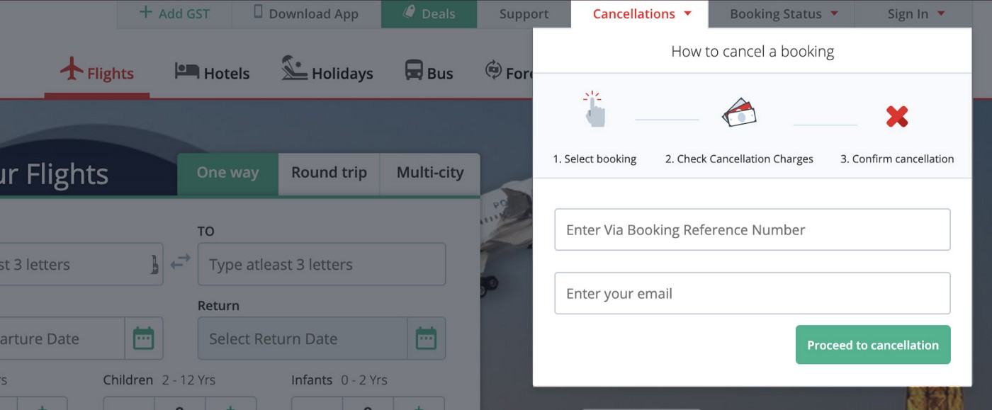
So, the UX team suggested the technology team to rework on the header navigation and to place a noticeable cancellation link where users can find it easily. As a value-add, we designed a small widget, which will be visible when you hover the “Cancellations” menu. The widget displays the basic steps of the cancellation process to the user.
- Step 1: Select booking by enter your booking ID
- Step 2: Check cancellation charges
- Step 3: Confirm cancellation
And a button to “Proceed to Cancellation”

The cancellation widget added to the header menu
It worked..
We have observed for another 2–3 months. The call statistics revealed that the call volume related to flight bookings has reduced upto 30% from the previous record.
So, the moral of the story is finding the root cause of any problem will give you proper insights of the actual challenges you are supposed to work on. Else, we will end up solving the wrong problems and wondering why it is not working.
Conclusion
A design that doesn’t solve the right problem, or solves a problem that is not really a problem to start with is doomed to failure. Some clients may set a brief that clearly defines the problem to solve. Others might not know about this crucial stage of defining problem statements. Therein lies an opportunity for you to lead the client in taking a step back and evaluating why this feature will exist. Together we can align the team, craft a solution, and kick off an effective and efficient process.
More than 16 years’ experience partnering with internal and external stakeholders to discover, build, improve the user experience and digital visual aesthetics. A proven history of creating cutting edge interface designs for websites and mobile applications through a user-centred design process by constructing screen flows, prototypes, and wireframes. Focused on ensuring and executing the UX quality of every systems getting designed by my team.


