Save
When a company expands or fills its product line through acquisitions or partnerships, there may be differences between the products in look-and-feel, user model, nomenclature, and so on. In some corporations, sadly, this happens with internally developed products as well. This variation does not mean a product is inherently bad or poorly designed; rather it reflects independent development by different groups at different times. It’s a very common problem in companies that have large number of offerings.
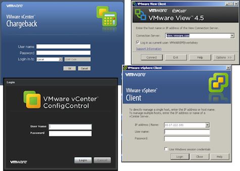
Visual design variation among products
The price for not having a well-thought-out user experience guidelines and standards story is paid for again and again through customer calls to service and support, through an inability to provide products that work well together, and through having to reinvent the wheel over and over in a product development organization. Many companies want their customers and users to be able to say, “Clearly, that is a <name-your-company> product.” Once your products are recognized as ones that work well together and that share a common visual aesthetic and user model, you are on your way to establishing a product identity.
This article is about a journey we’ve begun at VMware to design and implement a VMware product identity. Our intention is to create user experiences that work across products and up and down the stack in ways that make it easier for developers and designers to create products that work together well in an intuitive manner.
No lone designer can design the products and create standards and guidelines, let alone evangelize the guidelines across the development, quality engineering, and product management organizations. Nor, for that matter, can a lone design team. It really needs to start at the top. Executive leadership needs to support this as a priority within the company because, quite frankly, it is not cheap. A lot of design, engineering, and process will need to take place. It won’t happen overnight. You can’t stop shipping products because they don’t yet align with the new user model or visual design standards. You have to work with product managers to find a time when they will make transitioning to the new product identity a roadmap milestone.
Changing a product’s look-and-feel may seem to be a bad investment compared to rolling out new features that can be revenue producing. In the end, there will be clear benefits to the users, but while the transition is occurring it is probably more beneficial to the company. What the company gets out of it is standards and guidelines, which makes it easier to design new products faster, easier support and training between products, and a reduction in platforms to test for quality engineering; all good things.
So for us, it was supported from the top but the work is done in the middle. Even though we knew this was a substantial undertaking, we wanted to do this project quickly. Getting the stakeholders together from day one was critical. In our case the stakeholders included myself (Director of User Experience), the lead designer, two corporate branding folks and our Chief Development Officer. The group was small and we met frequently to review designs. Now, a lot of companies feel that their internal design teams are somehow not up to the task, and they may or may not be. My two cents: if you’ve got the talent, do it inside. If you go outside, it can be fairly demoralizing to the internal team. One very important thing to remember, however, is that your internal team has to ultimately own the design. They will be expanding and growing it. They will be developing the guidelines. I can guarantee you that if you helped design it, you are going to feel a large degree of ownership. My team has some very good designers but they had never done a corporate product identity project before. So I chose to bring in a single designer and colleague whom I’d worked with in the past, Margaret McCormack, to lead this project with our internal designers.
We wanted to do the visual design quickly, as we were targeting its first appearance in a flagship product and the engineering rework was going to be considerable. So we started working on this in October 2010 and completed most of the design work by Thanksgiving. We went broad right away. We did the “show early, show often” practice for socializing the work while it was happening. Even though the developer community was not part of our stakeholder group, their buy-in was crucial for the success of the initiative. We had to take examples from several products and show how they would look with the new designs. By respecting and acknowledging their ideas (though not always adopting them) and by showing high quality work, they were on board from the start.
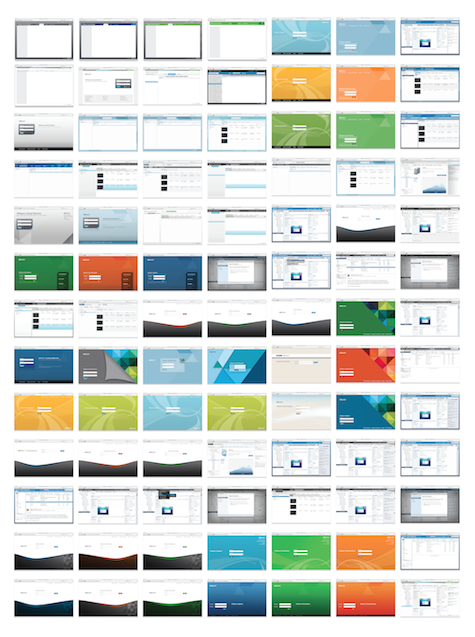
Going broad on the visuals, very early.
Certainly, everyone has opinions about visual designs and we wanted to hear them, but in the end, we all know that design by everyone with an opinion doesn’t work. So, while we solicit, collect, and digest ideas, the final decisions belong to the stakeholder group and, in reality, mostly to the designers. In our case, it worked out very well.
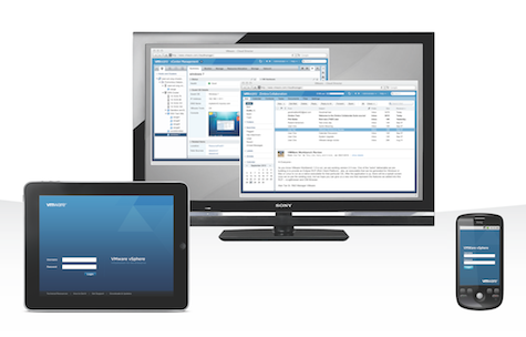
In all the designs, we paid appropriate respect to the corporate branding and website guidelines. But they were not entirely fitting for the kind of enterprise level products that VMware produces, so we had to go our own way. VMware produces desktop, web, and mobile versions of some very complex tools for creating and operating virtualized data center infrastructure and cloud producer/consumer technology. Our product design identity had to work equally well for our enterprise customers with mission critical requirements and our small and medium businesses who want to run a tight ship and grow their business. Below is an example that reflects how our requirements and constraints manifested themselves in our final designs.
Extending our look and feel across platforms
Our visual design is conservative and geared towards data center professionals. While appreciating the importance of a strong, consistent, and brand-respectful visual aesthetic, that alone does not encompass the product identity we are seeking. It is the totality of the visual design and deeply embedded user, data, and interaction models that comprise the product identity we are striving for.
Harry Vertelney
Harry Vertelney is currently Director of R&D of User Experience at VMware. He has 30 years of continuous experience working for such industry leaders as VMware, Apple, Intuit, Sun Microsystems and Pacific Bell as an individual contributor and manager. He has received several domestic and international patents. Harry has degrees from the University of Southern California and California State University. He is passionate about building high performing teams and relentlessly pursues design excellence.


