Save
You’re probably reading this article from your mobile phone. And with the US primary elections in full swing, there’s a good chance you’re learning about issues and candidates on the web, and sharing your political opinions through social media. Even though we live in a digital age, in Election 2016, you won’t be voting for Clinton or Trump via your phone or the web. Instead, if you go (43% of eligible voters didn’t vote in 2008), you’ll wait on a long line of US citizens to cast your ballot in a number of antiquated ways:
- Paper Ballot – 1856
- Mechanical Lever Machine – 1892
- Optical Scan Ballot – 1962
- Punch Card – 1964
- Direct Recording Electronic (DRE) Voting Machine – 1974
It’s amazing that the predominant ways we are using today to cast votes in our government elections have remained virtually unchanged through the whole digital age. Think about this:
NASA sent two people to walk on the moon in 1969, when the entire agency possessed less computing power than your mobile phone. We can do better!
So what’s the problem?
In a nutshell, the biggest hurdle to online voting is insufficient security. You may wonder, in a world where billions of dollars of financial transactions occur on a daily basis, why can’t I vote for my government officials online? Unlike a financial transaction, which requires a transparent and auditable process for its security, online voting needs to not only be auditable but also anonymous. These conditions, according to a report published by the Atlantic Council in 2014, are “largely incompatible with current technologies”.
Online Voting is Inevitable
It will take time, but once security concerns are mitigated, the benefits of online voting become clear.
The increased convenience that people would experience from voting through their own devices, and from home or work, would likely result in significantly higher voter turnout. Absentee ballots would be a rare occurrence and people with physical disabilities would have an easier time participating in elections.
Another benefit is cost efficiency. In 2009, the city of Honolulu saved around $100,000 on a municipal election by implementing online voting. The cost reductions were attributed to the removal of expenses associated with ballot counting, and the postage that was previously used in a mail-based system.
Suspending Disbelief
While online voting is a reality in smaller corners of the country, and in countries with smaller populations, like Estonia and Ukraine, it will take time and effort to upscale such a system for usage at the national level. But let’s suspend disbelief, and rethink what the user experience of online voting could look like if the obstacles preventing its widespread usage were overcome. From the perspective of a design and strategy consultant for Cooper, here are some design considerations our voting officials may wish to consider as online voting evolves.
Voters Need to Know Their Vote Will Be Secure & Anonymous
It’s not enough for the system alone to be secure and anonymous, the user must also be confident they are casting a nameless vote that is protected from manipulation. When Estonia had its first online election in 2007, it created an easy-to-understand, two-minute instructional video, which explained the security process behind each user’s vote.
A User Friendly Interface
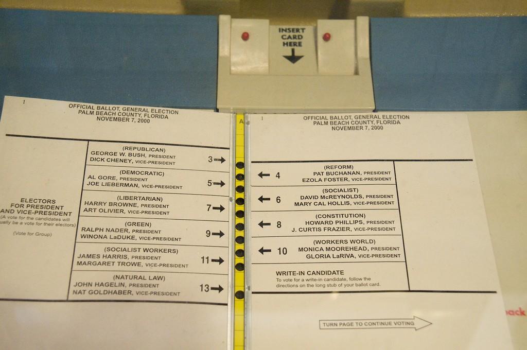
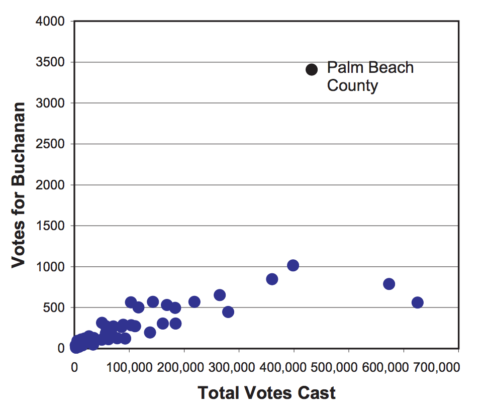
Before a user casts a vote, there must be zero doubt in their mind that they are voting for the right candidate. During the 2000 US Presidential Election, three residents of Palm Beach County filed a lawsuit claiming they were confused by the design of the now infamous “butterfly ballot” and instead of voting for Al Gore, they mistakenly voted for Pat Buchanan. Running on the Reform Party’s ticket during that election, Buchanan received an unusually high number of votes in that county compared with Florida’s other 66 counties. Palm Beach County was the only county in Florida to use that ballot design. (New York Times)
Photo Credit: Mediad.Publicbroadcasting.net
Photo Credit: Amstat
The dynamic design opportunities that online voting can offer will have significant advantages over the traditional, non-electronic systems. However, with great power comes great responsibility. If we are careless designers, we can create opportunities to unintentionally mislead voters.
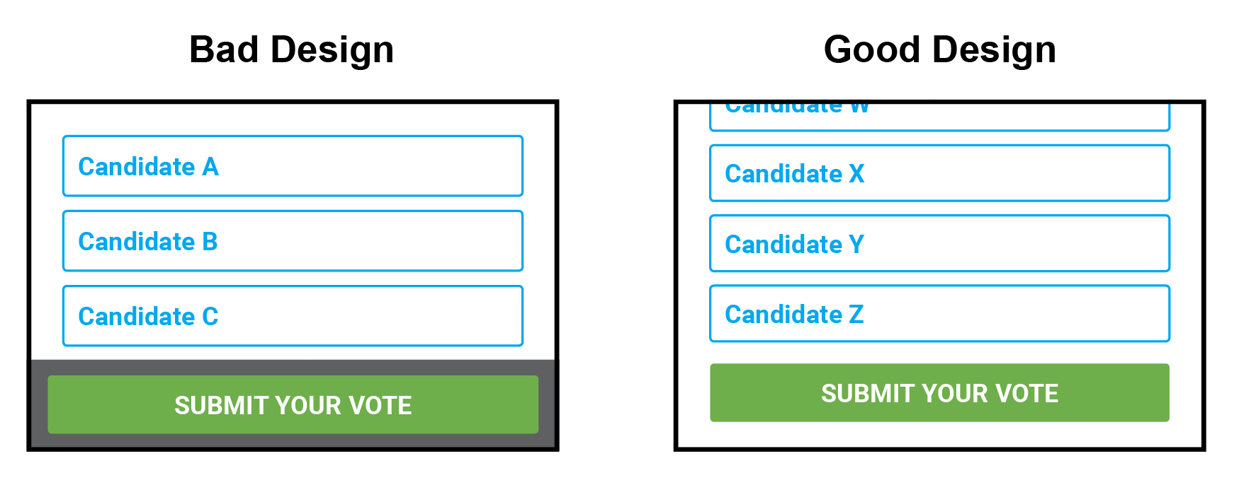
A sheet of paper is a fixed size. Therefore, it contains a finite number of candidates at a readable font size. In order for a ballot designer to fit all of the candidates on one side of the paper, she might need to reduce the font size or spacing of the layout. This could lead to a crowded design or a font that’s too small for some voters to read. In contrast, a screen (such as the one found on a laptop computer) can contain a seemingly infinite number of candidates at any font size and spacing. However, the designer must be aware that users may not see all of the candidates if it is not obvious that they can scroll.
The design on the left makes it clear how a user can submit a vote by placing the SUBMIT button inside of a fixed footer; if the user scrolls, the candidate list advances while the footer remains “fixed” in the same position. However, this convenience can become costly if a user fails to realize there are more candidates. A better solution, illustrated by the design on the right, is to place the SUBMIT button at the bottom of the list, which will force the user to see all of the candidates before they have an opportunity to submit their vote. It’s okay if a user takes a few extra seconds to figure out where the SUBMIT button is, but it’s completely unacceptable for her not to realize that there are more candidates.
In addition to being able to scan a readable list of candidates, online voting ballots also provide designers the opportunity to make the selection state of options more pronounced. With current voting systems, a voter marking an “X” next to a candidate’s name on a paper ballot or flipping a lever on a mechanical based machine might be the only visual indications she has before committing to a vote. But with a digital interface, we have more options.
Consider the illustrations below. The design on the left shows a perfectly adequate selection state, however, it doesn’t offer users much of an advantage over paper or lever ballot selections. The selection state in the design on the right is much more noticeable and will be easier for a user to find when they scan the page to double check their selection before voting. But we can add even more reinforcement by dynamically updating the SUBMIT button to include the candidate’s name.
Voter Validation
Using a traditional paper or lever-based voting system, a person must physically insert a piece of paper into a ballot box or physically pull a lever to submit a vote. There is an automated and clear confirmation that the vote has been submitted.
By contrast, the only system requirement needed from someone voting online is the click or tap of an on-screen submit button. But people need more than that. It’s not enough to just click a button and wonder if your vote has been uploaded. They need that same satisfying confirmation that physical voting methods yield. Like online retailers and financial institutions have been providing for years, confirmation pages are necessary for voters to confirm that they voted properly.
Creating More Educated Voters
Oftentimes voters are quick to vote down the Republican or Democrat party line on election day. Two reasons for this: pressure at polling stations to keep long lines moving, and widespread apathy. Although not as commonly practiced as it was 50 years ago, in states that permit straight ticket ballots, lazy voting is further encouraged by providing an option on the ballot to vote for all members of a particular party.
With online voting, that pressure would be eliminated. A voter would be able to cast a vote within a number of days instead of hours. In Estonian elections for example, voters have seven days to cast their vote online and they can even change their choice within that timeframe. With such a large window to cast a vote, there is an opportunity to provide education about government that doesn’t currently exist at polling places. Local elections will often have a bigger impact on our lives than a presidential election and voters need to know this. For example, what is a comptroller and why should you care? Voting websites could provide immediate access to that kind of information, which could lead to more informed decisions and less partisan voting.
Promoting Civic Engagement
No one votes because they think a single vote can change the outcome of an election. People who vote do so because they are fulfilling a civic obligation. Online voting has the potential to provide convenience and save us time, but voter turnout can be negatively affected if the social aspects that traditional voting offers are not considered.
Switzerland had attempted to combat decreasing voter participation by implementing a vote-by-mail system. They assumed that by reducing the time it took for people to vote, they would help increase voter turnout. The strategy backfired and turnout actually declined in areas where vote-by-mail was launched.
Patricia Funk, an economist who wrote a paper on the role of social norms in voting, theorized that social pressure, rather than economics incentives (such as time savings), was the motivating factor behind getting uncommitted voters to the polling stations. Switzerland, in their attempt to save people time through vote-by-mail, had unknowingly removed this social pressure and as a result, reduced voter turnout.
If we are to adopt a system, such as online voting, that physically isolates voters from the community, then we must replace that loss of community with something that can produce a similar sense of social cohesion, civic responsibility and inclusion.For instance, at the end of an online voting process, there could be an option for voters to share that they just voted across social media. It would be the online equivalent of the “I voted” sticker. According to a Techcrunch article, Facebook had success boosting voter turnout in the 2012 election when they promoted an “I’m Voting” button above the newsfeed.
End Points
This article intends to provide a starting place to contemplate considerations as we design online voting systems. The design examples appearing in this article are intentionally simplified because the needs of voters in an online voting environment have yet to be thoroughly researched and realized. Many government websites offer mediocre user experiences, and little benefit over paper forms and processes. My hope is for designers and policymakers to meet heads and start thinking and discussing a modern and engaging future of voting that serves citizens and democracy.
Chris Calabrese
Chris Calabrese is a Senior User Experience Designer at Cooper. He is passionate about transforming complex interfaces into practical, user-friendly experiences for devices of all shapes and sizes. @ChrisACalabrese


