Flag

We stand with Ukraine and our team members from Ukraine. Here are ways you can help

Get exclusive access to thought-provoking articles, bonus podcast content, and cutting-edge whitepapers. Become a member of the UX Magazine community today!

Home ›› Good Design Vs. Good UX Design

Good Design Vs. Good UX Design

by Esther Pomerantz
3 min read
Share this post on
Tweet
Share
Post
Share
Email
Print

Save

GoodDesign_Slider

The idea of a product that is aesthetically pleasing being one that has a good user experience is a common misconception.

When you hear the term “UX Design”, you might conjure up mental images of well designed websites, apps or interfaces. You might picture their beautiful color palettes, engaging animations, or fresh layouts. While these aspects certainly can contribute to a great user experience, the idea of a product that is aesthetically pleasing being one that has a good user experience is a common misconception.

An interface that is well designed from a visual point of view will not necessarily be one that will provide a good user experience. In fact, often times a product will be designed a certain way in order for it to be visually appealing, yet this design will actively hinder the user’s experience.

Take the Apple Magic Mouse.
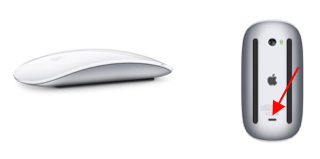
Just-complex-enough concept

While it certainly is designed well from a visual point of view, with its sleek, minimalistic design, it is not designed well from a user experience point of view. This is due to the fact that the re-chargeable mouse features a lighting port on its underside, making it a real challenge for the user to charge the mouse while using it. The lightening port was likely placed where it was in effort to compliment the design, yet this placement makes the experience of charging it frustrating.

Another example of this phenomenon is this air fryer.

Just-complex-enough concept
 

Although its modern look does look nice from an aesthetic point of view, if we take the user experience into account, it becomes evident that it is not designed well. Since the icons on the screen are not labeled, it can be difficult for the user to determine the actual functions of each option. While the icons were likely unlabeled to improve the look of the product, this lack of labeling can interfere with the experience of using it.

Yet another product that is not designed well from a user experience point of view is this cat mug.

Just-complex-enough concept
 

While the mug is certainly cute and creatively designed, its ears are positioned in a way that can poke the person drinking from it in the eyes, making it a user experience failure. Although the ears were added to the mug in order to make it look better, their positioning actually hinders the experience of drinking from it.

These examples illustrate that while a product may be designed well in that it is aesthetically pleasing, it can, in fact, be designed quite badly from a user experience perspective. Additionally, while a design decision may have been made in effort to make a product more visually appealing, this decision can ultimately render the product a user experience bust.

In essence, the purpose of UX design is to design products in a way that helps users be more successful at carrying out the things they are trying to accomplish. A product’s beautiful design will not be valued by its users if there is something getting in the way of them using it the way they want to. When designing products, we therefore want to ensure that the users are able to accomplish their goals in the optimal way, even if that way might not be the most aesthetically pleasing option.

post authorEsther Pomerantz

Esther Pomerantz

Esther Pomerantz is a UX/UI Designer who is passionate about employing design to help both people and businesses succeed. She believes that business problems are solved by addressing user problems and strives to continuously tackle those problems.  Follow her on Medium for more thought and ideas or reach out to her via LinkedIn.

Tweet
Share
Post
Share
Email
Print

Related Articles

Struggling with PowerPoint’s design limitations? This step-by-step guide shows you how to build systematic design solutions, from mastering slide layouts to using sticker sheets for patterns. Learn to create polished, professional presentations with smart workarounds and helpful tips.

Article by Jim Gulsen
A Step-by-Step Guide to Creating a “Design System” in PowerPoint
  • The article gives a step-by-step guide to building systematic patterns in PowerPoint. It talks about the program’s limitations and gives essential tips like mastering slide layouts and customizing text settings.
  • It suggests using PowerPoint’s automated features carefully and advocating for manual workarounds to elevate quality.
  • The piece introduces creating sticker sheets for reusable design components and highlights strategies for successful workflows.
Share:A Step-by-Step Guide to Creating a “Design System” in PowerPoint
5 min read

What is consciousness? This question has baffled the traditional physicalist approach to science. Part of the reason is that reductive physicalism is flawed, as it fails to effectively frame complexification, systems, processes, and the difference between objective and subjective epistemologies. This article introduces a new philosophical approach called “Extended Naturalism,” which extends both our view of the physical world and our understanding of the mental domain and enables the puzzle to be effectively framed so that we can achieve a coherent picture of the whole.

Article by Gregg Henriques
Understanding Consciousness
  • This article provides an overview of a new approach to understanding consciousness called “Extended Naturalism.” Extended naturalism shifts the basic framework for understanding matter and mind from a traditional “physicalist” perspective to a holistic naturalistic perspective.
  • This perspective alters the grammar of science, nature, mind, and knowledge and affords a new way to coherently align consciousness with the matter.
  • The article explains how Extended Naturalism is different from materialism, idealism, panpsychism, and dualism, and allows us to address both the question of what consciousness is and how it works in the natural world.
Share:Understanding Consciousness
34 min read

Publishing in HCI and design research can feel overwhelming, especially for newcomers. This guide breaks down the process — from choosing the right venue to writing, submitting, and handling revisions. Whether you’re aiming for conferences or journals, learn key strategies to navigate academic publishing with confidence.

Article by Malak Sadek
A Guide to Publishing Human-Computer Interaction (HCI) and Design Research Papers
  • The article provides a guide to publishing in Human-Computer Interaction (HCI) and design research, sharing insights from the author’s PhD experience.
  • It explains the significance of publishing in academia and industry, offering an overview of peer-reviewed journals and conferences.
  • It breaks down the two main types of papers — review and empirical — detailing their structures and acceptance criteria.
  • The piece emphasizes strategic research planning, collaboration, and selecting the right venue for submission.
  • The piece also outlines practical steps for writing, revising, and handling rejections, encouraging persistence and learning from reviewer feedback to improve publication success.
Share:A Guide to Publishing Human-Computer Interaction (HCI) and Design Research Papers
8 min read

Join the UX Magazine community!

Stay informed with exclusive content on the intersection of UX, AI agents, and agentic automation—essential reading for future-focused professionals.

Hello!

You're officially a member of the UX Magazine Community.
We're excited to have you with us!

Thank you!

To begin viewing member content, please verify your email.

Tell us about you. Enroll in the course.

    This website uses cookies to ensure you get the best experience on our website. Check our privacy policy and