Save
Much of UX for the Web focuses on the experiences users have while they’re interacting with a website or web application. But that focus neglects a key part of the user experience: the first impression visitors have when they initially discover a product or company. Whether it’s through a Facebook ad, banner ad, or landing page, these first impressions either help bring in new customers or they can result in lost revenue and wasted advertising dollars.
Unfortunately, the design of banners and landing pages for customer acquisition is typically neglected, with much of the time and effort instead going toward the optimization of the ad distribution, not the creative. This practice hurts conversions. Time and time again, it’s been shown that better design of banners and landing pages can make or break campaigns. It is imperative that design professionals insist that thoughtful design be applied to the elements of the customer acquisition flow.
First Impressions Matter
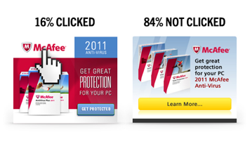
We all know that the vast majority of display ads go unclicked and unnoticed. ComScore reports that only 16% of display ads ever get clicked on, and the term “banner blindness” was coined more than a decade ago. The main culprit? Lousy design. Good design is obviously better than bad design, but we don’t really know how much it can help improve the performance of our campaigns. This inability to quantify the value of design leads to big ad spends that allocate very little for design, which is a big mistake.
Let’s look at a sample campaign to see how this plays out:
Scenario 1
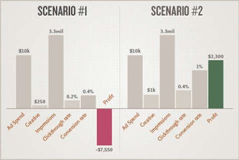
You spend $10,000 on ad placements for a new product, and only $250 for the design of your banners and a landing page. Your product sells for $100 per unit. Your banners get a 0.2% click-through rate (CTR) and your landing page converts visitors to new customers at a rate of 0.4%.
- Ad Spend: $10,000
Creative: $250
CPM: $3
Impressions: 3,333,333
CTR: 0.2%
Conversion rate: 0.4%
Purchases: 27
Revenue: $2,700
Net profit: ($7,550)
Scenario 2
Same as above, but this time we’re going to actually invest in design with compelling banners and thoughtful landing pages that drive purchases. Let’s see what happens:
- Ad Spend: $10,000
Creative: $1,000
CPM: $3
Impressions: 3,333,333
CTR: 0.4%
Conversion rate: 1%
Purchases: 133
Revenue: $13,300
Net profit: $2,300
As you can see, having design that works can swing the campaign from a major loser to a winning, profitable campaign. All for $750 extra dollars, and some thoughtful design work upfront. That’s a huge win for the business that invested in design upfront, and a painful lesson for the business that decided to skimp. But enough with the hypothetical; let’s look at a real-world example.
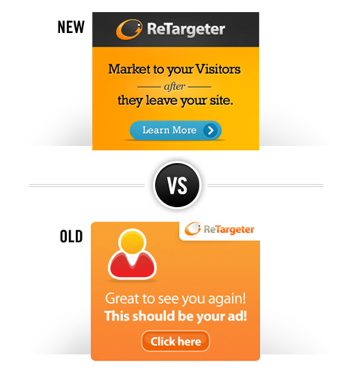
Digital Telepathy worked with ReTargeter to overhaul their banner creative. Although ReTargeter had diligently optimized their banners, they were only seeing incremental gains. We brought a new design and approach to the visuals and messaging that focused on creating a powerful first impression, and tested it against existing creative.
The results? The new design outperformed the old, driving three times higher click-throughs.
Here’s how we nailed that first impression and drove conversion:
- Grab their attention. Use visually striking yet clear design that stands out on the page.
- Show them your vibe. Whether the brand is meant to convey a sense of fun or of security, communicate it instantly through the creative.
- Be intriguing and inviting. Don’t try to sell everything in the ad unit. Tease the solution to make a click seems “worth it” for the viewer who wants to learn more.
From Banner to Landing Page
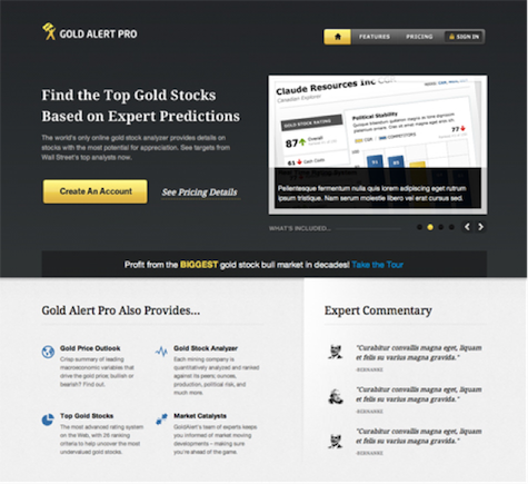
Once you get the coveted click, you have to deliver with the landing page. The design must be clear, consistent and intuitive in order to turn those clicks into conversions. Companies such as Unbounce have made it easy for anyone to set up landing pages based on best practices. But it’s up to you to bring them to life. Instead of stopping with the design of the ad unit, it’s time to think of the ad unit and landing page as symbiotic entities, where each one relies on the other for success.
Here’s how to get the most out of your landing page:
- Deliver on the promise of the ad. It’s like a song with a call and response—the ad promises, the landing page delivers.
- Give them what they want—almost. Give them almost everything they hoped for from the banner, with the last irresistible bit driving the conversion.
- Provide a second option. If some visitors don’t want to take the plunge on your primary conversion, give them a way to take a secondary conversion (like joining a mailing list) that lets you market to them in the future.
- Test and learn. We continually evolve as we learn what works and doesn’t.
Calls-to-Action That Really Drive, uh… Action
The landing page is the moment of truth: will the visitor convert or bounce? It’s your job to make the conversion as easy as possible with clear calls-to-action. Copy, creative and, yes, interface elements (e.g., buttons) all play a role in the call-to-action. Think holistically about how you highlight the conversion point for better results.
Here’s how to optimize your calls-to-action to really dial in conversions:
- Keep it simple. There should be no doubt about what the visitor should do.
- Make it as painless as possible. Don’t ask for too much information. Focus on getting the conversion; you can get the rest of the details later.
- Offer a consolation prize. If they’re not ready to buy, give them a way to sign up for a newsletter, a promotion, or some other mechanism that allows you to continue to market to them.
- Be cohesive. Remember to make sure that the design of the conversion pages, email communications and remarketing materials share the same design style and speak to the user based on their experience with your brand.
Good First Impressions Are Designed
It’s clear that marketers need to invest more of their budgets into design. Our job as designers to ensure that message is heard loud and clear. In fact, we believe so strongly in design-driven results that we’ve launched a new product to make beautifully designed ad units and landing pages easy and affordable. Check out Impress.
As a UX agency, we’re passionate about spreading great design across the Web. Lets rally as a community to demand that design be a priority. Show your marketing team how good creative can impact a campaign. And impress upon them that thoughtful creative that gets results is well worth the upfront investment. As they say, you only get one shot at your first impression, it’s imperative you make it one that matters.
Chuck Longanecker
Chuck Longanecker is the founder of the user experience design company digital-telepathy. DT has ambitious goal of improving the design of the web by introducing new design standards to be adapted by fellow web designers, entrepreneurs and large organizations. Current products include SlideDeck and Hello Bar. Chuck actively consults and collaborates with Tim Ferriss, Eric Ries of The Lean Startup, Gary Vaynerchuk and more. Check out Impress, digital-telepathy's landing page and banner ad design service.


