Save
Weathermob is a niche social networking service for sharing information about local weather, much as Instagram is a service for sharing pictures. It lets you share what you’re feeling about local weather and see what your friends are saying about theirs. A lot of weather apps allow users to share the weather report with Facebook, Twitter, and so on, but what’s interesting with Weathermob is the manner in which it helps the user put together an engaging story.
This is a great example how to make a utility application engaging. It takes a basic function—viewing a weather report—and helps users create whole stories around local weather to express themselves.
Inviting, Conversational Language
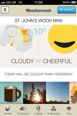
Weather is one of the biggest conversation topics across the world. Instead of just displaying the weather plainly and dryly, Weathermob tries to create a conversation around it by slipping in contextual tidbits like, “Today will be cooler than yesterday.” It’s almost like you’re talking to a real person, getting information but also some contextual small talk that make the information more interesting.
Takeaways
Try presenting data using a conversational tone. It makes the data look more interesting.
Easy to Explore
The interface is crisp and clean; there’s barely any clutter. You know exactly where you are and what you can do. Inviting graphics indicate different types of activities that fit different weather conditions, and are used as links on the home screen to entries by other users who associated that activity with a weather report in their area. It’s an impressive way to encourage users to explore the application.
Takeaways
Identify data elements that can be used to persuade users to explore further, and provide access to them in screens that are at the end of workflows, or in screens that displaying related information. This allows user to explore more of you have to offer.
Persuasive Triggers
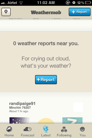
Weathermob provides persuasive triggers that encourage you to share your weather report while you’re viewing the reports from others. These triggers appear in a unintrusive manner at moments when users may find the data interesting and be swayed to take the effort to share a report. I find this to be very innovative because it tries to nudge users when they’re most likely to share.
Takeaways
If you’re dealing with user-generated content, identify points in the application flow where the user is engaged with interesting content, and provide friendly triggers for them to create new content of their own. When users already find content to be engaging, they’ll be more willing to add to the stream.
Very Easy to Contribute
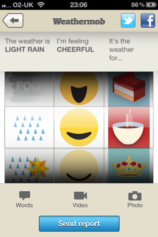
Weathermob provides a fun and easy-to-use interface for users to create compelling stories about how they feeling about the weather. The UI design makes it very easy to distinguish the fixed elements from the variables the user can select. However, the affordance of the input wheels would be improved if each wheel looked more visually distinct, thus indicating that they’re separately controllable. UIDatePicker is a good example of wheel-selection component that provides good affordance.
The social sharing features, currently accessible via the small icons in the upper-right of the screen, should be given more prominence to better utilize the social influence of users. The social sharing options could be provided closer to the “Send report” button so they follow the natural top-to-bottom flow.
Takeaways
- Provide a fun and easy way for people to create stories to express themselves.
- Consider the order of user task flows very carefully.
Barrier to Entry
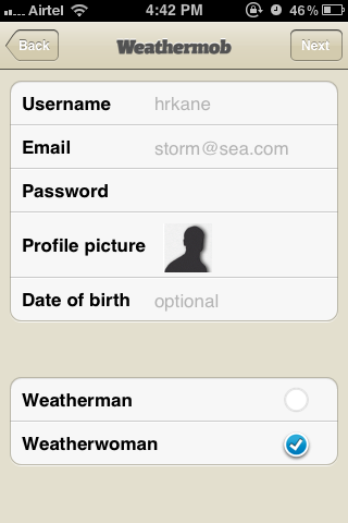
My understanding of the goal of Weathermob is that it should make it easy to express how you feel about the weather and share that with your social networks. With that in mind, I found that the sign-in process needs improvement. Currently, users are required to sign into the app, and then separately sign in again with Facebook and/or Twitter when they want to share. I think that’s too great a burden to place on the user. It might make more sense to allow users to try out the app without creating account, and then allow them to use Facebook Connect or Twitter’s OAuth to quickly sign up, log in, and share. This way users don’t need to log into multiple services separately, and can register a new account more easily.
Takeaways
According to a survey published by Janrain, registration screens seem to be driving away majority of customers, and three out of four respondents believe “social login” should be offered. If sharing on social networks is a major component of an app, it might make sense to use the sign-in tools provided by Facebook, Twitter, and other services so the user doesn’t have to deal with registering for one more service and then signing on again for social networks.
Uses Game Mechanics to Make Things Interesting
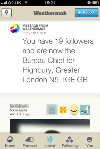
Game mechanics are often used to make boring and repetitive tasks interesting, and nothing says boring and repetitive more than watching the weather. To keep things interesting, Weathermob lets you earn points and titles like ‘Bureau Chief’ for your area (similar to Foursquare). Gamification.org has a great collection of books, articles and presentations on the topic.
Conclusion
Among other things, Weathermob is a good example of designing with users’ emotions in mind. As humans, we want to connect with real people. UX designers need to bring out the app’s personality to engage people emotionally. Using a conversational tone like “For crying out loud, what’s your weather” helps people relate to an app as if it were just another person.
I lead Accenture Studio for Experience Design. With a diverse background and passion for the many ways people interact with technology, my expertise lies in creating intuitive and desirable experiences that utilize deep insight into user behavior and psychology.
Say hi on Twitter @sachendra


