All aboard the time machine! We’re going back to the late 1970s — in search of a user interface designer. Come to think of it, that title hardly existed then, and the job description was somewhat different too. In some ways, you could say that your work was pretty serious but quite easy in other ways. It was easy because whatever you may be responsible for designing — a piece of technology, software applications, or even hardware — in all probability, you would be designed keeping in mind a big fat desktop computer that would only be used by a handful of really skilled personnel. And that was it — there were no other situations or no other cases or even no other users to keep in mind when designing. Even if you fast forward to around 15 years, into the mid-1990s, probably the desktop computers have gotten a little bit smaller in size but the situation is basically almost the same.
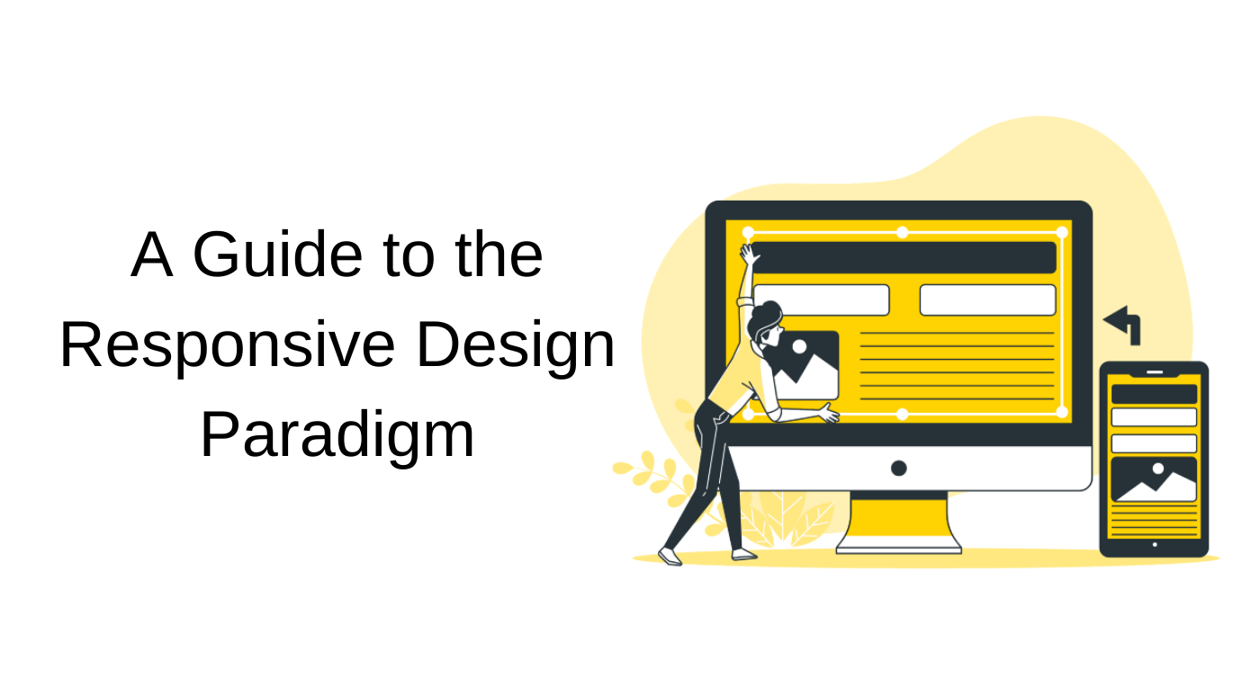
What it currently looks like
Things now have started to look a lot more complex. User interface designers are dealing with smartphones, tablets, smartwatches, and all sorts of smart things — from lightbulbs and door locks to robot vacuum cleaners. If you listen to podcasts you would know that every advertisement brings forward some new smart objects. But what does that mean for user interface designers?

Well, everything that is “smart”, needs inputs through human interaction, and anything that requires an interaction model, needs a user interface.
Interface designers to the rescue!
We would have to be ready to design for a large variety of devices and myriads of interfaces. But that is not the most critical part. Very rarely will you find someone who uses only one smart device (say, only a smartphone — no laptop; or vice versa). That only means we have to design for people who use multiple smart devices in conjunction at the same time.
Let me give you an example.
As I write these very words, Spotify is playing LoFi beats on my iPad. If I so desire, I can use my Macbook or my iPhone or even my Android smartphone to open up Spotify and start playing a different song or playlist on my iPad itself. This manoeuvre is possible only because of consistency in design and technology in the Spotify apps across all these devices — all of vastly different screen sizes and even different underlying operating systems.

Left to right — Spotify iOS app, iPad OS app, MacOS app
We need really comprehensive understanding of the benefits and shortcomings of each of the device types or platforms, making sure that when designing we make use of this knowledge to influence design decisions while building a product. All benefits need to be skillfully taken advantage of and all limitations have to be worked around. And this is where we dip our toes into the vast expanse that is responsive design.
But where did it all start?
Most articles on the internet will tell you that the idea of responsive design came around in the years 2012–2013. However, this concept was born at least around 1991. CTO of Xerox PARC, Dr. Mark Weiser had written an article, so famous that just this one article got upwards of 13000 citations. And this is one of the many articles put forward by this forward-thinking HCI researcher.
In his 1991 paper, Dr. Weiser established a framework of three main types of devices, and thus three types of platforms. He called them —
1. tabs,
2. pads, and
3. boards.
These are precisely what has come to be smartphones, tablets and wall-sized displays, or large desktop displays like we are used to seeing all around us now.Come to think of it, it is pretty cool that someone in the beginning of the 90’s could predict something so remarkably accurate — it is exciting to see Mark Weiser’s vision come to fruition.
And as we get better at designing for these platforms, we get better at designing better platforms.
So what is responsive design?
If you’ve done any course related to responsive design, or heard about it from anyone — you would know that all you need to do to make a website responsive is to make it aesthetically pleasing and properly functioning for all types of screen resolutions. Know this — responsive web design is not just about adjustable screen resolutions an automatically resizing images. It is a whole new way of thinking about design.
To get a sense of how one goes about responsive design, it is important to understand that, a designer does not just lay out the desktop version of the website, and then sort of hack around with a tablet layout and a phone layout. Instead, she/he looked at everything altogether and then implemented a design that was consistent across the specific screen sizes the users are looking at — the webpage width. That is precisely where the importance of platform and context lies, and why one should understand the nuances of each platform while designing for the same.
Here are some of the most important steps taken to enable a responsively designed website.
1. Adjusting screen resolutions
With great number of devices, come great variety in screen resolutions, definitions and orientations.

Account for varied screen resolutions
Every single day new devices with new screen sizes are being developed, and there is a pretty good chance that each of these may be able to capably handle the variations in size and functionality, and even colour. One will find some being predominantly used in portrait, some in landscape, and some totally square — designing for both portrait and landscape is a no-brainer. One also needs to enable both these orientations to effectively switch in an instant upon page load, keeping in mind the hundreds of different screen sizes.
Yes, it is quite possible to bundle these sizes into main categories, design for each, and make every design the most flexible possible. You can also use the Goldilocks approach to responsive web design — this states that you should be ideally making designs that are device-independent layouts, that will look perfect regardless of the device that you are viewing them on.
2. Accommodating touchscreens and cursors
You are as probably going to poke at the screen with your fingertip — as you are, to use mice to roam around the digital canvas with a pointer/cursor.

Design keeping in mind whether for touch or non-touch inputs
Necessary or not, touchscreens are becoming more popular by the second. They were so in fashion, that in August 2017, a US navy destroyer vessel, USS John S. McCain crashed into a Liberian oil tanker killing 10 and injuring close to 50, simply because the mechanical controls were replaced by touch-screens — which the sailors were very inexperienced in, and which provided no tactile feedback, compared to mechanical throttles.
It is extremely important to choose the platform that appropriately meets the purpose, and not the other way round. That said, there are innumerable applications of touch screen and pointer-based interfaces today. It would be foolish to assume by the current trends that smaller devices will have touchscreens and larger displays will have pointer input. Many laptops and desktops have touch support.
Touchscreens have different design guidelines than purely cursor-based interactive systems, and they have different capabilities as well. However, it is not too effort-intensive to make a design work for both in terms of usability and desirability.
3. Flexible everything!
Blessed are the flexible, for they shall not be bent out of shape.

Like water, your design should fill the shape of the containing vessel
Text, images, videos, forms, newsletters — everything. In the early 2010’s, flexible layouts were almost considered a “luxury” for websites, and even then the only thing that was considered flexible were the structural elements — the column layout, and the text. Images would end up breaking these flexible layouts, and when pushed enough, even the columns would give way to chaos. Effectively these designs could give or take a few hundred pixels, but more often than not, could not adapt when changing from a wall mounted ultra-wide monitor to an iPad — they weren’t really flexible.
Now, images can be automatically adjusted. Even the layouts can be made to never break — there are workarounds to make it totally flexible, although the columns might get squished and turn out somewhat illegible in the process. This may not be a complete fix, but it allows for multiple options and ways to smoothen out the transition from one device type to another.
4. Hiding content when possible
Isn’t everyone hiding something?

Hide all that is not immediately required
You should definitely do it for content on websites — judiciously and carefully, of course. As much as it is possible to scale down elements proportionally to fit everything into a smaller screen; making each and every piece of content from a large display, available on a small-screen mobile device is not always the best answer. Simpler navigation, focused content, rows instead of multiple columns are all best practises for small-display environments. But, it is also necessary to prioritise the content strategy and make it such that nothing of tremendous importance (primary information) is excluded — while secondary information should ideally be included, and tertiary information is what can be hidden — again, judiciously.
All said and done, you definitely can not plan out and design a website that is responsive, content-focused and mobile-first, the same way that websites have been created for years now.
Why?
If your ultimate goal is to design a website that does not have a fixed-width and serves small-display-devices the styles they require, there is no point in using a dated set of procedures that actually contradicts the above goals.
Also, the drawbacks are costly.
Failure to be platform-aware can lead to the failure of a product

Platform-awareness is indispensable knowledge
If there is something that cannot be stressed more, it is this — your design should be fluid and must understand the context of each platform before adapting to the screen size and constraints. To you and me, it may sound crazy, but we need to keep in mind the simplicity and ease of use of the users who go from smartphone to desktop, back to a tablet, out for a jog with their smartwatch and return home to their smart AC set at the right temperature and loaves baking in the smart oven.
The story has only begun …
Remember Dr. Weiser from a few scrolls up this blog? What he had envisioned in around 1990, is that what we understand as computing will become one with our environment. So much so, that we will hardly recognise when we’re interacting with a computer while going about our day. He expected that we will use computers everywhere, even possibly while spending time with our families, no longer think of these as computing devices, or as individual smartphones or tablets. We will look at them as simple tools that help get jobs done, dare I say — like something along the lines of a hammer or a wrench.

They’re all just tools in the end
We can actually see this happening, and when it does, it’ll be a tremendous success for user interface design. At the same time it will be a persistent challenge for us, designer folk — and we’re really excited looking forward.
Cheers!