Realism in UI Design

The history of the visual design of user interfaces can be described as a gradual change towards more realism. As computers have become faster, designers have added increasingly realistic details such as color, 3D effects, shadows, translucency, and even simple physics. Some of these changes have helped usability. Shadows behind windows help us see which window is active. The physicality of the iPhone’s user interface makes the device more natural to use.

In other areas, the improvements are questionable at best. Graphical user interfaces are typically full of symbols. Most graphical elements you see on your screen are meant to stand for ideas or concepts. The little house on your desktop isn’t a little house, it’s "home." The eye isn’t an actual eye, it means "look at the selected element." The cog isn’t a cog, it means "click me to see available commands."

Details and realism can distract from these concepts. To explain this, I’ll take a page from Scott McCloud’s Understanding Comics, a book which should be required reading for all designers.

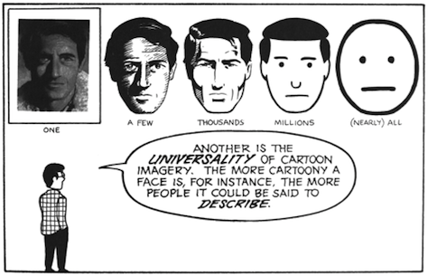
The image on the left is a face of a specific person. The image on the right is the concept "face;" it could be any person. When designing user interfaces, we rarely ever want to show a specific entity; typically, we want to convey an idea or a concept. Details can easily distract from that idea or concept.

Camera icon compairson

At the same time, it’s obvious that some details are required. Too few details, and the user won’t recognize the idea at all.

Face comparison 2

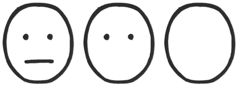
The circle on the left clearly shows a face. The circle on the right isn’t recognizable as a face anymore.

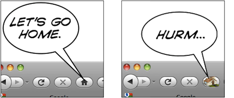
Let’s look at a symbol we actually see in user interfaces, the home button. Typically, this button uses a little house as its symbol.

Home image comparison

The thing on the left is a house. The thing on the right means "home." Somewhere between the two, the meaning switches from "a specific house" to "home as a concept." The more realistic something is, the harder it is to figure out the meaning. Again, if the image is simplified too much, it’s not clearly and immediately recognizable anymore.

home icon comparison

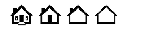
The thing on the left is a home button. The thing on the right might as well be an arrow pointing up; or perhaps it’s the ⇧ key.

Let me explain this concept using an entirely unscientific graph:

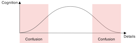
People are confused by symbols if they have too many or too few details. They will recognize UI elements which are somewhere in the middle.

The trick is to figure out which details help users identify the UI element, and which details distract from its intended meaning. Some details help users figure out what they’re looking at and how they can interact with it; other details distract from the idea you’re trying to convey. They turn your interface element from a concept into a specific thing. Thus, if an interface element is too distinct from its real-life counterpart, it becomes too hard to recognize. On the other hand, if it is too realistic, people are unable to figure out that you’re trying to communicate an idea, and what idea that might be.

button style comparison

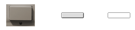
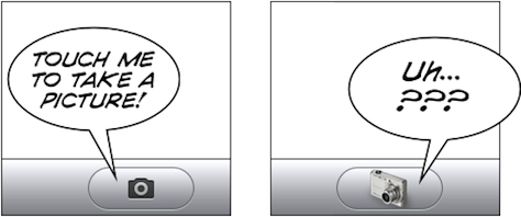
The button on the left is too realistic. The button on the right does not have enough details to be immediately recognizable as a button.

toggle style comparison

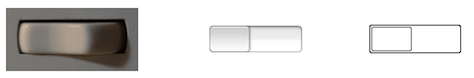
The same applies to these toggles. Shadows and gradients help the user figure out what he’s looking at and how to interact with it. Adding too many details, however, ends up being confusing. The toggle switch is no longer just a toggle switch that is part of a user interface, it is clearly recognizable as a photograph of a specific toggle switch; it loses its meaning. It’s no longer a symbol, it has become a specific thing.

home buttons

An Exception

There is at least one specific area where more details are good: application icons. You want your icon to depict one specific idea: your application.

application icons

Coda’s leaf isn’t a representation of the idea of a leaf; it’s a very specific leaf, the Coda leaf. Acorn’s acorn isn’t just any acorn, it’s the Acorn. Adding details moves these images from a generic concept towards a specific entity, and in the case of an application icon, this is exactly what you want.

Conclusion

Graphical user interfaces are full of symbols. Symbols need to be reduced to their essence. This helps avoid cluttering the user interface with meaningless distractions, and makes it easier for people to "read" the symbol and figure out the meaning of an interface element. Realistic details can get in the way of what you’re trying to communicate to your users.

The goal is not to make your user interface as realistic as possible. The goal is to add those details which help users identify what an element is, and how to interact with it, and to add no more than those details. UI elements are abstractions which convey concepts and ideas; they should retain only those details that are relevant to their purpose. UI elements are almost never representations of real things. Adding too much realism can cause confusion.

Thanks to Max Steenbergen and Cameron Kenley Hunt for helping me form a coherent opinion on this topic. The second house icon is from Dellustrations’s icon set "Dellipack".

This article was original posted on Lukas' blog, Ignore the Code.

Comments

James 25 January 2010, 13:29 (Permalink)

Apple really have nailed UI design haven't they?
Some of these ideas you've mentioned I'd kind of assumed, but never really thought about. You raise some very good points. Thanks for the article.

Joe Barstow 25 January 2010, 15:22 (Permalink)

Excellent read, Great information! Scott McCloud's 'Understanding Comics' Should be a required reading. :)

Almost everything covered, except I would like to read more on depicting realism with typography. I have noticed trends that mimic the embossing left by typewriters or a printing press. (slight text-shadow or highlight) Some people, including myself, may not be entirely sure of the caveats or proper usage for this technique.

oh, and the graph, its superb. I can finally visualize what I'm feeling, thank you!

Mohammed Alaa 25 January 2010, 16:10 (Permalink)

Nice and Amazing Information Lukas

Peter Gasston 25 January 2010, 17:43 (Permalink)

This is an idea that I began to explore a little while ago, but you've covered it better and in far more depth than I did.

John McRee 25 January 2010, 19:49 (Permalink)

Remember, too, that the concept can also be abstracted. The signs we use for men's and Women's restrooms would likely mean that there are rooms filled with those if they were literal. They don't have to be literal; we understand them anyway. Home and envelope and garbage cans are also good metephores that apply. I really appreciate articles like these that offer us a place to point clients to.

Ian Chan 25 January 2010, 20:11 (Permalink)

Make sure we don't confuse symbols with icons, because historically they are two very different things:

"An icon is a sign which refers to the object that it denotes merely by virtue of characteristics of its own.

A symbol is a sign which refers to the object that it denotes by virtue of a law, usually an association of general ideas, which operates to cause the symbol to be interpreted as referring to that object" (Buchler, 1955)

Your post brings up some very good points, as we have all seen interfaces that lean towards either side of your graph. Like John, I also really like seeing articles like this, which make us always be aware of these issues. I think the word you were looking for the whole time was "Affordance" ;)

Bernard Kowalski 26 January 2010, 04:57 (Permalink)

BAM! Ian nailed it (affordance). Great article.

Lukas Mathis 26 January 2010, 06:02 (Permalink)

Thanks for the comments, everyone.

@Peter Gasston: Applying the concept to wireframes is an interesting idea.

@Ian Chan: Yeah. I'm using "icon" in the "computer" sense of "small pictograph or ideogram". And yes, "affordance" applies. I try to avoid jargon (if that's the right term), because I hope that my texts are read by people outside of the UX community (programmers who design their own UIs, visual designers who are interested in usability, clients who are sent here by their designers because they wouldn't take the designer's word for it, etc).

@mspownall 26 January 2010, 06:50 (Permalink)

Great article Lukas

PSD Cutups 26 January 2010, 09:57 (Permalink)

This is a fantastic article that really lets me understand the concept behind UI design much better. I generally use these kind of stencils but it shifts your perspective.

Thanks again!

Amber Weinberg 26 January 2010, 11:12 (Permalink)

This is something that's plagued designers for forever. Balance between being too representational and too abstract.

Ian Chan 26 January 2010, 12:08 (Permalink)

Yes, I liked the language you used. UX jargon can be as bad as legalese in the law world. I am a programmer designing UI's :) so the article was great for me.

John Pugh 26 January 2010, 20:02 (Permalink)

A classic article, well written and concise. I think visual designers of all media have to negotiate this issue everyday. Thanks and I look forward to your next article. Studio_Pugh

Mr Obvious 29 January 2010, 09:19 (Permalink)

This is basic entry stuff. First year design school...if that. "This is something that's plagued designers for forever" i mean, come on. If this article is a revelation then good luck to you. You'll need it.

Lukas Mathis 30 January 2010, 07:50 (Permalink)

If you've picked up a few feature phones with vendor-proprietary operating systems recently (just to mention one example), you will have noticed that the idea isn't as obvious as it should be.

Louise Hewitt 1 February 2010, 02:07 (Permalink)

Thanks for this article: I'm not design trained, but have a comms background so, while I instinctively 'know' all this stuff, I don't find it as easy to articulate to clients/stakeholders as the language and typography aspects. So articles like these might be 'basic entry stuff' it is still valuable to someone like me working in the UI design field.

Moreover, 3rd party assessments like this that I can pass on to others are a big tool in winning the battle for good UI design and always have been.

Cheers!

Todd 4 February 2010, 21:55 (Permalink)

Thanks for the great article!

Steve Whetstone 25 February 2010, 02:48 (Permalink)

You said. . .

"There is at least one specific area where more details are good: application icons. You want your icon to depict one specific idea: your application."

How close are company logos to application icons would you say? can you think of any reasons why this rule might apply differently or work differently for company logos?

David O. 27 February 2010, 02:36 (Permalink)

I think there are some instances where a realistic user interfaces works well
For example the virtual effects rack in Propellerhead's Reason. That's a very popular software and it's realistic interface is very intuitive to use.
Ardentway

Post new comment