Crafting truly inspired user interface designs is hard. Any schmoe can slap a listbox and a couple of buttons on a screen and meet a user need (although sometimes a couple of buttons and a listbox is the optimal design). However, as modern software development tools such as WPF unshackle developers to let them efficiently realize any design they can dream up, we have a responsibility to more vigorously challenge our design proposals. While I do not advocate complexity or innovation for their own sake, there are cases where challenging conventional design metaphors can lead to much more elegant and pleasing solutions for users. If we are to create user interactions that transcend from the ordinary into the sublime, we need to invest significantly more energy and creativity. Modern tools let us ask, “Maybe this listbox should be a solar system”, but these questions do not ask themselves. It is on us to identify, discover, and ask them.
But therein lies the problem. When the options are limitless it can be difficult to decide on where to start. Introducing constraints can help alleviate this problem by narrowing the focus.
If you ask me to write a song about the ocean, I’m stumped. But if you tell me to write a ballad about a woman in a red dress falling off her bar stool at three in the morning, I’m inspired.
– Stephen Sondheim
I’d like to propose two things that might help you improve your design skills:
- There is creative value in specifying artificial constraints as part of an exploratory design process.
- We should dedicate time to “sharpen our swords” by designing solutions to problems we might not even have.
The first point has been evangelized by creativity advocates for quite some time. Constraints can be used to force us to explore unconventional avenues to reach our goals. Think Apollo 13 and the NASA team solving truly complex technical problems with what they had lying around the spacecraft.
The second point recognizes that it is impossible to pinpoint when inspiration will strike, and that you never know when the solution for a different problem might be the inspiration you need for solving your current problem (for example, Gutenberg’s printing press was inspired by early wine presses). The best we can do is to keep our toolbox of solutions as full as possible so that we can reach into it and find what we need, when we need it.
In the remainder of this article I will walk through a design exercise, describing a problem, introducing artificial constraints, and proposing some truly awful designs. The point is not to come up with an outstanding solution, but to flex creative muscles and fill our toolbox with ideas that might lead to an outstanding solution to a different problem somewhere down the line. In short, the value is in the journey, not the destination.
The Problem
Reporting in enterprise software is a fairly common requirement. Oftentimes these reports require users to enter date and time constraints for the report they wish to generate. Entering a date is no problem; the calendar control is the solution of choice. However, when the user must specify both the date and the time, the solutions are less standardized and less elegant. When time precision is not terribly important (such as with travel websites), the strategy of choice appears to be using the calendar control for dates and a dropdown for the time. This dropdown will offer options such as “morning,” “afternoon,” or “evening,” or a list of whole-hour increments. But what if more precision is needed? The solution might be like the time control in Microsoft Outlook’s “New Meeting” form. This control is a simple textbox with sophisticated parsing that will turn “14” into 2:00 PM or “1106” into 11:06 AM. This is a pretty good solution but, personally, I do not like using my mouse to specify a date in the calendar control and then having to switch to the keyboard to enter the time.
The challenge for this exercise, then, is to come up with a control to enable specifying both the date and the time.
The Constraint
Ideally there should be one input mechanism for both date and time. For this exercise I’ll pick mouse input as the first constraint since existing calendar controls already encourage use of the mouse. That’s not to say we won’t support keyboard entry, but the goal is to support mouse entry for both date and time.
The second constraint I want to introduce is that both date and time should be handled in the same control. In this scenario date and time are one piece of input to a report, so it makes sense that one control would be used to specify it.
Since we are targeting the mouse as our primary input mechanism, the third constraint we’ll impose is that the user should be able to enter both the date and time with one click. When using the mouse for input, we should strive to minimize the number of clicks required of users. One is a nice, small number of clicks, so let’s start there.
Limits are an artist’s best friend.
– Frank Lloyd Wright
So how do you make a single control for date and time input that requires only one click? None of the conventional date/time metaphors come close to meeting these constraints so I will need to explore some unconventional ideas. Hopefully one or more of these ideas will prove to be useful enough to tuck away in my toolbox for future reference.
Solution #1 – The Theremin
The first solution I came up with for this problem was to expand upon the new “spin” control that Microsoft has started using in its products, such as Expression Blend. With this control, the user can click on a numeric edit box and drag the mouse to the right or up to increase the value, or to the left or down to decrease the value. My idea is to use the Y-axis for the date portion and the X-axis for the time portion. Users can click and drag to eventually hone in on the desired date and time by moving the mouse toward an invisible destination on the screen. I would use mouse velocity to control precision; move quickly up the Y-axis to adjust the year, and move more slowly to adjust the day. Kind of like playing a theremin, it would have the feel of tuning a cosmic instrument.
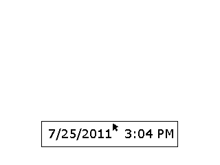
Figure 1: The Theremin solution (click to see animation)
It didn’t take me long to throw together a prototype of this design in WPF. While it did meet the requirements, it was an abysmal failure with regards to usability. I found it was too imprecise and, as a result, took too long to arrive at the desired date/time. However, I do see potential in the idea of a two-axis spin control like this one. Date and time require far too much precision for this approach but I could see the design being useful for two-axis input that is much coarser grained (e.g., day of week, and hour in day, font family, or font size). Granted, this idea is not going to find itself in many (if any) software products, but already this exercise is starting to put tools in my toolbox.
Solution #2 – The Mapped Theremin
One way to solve the imprecision problem with Solution #1 is to make it clearer where the mouse has to be to affect the date and time in a particular way. Rather than making the user blindly drag toward an invisible destination (as with Solution #1), we’ll give the user a map.
In this solution, the user clicks and drags on the edit control, just as in Solution #1. But instead of translating X/Y mouse movement to date/time manipulation, we’ll display a popup of where the user can hover the mouse to affect the date and time in the desired way.
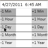
Figure 2: The Mapped Theremin solution (click to see animation)
The problem with Solution #2 (among other things) is that the date and time get updated on a timer. As a result, the user ends up parking the mouse in a particular location and waiting for the control to catch up to the date/time he is trying to specify. This takes too long and is very frustrating. Shortening the timer interval just introduces a different frustration: shooting right past the date/time you want and having to go back.
This solution provides another nugget of knowledge for future reference. While I do not anticipate ever reusing this design, the interplay between timers and user input serves as an anti-pattern I can use to reject similar proposals in the future.
Solution #3 – The Slot Machine
The control needs to be more interactive—I need to enable the user to be more proactive about arriving at the desired date and time. But how can interactivity be increased without increasing the number of clicks? Well, scrolling the mouse wheel doesn’t count as a click, right? The design that I came up with next looked a bit like a slot machine. Each date time part (day, month, year, hour, minute) is its own tumbler. The user can just mouse over each date/time part and use the mouse wheel to increase or decrease the corresponding value. This design ended up being very similar to the “UIPicker” control popular in many iPhone apps, the differences being that it would look like a normal edit box until you clicked on it, and you would use your mouse wheel instead of your finger to manipulate it.
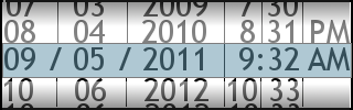
Figure 3: The Slot Machine solution
This design didn’t seem too bad. It was a little more work to specify a particular date/time than I would like (a lot of mouse wheeling), but I could see this idea having merit to solve a similar problem. I tucked the design away in my toolbox for future reference.
Solution #4 – The Wheel of Destiny
The spinning tumbler idea in Solution #3 sparked a new idea: what if the tumblers moved around the control in 2D instead of behind it in 3D? The user could use the mouse wheel or click on each tumbler to drag it around to the desired value.
I tried a couple different variations on this idea but they both shared the same problems. The first problem was that too much screen real estate was needed to show the 2D tumblers. The second problem was that the control could only support a fixed (relatively small) number of years. Because every selectable date/time part is visible at the same time, you can only display so many years before you run out of room on the tumbler.
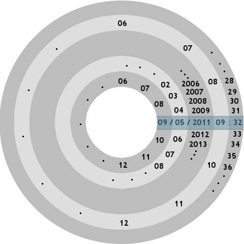
Figure 4a: The Wheel of Destiny (horizontal) 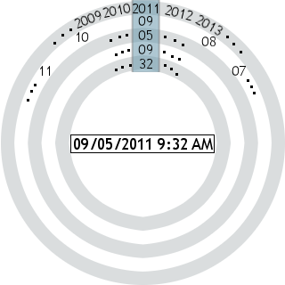
Figure 4b: The Wheel of Destiny (vertical)
However, one thing I did like about the control was the interaction with the 2D tumblers. It was kind of fun to click and spin them around, and you could do it really quickly (much faster than the mouse wheel) to find the desired date/time part. This led me to yet another idea: instead of showing every date/time part on the tumbler, I would just present the user with concentric, circular scrollbars. Each scrollbar would represent a date/time part. Clockwise rotation would increase the value, counterclockwise would decrease it.
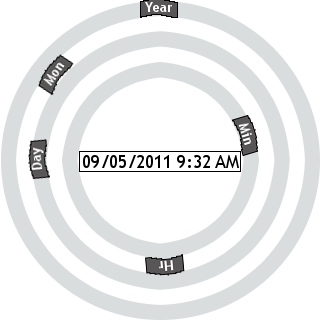
Figure 4c: The Wheel of Destiny (circular scrollbars)
This control wasn’t bad. While it mostly violates the one-click constraint (you could use the mouse wheel but the circular scrollbars really afford clicking), I felt as though I was getting closer to a usable, mouse-enabled date/time control. At this point I decided to drop the constraints and see how close I could get to a real solution.
Solution #5 – Getting Real
While I liked circular scrollbars for time entry, the main problem I had with the “Wheel of Destiny” was it was inferior to a standard calendar control for the date portion. Maybe the calendar control is not an area ripe for improvement and I should stop trying to reinvent it. All along, the real objection I’ve had is with keyboard-required time entry, not with the already mouse-enabled calendar control. If a calendar is the accepted metaphor for selecting a date, shouldn’t a clock be the metaphor for selecting a time? An analog clock also meshes perfectly with the circular scrollbar implementation.
![]()
Figure 5a: Date and Time edits with corresponding mouse-enabled icons 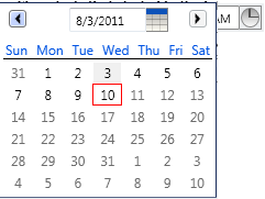
Figure 5b: Calendar control 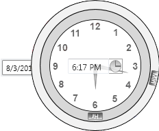
Figure 5c: Analog clock control
Conclusion
This calendar/clock hybrid control is something I’m very satisfied with and would be happy to use in a product that required precision date and time input. In addition to the mouse-enabled calendar and clock controls, the user can simply enter the date/time into text fields using the keyboard, and that input uses advanced parsing to make this option as simple as possible. The calendar and clock are only displayed if the user clicks the corresponding icon.
As important as the eventual solution are the designs and ideas I discovered along the way (two-axis spin control, timer anti-pattern, slot machine, circular scrollbars). Also, by introducing artificial constraints to the date/time control problem I was forced to explore some unconventional ideas and avenues that I otherwise would have never considered.
I hope you have found this exercise and walkthrough useful and that you will consider using this technique to improve your own design skills and to fill your solution toolbox.