Save
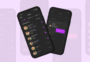
The design team at Yahoo! Mail just launched a beta version of their redesign for 273 million worldwide users—more users than Gmail and Hotmail combined.
Start-to-launch, they completed the redesign the Yahoo! Mail web app and native app versions for iPhone, iPad, and Android, and additional devices in about eight months, and it all had to work in a few dozen languages.
The changes were more than just cosmetic; to improve performance, they rebuilt the app from the ground up. By anyone’s standards, this is pretty darn fast to get a major redesign out the door.
We spoke to Andrei Herasimchuk, Sr. Director of Product Design, Yahoo! Communications and Communities and Stephanie Shum, Senior Product Manager, Yahoo! Mail, to learn some of the tips and tricks they’d used to get things done on their redesign effort.
- Eliminate busy work. The team minimized time spent on anything that wouldn’t appear in the final app. Rather than wireframe, they did more whiteboard sketching, and then just went straight into pixel-perfect design. This meant that some designers had to get ramped up and comfortable in new tools, which took some time. Even with that ramp-up time, they felt they were able to work faster overall.
- Tackle all devices and platforms at the same time. Rather than working through the entire web app, then going back and starting on the various mobile apps, a desktop app, etc, the team basically works on all of these in parallel. With a team of about 18 designers, they divided work up primarily by functional areas—like composing an email or adding a contact—and then worked on each piece of functionality across devices and platforms, rather than dividing work up by platform.
- All designers need to think about all aspects of the design. Like most design teams, the Yahoo! Mail team includes designers with more of a visual design background and designers with more of an interaction design background, and most people are more comfortable in just one of these areas. Andrei and Stephanie encouraged everyone on the team to think about the design holistically—so even if you can’t sling a great drop shadow yourself, you should have an opinion about how the drop shadows look.
- Take on more of the front-end development. They also changed they way they teamed with the development team. The design team took on markup, a task that had traditionally fallen to development. This allowed them to spend 30 seconds time just nudging the label over 5 pixels, rather spending 10 minutes composing an email or a bug report or walking down the hall to find the developer to ask them to nudge the label over 5 pixels. This change took some getting used to, but allowed the team to move faster in the end.
They also shared a few thoughts on how you approach a redesign for a product used by 273 million people.
- Pick your battles. All designers, when presented with an opportunity to redesign, are going to want to change a lot. But millions of users rarely want big changes all at once. To make improvements without alienating a large user base, many of the changes they worked on affect non-email features (twitter and Facebook integration, chat, SMS) while the updates to the email interface addressed smaller, subtler refinements.
- Understand the little details that people like. The team has learned, through usability and other feedback mechanisms, what details matter to people. Seemingly little things—like the checkboxes in front of each email, or letting people view their mail with a preview pane or not—may not seem like a big deal at first glance, but the team has learned that they are incredibly important to users. Another big one that might be tempting to change is the folder structure for organizing emails. Why not go to something like the labels in Gmail? But the team knows that most of their users are comfortable with and like the folders, and has resisted the urge to change things just because they seem more up-to-the-moment, instead respecting what their users actually like, use and are already comfortable with.
You can find out more about the redesign at https://.ymailblog.com/.


Beth Koloski is a Lead Experience Architect at EffectiveUI. She has more than 12 years of experience designing user interfaces for Web-based software, leading successful projects for clients such as Orbitz, Domino’s, Red Bull and Standard & Poor’s.
Prior to joining EffectiveUI, Beth held senior interaction design roles at Crispin Porter + Bogusky, texturemedia and Foci. Beth was the Experience Design Director for the American Institute of Graphic Arts (AIGA) Colorado Chapter Board of Directors from 2005-2006, and served as the editorial assistant for O’Reilly’s book titled, Information Architecture for the World Wide Web: Designing Large-Scale Web Sites.
Additionally, Beth is a contributor to UX Magazine and speaks at industry events such as IA Summit.
Beth received her Bachelor of Arts in English from St. Mary's College of California and her Master of Arts in English Literature from New York University.