Usability heuristics are each hailed as irrefutably true. They serve as our shared vocabulary for expressing why an interface is good or bad, and as an effective tool for teaching people about interactive design. In isolation, each heuristic presents an obvious path towards creating an optimal design. Showing feedback is better than not showing feedback, providing access to help is better than not providing access to help, and preventing an error is better than not preventing an error.
On the surface, usability heuristics provide a simple checklist for making any interface perfect. But what is fascinating about them is the extent to which all of the heuristics are actually in direct opposition to each other, the extent to which they are geographic and temporal, and the extent to which they expose the designer’s underlying political views (at least in the domain of things digital). Usability heuristics present a zero-sum game with inherent tradeoffs, and it is simply impossible to achieve all of the heuristics simultaneously.
The debates between specific usability heuristics will come to shape your career as a designer. While every interface has a different purpose and context, I believe the underlying debates ultimately remain the same. And just like all great human debates, these are shaped by geography, time, and politics.
Geography: Simplicity Versus Complexity
Perhaps the most immediately obvious contention in Nielsen’s usability heuristics is that simplicity carries different connotations in different geographic regions. In Western cultures, simplicity has a very positive connotation: a simple object is viewed as being elegant and sleek. However, in Eastern cultures this emotional affiliation is reversed: complexity has a positive connotation that leads to thoughts of an object being powerful and functional.

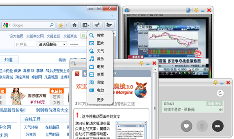
This effect doesn’t just apply to industrial design, but to software as well. Firefox’s localization in China doesn’t just translate the language of the interface, but also the interactive design. Unlike Western localizations of Firefox, the Chinese localization includes a plethora of additional functionality. The interface contains a window with constantly updating contextual information based on the information you’ve selected. It’s designed for browsing the Web while simultaneously streaming television and music in the background. It has a button for quickly launching a calculator. While a Western user might see these extra features as unnecessary and cluttered, users in China appreciate them.
Time: Recognition Versus Recall
One of the heuristics that drives increased complexity in graphical interfaces (which isn’t always bad) asserts that recognition is better than recall (which isn’t always true).
While recognition (seeing something) is commonly considered superior to recall (remembering something), there’s a caveat. If the user already remembers what he wants, showing him additional options may slow him down as he considers the various alternative options. Recognition wins in terms of users eventually finding something, but it loses in terms of creating the fastest and most efficient interface.
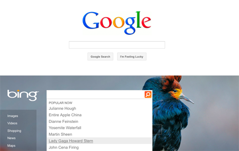
Google’s homepage is the epitome of both simplicity and efficiency: a blank white page with a single field. When you focus the field, there is only a flashing cursor. You are alone with your thoughts; there are no distractions. In contrast, Bing provides a daily image with explorable regions containing factoids. When you click in the search field, it provides suggestions based on what people are searching on now, including popular culture entertainment news like “Lady Gaga Howard Stern” and “Julianne Hough.” Which interface is better? It depends on how bored the user is. But it also depends on how bored you want the user to be. Do you want the user to be curious or passive? If the user already knows what she wants to search for, these types of alternative targets will likely slow her down.
Another consideration is efficiency. Users selecting their intention with a mouse are considerably slower than users entering their intention with a keyboard. This is due to the physical constraints of the input devices, the cognitive load being placed on users when presented with options they don’t actually want, and the relative search spaces of graphical objects on the screen versus any sequence of characters. When it comes to efficiency, recognition is not always better than recall. Consider the interfaces being used by ticket agents in airports. In the 1980s, they were fast, textual, and keyboard-based. Modern replacements are more commonly slow, graphical, and mouse-based. Watch your ticket agent’s eyes narrow slightly in frustration as he reaches for the mouse.
Time: Consistency Versus New
If recognition versus recall is a tradeoff in small amounts of time (seconds per interaction), then consistency is a tradeoff in large amounts of time (years between product releases). It’s hard to find a designer who will argue against consistency; leveraging users’ existing knowledge can bootstrap their adoption of a product.
Documented interface guidelines help establish a core set of common interaction patterns that should be shared between applications. But the problem with enforcing this sort of consistency is it inhibits innovation. Unlike desktop applications, which have large widget libraries and well-established UI guidelines, the Web provides designers with a blank canvas and only the most basic interactive widgets. While the interactive design of desktop applications is generally pretty consistent, the Web has a very high variability.
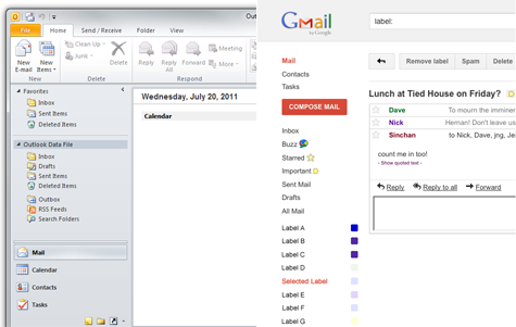
The lack of guidelines and direction for web applications has resulted in an extremely broad range of quality. Some web applications are absolutely awful and some, such as Gmail, are considerably better than their desktop competitors. The Outlook interface feels like it wasn’t designed for managing your email as much as it was designed to mirror the interaction paradigms of applications like Word and Excel.
UI widgets such as the tree, the splitter, the accordion, and the ribbon seem to be used primarily because they are available and familiar to users. But in interactive design, consistency doesn’t guarantee a fantastic interface as much as it simply mitigates risk.
The second argument against consistency has more to do with product perception than actual interactive design. While interfaces don’t exactly go bad over time like milk or produce, a strict adherence to consistency does send a message to users that a product is becoming stale. Interfaces don’t actually decay, but design evolves over time such that it is relatively easy to look at an application and give it a rough carbon dating. In a market where users are constantly seeking the newest product, fashion is a consideration.
Politics: User Control and Freedom
There aren’t a lot of designers out there who are opposed to giving users control. But the debates around the benefits of user control are some of the most fascinating, and also the most political, because essentially the debate is this: to what extent should people be free?
Should we take a digital-libertarian stance and put users fully in charge of managing their digital lives? Is the freedom they are granted worth the responsibility and consequences? Or should we take a more digital-authoritarian stance and build a perfect walled garden with gated access, where users are guarded and protected? Do users actually want to be in control? If we ask them a question, will they make the correct choice?
Let’s look at an example. Should users be able to control when a software application updates, and should they be able to undo that decision? Firefox’s update dialog boxes can become very annoying over time, but they were nonetheless created with the best of intentions. Developers at Mozilla believed that it was a violation of user sovereignty to silently force an upgrade onto the user’s machine. In contrast, developers on Chrome introduced a silent update system that takes control away from users. Avoiding disrupting users with administrative questions is widely regarded as providing a more pleasant experience even though it takes away user control.
What about the control and freedom to extend the capabilities of a software application? Firefox is renowned for its ability to be extended and customized. But over time some users install so many extensions, and some of them are so poorly written, that the performance of the browser itself suffers considerably.
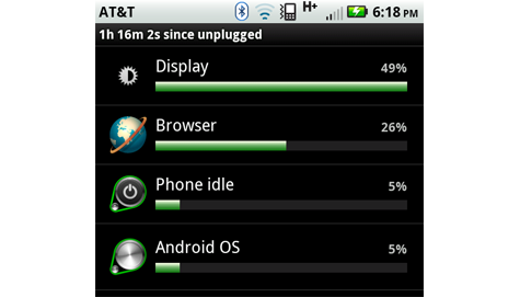
A similar problem has to do with battery life on Android devices. Some applications make heavy use of GPS, others access the network too often for updates, and others (e.g., Flash) put enough load on the CPU to make the device physically warm. When it comes to control, Android is rather digital-libertarian. If you dig into the preferences, you can view the actual distribution of battery usage, and then take on the personal responsibility to choose which applications you would like to use based on this data.
A designer on the digital-libertarian side of debate believes that users need to have the personal responsibility to make the correct decisions for themselves. You don’t want to update the application? You don’t have to. The application is running too slow? It’s your own fault for installing 15 extensions. Your battery only lasted an hour? Don’t run Flash next time. Would you like to hideously customize your MySpace profile page? Sure! Why not add a soundtrack as well! The highest priority is freedom; how good your experience is with the product is left entirely up to you.
A designer on the digital-authoritarian side of the debate believes that applications should make the best decisions on the user’s behalf. You don’t want to update the application? It’s a security update and you don’t have a choice. Worried about your application running too slow? Don’t worry, we’ve detected your attempted modification and disabled it for you. Want a longer battery life? We’ve banned Flash from our platform. Would you like to customize your Facebook profile page? Yeah, not so much… remember MySpace? The highest priority is making a product that is insanely great, and you can’t be trusted.
This leads us to perhaps the broadest question of user control: should users be able to install any application they choose on their computer? Windows has traditionally been a very open operating system, giving users a great deal of control and freedom. Users can install anything they want, including malware, provided they get past the “are you really, really, sure?” dialog boxes with big shiny shields on them. This level of control and freedom is both what is great and what is horrible about the experience of using Windows. In the lead-up to Microsoft’s anti-trust trial, Bill Gates made the point that no one has ever asked Microsoft for permission to write a Windows application. At the time, few considered how important that was, or thought very deeply about the statement.
In contrast, look at iOS, where you can only install applications that have been approved by Apple. iPads and iPhones don’t degrade, they don’t get malware, and they don’t ask you if you happen to trust the people who created the software you are about to install. In the rare event that a malicious piece of code gets into the walled garden, they can target and eliminate it from orbit. And then the garden is perfect again.
Most designers would argue that the iPad provides a fantastic user experience, but it does so in part because it doesn’t trust you enough to let you mess it up.
Conclusion
There are a number of ongoing debates in the field of interactive design. From sections above, you might conclude that you should:
- Value complexity over simplicity, it’s more functional
- Value recall over recognition, it’s more efficient
- Value change over consistency, it’s more innovative
- Take away user control and freedom, and do it quickly, ideally before your users completely wreck the experience
And this is all true… sometimes, depending on a lot of factors.
Novice designers memorize the list of usability heuristics and try to employ them in their work. As a more experienced designer, you may have already seen a deeper dynamic at play here. Instead of using heuristics as a simple checklist, try placing pairs of the heuristics against one another in a spider graph:
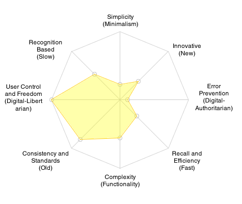
Achieving every ideal isn’t possible because the pairs exist in direct opposition. Realizing this, the challenge shifts to shaping a design that captures as much surface area as it can, given all the opposing forces.
About the author: Alex Faaborg is, generally speaking, a pro-simplicity, pro-efficiency, anti-consistency designer who happens to be a secret digital-authoritarian sympathizer. He works on the design of Firefox at Mozilla, one of the most digital-libertarian organizations in existence.