Experience design, especially interface design, is perhaps one of the most fertile fields for the idea of scientific design. This is due to several reasons, including:
- the multidisciplinary nature of interface design teams, which include people with different backgrounds
- the inherent complexity of software as a product
- the large number of scientific journals and papers that makes human–computer interaction (HCI) one of the most prolific areas of design research
In this article, we discuss three examples of solid scientific knowledge that are often applied to interface design. In our view, the translation of scientific findings into design practices is not always as straight-forward as we wish it would be.
The concept of scientific knowledge refers to convictions about the world that have been reached through controlled processes of inquiry and investigation and that, in principle, are not influenced by arbitrary conventions, personal preferences, or individual interests. Scientific knowledge is derived from systematic observation that gradually leads to an understanding of reality that must be valid for everyone.
Miller’s Classic “7 ± 2” Paper, and What Should Not Be Inferred from It
Our first example of misapplication of scientific knowledge by interface design is related to the set of experiments behind a classic paper by George Miller entitled The magical number seven, plus or minus two: Some Limits on Our Capacity for Processing Information. Miller hypothesized a connection between short-term memory span and absolute judgment span. As we do not intend to delve into these concepts, we refer the reader to Miller’s paper to check his definition on these cognitive parameters.
Miller did not prove his hypothesis—those two quantities are not related. He concluded that, while absolute judgment’s span should be measured by bits of information, short-term memory should be measured by the number of items (“chunks”).
But this is very different than saying that immediate memory can only deal with 7 ± 2 items at any given time.
Miller was careful not to extrapolate his conclusions beyond the limits of his experiments. His inferences do not go further than allowed by the cited literature or the facts that he observed. Despite this caution, his work has been used as an argument for the reification of the “magic number 7 ± 2” in interface design.
Miller’s conclusions do not indicate that there should be rules for how many items menus, lists, or telephone tree systems should have. The task of using one’s home telephone to choose the option to cancel a service from a voice menu is not the same as retrieving word sequences in a lab. When choosing items from a voice menu, you do not start by trying to memorize the items to choose between them later, you don’t know how many options there are in the list, and you don’t know how many of them are relevant to you or how they relate to each other.
In this case, you are engaged in a task, and the task influences the way you relate to the information and, therefore, your working memory. If you are asked to retrieve as many items from a list as you can, you will try to memorize the items, but if you are asked to choose among items, you will compare the current item with your best choice so far and so on, in a loop. This behavior can be more difficult to identify, but is no less true, when dealing with written menus or sets of icons, because written words and images operate as memory helpers. Speaking of images, the next topic we chose to approach are visual perception theories.
Gestalt Theory and Its Application to Design
Another interesting example of problematic application of scientific knowledge by interface designers has to do with visual imagery (i.e., what we see in our minds). Most designers draw a direct association between visual perception and Gestalt Theory, as most of us have been taught that following Gestalt principles is a basic condition for good visual design. Academic papers on the subject reinforce the link between Gestalt principles and good interface design, for example, by affirming that “ignoring Gestalt visual theory will lead to unexpected interpretations by the reader and therefore impede clear communication” (Graham, 2008). The importance of Gestalt principles for interface design are also reaffirmed in books such as Jenifer Tidwell’s Designing Interfaces, which states: “the Gestalt principles of proximity, similarity, continuity, and closure (…) form the foundation of page organization and should not be shortchanged” (2010, p. 477).
Questioning Gestalt
It is important to recognize the importance of Gestalt and our debt to its founders, who shed light on a topic that once was regarded as not worth exploring. But, as far as we know today, the fundamental Gestaltian claim that perception follows definite principles, and that we perceive a scene as a whole, is not correct. In the late 1970s, David Navon tested the hypothesis of the precedence of global features (instead of individual elements) in visual perception in a set of experiments described in his article Forest Before Trees: The Precedence of Global Features in Visual Perception. He wrote that at that time, “the Gestaltists’ view of the perceptual system as a perfectly elastic device that can swallow and digest all visual information at once, no matter how rich it is, was already considered naïve, as there were experiments that demonstrated that people kept extracting information from a picture for as long as they kept looking at it” (p. 353).
Navon’s experiments were based on depictions of large characters composed of other small characters, as shown below.
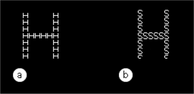
Representation of the visual stimuli used in the first three of Navon’s experiments. People were asked to observe large characters composed of small characters and judge which was the biggest letter in the situation (a) and the smallest letter in situation (b).
His results indicate that when visual stimulation is not the only source of information, visual processing may favor global features—i.e., the big characters. Navon concluded that “attention cannot be efficiently diverted from the whole [which] may be interpreted as support to the notion that global processing is a necessary stage of perception prior to more fine-grained analysis” (1977, p. 371). In other words, visual perception works by decomposing a scene, not by building it up. Navon’s conclusion reinforces Gestalt principles, which were being questioned at that time. But three years later, another view of perception process took its place.
Perception and attention
Three years after Navon’s experiments were publicized, Anne Treisman and Gary Gelade published Feature integration theory of attention, which predicted that searching for a target that differs in only one characteristic (e.g., color, orientation, or shape) is much faster than searching for targets that differ in more than one characteristic. This prediction is based on the assumption that searching for single characteristics occurs in parallel, without attention limitations, while simultaneous identification of more than one characteristic requires serial searches.
Treisman’s and Gelades’s argument is that visual queries happen in a “pre attentive” stage, which is why we are not aware of it. Think of the seeing process as having two stages: a subconscious bottom-up, and an attention-tuned top-down. In the bottom-up stage, patterns emerge from visual characteristics in a process that is not subject to demands of attention. The more prominent these features are, the more they are reinforced. The top-down stage is tuned by attention. The most prominent visual characteristics are reinforced by attention, resulting in visual patterns. In the next stage, they will be grouped with non-visual attributes and be held in our working memory, identified as a chair, a dog, our grandma, or the main menu of a web page.
We consciously experience perception as “a whole” because we become aware only of the final outcome of this complicated sequence of prior operations. In this sense, the Gestaltian idea that visual apprehension favors the whole over its parts is not correct, because we are not aware of bottom-up processes that precede it. This implies that you are helpless in orienting the user to find the “news area” of your web page unless he wants to find it.
Besides, if every single interface designer always places the menu in exactly the same location, the belief that this is the only possible option is likely to evolve into another of those design patterns that we cherish as undeniable truths, with scorn for any other possible alternative.
Color Choice
Color choice is another design topic that tends to be justified by oversimplified or misunderstood scientific claims. Color theory can help you choose colors if you are using software such as Adobe Kuler or Color Scheme Designer, but when it comes to explaining why you should choose this color over that, you are, once again, helpless. In graduate-level design courses, you can hear students justifying color choices based on what they believe (or are taught to believe) are natural color connotations: “I chose red because it’s violent and aggressive” or “I chose green because it is the color of hope.”
Practically all specialized literature agrees, however, that the feelings and meanings we associate with colors are highly dependent on a large set of variables, the most obvious of which are cultural determinants. Geographical conditions are also known to change the way people relate to color. Wearing white is a promise of good luck on a hot Brazilian New Year’s eve, but might not be the most hopeful color for a similar party in Norway.
There are, however, studies in specialized color applications that have turned into design guidelines, such as the division between incremental and non-incremental mapping strategies. An example of an incremental mapping would be showing temperature variations on a map using color tones. An example of non-incremental mapping would be using different textures to show on a map where rice, corn, and soy are cultivated. But creating a rule for color (or texture) coding is not enough to ensure your message will be understood. Colin Ware reminds us that the color spectrum (from green to red, the most logical color scheme) is not recognized as an incremental code. He suggests that best results in legibility are achieved through gradual (in opposition to continual) color sequences varying in luminosity or saturation. Colin Ware’s conclusion is an example that the plausibility of an idea (in this case, incremental color coding) does not mean that the sole definition of a rule for color sequence generation can ensure effective design and harmonious results; this would be another ready-made rule for interface design.
Conclusion
Of course we don’t mean to suggest that interface design cannot benefit from scientific knowledge. But we should be careful when generalizing conclusions obtained in strict academic or laboratory conditions to the real world environment our to the products we’re designing. When possible, you should check the information from the source instead of reading someone else’s interpretation of the conclusions.
University lecturers are just as prone to diluting scientific findings into oversimplified rules of thumb as design practitioners are. The need to make sure students’ results meet the standards of academic and professional communities often backfires into the purveyance of simplistic, pseudo-scientific how-to manuals. These works, unfortunately, too often find their way onto the list of best-selling design books.
References
Graham, Lisa. (2008). Gestalt Theory in Interactive Media Design. Journal of Humanities & Social Sciences 2(1).
Kuhn, Thomas (DATA) The Structure of Scientific Revolutions. Chicago, University Of Chicago Press.
Miller, George A. (1956) The magical number seven, plus or minus two: some limits on our capacity for processing information. Psychological Review, 63(2), 81-97.
Navon, David (1977). Forest before trees: The precedence of global features in visual perception. Cognitive Psychology, 9, 353-383.
Tidwell, Jenifer (2010). Designing Interfaces. Cambridge, O’Reilly.
Treisman, Anne & Gelade, Gary (1980). A feature-integration theory of attention. Cognitive Psychology, 12, 97-136.
Ware, Colin (2008). Visual Thinking for Design. Morgan Kaufmann