Maximalism makes me think more of the Roman Emperor Magnus Maximus than the design term denoting an “aesthetic of excess.” Both share the same etymological roots and, like maximalism, the real Maximus was all about the idea that ‘more is more.’
After Maximus was declared emperor by his British troops in 383, he travelled to Gaul to pursue greater imperial ambitions. There, he usurped the Western Emperor, Gratian, going on to rule Britain, Gaul, Spain, and Africa. But he wanted more, eventually trying to invade Italy in 387. Failure there caused his downfall — less was never going to be enough for the great Maximus.
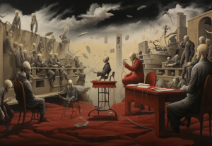
The same goes for maximalism, the extravagant younger brother of minimalism. Unlike its restrained older sister, which seeks to do away with any elements of design perceived as distracting or excess to requirement (following the ‘less is more’ principle), maximalism wants more — more colour, more patterns, more images, more texture, more videos…more everything. But, unlike Maximus, it doesn’t want too much!
As the 388 defeat of Maximus by Roman emperor Theodosius I shows, the thirst for too much can lead to trouble. Is this also true in terms of user experience design? Or can a subversive ‘more is more’ approach actually help to improve — rather than impair — the user experience?
In UX design, a minimalist User Interface (UI), as expected, will keep design elements to a minimum. This means users have fewer choices, allowing them to make faster decisions and move around a website easily — improving the overall user experience. This is the path most brands choose to head down, and it usually works out just fine for them. Apple and Google have done well in this respect. That said, it might surprise you to learn this isn’t always the right choice for every brand.

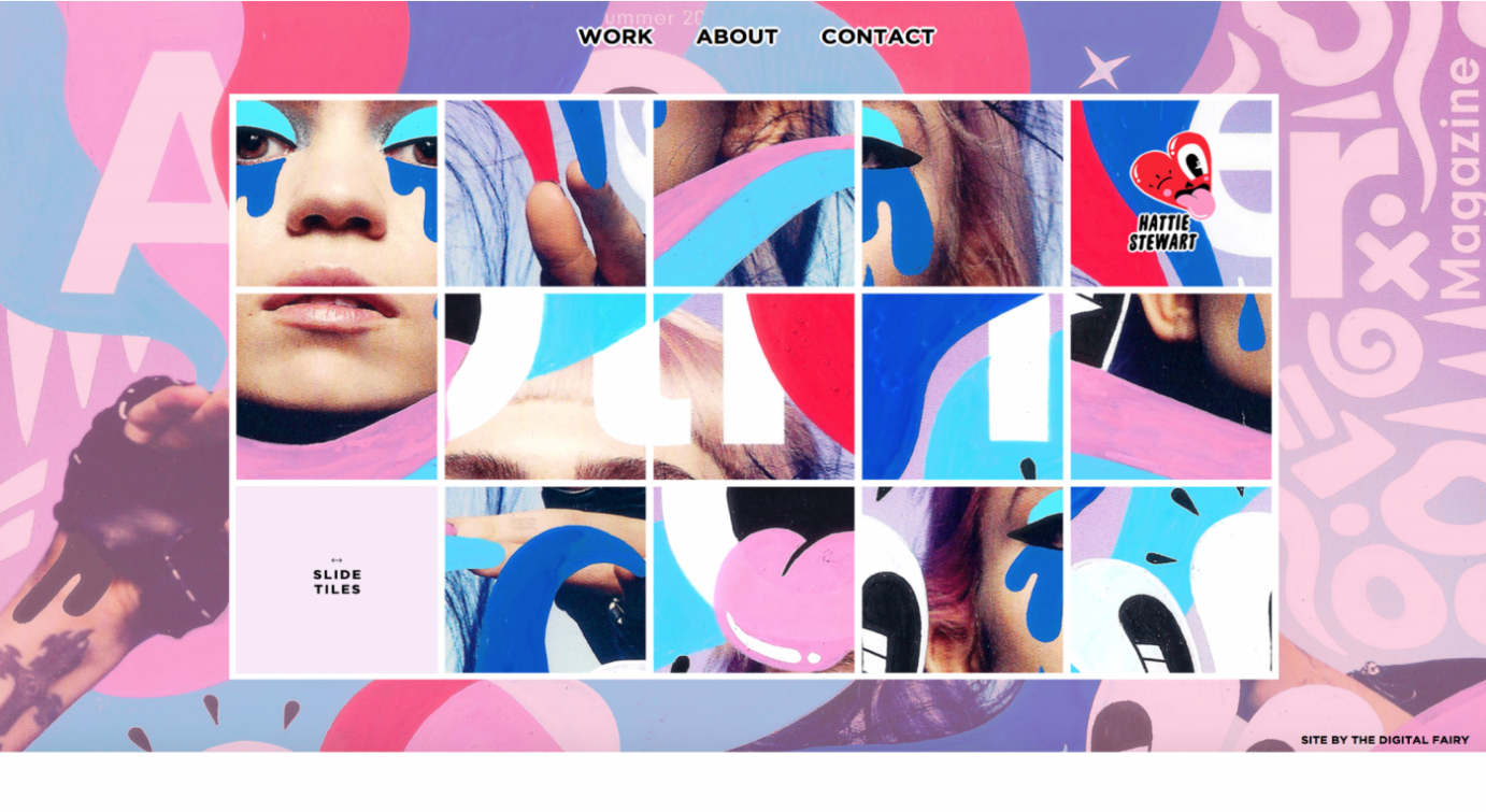
Maximalism also seeks to improve the overall user experience via UI — only through striking design (although that’s not to say simple design can never be striking), which encourages users to continue navigating around a website. A bold solution may better serve some brands, especially if they want their website to stand out in a vast cyberspace of homogenous rivals. Design brands should stand out — personal brands that reflect their maximalist owners should shout, not whisper.
The stylistic choice between minimalism and maximalism depends not just on a brand’s need for distinction, but also their target audience. You might prefer straightforward design — the Ikea-esque nordic simplicity of Google, for example. But your mum might be drawn to something a little fussier — Cath Kidston’s nostalgic floral patterns, perhaps? A cliché for sure, but you get my point.
We see a similar distinction in other creative domains — take writing, for example. In her superb Masterclass, Margaret Atwood argues that most writing falls along a spectrum between two prose styles: plainsong (think Ernest Hemingway) and baroque (think Charles Dickens). Plainsong (like minimalism) is blunt and uncomplicated, while Baroque (like maximalism) is more ornamented, containing lots of adjectives and adverbs, subordinate clauses, and details that pile up. These components of writing are much like the design elements I mentioned earlier — colour, pattern, texture, and so on — and the contrasting prose styles to which their absence or presence give rise will naturally appeal to different people.
Personally, I sway between Dickens and Hemingway, as I do between their design counterparts discussed in this blog. However, for my own website, I plumped for something undemanding. Ultimately, I simply didn’t require anything bolder or fancier to give my visitors what they need. But I’m an individual, not an organisation, so this might not be the case for you.
If you’re thinking about designing a new site, or revisiting the design of an existing one, carefully consider what will work best for your brand and the user experience you aim to craft. If you do happen to go for a maximalist design, great — I’m sure you’ll achieve something special. Just do me one huge favour: don’t go too far like Magnus Maximus.