- Interface and Navigation Design
How adopting maximalist design can differentiate a brand and help users to identify with it.
Article by Catriona Campbell
User Experience— ‘Less is More’ vs ‘More is More’
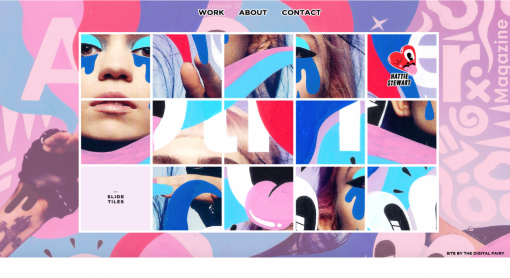
- In contrast to minimalism, maximalism in UX is characterised by the use of multiple colours, patterns, images, forms, etc. Its motto is “more is more”.
- Numerous brands adopt a minimalist approach as they consider that it can simplify users’ navigation.
- However, maximalist design can also improve overall UX and make a brand stand out among competitors.
Share:User Experience— ‘Less is More’ vs ‘More is More’
Share this link
- July 27, 2021
3 min read


