Save
User experience research can mean the difference between a product’s success and failure. You might, for example, watch users who are playing a video game for the first time to see where they get lost, confused, or bored. You might review clickstream data to see where customers abandon their shopping carts. You could do formative research to help define features for a new product by interviewing people about their needs and preferences.
Not all of this research is done face-to-face. Remote research—recruiting and interviewing people without face-to-face contact—offers lots of advantages over more traditional research. Remote methods allow you to talk to people all over the world without travel expenses. A broader range of users provide a broader range of perspectives. Easier, cheaper, and better research? Rock n’ roll.
Now several services promise to make remote testing even easier, cheaper, and faster, but how well do they work? To find out, I used two of them, Usabilla and Loop11, to help with some real research I am doing for a company called Livefyre.
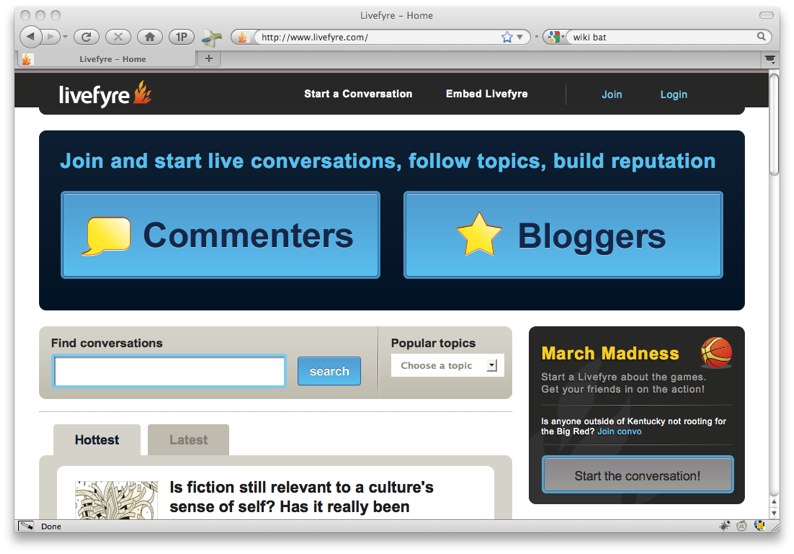
Livefyre is a San Francisco-based startup that has developed a conversation platform that can be used as an online community at livefyre.com, or as a commenting widget incorporated into blogs. The team at Livefyre asked me to help them answer some questions about how people are using and understanding their new site.
Some of their main concerns were:
- new visitors to livefyre.com might not understand the purpose of site
- new users might have difficulty getting started
- creating an account might pose barriers
- some users might be turned off that accounts needed to be tied to either a Facebook or Twitter accounts
We crystalized these issues into the following user research study questions:
Homepage
- What do you think that people do on this website?
- What’s the first thing you’d like to do on this page?
- Where would you go to create an account?
Login Overlay
- Is this login page what you expected to see?
- Do you feel comfortable entering your Facebook or Twitter username/password when you create accounts on other sites?
And so I used these questions to test whether Usabilla and Loop11 could help answer these questions through remote user research.
Usabilia Testing
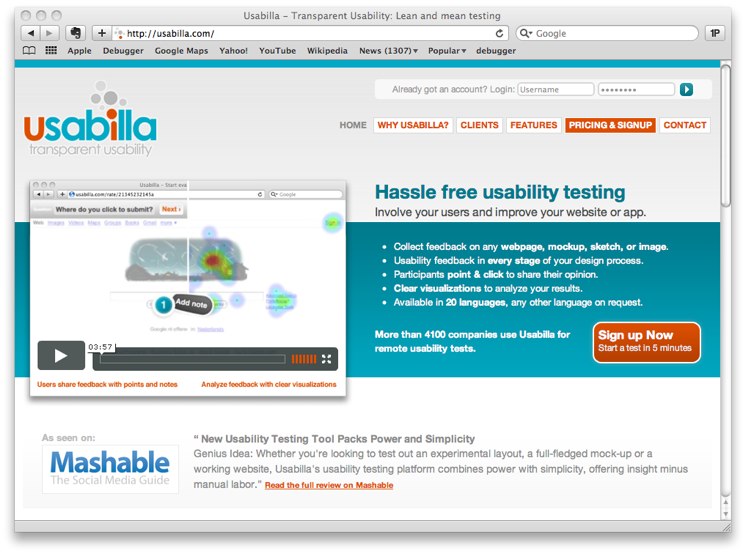
I started with Usabilla. Usabilla promises “hassle free usability testing” through “one-click” tests: “You ask your users a question and they answer it by clicking anywhere on the screen.” Access starts at $49 to test 10 pages and goes up to $950 to test 250 pages.
I wasn’t exactly sure how it worked, but I jumped in to figure it out.
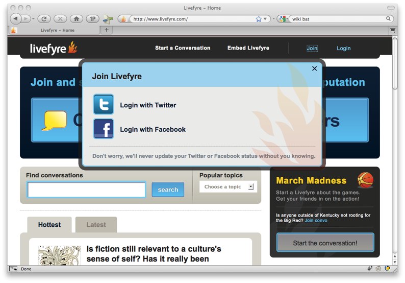
First you upload a screenshot of your site. There is an option to paste in a site’s URL, but it’s a bit misleading; Usabilla just takes a screenshot of that page, and the screenshot it takes is only above the fold. I wanted to ask questions about the entire homepage, not just the part above the fold, so I had to download and install a Firefox extension to do a full-screen grab (I used Screengrab). I took screenshots of both the homepage and the homepage with the “Join Livefyre” overlay.
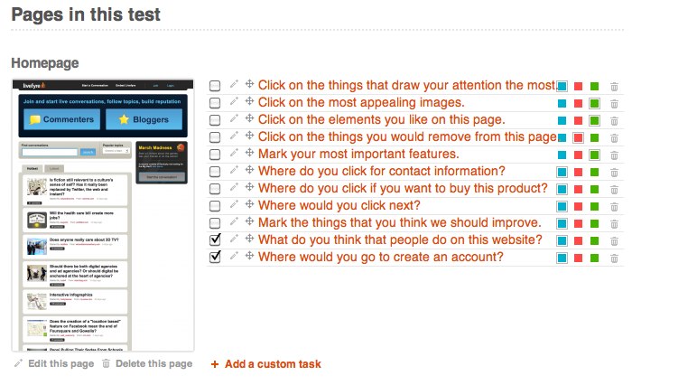
After uploading them to Usabilla, I then moved on to the question component. Usabilia recommends default questions, but they didn’t seem very useful. I added my own questions: the three questions about the homepage and the two about the account creation dialog listed above.
Once I had uploaded the pages I wanted testers to evaluate and added (or selected) the questions to ask on those pages, I was done. Usabilia then generated a URL to share the test.
Overall, I found the process to be fairly painless once I figured out about the full-page screenshot. The downside, though, is that since you’re only looking at static images you can’t show site interactions. The Livefyre site has some lovely interface behaviors that a picture of the site can’t convey.
I sent the URL to four test users. Unfortunately, it didn’t work well. The users didn’t know that they had to click on the page to add a note, and then add an annotation to this note in order to answer a question. They would just click to progress to the next question and there was no way to return to respond to a previous question. The process—clicking to add a note—was described in an introductory movie that none of them watched.
Because of this significant usability issue, I would not trust the data I would get from a larger-scale study.
Would I try Usabilla again? Probably not. The same answers could have been gained for free, and more easily, by posting screenshots along with a form created in Google Docs. If you’re primarily interested in how a large group of users navigates your site, you would be better served by traditional traffic analysis using Web analytics tools.
Pros
- Easy to set up
- Somewhat inexpensive
Cons
- Usability problems
- Impossible to test interactions
Summary
You’re probably better off doing a survey along with basic traffic analysis.
Loop11 Testing
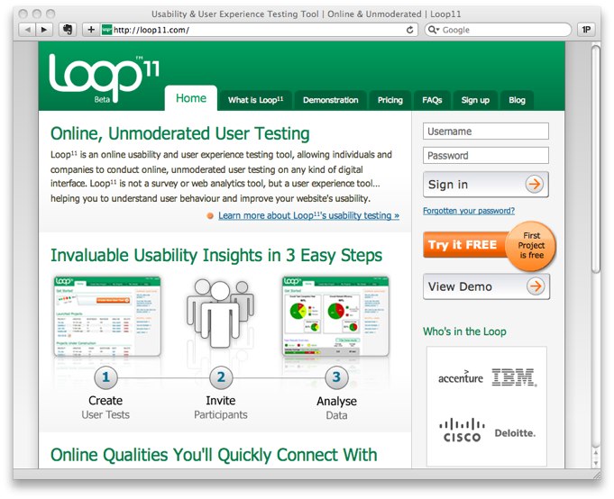
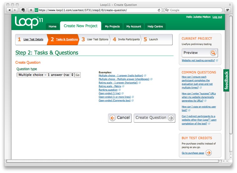
Loop11 required more effort to get started and the pathway to beginning a new project was not as clear as with Usabilla. I signed up for a free trial and forged ahead.
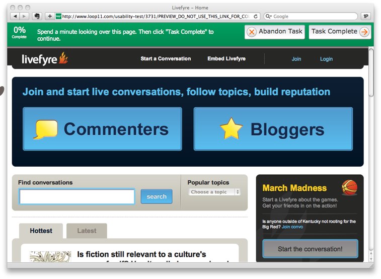
The biggest difference I saw at first was that Loop11 uses live HTML pages rather than screenshots. An obvious benefit is that you don’t have to go through the hassle of getting screenshots. But a less obvious problem is that you can’t easily test a dynamic page that changes without changing the URL.
Here’s what I mean: my little study was looking at two pages, the homepage (livefyre.com) and the overlay that appears when you click on “Join.” The URL is the same for both. I was stymied as to how I could ask a question about the “Join” overlay. I ended up just telling the users to click on the “Join” button to complete the test.
Loop11 allows you to enter either “questions” or “tasks.” I entered the first question, “What do you think that people do on this website?” and was pleased to see that I could choose the question format.
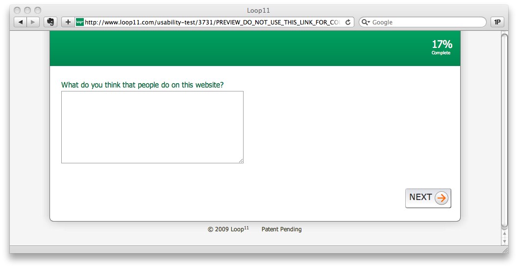
What I didn’t realize, though, was that I could not ask a question and display the Livefyre site at the same time. The site can only be displayed for a “task” such as “Click on a button.” Any questions appear separately on otherwise blank pages. In order to ask a question about the site, I created a task to “Spend a minute looking over this page. Then click ‘Task Complete’ to continue.”
Then on the next screen I asked a question: “What do you think that people do on this website?”
This felt clunky, but I couldn’t figure out a better alternative.
As I added more questions and tasks I got a better sense of the real value of Loop11. The ability to alternate survey-type questions with task analysis is something that I haven’t seen before, and it’s potentially very powerful. You could ask, for example, “How many times have you gone to the grocery store this month?” and then ask the participant to navigate part of a recipe site. Would people who shop for groceries more often find it easier to navigate a menu of ingredients? There are lots of possibilities for how this mix of questions and tasks could add a useful dimension to user research.
I launched the test and shared the URL with four participants. They all found the process of using Loop11 straightforward and did not have trouble using it. They did note, though, that it was difficult to answer a question about a page that they had previously seen without being able to look at it at the same time.
The dashboard displays the number of responses, the paths that the participants took when responding to tasks, and the answers to questions. For each participant you also get a breakdown of total time spent on the test, average time taken on tasks, and average page views per tasks. For the Livefyre test, most of these metrics weren’t very useful.
Going through the process of creating, launching, and analyzing a test helped me understand that Loop11 is optimized for research into specific task completion such as, “How quickly can users find an answer in the help center?” rather than more open-ended tasks like the ones I was working with.
I would say that Loop11 will be a great tool further down the line with Livefyre. At this point, as we do work that requires a nuanced understanding of messaging comprehension, Loop11 provides some insight. As we do more research into user task flows it will be a great tool. Also, it integrates with Ethnio, which is a great remote testing recruiting tool. It will be interesting to see how the partnership between these two services continues.
Pros
- Flexible question format
- Ability to track and measure tasks
- Integration with Ethnio
Cons
- Can’t ask questions on a page with visuals
- Relatively expensive
Summary
If you have a budget to work with and tasks to measure, this would be a great tool to add to your arsenal.
As we wrap up, remember that these are just tools; they support, but don’t replace, the work that a researcher does. Just as with all research tools, you need to understand what you want to discover, what questions to ask, who you should ask, and what insights you can glean from the resulting data.
Have you used remote testing tools? What’s your experience? Please share in the comments below.
Juliette Melton is a design researcher based at IDEO in San Francisco. Her work has spanned a broad range of practices including education leadership, public health research, and digital publishing.
Juliette holds an MEd from the Technology, Innovation, and Education program at the Harvard Graduate School of Education.
When she's not focusing on design research you'll often find her doing portrait photography or chopping vegetables.


