Save
Pulse is a news reader that aggregates feeds from various sources using RSS and presents them in an attractive interface. I’ve been using RSS readers for a while and at a first glance Pulse seemed like a great leg up from the existing apps such Reeder or Byline. It feels like you’re using a proper app with all the goodies of immersive experience instead of a web browser wrapped in an app. Steve Jobs showed off the iPad version of the app in his keynote and there have been lots and lots and lots of rave reviews about the app, so I won’t go into those details but focus on the issues instead.
The Key Differentiator Is the Problem
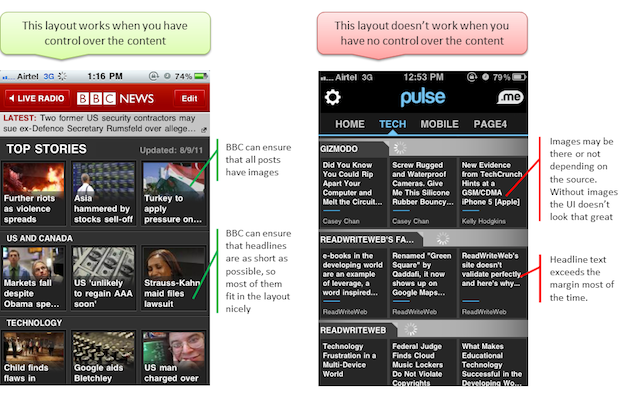
This is a classic example of how not to design for multiple devices. This interface was designed for iPad and it worked great there, but the problem started when the exact same UI was scaled down for the iPhone. Now when you start off its all hunky dory, but when the novelty wears off, you realize it’s not that usable. Here’s a comparison between BBC, which has a layout similar to Pulse.
Now I understand the need to stand out and be unique, but that can’t come at cost of basic usability. As described above, this layout works for BBC because it has control over its content but won’t work for someone who sources their content from independent feeds and has no control over their content.
Suggestion
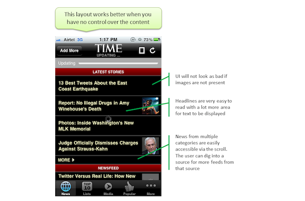
I suggest something on the lines of TIME layout, which works better when you cannot exert control over the content.
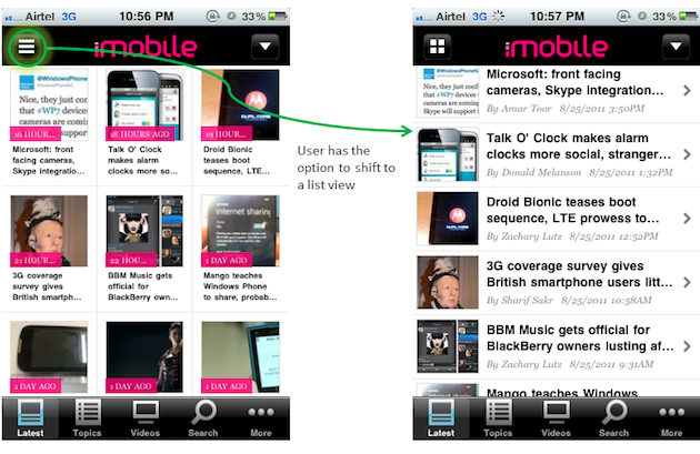
I understand the business need to stand out and be unique, but that cannot come at the expense of basic usability. If there is a business need to present content in a particular manner, the designers should at least give users the choice to shift to a layout that aids efficient and easy consumption of the content.
Conclusion
The Pulse news reader interface was designed for iPad and it worked great there, however, the adaptation of the interface from iPad to the iPhone by scaling it down created a broken user experience.
Takeaways
- Users expect delightful experiences across devices.
- UIs created for one device may not work for others.
- Understand the context in which you application will be used.
- Understand the limitations and strengths of the device and other dependencies.
- Adapt the content presentation to achieve a great experience for each device.
I lead Accenture Studio for Experience Design. With a diverse background and passion for the many ways people interact with technology, my expertise lies in creating intuitive and desirable experiences that utilize deep insight into user behavior and psychology.
Say hi on Twitter @sachendra


