Save
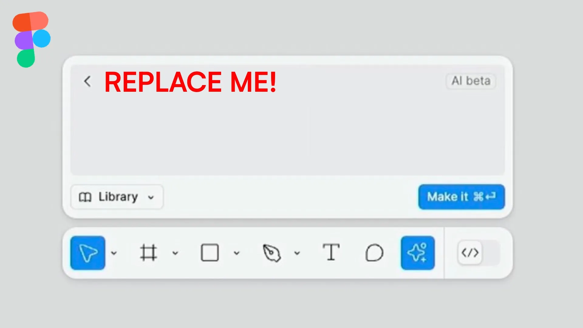
The AI controversies explained.
Design is changing. Again. It’s not like it was a constant for too long, but as always designers are being caught by surprise.
Will AI generators make your entire career obsolete? Why is this happening?
Are the companies that you now pay subscriptions to simply going to switch to charging your clients directly without you in the loop?
What is a designer?
The first, fundamental question is what a designer is.
To make it easier let’s limit the scope to just UX design. If you asked this question in 2009, people would show you sticky notes and a grey wireframe and would say: This! This is a designer.
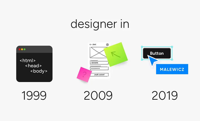
If you asked it in 2022, people would show you Figma with a UI kit open and say: This. This is UX design.
We humans sure love to oversimplify things.
Back in the late 90’s we didn’t really use the term UX, but a Web Designer back then was similar to Today’s frontend developer. The interface person.
Three distinct eras, around a decade apart, and such a big difference! What gives? The reason the definition was never clear is the fact that digital products evolve and the role evolves with them.
Join the UX Magazine Community!
Dive into exclusive articles, podcast episodes, whitepapers, and more on the cutting-edge of AI and automation. Stay ahead of the trends reshaping industries.
Become a memberNo skill, no problem!
What if I told you, that you can simply type what you want into a box and get it almost instantly? A hotel booking app like Airbnb but for cats? Boom!
You get some auto-layouted boxes with what an app like this should have. Not happy with the fonts? Colors? A change is just one click away. Fast. Streamlined.
Mindless.
FOBAR = fear of being AI Replaced
The fear in many junior designers is completely normal. Are PMs going to replace us now? Is Figma, the industry’s main player trying to kill its main audience for a new one?

Are they angry not enough designers bought the paid plans?
With the introduction of a separate slides product for presentations and AI tools to generate UI, it seems like the new target of the app is Project Managers. But do they have enough skills to know what to do? Let’s look back to 2011 for answers.
When Apple killed Skeuo
When Apple killed Skeuomorphism with iOS7 in 2012 the paradigm shifted in a big way.
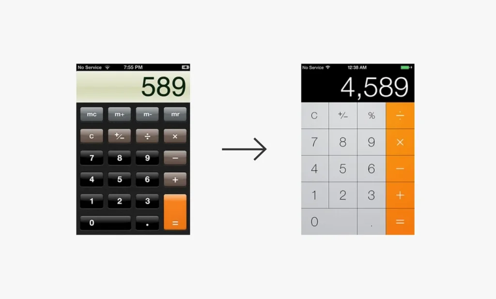
Before, designers were using raster tools like Photoshop to create beautiful, textured, and very detailed buttons and dials for UI.
The shift went from those little works of art to just rounded rectangles and vector tools.
Many UXers without any visual skills were ecstatic! We can do UI now! It’s just some rectangles! And we can even drag and drop pre-made ones later to build stuff faster!
That one decision pushed flat design into the mainstream and allowed for tools like Sketch to exist. Later, Figma copied Sketch and added multiplayer to revolutionize the game again.
We used to design solo, but now teams design together. Portrayed aptly by six people moving stuff around on one screen. While nightmarish in concept, the world was forever changed by this.
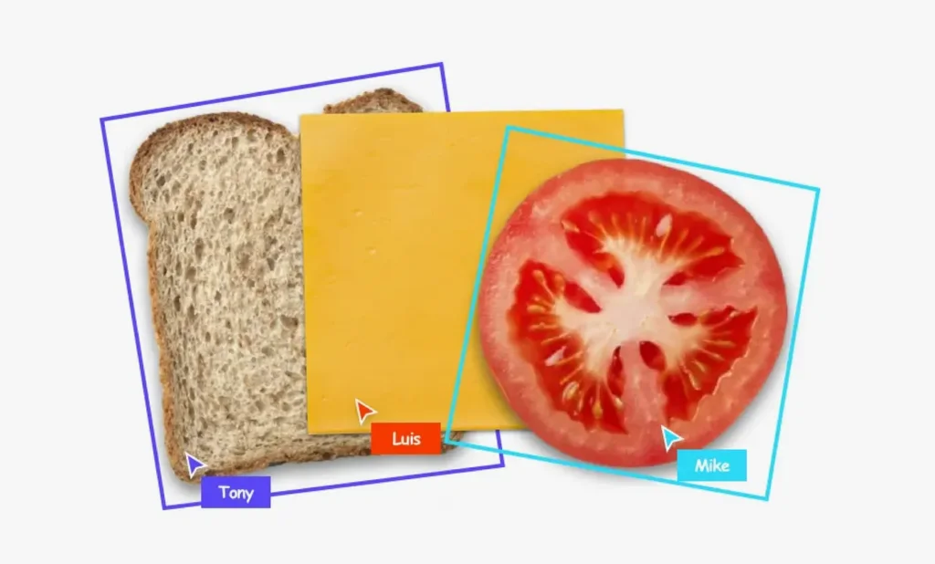
This was also the first time PMs were more strongly introduced to design tools. They could now “join the file” — likely at an extra cost — and follow you around when you’re designing.
Think of this as a modern-day standing behind your shoulder and asking to make the logo bigger. Now they could do it from anywhere.
What design was supposed to be?
When starting my design journey I had this idea that I would be making the web. And in the late 90’s it was true. We were pioneering new things — often using now obsolete technologies like Flash or VRML (anyone remember this?)
But with every new technology, especially with such fast growth, monetization is inevitable.
There are billions of websites out there and that means a lot more competition. Millions of apps. Everyone wants to make money. That’s normal.
The role of the designer was slowly but surely commoditized from solving user problems in a creative way to making more money in the most cost-efficient way.
The goal to save as much time as possible was there pretty early on. As soon as Material Design caught track businesses realized design systems can save a ton of money.
Everybody wanted one. Even those who didn’t need it jumped onto that train lured by some superficially created need for consistency. Consistency is fine and all, but we shouldn’t sacrifice creativity at the altar of consistency. That is regression, not innovation.
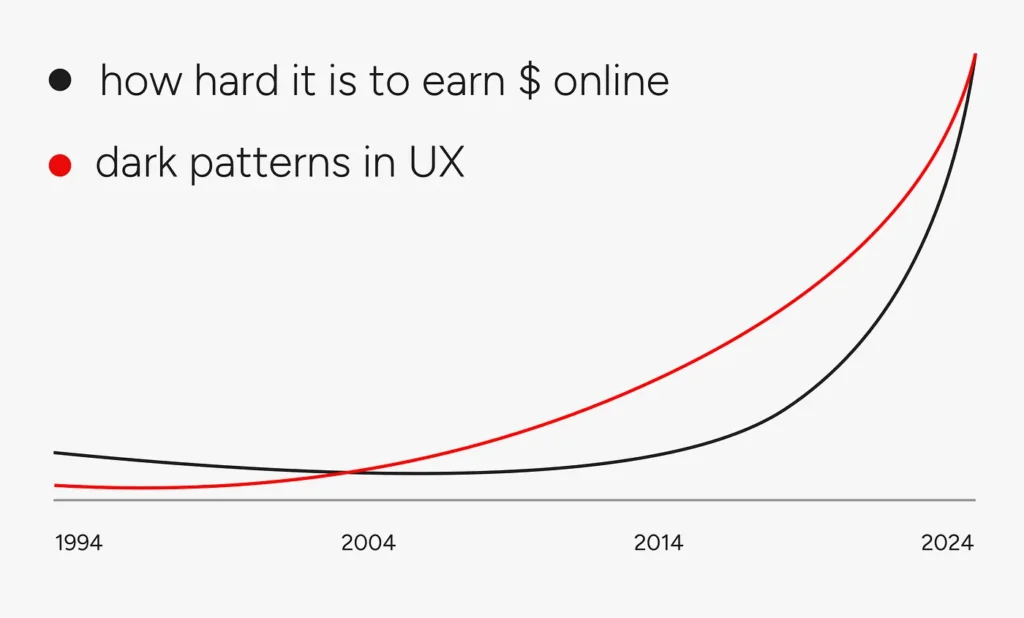
Design is money-driven. Nobody even deludes themselves anymore that they’re doing anything “for the users”. The Beatles had this saying that when they play a show, they don’t see young people dancing near the stage — they see dollar bills.
It’s the same with digital businesses and users. It’s a semi-parasitic relationship in which the goal is to suck as much money out of the user as possible without crossing the line.
Notice how many people complain about Figma charging people multiple times their Pro license for just accessing a file from outside their organization. See how Adobe got sued by the US government lately for shady unsubscribe tactics.

Money talks.
Businesses only care about money. That’s why they change their logos to a rainbow in June in all countries except for the Middle East.
It’s too big of a market to risk having consistent values, so they support the green of the dollar instead.

Is Figma going to destroy design?
No. We’re in the middle of another shift which was to be expected. I do find it amusing how most design influencers are paid to promote Figma to unsuspecting juniors and thus re-educate them that allowing AI parsing of your work is just fine.
Getting angry at a company is pointless though because you do have alternatives. There’s Sketch, there’s Lunacy and Penpot has been growing like crazy recently.
The myth that there’s no business outside of Figma is fueled by Figma itself. It makes sense. They want more of the market. More money.
Enabling Project Managers to “design” a bit is just a natural next step. First, we enabled people with no visual skills to do UI, now we enable people without UX skills to do UX.
This is NOT design
The notion that design is assembling a screen from some components is also part of the clever marketing of a tool above skill. A lot of people fell for it and seriously considered this design.
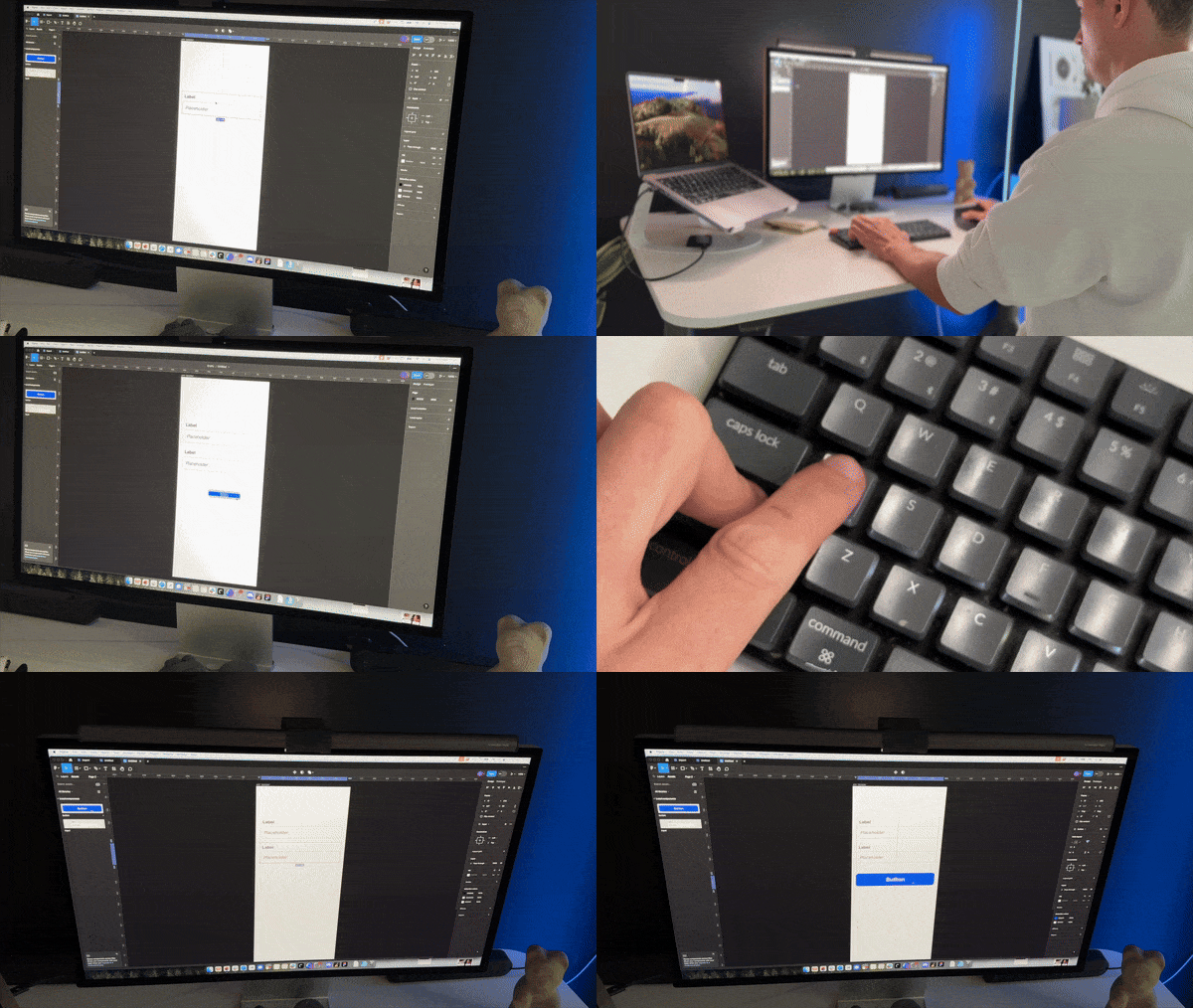
Is it?
I recently talked to a client who has a small team of in-house designers. He said that they’re quite good at assembling screens from their company design system. However, any instance where they need to solve a more complex problem is faced with fear.
Fear of not being good enough. Impostor syndrome. Fear of failure. Decision paralysis.
I could go on.
The drag-drop society has led to designers only focusing on this one small part of assembling the screens.
Critical thinking or logic aren’t even as popular. What is popular is searching how someone else did a functionality and then slapping our own design system on it.
It’s symptomatic of the bigger problem in design as a whole, but that’s a story for another day.
Designers who just drag & drop UI will not be replaced. They’ll be slowly phased out. Design is finite and using pre-baked competitive analysis can lead to AI assembling a similar screen with our DS easily. What’s missing in that equation is understanding what you’re doing.
It’s like coding with Chat GPT — you may be able to make a functioning app, but if anything goes wrong you have no idea how to fix it.
If there’s a security vulnerability in your app you aren’t even aware.
Auto-Layout
In the world of design that’s faking it. I’ve been against the Auto-Layout obsession right from the start.
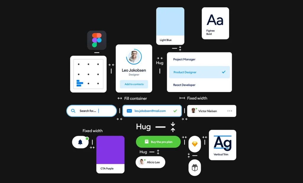
It is impressive. It makes sense. But it shuts off the ability to see and understand the layout. The majority of beginner designers skip that step completely. They don’t see badly aligned layouts anymore because they got so used to Shift-A’ing everything.
If it’s automatic it surely has to be good, right?
AI is going to do the same thing. People will be ok with lower and lower quality outputs because a computer brain magically gave them a solution in a few minutes.
Who’d argue with that?
Those design skills will atrophy and the decision paralysis will be even bigger. The more stupid ones will just blindly trust AI with everything, and others will be too afraid to speak up.
Update: The Figma AI Controversy
Literally a day after the first version of this article came out, Figma faced some new controversy when one X user noticed that some of the AI-generated design is suspiciously close to some popular work by others.
Namely, the weather app design looked almost exactly like Apple’s weather. You don’t want to mess with Apple, so Figma quickly turned off the AI and is working on a fix. Techcrunch reported this first, and then the news quickly became viral.
Now, we don’t know whether the source data to train the model really were popular apps by Apple, Airbnb, Uber, and others. But it does open a lot of doors for potential interpretation. Is redoing those apps and successful flows manually to feed the AI considered good? Or is it still copyright infringement?
We are so not ready for AI!
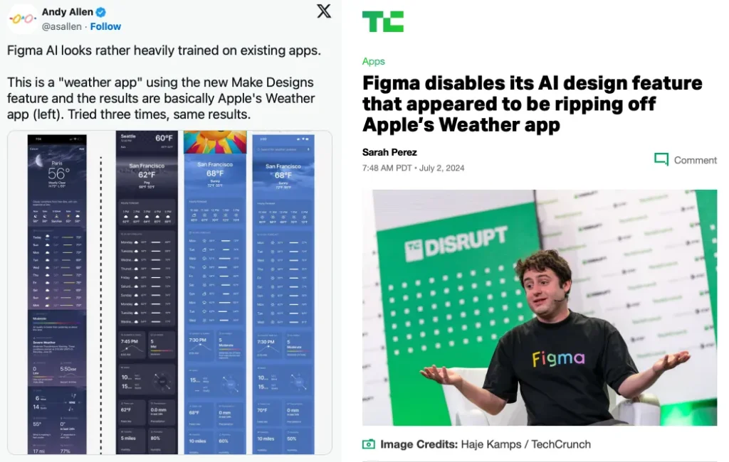
What’s interesting is that this was the moment when a lot of people started to finally grasp what they were applauding at Config exactly. Now a lot of them understood how their own work will eventually be parsed and used by others. Art generators already do it.
Some popular accounts even asked Sketch to save us. Well… The signs were there from the start. Currently, the biggest push with AI is to feed it quality knowledge — and design is part of a knowledge base that’s quite valuable.
We don’t know if the whole AI hype won’t collapse under its own weight soon, as it’s already running out of energy required to run it with that kind of growth. Hype! All to drive more money from investors and shareholders.
All to show the best results this quarter and if all burns down the next one we’ll figure something out then.
People now realize the dangers of letting companies “own” the work of people. This is the cloud for you. You don’t really own anything anymore. You rent your design tool and you rent a space where you hold your files. And they only take a small peek every now and then to learn how you did stuff.
We’ll see how this goes, but it’s both scary and hilarious.
Designer of the future
The designer of the future is a generalist with strong skills in all the major design fields.
But the main skill is very high confidence in your design decisions. It’s the ability to lead on a project and to stand by what you think the team should do.

At Squareblack, we are now getting better clients than ever. Is it because we’re so efficient with Figma? No. We don’t even use Figma at all for any of our client projects.
Clients come to us for guidance and expertise. Then some beautiful UI on top of that.
They come because we listen to their problem and either come up with multiple potential solutions or a path towards finding them.
We take full responsibility for what we do. We own the design.
In the next wave of design, a lot of lazy people will be replaced. But that ability to take action without being afraid is going to be in higher demand than ever.
Someone will have to fix those horrible AI-generated designs. Someone will have to step in and do the right thing.
Will that be you?
You can find Michal Malewicz on X and his YouTube channel! He designs at Squareblack and runs Square.one.
The article originally appeared on SquarePlanet.
Michal Malewicz
Designer. Started freelancing in 1998 and since then worked on over 500 products in practically every product category - for both startups and Fortune 500 brands. Skateboarder in my free time. Teaching 100K+ people how to design.
- The article explores the impact of AI on UX design, questioning the future role of designers as automated tools become more prevalent.
- It highlights the historical evolution of UX design and the commodification of design roles, emphasizing the shift from creative problem-solving to efficiency-driven practices.
- It emphasizes the need for future designers to be generalists with strong decision-making skills, capable of leading projects and maintaining creativity in an AI-driven landscape.


