Save
Practitioners of mobile UX design often cite context as the biggest difference between designing for mobile experiences and other design spaces. But what does “the mobile context“ really mean?
Early in my career, I worked on a research project designed to answer that very question. We recruited ten participants and asked them to photograph their surrounding environment each time they used their mobile device. The research team hoped these photos would reveal a pattern, that somehow through analyzing all these images we could crack the code of the mysterious and elusive mobile context.
A week later, we were drowning in a sea of photographs. Some photos were predictable on-the-go shots often associated with the mobile context: the inside of a supermarket, interiors of buses or trains, and photos taken by users while rushing down the street. Other environments were surprising: the interior of a public restroom, a bedroom, the interior of a church. After many days of sifting, sorting, and clustering photographs the research team came to a sobering conclusion:
Mobile context = anywhere and everywhere.
It wasn’t the earth-shattering, code-cracking conclusion we’d hoped for. It did, however, underscore one of the most fundamental aspects of designing for mobile user experiences. Unlike the static and predictable PC context, the mobile context is a lot like life. It’s unpredictable, ambiguous… it’s everywhere. The sheer number and variety of environments depicted in the photographs we received emphasized one of the most magical aspects of mobile user experience that is still true today. The ability to access, consume, share, and create information from anywhere, anytime—untethered from a keyboard or mouse—is a latent human need that mobile technology has only just begun to solve.
It Was a Dark and Stormy Night…
“Let me give you some context.” It’s the phrase that frames any great story from gossip to epic parables. Behavior doesn’t happen in isolation. Instead, much of life is a reaction to the world around us. Experiences occur in place and time and under dynamic social conditions. Context, which is the set of circumstances or facts that surround a particular situation, profoundly shapes our daily experiences. 
If you’re a practicing designer, chances are that context is your design blindside. Designers have been steeped in a tradition of designing experiences with few context considerations, though they may not realize it. Books, websites, software programs, and even menus for interactive televisions share an implicit and often overlooked commonality: use occurs in relatively static and predictable environments.
Put simply, what makes mobile difficult (and different) is that people move.
Movement causes the environments of use to be vast and variable. Movement causes the need for devices to have a small and portable form factor. And movement creates a host of cognitive limitations, dynamic social implications, and ergonomic design considerations. It’s humans’ pesky need to move that makes context so important for mobile UX.
Mobile Context Framework: Nouns and Relationships
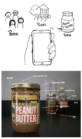
A framework I’ve developed to decrypt the complexity of context is to think about mobile’s “everywhere-ness” in terms of grammar. Everything can be categorized as a common noun: people, places, or things. What breathes life into nouns is their relationship to other nouns in the world. In the world of mobile UX, relationships can be described and categorized into four basic types: semantic, social, spatial, and temporal. Getting a handle on the mobile context is about developing an understanding of the implicit human relationships between users and the people, places, and things (the nouns) that make up the world.
The nouns are the easy part of this framework; the relationships are the tough part because they are dynamic and fluid and never happen in isolation. All four relationships are likely in play during any mobile UX interaction. Just as a musician artfully inflects emphasis on particular chords of a song, mastering context is about understanding which relationships to emphasize and when.
Understanding relationships will help you understand the mobile context.
The Mobile Context Framework in Action
Spatial relationships
Consider the information needs one might have for a jar of peanut butter sitting on the shelf at a supermarket. Now imagine the information needs one might have for a jar of peanut butter sitting on a kitchen shelf. The information needs are different because of your spatial relationship.
Temporal relationships
I could eat anything that contains peanut butter at almost any time of day or night. Most people are more discriminating, though, because of their relationship to time. Receiving a phone call in the middle of the night, a wonky dialogue box in the middle of completing an online purchase, and eating tofu with peanut sauce for breakfast have something in common: bad timing.
Social relationships
Online personal ads, Facebook posts, and talking about peanut butter cookies with a fellow customer in line at Starbucks all share a similarity. They exemplify the use of our relationships to people, places, and things in the world for social purposes. Sharing information—like a passion for a thing like peanut butter—serves as our common ground. Humans use and reinforce common ground to facilitate conversation, manage identity and deepen relationships to other people in the world.
Semantic relathionships
Semantic relationships have to do with the words we use to identify and describe nouns. When people learn a language, they are learning the semantic relationship between a word or group of words and the person, place, or thing that particular word is associated with. It’s important, for example, to know the word associated with peanut butter when traveling to a foreign country like China, as peanut butter is difficult to pantomime.
Peanut Butter in Denver?
Imagine you just arrived by airplane to an unfamiliar city, such as Denver. As you collect your suitcase in baggage claim, you’re struck with an insatiable craving for peanut butter. How would you use your mobile device to find peanut butter?
This example underscores one of the important shortcomings of how we experience technology today. Technology experiences are good at “things” and leveraging semantic relationships. Place and spatial/temporal relationships, however, are relatively unexplored. Accessing information as it relates to place, space and time—such as finding peanut butter in Denver—remains elusive. The legacy of the PC is likely to blame.
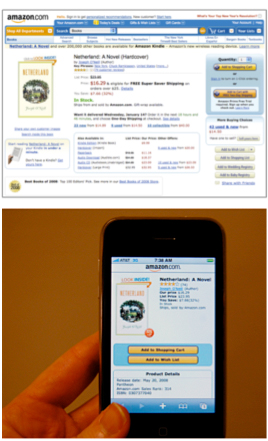
Whether writing paper or surfing the Web, PC experiences have important contextual commonalities. It’s safe to assume a PC user’s context of use will be seated in a relatively predictable environment with few spatial or temporal considerations. Keyboards—tailored for text entry—make it easy to rely heavily on text-based semantic relationships for interaction. Google search—the seminal interface of the Internet—leverages these characteristics and relies almost solely on the use of semantic relationships for its success. Subsequently, many of the technology experiences we are most comfortable with today have been tailored to leverage semantic relationships to people and things.
These assumptions, however, become brittle when applied to mobile. The mobile context of use is highly variable. Text input, regardless of even the best of mobile keyboards, requires a high degree of focus and proves a challenge. Applying PC context assumptions to mobile experiences all too often results in a marginalized experience for users. One of the biggest challenges for mobile user experience is coming to terms with the legacy of the PC and having the courage to invent new ways for people to interact with information that feels intuitive in a mobile context.
Mobile UX Beachhead
If the PC is good at “things” and “semantic” relationships, its blindside is place, as well as spatial and temporal relationships. While information about right here, right now remains elusive in the static context of the PC, mobile is especially well suited to explore information along these dimensions. People carry their mobile phones everywhere, and most modern devices have features that enable users to place themselves in space and time. That’s why instead of getting caught up in the complexity of designing for everywhere, designers should focus on what mobiles can do well. There is a beachhead for mobile UX: place and spatial–temporal relationships. Instead of repurposing experiences from the PC, mobile experiences present the opportunity to unlock the power of place and invent new ways for people to explore our spatial and temporal relationships to information.

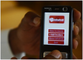
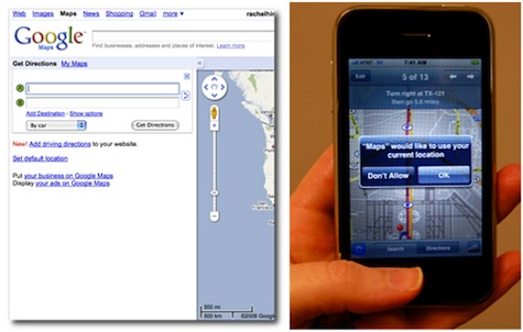
While embracing the spirit of invention is a key part of mobile UX, simply adding dimensions of space and time to experiences borrowed from the PC can dramatically improve a mobile experience. Maps are a great example. Looking up maps on a PC requires user to know and input their location in time and space. Modern smartphones know this information and leverage it, allowing users to never feel lost (at least in the geographic sense) again.
Admittedly, designing for the “everywhere-ness” of the mobile context can be overwhelming. Instead of repurposing PC experiences, it’s important to remember that mobile UX presents the opportunity to invent new ways for users to interact with information. Focusing on what mobile can do well—place + spatial–temporal relationships—can help you focus your work and break down the complexity of the mobile context.
Here are some additional tips for creating mobile experiences that are sympathetic to context:
Mobile Context Design Tips
1. Trim the fat
Edit, edit, edit! Users want and expect interface options to be edited to what is essential and relevant in a mobile context. Shoot for low information density with extraneous information cruft removed.
Trimming the fat is a necessary part of creating mobile experiences. PC experiences have a relatively large amount of screen real estate, which allows designers to annotate expectation. In mobile, options have to be readily apparent.
2. Design for glance-ability

The dynamic tile homescreen of the Windows Mobile 7 interface provides users with a glance-able view of their communication channels. Playing to notions of continuous partial attention behavior, this UI feature allows users to feel connected without diving into the world of their mobile device.
3. Reduce digging
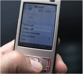
Deep menu structure found on the Nokia N95 forced users to dig and burrow into the UI in order to access functionality.
4. Grease the skids of natural connection points
Information may naturally reside in one application silo, but can be used as interaction triggers for functionality that resides in multiple applications. Anticipate the possibilities. Clear the path for anticipated interactions.
5. Let them pick up where they left off
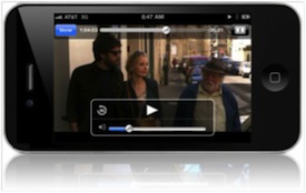
Users of the Netflix application can start watching movies on their PC, pause, and pick up where they left off on their mobile device.
6. Use time as an organizing principle
When people are interrupted or returning to a task, time is a natural and intuitive way for users to orient themselves. If appropriate, consider using time as a way to reorient users within an experience.
Rachel Hinman
Rachel Hinman is a researcher, designer and a recognized thought leader in the mobile user experience field. Her passion for art, design and cultural study coupled with the belief that people can use technology to improve the human condition have been the driving forces in her career for over a decade.
Currently, Rachel is a Senior Research Scientist at the Nokia Research Center in Palo Alto, California. There she focuses on the research and design of emergent and experimental mobile interfaces and mobile experiences for emerging markets. Prior to joining Nokia, Rachel was and experience design director at Adaptive Path, and a mobile researcher and strategist for Yahoo's mobile group. Rachel's innate sensitivity to people and culture have proven powerful skills in the field, enabling her to successfully lead research studies on mobile phone usage in the US, Europe, Asia and Africa.
Rachel writes and speaks frequently on the topic of mobile research and design. She is the creative force behind the 90 Mobiles in 90 Days Project and her perspectives on mobile user experience have been featured in Interactions Magazine, BusinessWeek and Wired. Currently, Rachel is writing The Mobile Frontier: A Guide for Designing Mobile User Experiences with Rosenfeld Media. Expected publication is winter of 2011. Rachel holds a Masters Degree in Design from the Institute of Design in Chicago.


