Save
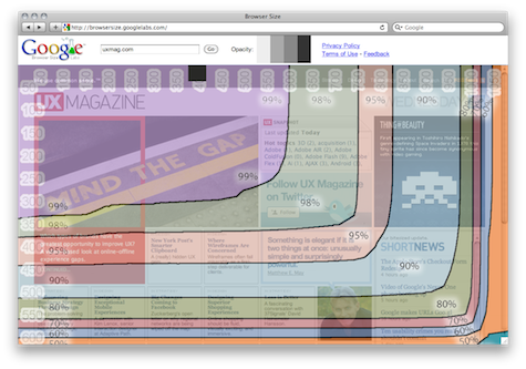
Google Labs has cooked up another interesting tool, called Browser Size. It demonstrates how much—or, sadly, how little—of a website is visible without scrolling. Enter a site URL to see an overlay of what percent of users will be able to see regions of the site “above the fold.” This is affected by screen resolution, of course, but also by the size of the browser chrome, the size and number of toolbars installed, and other considerations.
I was pleasantly surprised to see just how much is actually above the fold for 90% of users: roughly 975 x 500px. I’d be interested to see a different overlay in this tool that, rather than showing how much is initially visible to a user, shows how likely users are to view a given region. Of course the closer to the upper-left the region is, the greater the probability, but what about the content below or outside the fold? This would make clearer the magnitude of the importance of content being in a certain position. And something that’s below the fold vertically is more likely to be viewed than something that the user has to scroll horizontally to. It’d also be useful if you could select parameters about user demographics and system specs to see how the visibility of page content changes.
Jonathan Anderson | UX Magazine
I am a tech-focused jack of all trades and the editor-in-chief of UX Magazine. I'm also the author of Effective UI: The Art of Building Great User Experience in Software, published by O'Reilly Media. Through its partnership with UX Magazine, I am also a senior advisor to Didus, a recruiting and career development company focused on user-centered professionals. As well, I'm engaged as the Managing Director, Product Strategy & Design for Dapperly, a fashion-oriented software product startup, and am the Principal of First Day, a small private equity and consulting company. From 2005 to 2009, I helped found EffectiveUI, a leading UX strategy, design, and development agency focused on web, desktop, and mobile systems.
I’ve been fortunate to participate in work that’s on the leading edge of user-centered strategy and design, customer experience, and software development. Everything is converging around an increased attention to the quality of user experiences, around web-enabled or web-like software, and around technologies that can create unified experiences across multiple platforms, devices, and applications. I’ve built on my experience at UX Magazine, EffectiveUI, and in writing my book to undertake a major project to find ways to make dramatic improvements to the user-centered field and to increase the perception of user-centered design, research, and technology as being core strategic values.
My work can be very hard to explain because what I do day-to-day is extremely varied since my role is usually to be a jack-of-all-trades. If I’m performing any one job function this week or month, it’s always in the broader context of fulfilling the needs of that business (whatever they might be) and in the even broader context of the private equity holding and management activities of First Day.
My primary value has been to be an adaptable, fearless, fast-learning manager of and versatile resource to a large number of small businesses, where I hold the line in diverse functions while the companies are too small to hire specialized professionals for any given part of their business. This means I’ve had my hands in almost every aspect of starting, growing, and managing a small business, including finance, accounting, legal, management, HR, marketing/brand, PR, IT, resource management, facilities, general operations, corporate governance, project management, product development, change management, and many others.


