Save

Thoughtfully designed onboarding creates momentum and motivation for the user — and according to Apple’s Human Interface Guidelines, one of the keys to creating a successful onboarding experience is to make it fast, fun and educational. As a company, you invest both time and resources in bringing the users to this special moment where they bought the idea of using your app.
Statistically speaking, 25% of users abandon an app after just one use (sourceLocalytics). If you don’t welcome them and ensure they understand it, they will leave for good. Get user onboarding right, and you can look forward to all sorts of good things — like better engagement and retention rates, happier customers and a more profitable product. Get it wrong, and you can expect high user abandonment rates, unsustainable revenue churn, negative product reviews and diminishing returns.
Just imagine all the effort your entire team has taken to design, develop, market and sell your product. Why put everything at risk with a bad first impression? You certainly want to do it the right way by empowering users with the knowledge of what they can do with your app.
On the other hand, by not doing, your App can fall into this statistics: the average app is uninstalled by 77% of its users within the first three days after installation and only 20% of the users open the app once before deleting (source Quettra).
Finally, let’s take a look at some of the best practices for building a successful onboarding experience.
1. Make sure the new users get a chance to see the onboarding
Every new user must at some point be able to go through the onboarding flow to help introduce them to the experience and highlight the main features of your app.
2. Don’t show too many screens
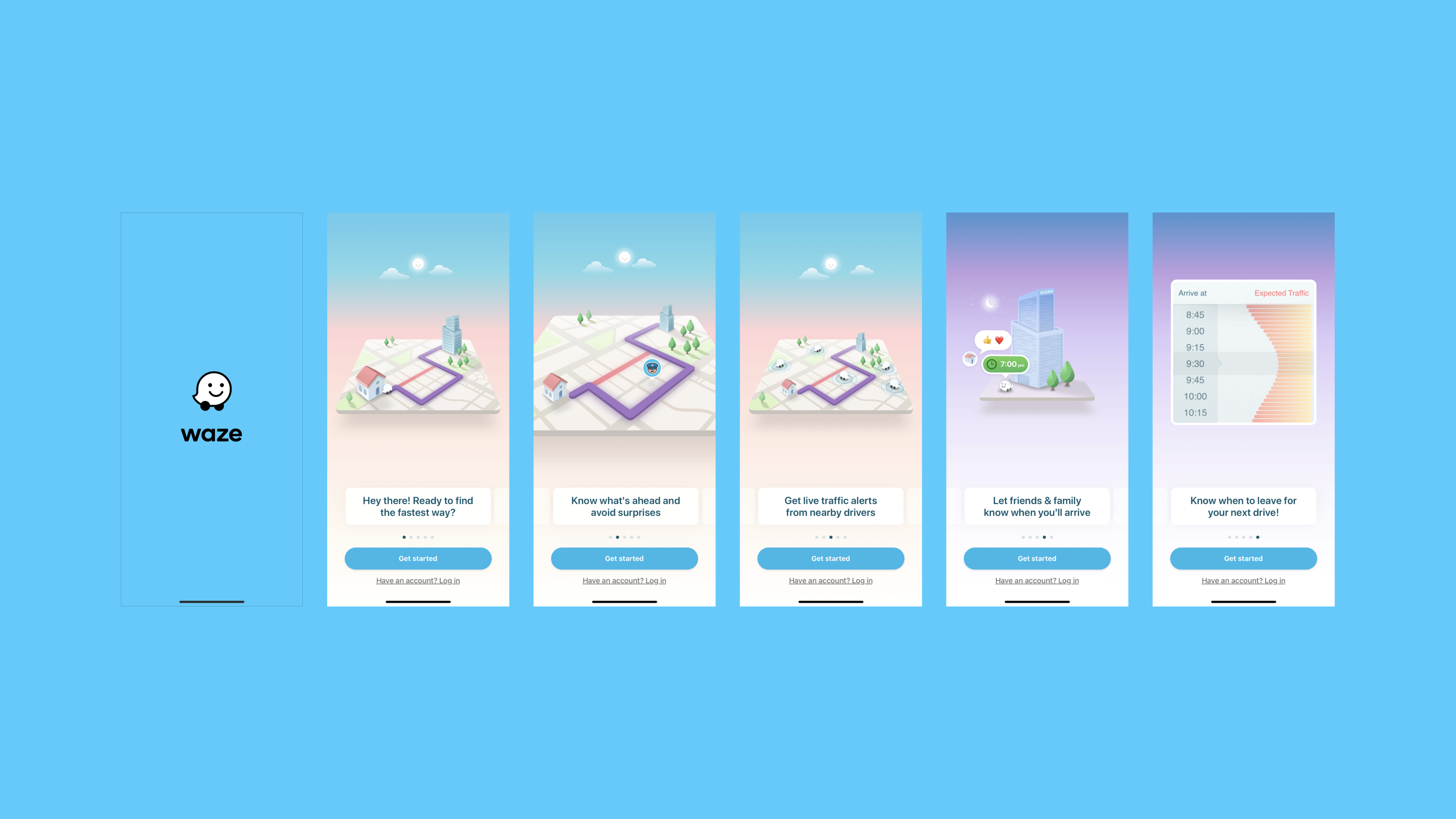
Consider a scenario where you have a new user and this is their first look into your app — you don’t want to overwhelm them. Three to four screens is enough to give the user a basic knowledge and a quick look at your product’s features, without making them think it will be too complex to use.
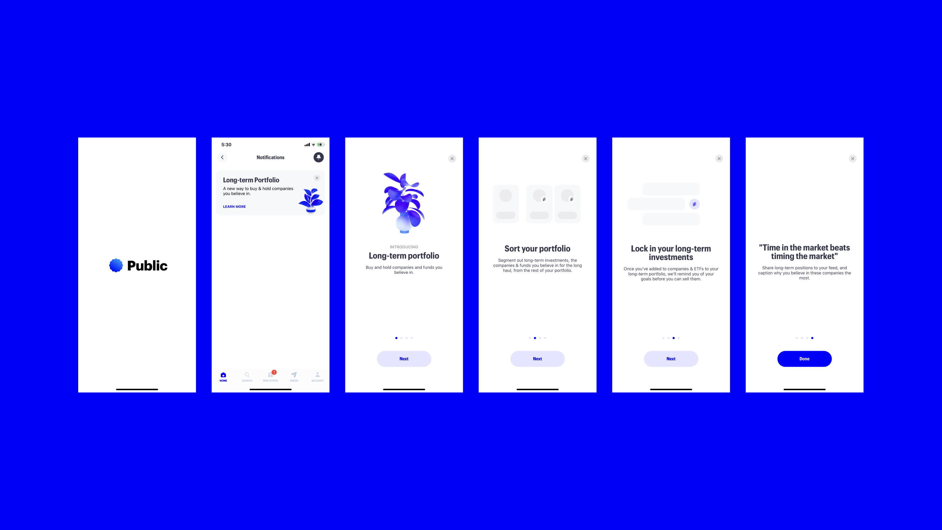
Onboarding is not just limited to first-time users — existing users may also be onboarded when new features are released or redesigned. For secondary features, you can create a separate flow to display to the users the second time they log in to the app. That way, the users gets the most critical features upfront and isn’t discouraged seeing a never-ending flow of features.
3. Use illustrations and motion
Visual content will have a much faster impact than text. Make sure to use illustrations that allow the user to quickly associate the feature to what it does.
Use your brand’s assets to expand its styles to the onboarding illustrations. That could be translated into icons, abstract backgrounds or even characters and objects. The important thing is that your illustrations can speak for themselves.
If you have the resource, I’d highly recommend to use motion — lottie animations if you will — it’s much easier to tell a story through motion. It doesn’t have to be a super complex animation, just a simple one that translates or symbolizes the feature’s ultimate action.
4. Concise copy goes a long way
The copy in the onboarding must be short and straight to the point — it’s very important that it is useful and easy to understand. Keep in mind this is the first contact with your app, if the users don’t get the message they’re very likely to go away for good. Keep it simple.
5. Show the user’s progress
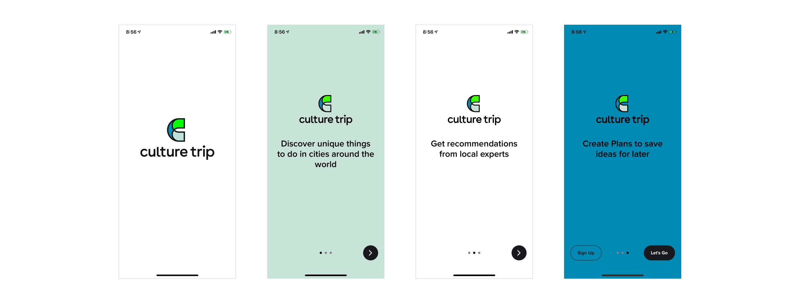
The user must be able to see where they are in the whole process and, more importantly, how much they have left to complete the onboarding.

Imagine a scenario where the user really needs to understand something about your app, but at the same time they’re in the hurry with not a lot of time to spare. By showing them their progress, they know they’re near the end and will likely stay to complete the process.
6. Allow the user to skip steps or dismiss the flow
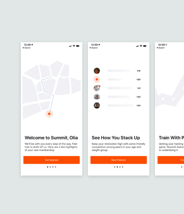
You’re already showing a progress status somewhere in your interface so it’s essential to give the user the ability to skip steps and maybe even go back — slide back and forward if you will — and dismissing the flow. The goal for the onboarding is to introduce the user to your cool and very useful app and to do that you must always empower them to use it as they will.
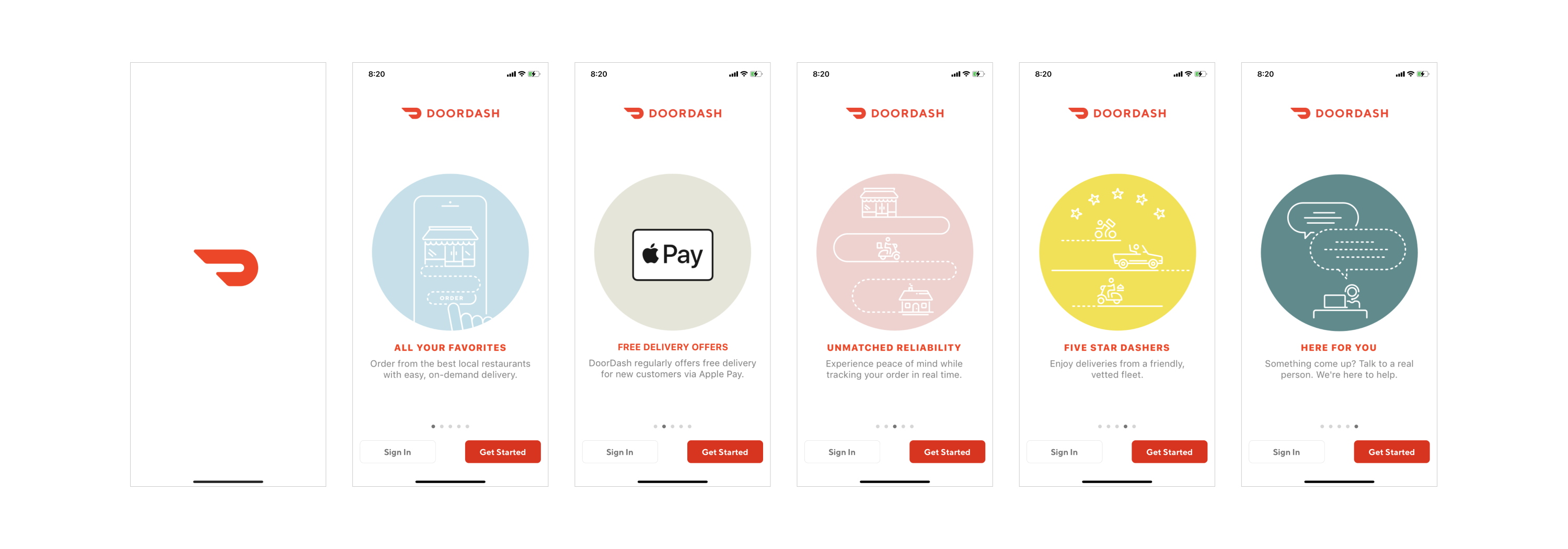
Realize that not all new and regular users are willing to go through the entire onboarding process and the last thing you want to do is to force them to do something, after all, this is the first interaction you’re having with them.
7. Keep it consistent
If you’re designing your first onboarding flow keep in mind every time your app has a new feature you’re gonna have to introduce it to the existing users. Keep it visually consistent so they already feel familiar with the UI, copy and brand assets. You want to extend the visual language you’ve been using and not reinvent the wheel.
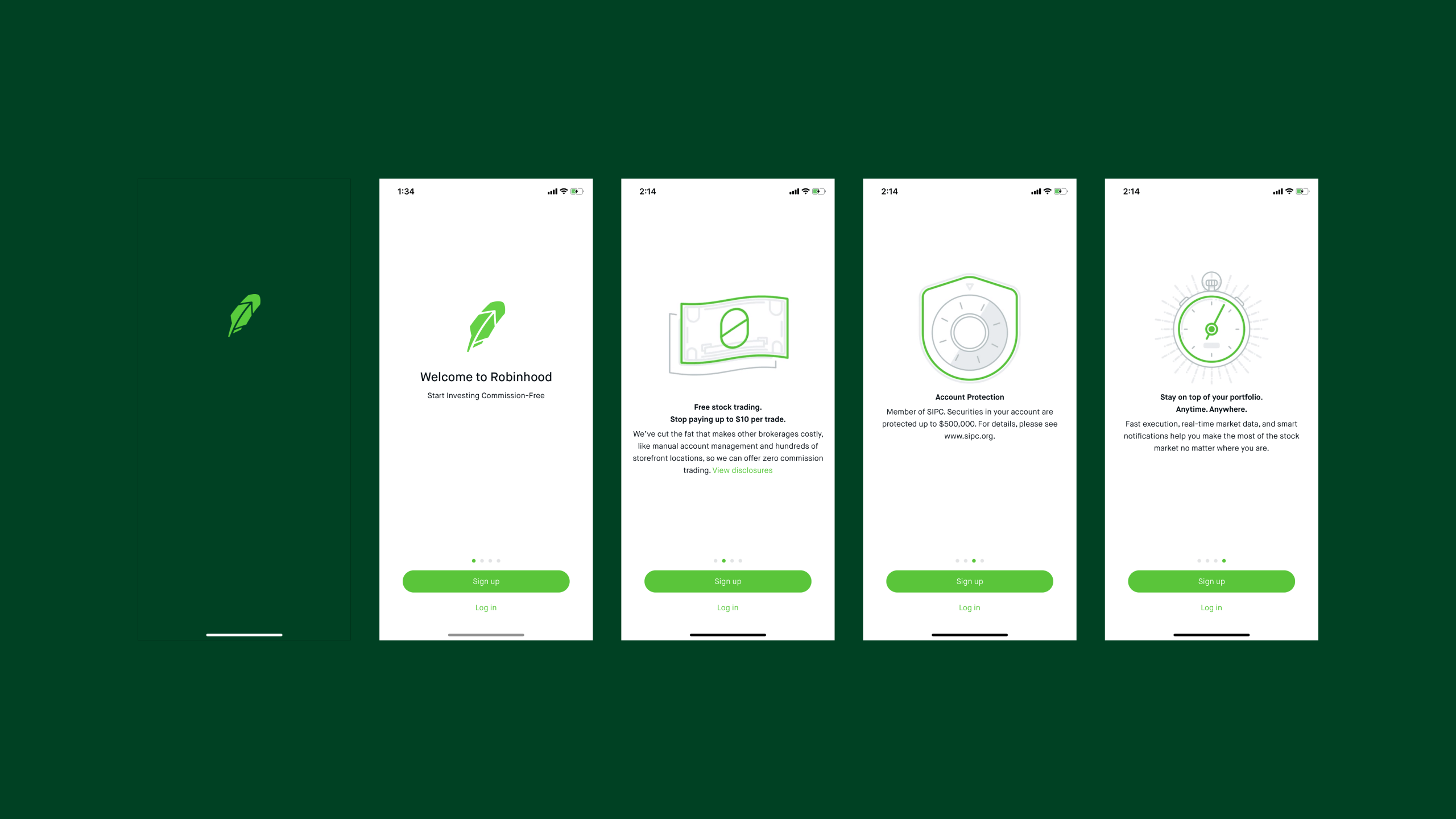
Robinhood app does a very good job bringing a brand consistency to the onboarding flow by introducing the user to it’s illustration style which can be seen across the app, a well defined color hierarchy and a very clean and modern interface.
There you have it
Try taking all of that in consideration, provide a quality onboarding experience for first-time users, ensure they will understand the capabilities of your app and come back to it. Doing so will increase adoption, user engagement and ultimately customer loyalty. Effective app onboarding increased retention rates by up to 50% (source Localytics).
I hope this article helps you to create some amazing onboarding experiences that delight users and that your team will be proud to ship!
Andre Augusto
Andre Augusto is an international Product Designer based in Sao Paulo, Brazil. Currently working for YML, one of the hottest digital agencies in Silicon Valley. He started his career around 18 years ago and since then worked on multiple areas of the design industry having moved around the globe in places such as England, Spain, Italy, USA and UAE-Dubai and doing remote for an even longer list of countries.
- Well-thought user onboarding is essential for customers engagement, satisfaction and ultimately their retention.
- Best practices of exceptional onboarding experience include providing a simple overview of the product’s main features, use of visual content and motion design, concise copy.
- Additionally, it is important to allow users to see their progress in the onboarding and skip non-essential steps.


