Save
In 1899 the largest automobile producer in world, Benz & Cie, made a grand total of 572 cars. Few could afford such hand-built luxuries.
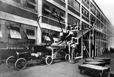
But in 1908 Henry Ford began to mass-produce the Model T using an assembly line. By distilling the complex process of constructing an automobile into a distinct set of repeatable tasks, Ford reduced the time required to assemble a car down to just 93 minutes. By the 1920s, 10,000 cars were being produced every day, each with a price tag of just $290.
Software, too, thrives on the transformation of abstract ideas into concrete, reusable components.
The last several years have seen the release of a number of design pattern libraries from Yahoo!, Peter Morville, Endeca, Martijn van Welie, and others. While design patterns are the crucial starting point, they take a significant investment of time, skill, and money to execute well. In order for our digital interactions to advance in richness and quality, the design patterns of today must become the UI components of tomorrow.
The Blueprint
Design patterns were popularized in the 1970s by architect Christopher Alexander. In his book A Pattern Language, Alexander chronicled 253 classic, tested architectural patterns ranging from the design of cities and buildings all the way down to the arrangement of rooms and even the placement of doorknobs. Alexander’s patterns provided principles for other architects to follow, but gave them room to adapt the details to match their particular environments.
While originally developed for architecture, design patterns have long been adopted by UI designers as well. Design patterns are refined solutions to everyday problems communicated through a written description that usually consists of four primary sections:
- What problem does this pattern address?
- When should this pattern be used?
- Why should this pattern be used?
- How is this pattern achieved?
An excellent example of a thoughtful, concisely written design pattern is Peter Morville’s definition of faceted navigation:
What
Faceted or “guided navigation” leverages metadata fields and values to provide users with visible options for narrowing or refining their query.
Why
This integrated searching and browsing experience lets users begin with a simple keyword search, but then offers useful next steps and insights into the content and its organization.
When
Guided navigation has become almost ubiquitous in e-commerce given the availability of structured metadata and the clear business value of improving findability. This pattern is applicable in most contexts, assuming a substantial volume of valuable content.
How
Requires significant investment. Leading vendors include Endeca and FAST. Also supported by open source products such as Apache Solr. Human effort required for defining metadata fields and values. Tagging can be distributed and/or semi-automated.
Design patterns provide the recipe for success. They’re the blueprints. But a recipe isn’t the same thing as a baked cake, nor is a set of blueprints a physical building. It takes time, expertise, and materials to turn the idea into the reality.
Going from design pattern to a polished, fully functional UI is hard work. It requires an interdisciplinary team of designers and developers. It takes time to design the interaction, write the code, and test it with users. Because of this, only organizations with top talent and sizeable budgets are able to achieve truly great user experiences. But it doesn’t have to be this way.
The $290 Car
The componentization of automobile manufacturing meant that every working family could own a car, not just the elite. Similarly, responsive, highly interactive interfaces need not be the monopoly of large companies such as Amazon, eBay, and Google. Components can make it possible for products and companies of any size to deliver excellent experiences.
While design patterns are a structured description of how something should work, a UI component is a reusable building block that fully encapsulates all the code necessary to put that design pattern into action. A component offers a refined, tested solution that fully addresses every nuance and is easy to incorporate into the surrounding interface. Components are the ultimate realization of design patterns.
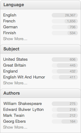
An example of a component is the faceted navigation widget that I helped develop at TwigKit. To add facets to a page, one would need to add a single tag:
     <facets

facetNames="Language,Subject,Authors"

mode="expandable"

numberInShortView="4"

numberInExpandedView="12" />

Components reduce development time and provide a more reliable end result. They are cheap to get up and running, and mean that there is less custom code to maintain. While implementing a design pattern requires a large team of specialists, small teams of generalists can use off-the-shelf components. The end result is that components enable teams to deliver a better user experience than they would be able to achieve by building everything from scratch, and in much less time.
The Cycle of Innovation
In fact, we use components all the time without even thinking about it. When designing for the Web, we use browser components to add buttons and dropdown menus. Even tasks that we previously wrote code to achieve—everything from playing video to drawing rounded corners—are now handled for us much more simply by modern browsers.
The idea of reusable components is not, however, limited to UI design; it is fundamental to the very process of innovation. In order for the automobile to be devised, for example, a host of technological groundwork had to first be in place, including components as basic as the wheel and as advanced as the internal combustion engine. Only when each of these component parts had reached a state of maturity in their own right could the inventor of the automobile assemble them into something greater.
“When you go back and you look at the history of innovation,” says Steven Johnson, author of Where Good Ideas Come From, “…the ultimate idea[s] come from this remixing of various different components.” In other words, transforming conceptual design patterns into concrete components provides a platform on which others can build upon.
Off the Shelf, or Roll Your Own?
With all of these advantages, your team should either be using an existing component library, creating your own, or both. In deciding which route to take, you should consider your team’s strengths, the scope of the project, and how much time you have available.
Existing libraries
There are now a handful of widely used component libraries available that provide widgets for common interactions such as picking a date, using a slider, and graphing data. While jQueryUI is the most well known example, Sencha’s Ext JS provides an even greater range of components (and both jQuery and Sencha are working on mobile frameworks as well). There are a number of other libraries that provide specialized components, such as Vaadin for Java-based applications, Flot and Highcharts for graphing, and TwigKit for search-based interfaces. Going with a suitable existing library should result in the quickest initial delivery time, and empower small teams to punch above their weight.
Building a library of your own
While off-the-shelf libraries are good at providing commonly used widgets, your project may require a specific set of interactions not present in existing components. In this case, consider creating a reusable solution of your own. It will take an initial investment of time and attention, but if done right will mean you can reuse that same component again and again.
Components 101
Not all components are created equal. Whether you’re shopping for existing components or creating your own, there are five characteristics that all good components share.
Sound interaction design
Above all else, a component must adequately address the needs of the user. It must be both useful and usable, properly support all of the desired mouse, keyboard, and/or touch interactions, and plan for accessibility.
Clean code
If the component is meant for the Web, the front-end development should reflect Web standards. It should validate and be cross-browser compatible. It also needs to be compact (so that it downloads quickly), and optimized for browser performance.
Ready to use
A component should be easy to implement with as little configuration as is practical. One line of code is ideal.
Easy to configure
While a component should work out of the box, it should also be easy to customize. The best components are versatile enough to work in a variety of situations, giving the developer ample control over the main variables. While difficult to achieve and requiring a rigorous decoupling of concerns, it is absolutely crucial.
Well documented
A component library must be thoroughly documented. At the least, the documentation must indicate how to start using a component, and describe all of the available configuration options.
Don’t Reinvent the Wheel
In the end, use existing components to solve commonplace problems, and develop your own reusable code to solve problems that are specific to your area of expertise. In the words of Jared Spool, “[Component] libraries give the team speed and efficiency, letting them leverage the rich history of “things-implemented-before.”
Tyler Tate
Tyler Tate is a user experience designer focused on making the complex feel simple. He's also the founder of Crema.co, empowering you to discover single-origin coffees, get to know the people who grew them, and have the beans delivered to your door. Tyler lives in London with his wife Ruth and son Galileo. You can keep up with him on Twitter.


