Save
When I started as an application designer in 2001, I worked really hard for my clients, whipping their applications into shape. I would conduct usability reviews and hands-on design sessions to overhaul the app, I’d agonize over each screen layout, review, test, revise, then buckle down with development until we pushed out the release. It was hard work and I was proud that I was a good designer.
But I had tunnel vision. Now I can see that the product interface is only one part of the customer’s end-to-end experience. I suppose that’s why we have moved away from just user interface design and into user experience design. UX means more than just the product interface; it encompasses the whole experience a person will have with a brand and their overall satisfaction with a product.
Over the past ten years of in this field, I’ve evolved a solid UX design process that starts with discovery and ends with development integration, relying heavily on stories and prototypes in between. Many agencies and designers have evolved similar processes and share them on blogs and at conferences. Lists of UX deliverables such as wireframes, flow maps, and diagrams are frequently the topic of articles and talks, as well. But what I haven’t seen is a discreet checklist for what an end-to-end experience should include.
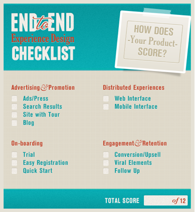
So I developed a checklist for the four phases of a customer’s experience:
- Advertising & Promotion
- Onboarding
- Distributed Experiences
- Engagement & Retention
This checklist can help product managers see the big picture for staffing, scheduling, and budgeting a project appropriately. UX designers should review this list with cross-team leaders to determine which dimensions they will need to provide design for, e.g., will the marketing department create the ads or will the design team?
Let’s look at how some successful products handle these important customer touchpoints.
Advertising & Promotion
What’s the first experience a prospective customer will have with your product? An online ad, a link in a long list of search results, your public facing website, or your blog are the most likely touchpoints. Each of these offers a unique opportunity to set expectations about the value and quality of your product.
Ads / Press
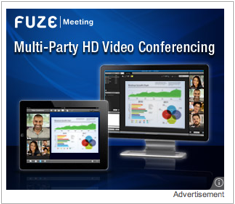
Products such as FuzeMeeting and Hipmunk use ads to drive traffic to their sites. Although FuzeMeeting is subscription based, and Hipmunk relies on ad revenue, they can both benefit from more visitors. Each of these ads displays the product name and a descriptive tagline:
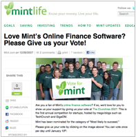
A little press can go along way, but don’t wait for it to come to you. In 2007, Mint encouraged users to vote for them in the Crunchies and on Motley Fool, then they won PCWorld’s Top 25, and the rest is history. Balsamiq gave away thousands of free copies of Mockups to bloggers, and netted over $100,000 in profits in their first 6 months.
Search Results
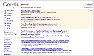
Ancestry.com and Basecamp are good examples of well-designed search results and effective search engine optimization. Search for genealogy and on the first page of results you’ll find out that Ancestry.com is the “world’s largest online family history resource,” and farther down you’ll see another link and persuasive description:
Or search for project management and you’ll find Basecamp on page one:
Compare this concise description with that of Axure. Axure used to be one of the top UX design tools, but you would never guess that from their product description on the fourth page of search results for wireframes:
Site with Tour
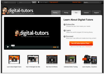
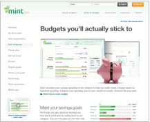
Your product’s site will shoulder a lot of responsibility, and is probably one of the hardest things to design. It needs to inform, persuade, engage, and ultimately convert visitors to customers. Mint and Digital Tutors use tours to engage visitors early and showcase the power of their products. Tours are usually a combination of product screenshots, informative copy, and videos:
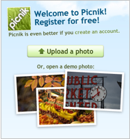
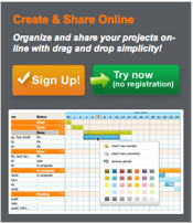
Along with a product tour, Tom’s Planner and Picnik also offer visitors the option to try out the product with demo data before registering:
Blog
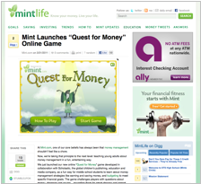
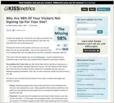
KISSMetrics and Mint both offer topic specific blogs that attract prospective customers and channel them to registration:
Onboarding
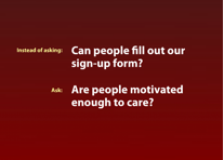
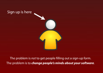
Joshua Porter has a great talk on Designing for Sign-Up in which he explains the problem of signup is not to get people to fill out a form, but to change people’s mind about your software.
If your advertising and promotion are effective, people will be motivated to try your product, which brings us to onboarding.
Trial
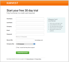
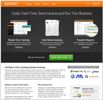
Harvest, like many software-as-a-service (SaaS) products, offers a free trial. They don’t even require a credit card, making it super low risk for a motivated user to become a trial user:
Early Registration
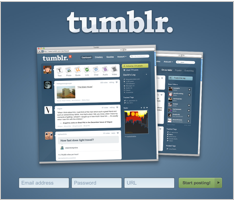
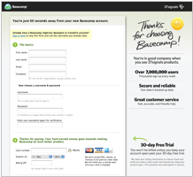
Sign up should be fast and simple. Basecamp requires a few fields of information plus a credit card to get started, but they promise you won’t be billed if you cancel in the first 30 days. Tumblr is even faster; just enter your email, password, and the URL you want, and you can immediately start posting to your new blog:
Quick Start
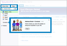
Quick start tips, also called “tour invitations” or the “blank slate stage,” keep up the momentum by immediately getting the customer using your product. PivotLabs and Yahoo! Calendar use this technique to quickly acclimate the customer to the product’s features:
Distributed Experiences
The UX agency Punchcut coined the term distributed experiences to describe the approach to designing multi-dimensional experiences for the new ecosystem we find ourselves in. They point out that “users are no longer fixed to high-computing desktops—they are surrounded by digital ecosystems and information networks wherever they go.” A web interface may satisfy many of your customers needs, but there is likely a growing demand for a mobile solution as well.
Web Interface
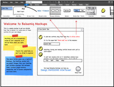
With the arrival of rich Internet applications (RIAs) in 2004-05, people’s expectations for the web changed. Instead of websites, there are now hundreds of thousands of web apps with highly interactive features like drag-and-drop, live preview, live save, and live scroll, to name a few. Balsamiq and Picnik are two of the 50 Most Usable RIAs; they are functional and beautiful, easy to learn, and easy to grow with.
Mobile Interface
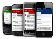
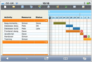
A mobile version of your product can be a significant factor in customer satisfaction. Basecamp and Tom’s Planner both provide mobile-optimized web solutions, so customers with most types of smartphones can access their accounts.
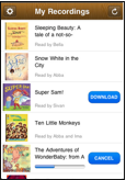
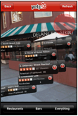
An alternative to a mobile version of your web application is a mobile app, available to your customers for download and installation. Harvest and A Story Before Bed offer a subset of their functionality on the iPhone. Groupon provides the same functionally as their web product. Yelp actually provides more functionality than their web product with an augmented reality feature.


Engagement & Retention
Now it is time to close the deal. Market research can help determine the best pricing plans to offer customers. But conversion isn’t the only metric to design for; retention is possibly even more important.
The perceived value of the product will be measured against the cost each month (or other payment interval), so it is important to continue to communicate with your customers and provide a channel for their feedback.
Conversion / Upsell
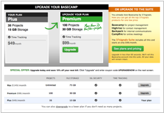
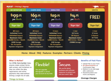
Wufoo offers a monthly subscription model, like many SaaS products. The pricing is based on usage. Conversion to a paying plan after the trial period is encouraged. Basecamp uses the same approach, but they periodically offer discount codes for existing users to either upgrade at a reduced rate or try out other apps in their product suite, such as Highrise or Campfire.
Viral Elements
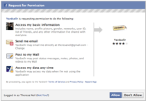
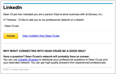
LinkedIn relies on people’s ever-changing connections in their professional networks to attract new users and retain existing customers. Other products such as YardSellr rely on existing social networks such as Facebook to gain exposure.
Follow-Up
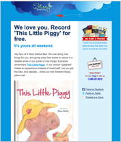
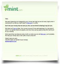
There is a specific window for (re)engaging customers. Mint will tell you “your money misses you” if it has been more than two weeks since you logged in. A Story Before Bed keeps their product in the forefront of customers’ minds with special offers and new feature updates.
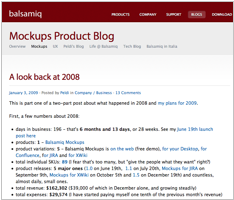
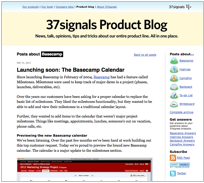
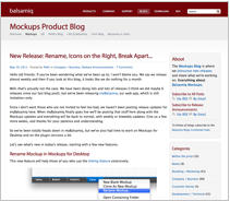
In addition to emails, an active blog and community forum can increase customer loyalty and your net promoter score. Balsamiq Mockups and Basecamp both have product blogs that encourage customer involvement:
Your Product’s Score
Take a moment and see how your product scores. Does it rate a perfect 12 or are there some gaps in the end-to-end experience?
Theresa Neil
Theresa Neil is an independent interface designer based in Austin, Texas. She has led the design for more than 80 live web, desktop and mobile applications since 2001. Recent clients include PayPal, Pearson, UnboundID and a number of start-ups. Her portfolio and blog are at www.theresaneil.com. Theresa and Bill Scott co-authored "Designing Web Interfaces: Principles and Patterns for Rich Interactions" published by O’Reilly Media in January of 2009. More about the book including the Flickr photo stream and blog are at www.designingwebinterfaces.com.


