Save

Chances are, you’ve experienced the feeling of opening a new SaaS application, engaging with its features, and realizing after a few minutes that it feels like a total novelty. It might not be because the product was actually empty of features or because it was poorly designed, but really because it somehow didn’t add any value to your life — there was no utility.

Once the thrill of enhanced productivity or creativity or sheer time-wasting-“WTF” evaporates [for a product], everyone moves on — often abruptly, decamping from the service en mass, leaving it like an abandoned space station. — Clive Thompson
Although I agree with Clive that a disproportionate amount of applications face this dilemma, I think we can take a deeper dive into why this happens. More importantly, I want to explore what designers, developers, and product managers can do to avoid this from happening.
The Product Value Spectrum (PVS)
One one side of the PVS you have linear and/or exponential adoption. The metrics influencing this measurement include things like: time in app, customer retention, exponential growth, positive feedback, low churn rates, high customer lifetime value, and so on. These values are consequences of products that capture our interest through powerful features. They are inherently sticky. This is where you want your product to exist because users on this side of the spectrum are finding consistent value.
On the opposite side of the spectrum you have your One-Trick Pony (OTP). This slippery, data-barren landscape consists of memes, intangible behaviors, high churn rates, and a general lack of utility and focus on long term use. It can be one hell of a beauty, but that’s where it ends. What makes an OTP an OTP is that it does in fact have redeemable qualities, ones that even very high-value products strive to have. The issue is, it needs to do more than that. By the way, it’s totally OK if this is where your product exists, because there are multiple ways to move from here towards a more holistic product experience.
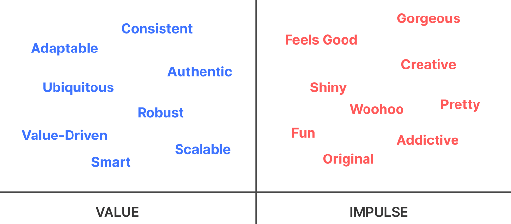
Here’s a diagram of words I compiled that feel very aligned with my aforementioned PVS. When you’re building a product, I think it’s good to exist in both zones. The issue arises when you find your product only exhibits responses on the Impulse side of the chart.

To get to that balance between Value and Impulse, however, you need to take a deeper look at what’s going on. Are you actually solving a problem? (Yes, I know, it’s so cliche). Is your product providing value for a specific demographic that reacts in a measurable and proven way? Why? At this stage you should be asking every question imaginable in order to get to the root of your product’s fit.
Even good products are constantly treading the line with novelty, because novelty can be deceiving. It can make you think you have something really valuable on your hands that might not reflect its true value. And that’s scary as hell.
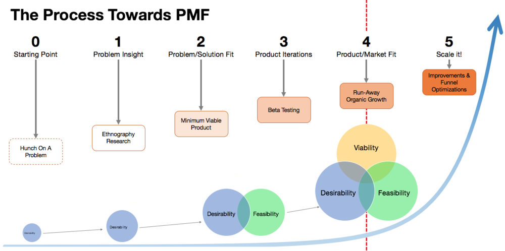
Pourya Moradi’s article on achieving product market fit is amazing because it does such a good job at giving a clear breakdown on what you need to be considering to reach the elusive Product Market Fit. For the purpose of this article I want to focus on a key areas that occur at the moment right before you find your PMF. This sweet spot is where you need to gauge how much additional iteration is required to start capturing feedback tailored around the Value vs Impulse word chart above I demonstrated earlier.

Credit: Brian Tod
Simple vs Simplistic
So where do you start? It’s easy to lump any project that focuses on one core issue into the “Simple” bin. You might even consider the streamlined approach as bringing immediate value. And sure, it can. But there’s more to it than that. In general, most products are attempting to abstract workflows (think Slack, Notion, Asana, etc.) into digestible chunks of interaction that bring repeat value, and thus, repeat customers.
Simplistic applications however can in fact be abstracting complicated data and/or content for the user’s sake, but they aren’t considering where people go from there. It’s the task management app that looks great, is exciting to use, but quickly fails to satisfy your product requirements at the end of the day.
Be simple, not simplistic.
Constant Feedback
Our entire purpose as creators is dependent on other people. So why would you not hear them out? Friends and colleagues can give you good runway by letting you know about more top-layer issues. That feedback can only go so far. I’d wage that many will not be honest if they feel your product is a One-Trick pony, and how would they? For that level of assessment you need something more intuitive, you need yourself a toolkit.
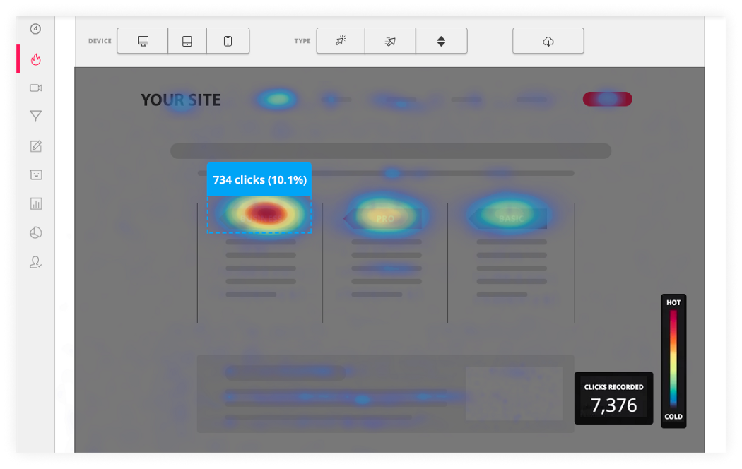
Hotjar is incredible for this. Whether you’re in need of seeing exactly how users move around your app, or hearing feedback from them the second they land on your web app, the constant feedback is invaluable. You can even watch recordings of people interacting with your product!

Credit: Hotjar
The benefit of this is that when you’re teetering near the end of your iteration cycle, you need a completely objective viewpoint to confirm your hard work is paying off. Often that shows in unwanted page skips, users following your intended flow, and improved click through rates where they should be.
Similar to Hotjar, User Testing gives you the ability to see real people try your product. It differs in that users are paid to evaluate your product, but in doing so, you are given complete freedom to request tailored feedback — one that focuses on the core problems your product team deems necessary. create an experience that will result in users focusing on the problems your team has identified as most pressing. The best part is you get a handful of long-form recordings to review at your convenience.
Why these two tools are so important is that they act as primary sources, informing you if what you have on your hands works as intended. Do the results suggest your customers will return? Is your application solving a problem? Could it in fact be confusing? These are the questions you need to answer before you can safely say your product is not a novelty.
Solution Breakpoints
So you feel you have a solid grasp of the problem you’ve identified for your customer base and believe the solution is bringing positive change to their lives. Now what if you’re introduced with a new problem to solve? And then another one? It’s not uncommon after you receive all of that valuable feedback to realize you are standing amidst three or more problems your might have to solve.

Problems come and go, so you have to be prepared to juggle them.
The key to juggling these variables is to set clear target segments with your customers. Which customers are looking to have problem #1 solved? Which are looking for #2 to be solved? Where’s the crossover?
Your goal at the end of the day is to bring all of those problems to the X axis in as little time as possible, because that iteration and attention to feedback will drive you away from the one-trick pony and closer to delivering consistent value. One of my all time favorite companies who take this to heart is Figma — their team is just on point when it comes to hearing their customer problems, addressing them in new iterations, and pushing forward. Although they are far deeper in their life cycle than many at the novelty frontier, there’s no reason you shouldn’t be emulating this process to ensure you drive value home.
Hopefully these points leave you with a few ideas and tools to ensure you’re not building a one-trick pony. Although it can look fun and give your users short-term satisfaction, like every novelty, it will wear off. Make sure you’re taking hold of user insight throughout your development cycle. You’ll be rewarded with a mass of users clamoring to get their hands on your product.
At the crux of product development and growth marketing. Mixer of UX, culture, and technology to build powerful user experiences. Product Hunt aficionado, frequent writer for design publications, and go-to-market champion. Learn more about me at https://semino.me


