Save

Can we really be user advocates while only focusing on the generalized user?
Have you ever listened to a new perspective and it resonated with you for weeks after?
Three weeks ago I attended a webinar called “Designing Experiences for Underserved and Gentrified Communities” with Cora Cowles, Experience Design Director at Huge. Cora gave an amazing, well-researched lecture explaining how we as designers are leaving out so many users. And since then, I have not been able to stop thinking about it. I will not recap what she said because I will in no way do it justice (watch it here), but it made me think…
As UX Designers, aren’t we supposed to be user advocates? And how can we say we are user advocates if we aren’t actually being inclusive?
So let’s unpack this
Cora starts her talk referencing the 80/20 rule, also known as the Pareto principle. If you aren’t familiar with this, it means that 80% of the effects come from 20% of the causes.
As designers, this means with 20% of our effort, we can cover the needs of 80% of users. All sounds great but then Cora Cowles says:
“The problem is, by going with the 80/20 rule, it becomes a generalization and that means you are always leaving someone out”
I don’t know about you but the “always leaving someone out” part doesn’t sit right with me.
Understanding the other 20%
In order to properly design for the 20%, you have to first understand accessibility and inclusivity. There are endless resources for understanding different user needs but one I have been referencing is the Microsoft’s inclusive design toolkit. Microsoft defines inclusive design as:
A methodology, born out of digital environments, that enables and draws on the full range of human diversity. Most importantly, this means including and learning from people with a range of perspectives.
While Microsoft breaks down constraints into permanent, temporary and situational, Cora took it a step further and expanded it:
- The impaired: Permanently, temporarily or situationally. Those with physical, mental and learning disorders.
- The resource deficient: No home, transportation, internet or smartphone. Living at or below the poverty line.
- The cast aside: Those with a race, religion, language group or social status different from that of the majority.
User Personas are detrimental to inclusivity
For those who are new to UX or just happen to find yourself reading this article, I should explain what a user persona is.
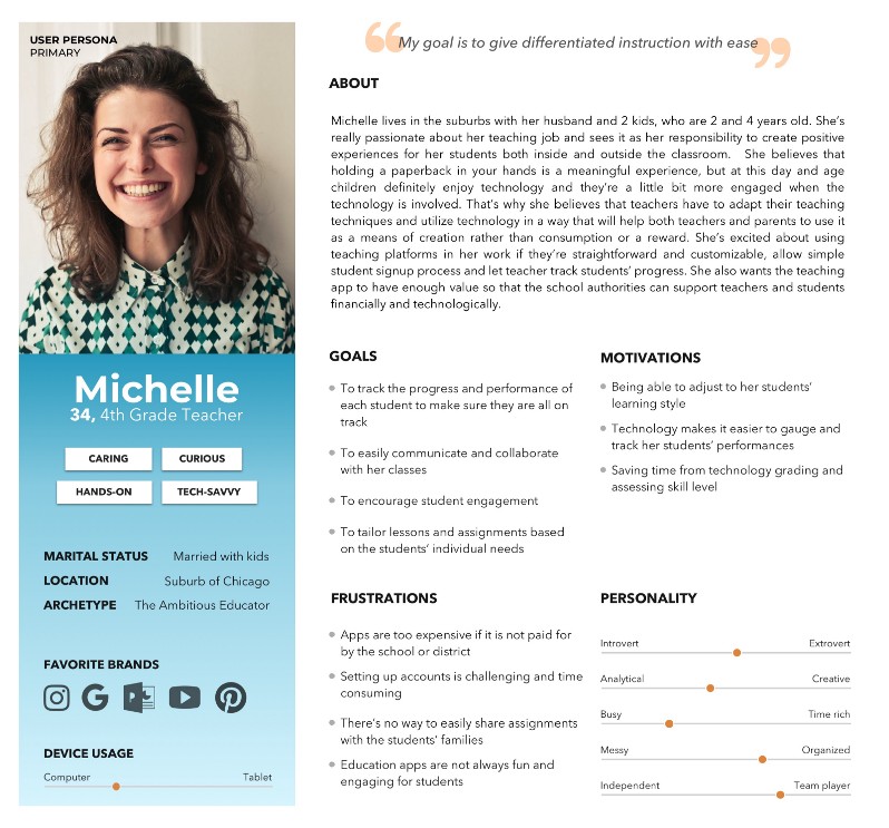
Personas are created early on in the design process to help designers and stakeholders empathize with their users. They are essentially fictional characters that represent synthesized data collected from user research. They summarize the common goals and pain points users expressed during the research phase. Since this acts as a summary of their users, if an issue is brought up by only one user, it typically gets discarded since it is not a common theme among the whole group of users.

Sample of a persona created for a project with Flatiron School
But see how that can be an issue with inclusivity? If one user mentions they are color blind, you won’t include that in your persona since none of the other users you interviewed have any constraints. So your persona becomes this “ideal” version of your user.
While yes, understanding the your demographic of your product is important, it’s also important to not over generalize. Over generalization will result in designs not friendly to all users.
Educating yourself on the different constraints people can experience and designing with those constraints in mind first, it will be easier to incorporate the needs of the 80% after facing the needs of the 20%.
Conclusion
Don’t only be a user advocate — be an advocate for accessibility, diversity and inclusivity.
Keep creating user personas to represent your demographic but add a quality that will be a reminder to you, as the designer, to be more inclusive in your research, designs and testing.
“Removing the blinders uncovers a new level of empathy and understanding for users.” — Cora Cowles

I’m a hardworking yet light-hearted UX Designer trying to positively impact people’s lives through creative problem solving. I strongly believe in the power of design thinking to create not only functional solutions, but inspiring solutions as well.
Coming from the architecture world, human-centered design is my jam. I worked as an Interior Designer in world-renowned architecture firms for the first 5 years of my professional career. With my main focus on workplace transformation, I learned the importance of understanding your user group to properly design the physical space. Many ideologies can cross over from designing physical space to designing digital space.
When not googly eyed from a great interface or a beautiful old building, you can find me at a coffee shop with a good read trying to pet every dog I see.


