Flag

We stand with Ukraine and our team members from Ukraine. Here are ways you can help

Get exclusive access to thought-provoking articles, bonus podcast content, and cutting-edge whitepapers. Become a member of the UX Magazine community today!

Home ›› Analytics and Tracking ›› A Simple Method to Analyze Task Flow

A Simple Method to Analyze Task Flow

by Khatia Gagnidze
3 min read
Share this post on
Tweet
Share
Post
Share
Email
Print

Save

This is a simple method to prove to ourselves and the stakeholders that the task flow we just created is worth being implemented.

As designers, we often have to prove to ourselves and the stakeholders that the task flow we just created is worthy of implementation. It’s difficult to find convincing arguments to make them believe that the upgraded flow will be successful (RIP Great ideas).

What is one of the best ways to show the efficiency of a product or functionality? Numbers! To be more specific — ideas validated with data. I found a simple method for such scenarios and share it with you in this article. 

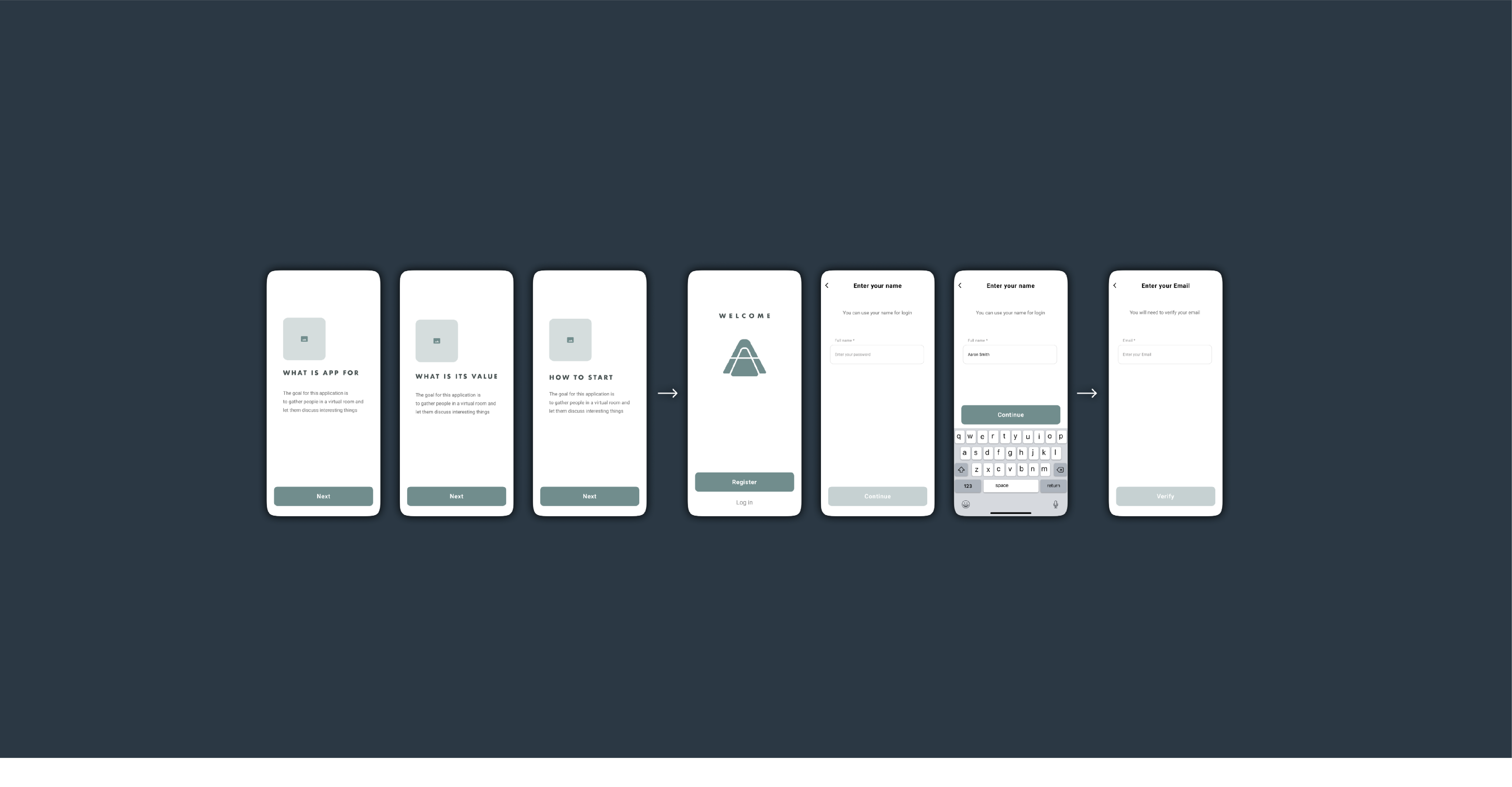
Take a look at the example of the onboarding flow:

 Analyze Task Flow

Onboarding flow

As soon as we have a flow, all the actions that a user will have to take should be written down (Note that these actions can vary depending on the type of flow; there might be gestures, fingerprints, and screens that disappear within a few seconds). In this example, there are four actions provided:

  1. Tap
  2. Type
  3. Open external link
  4. Scroll

Next, we need to evaluate them according to their importance (mental workload), time, and effort spent. For example, Scroll seems to be the easiest task as a user doesn’t have to make a crucial decision — they merely look through the content fast while scrolling. Therefore I assigned it 1 point. It is a very subjective part of the process, so feel free to experiment while evaluating. In my case Tap is 3 points, Type is 5 points, and External link is 10 points (this is the highest because users have to leave the app, which can be dangerous).

Assess the screens

Place signs to identify each action near the corresponding screens:

 Analyze Task Flow

12 Taps / 4 Types / 1 External link / 1 Scroll

Simplify the flow

Now it is time to simplify the flow and count the actions again. I decided to turn the first four screens into one, placed all types of inputs together, and eliminated the number of password input fields. Here is the simplified version of the flow:

 Analyze Task Flow

6 Taps / 3 Types / 1 External link / 1 Scroll

Calculate

As soon as we evaluate initial and updated flows, it is time to open excel and create two pages: one for the initial version and the other for the updated version. Enter simple formulas in the third column (e.x. =B1*3 — in case of taps — the number of taps multiplied by its value).

 Analyze Task Flow

Tap counts =B1*3

As soon as there are formulas entered in the C column, fill in the B column with digits. The total score will appear in the 5th row & C column (enter =SUM(C1:C4 in it to view the result).

 Analyze Task Flow

Working in Excel is optional, you can calculate everything using just pen and paper

Now you can see the results: the updated flow is 37% ((67–42)/67×100=37) simpler than the original one!

When is the method useful?

This method is useful while redesigning a website or an app, and while simplifying the most frequently used flows. Most importantly, as I mentioned above, all the data gathered can enforce your arguments during the negotiations with stakeholders.

post authorKhatia Gagnidze

Khatia Gagnidze
Khatia is a designer with over 6 years of experience in product design, specializing in fintech, eCommerce, blockchain, banking, social network, and other industries. She has successfully designed, UX audited, and conducted research both remotely and on-site for companies worldwide, including in Australia, Singapore, UAE, France, and the USA.

Tweet
Share
Post
Share
Email
Print

Related Articles

Why do designers grumble at the mere mention of PowerPoint? Discover smart strategies that turn frustration into creative solutions.

Article by Jim Gulsen
Why Designers Hate PowerPoint (and How to Fix It)
  • The article examines why PowerPoint often frustrates designers, from its limited design capabilities to inefficient workflows, and explores opportunities to bridge those gaps.
  • It highlights strategies like building systematic design elements, creating templates, and augmenting slides with other design tools.
  • The piece underscores the importance of collaboration, simplicity, and proactive planning to elevate design and streamline workflows.
  • It highlights practical methods to help designers balance quality and speed for presentations that are both functional and visually engaging.
Share:Why Designers Hate PowerPoint (and How to Fix It)
4 min read

Struggling with PowerPoint’s design limitations? This step-by-step guide shows you how to build systematic design solutions, from mastering slide layouts to using sticker sheets for patterns. Learn to create polished, professional presentations with smart workarounds and helpful tips.

Article by Jim Gulsen
A Step-by-Step Guide to Creating a “Design System” in PowerPoint
  • The article gives a step-by-step guide to building systematic patterns in PowerPoint. It talks about the program’s limitations and gives essential tips like mastering slide layouts and customizing text settings.
  • It suggests using PowerPoint’s automated features carefully and advocating for manual workarounds to elevate quality.
  • The piece introduces creating sticker sheets for reusable design components and highlights strategies for successful workflows.
Share:A Step-by-Step Guide to Creating a “Design System” in PowerPoint
5 min read

Publishing in HCI and design research can feel overwhelming, especially for newcomers. This guide breaks down the process — from choosing the right venue to writing, submitting, and handling revisions. Whether you’re aiming for conferences or journals, learn key strategies to navigate academic publishing with confidence.

Article by Malak Sadek
A Guide to Publishing Human-Computer Interaction (HCI) and Design Research Papers
  • The article provides a guide to publishing in Human-Computer Interaction (HCI) and design research, sharing insights from the author’s PhD experience.
  • It explains the significance of publishing in academia and industry, offering an overview of peer-reviewed journals and conferences.
  • It breaks down the two main types of papers — review and empirical — detailing their structures and acceptance criteria.
  • The piece emphasizes strategic research planning, collaboration, and selecting the right venue for submission.
  • The piece also outlines practical steps for writing, revising, and handling rejections, encouraging persistence and learning from reviewer feedback to improve publication success.
Share:A Guide to Publishing Human-Computer Interaction (HCI) and Design Research Papers
8 min read

Join the UX Magazine community!

Stay informed with exclusive content on the intersection of UX, AI agents, and agentic automation—essential reading for future-focused professionals.

Hello!

You're officially a member of the UX Magazine Community.
We're excited to have you with us!

Thank you!

To begin viewing member content, please verify your email.

Tell us about you. Enroll in the course.

    This website uses cookies to ensure you get the best experience on our website. Check our privacy policy and