Save

But CLIs are still very much alive. In fact, I believe they’re making a comeback in a new and evolved form. New CLIs are currently being developed, even if their developers don’t realize they’re building a CLI. So why would command lines be a user’s nightmare?
The Crappy Old Stuff
A big drawback of CLIs is their nonexistent discoverability. You can’t look around a CLI, open some menus, or hover over icons to discover the application’s functions and possibilities. A blinking cursor, waiting for input, doesn’t reveal anything about the options available to you. And the standard-issue CLI doesn’t provide any feedback other than plain text responses to executed requests. There’s no pre-execution feedback or validation—no green check mark to indicate a successful operation, nor readability-focused typography.
Having to learn syntax doesn’t have to be that big a deal, were it not that this same syntax is often perversely abstract. An oft-used approach is to reduce options to their beginning letters. Doing this is all good for speed, but all that speed-gain is lost when you don’t know how the commands are named in the first place. For simply viewing folder contents, the programmer could just as easily have used “-b” for Browse, “-o” for Open or “-e” for Expand. Instead, he went with “-l”, the “List” verb. Having to remember that -l stands for List isn’t that hard, but remembering a different argument for each letter in the alphabet is a lot to ask of a user. And let’s not even get started on case sensitivity. Compounding this complexity is the fact that virtually every application or system that uses a CLI has its own syntax.
Evolution
These drawbacks aren’t major issues, though, nor have traditional CLIs become totally obsolete. Many system engineers and Linux users prefer to use the command line over any other option. Once someone has mastered the CLI—despite its many syntaxes and case-sensitive arguments—it is often simpler and faster to use. These so-called “power-users” can execute system commands using just their keyboards, and can do it faster than most people can click on a button.
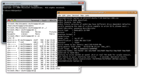
Additionally, the drawbacks I mentioned earlier are based on the archaic command lines as used in the early days of DOS and UNIX. In those days, a single-color, single fixed-width font command line was all that could be displayed on a screen. A lot has changed since then.[1] But improvements in typography and computer displays didn’t change the nature of the CLI; it still involves typing commands by hand into a textbox. However, they do provide a new opportunity for the usability of CLIs to improve, as an interface’s usability is not solely limited to how it’s operated: the app’s graphics, interaction design, and many other factors can affect its perceived usability.
The ways CLIs can be improved with today’s graphics rendering capabilities is evidenced by a fusion between the GUI and the CLI: the keyboard-based app launcher. In essence, keyboard app launchers are command lines ensconced in an application window, which makes it possible to enhance them using established usability principles like contrast, grouping, and simple aesthetic appeal.
This idea has been around for quite a while already. Windows users can use Launchy, Find-And-Run-Robot, and Executor[2], Linux has Gnome-Do, and many Mac users can’t live without Quicksilver, or even simply Apple’s own Spotlight. Mac users have another, relatively new app launcher at their disposal, one that I’ve personally fallen in love with: Alfred.
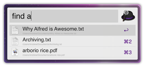
Each of these applications has the same principal function: to open applications or issue system commands using the keyboard whilst staying in the GUI. When invoking Alfred or any other launcher, all it shows is a text box, waiting for you to type something.[3] Usually, just the beginning letter of the application or command is enough for the launcher to show a list of possible matches. There is still syntax to learn, but providing immediate feedback on matches means you don’t stay in the dark whether or not the command you issued was the right one, and the syntax uses natural language rather than single-character commands.
CLI+GUI=Awesome
How is this any better than a graphical app launcher, such as a Start Menu or a Dock? It’s not—not for everyone, anyway. If you’re more comfortable clicking your way through various menus to a specific application, then CLIs will only annoy and cause irritation. But many people like to keep their hands on the keyboard as much as possible. It’s not a matter of right vs. wrong but simply a matter of personal preference—both approaches are able to achieve the same goals.
That said, using a CLI is simply faster. It can be invoked at all times by pressing a shortcut key on the keyboard (e.g., Option+Space for Alfred). There’s no need to move your hand off the keyboard, grab the mouse, move it to an icon on the screen, click it, and then move your hand back to the keyboard. Both hands stay on the keyboard at all times, so there’s a definite speed advantage.
Also, thanks to forgiving code, syntax can be much more liberal than before. Why force a verb-noun model onto your commands, when a noun-verb model conveys the same information just as well? After all, “Open Firefox” means the same thing as “Firefox: Open”.[4] If synonyms for those commands are also supported, learning the syntax becomes a whole lot easier; “Browse” is the same as “List” or “Expand,” and so should trigger the same action. And case-sensitivity is something that should be a thing of the past.
Coupled with the benefits the GUI has to offer, a well-designed, modern CLI is much easier to use than traditional CLIs. Let’s call the fusion of the CLI with the GUI a Graphic Command Line, or GCL.
One example of a GCL’s benefits over traditional CLIs is the ability to display a predictive list of results as the user types, which reduces keystrokes and provides immediate feedback, much like Google Instant. Icons also enhance the usability of GCLs; icons are more recognizable than text labels, so user interactions can be quicker. GCLs can also use typography to indicate relevance and hierarchy through font-size, indentation, and the like.
App launchers like Launchy, Spotlight, and Alfred work on an OS level, so they have no interface into an individual application’s functions. But that doesn’t mean that a GCL implementation can’t be used in applications. For example: you’ve developed a brochure in a publishing application like InDesign, but notice some of the graphics are a bit too transparent. You could edit them all one-by-one by right-clicking, selecting “Edit style,” selecting the transparency control and adjusting it by moving a slider. If you had a GCL on call, you could simply invoke it and type something like “Opacity 100”. Auto-completion would help not having to type every single letter. That would give you a massive speed gain.
Granted, not all software would benefit with an additional GCL. Not all commands are well-suited or even possible to issue via command line, such as Photoshop’s brush tool, or making selections of multiple objects. But that doesn’t mean a GCL couldn’t benefit the app in many other use cases. Microsoft Office applications like Word or Excel, for example, could benefit a lot, in much the same way as in the brochure example. In fact, Excel’s formula bar is already kind of like a GCL. Typing the “=” operand displays predictive text and tips for completing formulas.
Excel isn’t the only product that features a CLI-derivative that we are unaware of. Most applications do: everyone knows that CTRL/Command+S means Save, and CTRL/Command+O means Open. Issuing commands using these key combinations is essentially like using an invisible CLI. But these key combos often don’t give enough feedback. In my personal experience, the only way I know an app received my Save command is the cursor changing to its busy state, but this happens so quickly that it’s barely noticeable. Invoking a GCL to issue a Save command may require more keystrokes, but if the result is better feedback, it’s a good tradeoff.[5]
It’s important to keep in mind GCL’s don’t have to replace the GUI of the application: they can be a complementary mode of interaction, which stay hidden until the user explicitly summons them.
CLIs are not the antithesis of usability. Just as the GUI has, the CLI can evolve, and it’s already happening. Taking inspiration from the GUI and taking into account lessons everything we know about usability today, the command line can be a seriously usable interface, especially as a complement to the “regular” GUI approach of today’s applications. It’s not a matter of which type of interface is better; it’s a matter of making the entire application better. The mouse and keyboard have always existed in peaceful harmony, and that harmony can get even better by close study of their interaction with both user and application.
Footnotes
[1] This old-skool type of CLI is still actively used in today’s OSes. Windows’ Command Prompt, Mac’s Terminal, and Linux’ Console are all remnants of those early days. [back to text]
[2] Humanized’s Enso, co-developed by Mozilla’s current Creative Lead Aza Raskin, kicked the collective asses of these three in terms of usability, but unfortunately has since fallen into development limbo. [back to text]
[3] Many of Alfred’s features and uses can be achieved with the other applications, but for the sake of the article I’m sticking with Alfred for examples. [back to text]
[4] There is a bit of a difference though. In the case of app launchers, the verb-noun model addresses the operating system, whereas the noun-model model addresses the target application. [back to text]
[5] Yes, feedback can also be improved without implementing a CLI. But keep in mind that such a command line won’t be used for just saving and opening. The entire range of functions would be implemented. [back to text]
Max Steenbergen
Max Steenbergen is the resident UI & graphic designer for a Dutch company developing yacht-monitoring software. After graduating professional photography, he stumbled into the UI/UX field which turned out to be the thing he wanted to do all along. Being completely self-taught in the ways of user experience, interfaces and graphics, he's about to follow a 3-year course called Communication & Multimedia Design to gain more knowledge on the subject. He blogs about UI's and UX at https://face-value.tumblr.com Twitter: https://twitter.com/maxsteenbergen


