Save
I keep coming back to this notion that design, in its rawest form, has no boundaries. Thus, sequestering one’s thoughts and ideas to a narrow set of disciplines, such as interaction design or UX design, does a disservice to ideation and inspiration.
Our history as a creative culture is vast, and the people I’m interested in are those who tinker with our world and challenge perception with theories and crazy ideas that often go against conventional wisdom of the day—those who sit on the fringe of possibilities to keep our businesses, communities, lives, world, and imaginations moving forward.
Architect, designer, and living legend Ephraim Goldberg, better know as Frank Gehry, is one such individual. His explorations in light, sound, movement, and materials, as well as his innate ability to understand the psychology of human behavior, set him apart in the fields of architecture and design. To Gehry, the physical form of architecture isn’t really about a physical structure at all, but rather the manifestation of all disciplines of art, design, and technology coming together to solve a problem.
From the organic forms that rise like foreign landscapes above city streets to his unique furniture and product designs, Frank Gehry is known to break away from conventional thought and disrupt the very principles of form and function like no other.
Within the field of architecture, Frank Gehry does the unthinkable; he sets all the rules aside, “going beyond current modalities of structural definition.” Constantly pushing not only his own creativity and understanding, but also those around him. It’s this constant pushing and pulling, collapsing and expanding, aligning and rearranging, as well as his unconventional thinking and use of unconventional materials that transfixed me to the genius of a man that some call the most influential architect of the 20th century.
Three Principles of Being Frank
1. Purpose before presentation
In his work, Gehry typically starts from the inside, working his way outward—a counterintuitive approach that looks at a building’s purpose before its presentation. For instance, he thinks about how sound will impact the audience and the orchestra in a concert hall, how artwork will live and interact within the constructs of museum walls, and how visitors will weave their way through the experience. Yet it’s the presentation of his art through his exterior designs that has garnered his “starchitect” reputation.
“He has the ability to explode familiar geometric volumes and reassemble them in original new forms of unprecedented complexity.”
– Academy of Achievement
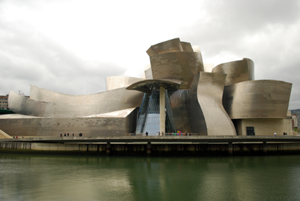
Gehry’s style is commonly referred to as “deconstructivist,” an expansion of the postmodern architectural movement, and is most evident in what is arguably his most famous work to date, the Guggenheim Museum in Bilbao, Spain. This structure—with its glass, limestone, and titanium shell that seems so completely foreign yet lives in such harmony with its urban surroundings—has been hailed as “the greatest building of our time,” by famed architect Philip Johnson. Its undulating forms seamlessly flowing with the river as its organic curves and spiraling peaks are juxtaposed against the mountainous backdrop. It’s a breathtaking work of art. I think Gwyneth Paltrow states it best, “Frank Gehry is an artist. In fact his buildings don’t have to function as buildings they’re so incredible. So innovative.”
Source: Gerard Lazaro
Great design is about art, art that proves itself by revealing its form to us in a vast number of ways. Through a painter’s canvas, a series of musical notes, a photographer’s lens, a poet’s words, a designer’s pixels, or an architect’s sculpture. Great design is also about science and technology, science that advances our thinking and opens up new possibilities. The Guggenheim would not have had the refined elegance and details it does today if it were not for the computer’s ability to manipulate material and help Gehry realize his vision. As John Lasseter says, “The art challenges the technology, and the technology inspires the art.”
At its core, design serves a purpose. It tells a story. It’s a cultural snapshot that lives and breaths in the moment yet strives to be timeless. It’s relevant in the present, yet echoes the past while creating fresh new conversations about the potential for the future. At its inception, the Guggenheim was not about a museum at all, but rather about the revitalization of a dying city—a purpose invisible to most onlookers.
“Architecture is a small piece of this human equation, but for those of us who practice it, we believe in its potential to make a difference, to enlighten and to enrich the human experience, to penetrate the barriers of misunderstanding and provide a beautiful context for life’s drama.”
– Frank Gehry
Design gives us the opportunity to see things in a new way. A failing city suddenly sees hope, a business taking its last breath finds new life, a product on the verge of extinction reveals a new personality, a building sparks our imaginations. It’s really about uncovering the true purpose! For designers, our primary goal is to fully understand the purpose that’s swirling around the problem. Then, and only then, we can begin to build a cohesive experience that, at is core, embodies the solution—an experience that makes sense and connects the user visually, psychologically, and emotionally to something that is meaningful to them.
Rest assured, however, that getting to the end goal—that presentation layer—is truly a craft and a discipline all to its own, one that subjects itself to continuous exploration, critique, and iteration.
2. Explore and iterate
The art of iteration is that perfect marriage between vision and reality. It’s the constant, sometimes subtle and sometimes dramatic, tweaking of one’s design until the purpose is clearly articulated through the visual presentation. And Frank Gehry is the master of “failing your way to success.” It’s the ultimate pushing and pulling and challenging those around you technically and aesthetically to realized that vision.
In an interview, Gehry described the process of finding just the right material that would to be the prominent visual skin for the Guggenheim Museum:
“We made mockups of stainless steel and in the bad light they went dead. Really dead, and I was frustrated by it. We figured out ways to scratch it to get light into it. We dyed it. We did everything. We even stamped on it. I was in LA in my office and I was very frustrated about it and I was rummaging through the materials file and I found this piece of titanium and I looked at it and I said ‘nail it to the telephone pole outside and lets see what happens.’ By some miracle it rained in LA that day and the piece of titanium was golden. This was our eureka moment.”
Gehry went on to say that they spent the next two years in a Pittsburgh steel mill trying to perfect this golden titanium glow. “It’s like making the perfect salad,” he says. “So it’s oil and acid on the rollers and you have to watch it and watch it and watch it. So after many, many iterations we got it. I’ve never been able to get it again. Its one-of-a-kind.”
Over and over again you see this persistent iterative discipline within his works. In his exhaustive explorations of new materials and his highly collaborative critiques, each step in the process reveals new strengths and weaknesses that can be added to, taken away, or left alone—a continuous cycle of exploration, critique, and iteration that constantly challenges the interpretation of the product.
It doesn’t sound like rocket science, this practice of iteration, but it’s tempting to try to find the quick and easy solution as deadlines loom and clients steer us into unsettling waters. Yet if you look at great composers, designers, artists, and scientists who have changed the way we work, play, and interact with our surroundings, there’s a common thread that links them all: the notion that they didn’t get it right the first time.
There continued efforts to improve their craft was a commitment of time. Time to sit with it. Time to challenge it. Time to explore other possibilities. Time to collaborate. Time to disconnect from it. Time to refine it. As Gehry says, “Everything we do is purposeful and deliberate.” Ultimately, iteration is one’s ability to know what to throw away and what to keep in order to move closer to one’s goal.
3. Shape and movement
In Gehry’s work, shape and movement are overarching themes, and if you could break them down in his work it would look something like this:
- Choreography: The overall design presentation that gives us a sense of movement with his use of organic forms.
- Flow: The movement of people in, out, and through the experience.
- Progress: The potential energy of the community or individual to which his creations interact.
So, at a much smaller scale, let’s take a look at how movement fits into this story.
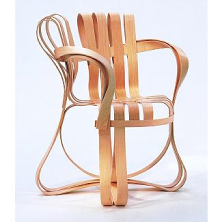
In his bentwood furniture, Gehry again challenges conventional wisdom and produces furniture that seemingly impossibly, yet beautifully, bends and twists in unconventional ways. “The material forms a single continuous idea,” he remarks.
Credit: Design Within Reach
His use of shape draws us immediately into this rhythm where our eyes begin to follow the interwoven network of thin, wooden ribbons. As you sit, cradled within this basket-like chair, your weight is cushioned as the form envelopes you in subtle movements. Sitting in one of the Bentwood pieces is a sudden progress of thought, a shift in understanding that challenges your very own perception of what a chair is—an extension of your body.
Movement is a delicate balance between motion and emotion where the dynamics of shape, color, texture, scale, and touch are crucial elements that come together to inspire and move the soul. When you have that emotional connection with your audience, they’ll be more apt to buy your product, listen to your advice, change their direction, and tell others about their experience. But it’s how you use those aesthetic principles, coupled with a firm purpose and backed up with critique and iteration, that will draw out the desired reaction.
There is no doubt that Frank Gehry lives in a continuous state of curiosity when it comes to the psychology of human beings and the role design plays. How people react to different materials and colors. How light and scale can alter an impression. How geography and weather can change our mood. He challenges us not to reinvent but rather to reinterpret how we look at our world. He didn’t invent the building, but rather challenged our perception of what a building could be. Likewise, he didn’t reinvent the chair; he just made us look at it through a different lens.
So What Does This All Mean from a UX Perspective?
Time and time again we see Frank Gehry, with great intention and thoughtful discipline, building great experiences around the needs of people. He never once started a project with the end goal of pleasing his client; rather, he approaches each engagement with a continuous devotion to the end user.
So if we take the Three Principles of Being Frank:
- purpose before presentation
- explore and iterate
- shape and movement
we begin to see some very foundational UX practices.
1. Purpose before presentation
1. Purpose before Presentation: Always be sensitive to the fact that you’re not designing for your client but rather for your client’s client (the end user). And if you don’t understand their ultimate purpose, their reason for opening up that application or for using that specific device, their daily struggles and pain-points, then the presentation falls short of purpose.
- Challenge: What is the purpose of your current project? Write it down and continuously refer back to it in order to validate critical decisions.
- Challenge: If you haven’t done so already take time to speak with your target audience to get a feel for their challenges, desires, and goals.
2. Explore and Iterate: The art of iteration is being able to take an approach and begin to see it from a different angle.
- Challenge: Interact with your design in “offline” mode. Start by wallpapering your office with wireframes, sketches, and early design studies. Now get out your sharpie, tape, scissors, and Post-It notes.
3. Shape and Movement: The way users are drawn into the experience and progress through the storyline overwhelmingly dictates the experience. Was it enjoyable? Was it simple and intuitive? Did it make me more productive? Was is worth coming back for? Did it help me reach my goal? Was it worth sharing with others?
- Challenge: Find an opportunity to bring in visual cues, gestures, or transitional elements that may help enhance or simplify the users overall experience.
Great experiences inspire conversation, challenge our thinking, and push us beyond the status quo. Frank Gehry is the embodiment of such ideals. His practice of architecture, although outside of the UX field, can be instructive in breaking us out of a daily “pixel pushing” lifestyle and rousing our collective sense of exploration and learning. And it’s my hope that through this article you’ll be inspired to delve into uncharted territories outside our industry, to discover new and exciting approaches from people, products, and events that have influenced the way we view and interact with our world.
Christian Saylor
Christian Saylor is a Senior UX Design Specialist at Universal Mind. He specializes in bridging the gap between functionality and aesthetics, delivering beautiful, effective digital experiences to his work for clients. With 15 years of experience in the interactive design community, he sees the user experience as the touchstone of interaction—the connection point through which a message is heard, a purchase is made, or a thought inspired. His goal is to engage users on a personal level independent of medium, using design to meet them where they are and in ways they’re comfortable with, whether that’s via a mobile or embedded device, a car, a website, or even a well-designed t-shirt.
In order to disconnect with all digital aspects of life Christian loves opening up a good book, spending time with his family and on occasion giving back to the design community by teaching at Kendall College of Art and Design.


