Save
In the beginner’s mind there are many possibilities, in the expert’s mind there are few.
– Shunryu Suzuki
Recently, I was asked for my opinion on a project in which a UX team was trying to represent complex relationships using a specific type of data visualization. I asked whether that type of visualization was the best way to represent the relationships, and why that particular approach had been chosen. The answer: a designer “liked it.” Perhaps not enough foundational thinking had gone into what they were trying to accomplish. I believe UX practitioners, and the growing variety of users working with these kinds of visualizations, need to consider and ask fundamental questions about the full process that determines what data gets collected, stored, processed, and ultimately displayed. Otherwise, they become part of the problem of misinterpreting data rather helping to make it clearer and more meaningful. Sometimes the simplest questions are the most important to ask, especially when designing visualizations for complex data sets.
The Japanese term shoshin, or “beginner’s mind,” describes the mindset of a novice—full of openness, enthusiasm, and fresh perspectives in learning something new. This approach and attitude can help someone who might have a lot of knowledge about a subject, but might be stuck in a cognitive rut. Both expert and novice alike can make important contributions to problem solving and innovation. Beginner’s minds can help make breakthroughs with the help of collaborative data sharing and visualizations. If there is rigidity and unwarranted certainty as we work with data, we may miss key patterns hiding in plain sight. On the other hand, rigor and expertise are necessary to help guide and validate our understanding of what we are looking at. Ideally, we can find optimal combinations of these perspectives. The visualization tools will need to be able to enhance this balance rather than feeding into and reinforcing preconceptions and biases.
Some Beginner’s Questions
Is something important because you measure it, or is it measured because it’s important?
– Seth Godin
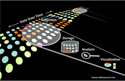
Here are a few types of questions of various kinds of people who work with data, and those who design visualization displays, might consider for each stage of the basic data lifecycle:
- Collection: Why might you want to collect data about something and are you sure you know what you really need? How wide a net should you, and can you, cast? For this net, how fine or coarse should you make the filtering mesh?
- Storage: How are the data stored? Boxes of papers? Computer files? What are the file formats? Are they cleaned or preprocessed before storage? How are they organized, indexed, and arranged?
- Analysis: How much processing do the data undergo? How are they summarized (statistically) and modified? There can be extensive processing with many different outputs or just a superficial perspective with a few simple pie charts or bar graphs showing seasonal sales changes.
- Visualization: How are the charts displayed, formatted, and presented in the context of the full interface? Are the content and format a good match?
Thinking about these kinds of questions, even at the most basic levels, is essential for designing the right tools for the job and making good judgments about the quality of the supporting data.
Data at the Seams
Baseball is ninety percent mental and the other half is physical.
– Yogi Berra
As a broader range of people acquire tools that allow them to directly and effectively engage with data, or at least get a better sense of what’s out there, opportunities for important insights and innovations increase. This opening up enables new intersections to form between areas of knowledge that have long been walled-off and ostensibly unrelated.
Flip Kromer, co-founder of the data marketplace Infochimps, describes this as “data at the seams—a new dataset that arises from the tectonic collision of different disciplines.” Just as geologic plates bump against each other to generate new landmasses (along with earthquakes and tsunamis), so too the overlaps and collisions of data sets will inevitably produce new insights as well as shake seemingly immovable views of the world. “We see a spectrum where people are looking to leverage data outside their own fields such as sociology, biology, and public health.” However, there’s much work to be done on the human interaction and social commodity side of this process. Kromer believes, “It’s appalling how few peer-reviewed research papers provide the data behind their results in any discoverable and usable form. We’re looking to work with journals, and directly with researchers, to improve this.”
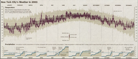
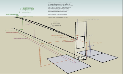
The shifts in perspectives derived from data mashups could apply to everything from the Big Bang to baseball. For example, Kromer says, “Every pitch takes place in a stadium, every stadium (via some openly-available KML files) has a geolocation, and that means you can smash it against the global hourly weather data.” Now we can ask, “What is the change in performance for pitchers over 40 years old when the temperature exceeds 80F and it is overcast?”
Here’s an example of sources for answering that kind of question:
The MLB Game Day data (the pitch-by-pitch trajectory)
Excerpt of Retrosheet instructions
A chart of New York City weather in 2003
Major league baseball produces a dataset giving the trajectory of every pitch, with full game state, for every major-league game of the past several years.
The Visible Citizen
Do you want to know who you are? Don’t ask. Act! Action will delineate and define you.
– Thomas Jefferson
The idea of “beginners mind” could be applied to communities as well. As expanding open source communities and simple visualization tools allow more people to engage with the “social commodity” of data, the interactions between various levels of society will change. While this may seem like a boon to some and deeply disquieting to others, one thing is certain: it will inevitably invite some rethinking of civic involvement. For example, a city manager might think that a citizenry with the ability to flag problems such as potholes and inoperative fire hydrants would make the number of service calls explode, straining resources and busting already tight budgets. That’s an understandable concern, but it does not take into account a dynamic of human nature that might work for the city manager’s benefit. Jennifer Pahlka of Code for America, a non-profit that works with city managers to help them identify projects that can benefit from new technologies and civic engagement, says, “A core part of the program is trying to really understand and help address the pain points of the city managers and the data that can help take the burden off of them…transparency has often been viewed as a ‘gotcha,’ but it can be turned into a problem solving tool.”
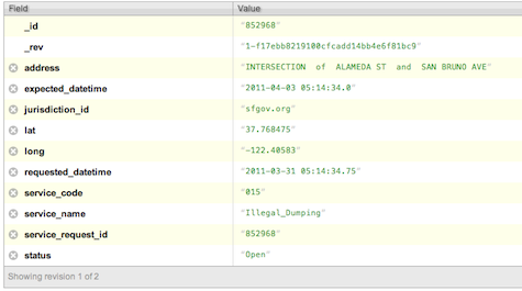
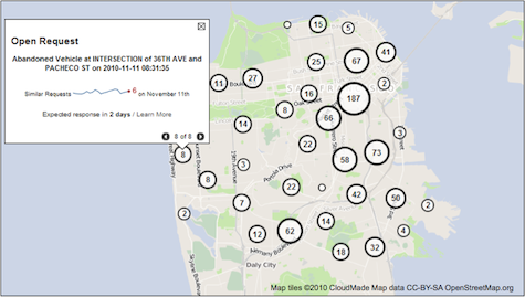
Sometimes, just having a sense that your voice is heard and that your concerns are somehow made visible and will eventually be addressed, can go a long way to helping the situation. Haven’t we all experienced that feeling at some time? By using emerging tools such as Code for America’s Open311 Dashboard that allows citizens to submit data that can be visualized about local, non-emergency issues, the conversation between citizens and local officials can actually improve for all parties and not be a zero-sum game of frustration and avoidance. As data-capture devices, open APIs, and visualizations become more standardized, the exchange of data and its role as a “social commodity” will inevitably grow. In addition to improving transparency and efficiency, Michael Evans, a CfA fellow and project lead for the Open311 Dashboard, wants to visualize and analyze 311 data to set expectations between city managers and citizens.
The more we can approach data with open minds and fresh eyes, the better. That said, it can be very difficult and often pointless to make sense of data without any supporting framework for analysis. The challenges presented by big, complex data are often going to require collaboration, and in these assemblies of people’s skills and talents we’re also going to have a spectrum of beginners. Someone might be a top-flight molecular biologist, but may not have very deep data science skills. Or perhaps they have those, but their communications skills need polishing. The key is to engage and ask even occasionally “obvious” questions. When it comes to working with data, we are all “experts” and “beginners” at something and can all bring something useful to the table. Effective visualizations based upon solid UXD practices can help make this possible.
Hunter Whitney
Hunter Whitney is a consultant, author, and instructor who brings a distinct UX design perspective to data visualization. He has advised corporations, start-ups, government agencies, and NGOs to achieve their goals through a thoughtful, strategic design approach to digital products and services.
Hunter is the author of "Data Insights: New Ways to Visualize and Make Sense of Data”. He was also asked to contribute a chapter in the book, “Designing for Emerging Technologies: UX for Genomics, Robotics, and the Internet of Things”. Additionally, Hunter has written numerous articles covering a range of subjects for various online and print publications including UX Magazine.


