Save
Most everyone in the UX industry is reading or has at least heard of Smashing Magazine, one of the go-to resources for the interactive design, development and, in recent years, UX communities. Since 2006, Smashing has expanded to stay relevant to a constantly changing and evolving set of disciplines, and to practitioners who have an insatiable appetite for knowledge.
Most everyone in the UX industry is reading or has at least heard of Smashing Magazine, one of the go-to resources for the interactive design, development and, in recent years, UX communities. Since 2006, Smashing has expanded to stay relevant to a constantly changing and evolving set of disciplines, and to practitioners who have an insatiable appetite for knowledge.
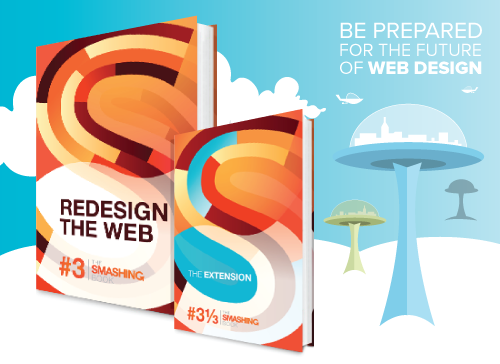
Smashing Magazine has compiled its repository of best practices, theories, and techniques into a series of books. The latest book, Smashing Book #3: Redesign the Web, compiles the latest techniques and best practices through the lens of website redesign. The perspective of redesign might seem somewhat myopic in today’s expansive digital landscape, but it’s quite successful at encompassing a vast array of topics. Although I’ll be focusing on the chapters about UX for this review, I have to say I was very impressed with the chapters that focused on HTML5, CSS, and web development.
Are You Redesigning for the Right Reason?
“Redesigning a website is the most fun Web designers can have with their clothes on.”
The opportunity to do a redesign might feel at first like a chance to right the wrongs of a bad brief, counteract the meddling input from a client, and apply the cool techniques and styles that are constantly emerging. But it’s actually a completely new problem that must be solved through objective reason, research, collaboration, and the UX mantra of, “Test. Test. Test.”
The chapter “The Business Side of Redesign” focuses on strategies that help drive the redesign effort toward accomplishing business objectives instead of just satisfying aesthetic or technical requirements. These strategies condense classic UX techniques such as research, heuristic evaluation, and user interviews, while also illustrating a clear process that emphasizes testing early and often to help insure the business objectives are successfully met. Recommending a collaborative approach to working with stakeholders and clients, this chapter offers solid advice for securing buy-in, developing trust, and selling the many benefits of user testing. For readers who are new to UX techniques, this chapter also provides a comprehensive overview with strategies the reader can leverage to help clients see them more as strategic partners and less as simply implementers.
Going Beyond Design Patterns for a Better Experience
Although there is an extensive amount of information on the Internet regarding best practices for form design, these are typically presented outside the context of the overall user experience. What about the uniqueness of your offering? When do you ask a user to sign up? How much information do you ask them to provide?
Answers to these questions are covered in the chapter “Techniques for Building Better User Experiences,” which focuses on solving specific interaction issues based on context. It also discusses the benefits of good copywriting and even introduces a few experimental techniques. The chapter also explains the importance of designing the overall customer service experience, which includes the experience users have communicating with support staff, reading documentation, and resolving any issues that may arise.
The chapter closes with a stern warning about resisting the temptation of “dark patterns” and how to recognize when you start down one of those slippery slopes. Dark patterns are devious interactions that attempt to trick a user into performing some action, such as clicking on paid links or unknowingly signing up for services. Any respectable UX practitioner is well aware of these, but it’s good to have as a reminder for the next time you meet with your Marketing Director who has “a few new ideas” on the conversion funnel.
Adding a Personality to Your Redesign
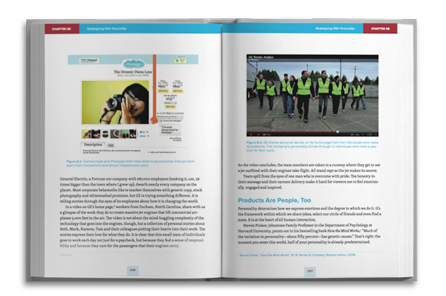
Although it’s not appropriate for all products or services, instilling a site with a unique personality can greatly improve the user experience while developing an emotional bond with customers. That is the focus for the chapter “Redesigning with Personality.”
This chapter takes the concept of personas in an interesting new direction by introducing the design persona. While personas help to define the users of a site, a design persona describes the personality, traits, voice, and visual vocabulary of the site itself. When created at the beginning of a project, a design persona acts as a guide to maintain consistency in the look and voice of your site throughout the redesign process.
The chapter continues by focusing on the importance of voice in copywriting and how it helps establish an emotional connection with the user. These connections are important as they build brand loyalty and establish much longer-term memories.
The Two-Headed Beast That Is Mobile
Although technical in nature, the strategy for deploying an application or site on mobile platforms has a huge impact on the user experience. This is explored in-depth in the chapter “Mobile Considerations in User Experience Design.” This chapter covers the question of whether to deploy a mobile application as web-based or native to the device’s operating system, and the impact that decision has on the user experience.
There is quite a lot of ongoing debate about whether to build applications in a native language such as Objective-C for iOS or to build them on traditional web technologies such as HTML, CSS and JavaScript. Things really get interesting if you bring cross-platform frameworks such as PhoneGap, Unity, or Corona into the equation to create native applications using web technologies. All of these options have direct implications on the user experience and budget. This chapter does a wonderful job explaining all these possibilities while putting them squarely in the focus of the UX.
Although this chapter is somewhat technical, it’s a must-read for any UX practitioner working in the mobile space. It’s critical to understand these techniques to communicate effectively with developers.
Making Your Workflow Future-Friendly
Technologies and screen sizes are always changing, but how often does your design workflow change? Having a workflow that is future-friendly and flexible establishes a process that can more easily adapt to change.
The chapter on “Workflow Redesign: A Future-Friendly Approach” details the advantages of a design workflow that remains adaptive and flexible for future products and technologies. The explanation of this workflow starts by providing guidance on creating a content inventory, developing its structure and presenting that content initially on mobile and then adapting it for other screens. Utilizing UX techniques of wireframing, prototyping, and iterative design this chapter provides a very straightforward process that allows for client review and also user testing while presenting the incredibly valuable step of prototyping to an audience that might be somewhat new to it. This workflow establishes a successful design process that will be adaptable to the many new technologies, devices, and user behaviors of the future.
But Wait, There’s More!
In addition to the Smashing Book #3, Smashing Magazine has published an additional work entitled Smashing Book #3-1/3: The Extension.
This separate publication presents content strategy at a deeper level while exploring the techniques of storytelling in web design. It also includes a review of emerging navigation design trends and patterns with recommendations for their appropriate use. The Extension is capped off with a comprehensive case study of Smashing Magazine’s own website redesign process, starting from what sparked the need to redesign and continuing through the process they followed. This section provides an interesting insight and a practical example of many of the concepts presented in the main book.
Who Should Read These?
Although many of the concepts presented in both of these books may not be earth-shattering for well-versed UX designers, the sum of the book is greater than its parts. Smashing Book #3: Redesign the Web and its extension provide a thorough illustration of the modern interactive landscape that many will find valuable. If you are still somewhat new to UX concepts or have a desire to learn about modern application and website development techniques, reading these books will be time well spent.
Michael Wilson
Michael Wilson is the Creative Technologist for Pure Brand Communications in Denver, Colorado where he leads digital strategy, user experience design and development.
With over 15 years in strategic design and development working with startups, technology companies and advertising agencies, Michael leverages a broad knowledge of user experience and interactive technologies to deliver compelling and effective solutions. Equally adept with markers, Photoshop, git and command line, Michael is the creative bridge between great ideas and getting those great ideas built utilizing the ever-growing list of technologies available today. Michael has worked with W.W. Grainger, Accenture, Herman Miller and locally with Xylem Interactive, Communication Arts and Legwork Studio.
When he’s not trying to convince his wife of the wonders of the Ruby language or the perils of a closed technology ecosystem, you’ll find him in the mountains on his motorcycle perfecting his late apex.


