Business strategists have long preached the advice, “Adapt or die.” Adaptation is happening in the social pond with a user’s social graphs influencing online and offline decisions. A user’s community is more important than ever. Businesses are mining online communities for valuable consumer information that can influence every phase in their go-to-market cycle, from product innovation to fostering repeat purchases. The definitive tome on the social movement, Groundswell: Winning in a World Transformed by Social Technologies, foretells, “Within a few years, a company that doesn’t engage in this sort of activity will look dated… companies that aren’t wired into the groundswell in 2012 will look very 20th century—which is to say, out of touch.”
The transition means that UX designers no longer design “flat sites” or interactions where the company pushes out content, but rather ones that foster rich community interaction and contribution. Designing for a community experience brings new design challenges and solutions for sites to capture the collective creativity of members and, ultimately, rise above other sites.
The seven best practices in this article are based on my work as a senior UX designer at SolutionSet, a marketing agency with a large social business practice. As part of my position, I lead UX strategy for collaboration software, which is heavily focused on successful community design, and I help enable positive and valuable community interactions using expert reviews, stakeholder interviews, persona development, usability testing, and interaction design.
1. Design for Two Goals
At the heart of a vibrant online community are its members. Online communities are organic, and the value of content and interaction come from members and the businesses that host them. Sites can act as a gracious host to foster valuable contributions by designing with two goals in mind: to show the value of the community, and to make it easy to browse and contribute.
A valuable community is one that answers questions, helps solve problems, and generally makes life better for the visitor by taking advantage of helpful information from like-minded people. If you think of planning a trip, chances are you’ll think of the travel community Trip Advisor. Trip Advisor does a good job of showing that it’s a valuable resource because every part of the user experience fulfills their goal: “plan the perfect trip.”
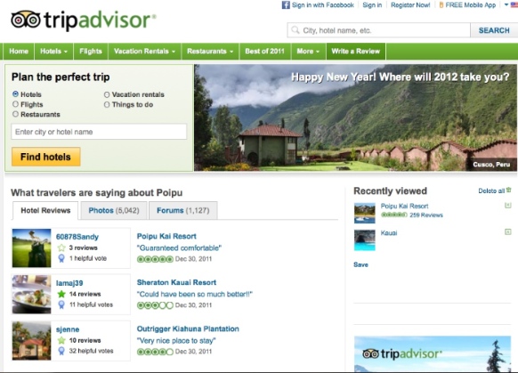
The value of Trip Advisor’s community content is made clear on its homepage through:
- access to a powerful faceted search capability
- member-generated featured content related to various travel
- clear, scannable ratings to show the value of individual pieces of content
- highlighting contributing members
- intelligent information architecture that supports every part of the trip planning process
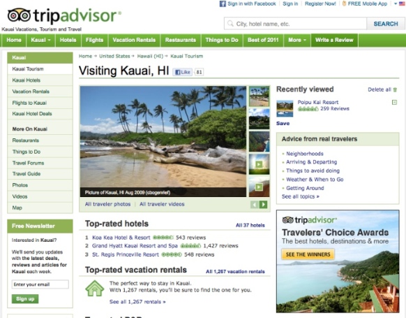
Within the site, there are destination pages with traveler reviews, top-rated places to stay at and see, traveler photos, and links to forum content described as “advice” from other travelers. This user experience gives those wanting a “perfect trip” all the information, navigation, and interactions they need to be able to do so.
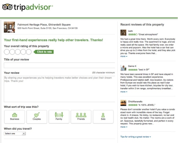
After that perfect trip, a Trip Advisor user can contribute to the community by writing a review of aspects of that trip. There’s a clear call-to-action in the global navigation on each page that invites users to write a review. The contribution flow follows UI design best practices for a guided flow and form design. Plus, it shows secondary content in the right rail to aid the users in providing helpful and well-written reviews.
Trip Advisor is an example of community design that demonstrates through each element of the user experience why a person should become a contributing member of the community. This demonstration of community value builds trust in the information, which in turn helps increase the number of contributions and fosters a vibrant traveler community, building longer-term commitment and connections by members. At the highest level, community design should show value in every part of the user experience and make it easy for members to contribute to the creation of that value through helpful contributions.
2. Accommodate the Spectrum of User Behavior
User behavior on community sites is like a cocktail party: people arrive, see what’s going on and, if it’s worth their while, they stay and engage in conversation. Essentially, they are browsing, searching, and contributing. The user experience of the community needs to accommodate each of these levels of user behavior.
Browsing
Community sites, like any other website, need to facilitate browsing using design tactics that immediately tell the user the purpose of the community and answer the question, “Should I stay?” At first glance, the community visual design should welcome the visitor and communicate the brand. Clear headlines, content previews with links to full posts, thumbnail imagery, meaningful organization of information, faceted search, and calls-to-action can help users browse and engage beyond browsing.
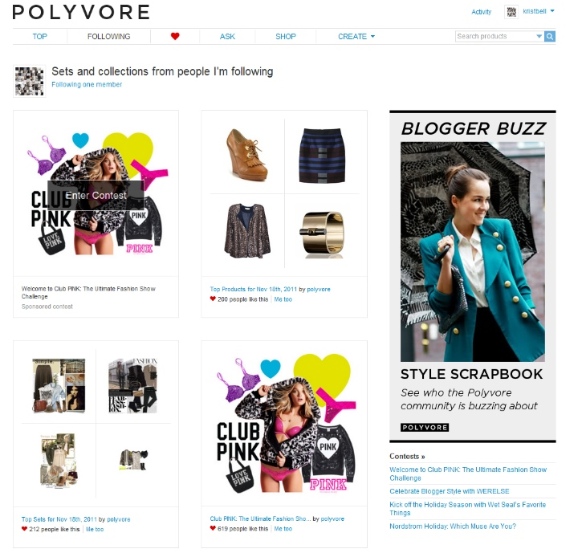
One popular UI paradigm that is very helpful in community design is the activity feed. It’s a comprehensive way to display a running stream of community activity by showing the most recent activity from community members. It is dynamic and “streams” past users, letting them browse what’s most relevant to their needs. Activity feeds are a good entry point into a community site that help users dive in, share content, follow members, and ultimately contribute to the discussion.
Searching
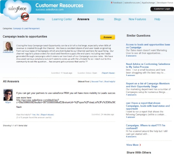
Google has taught us all to search as a default behavior, so community members expect a functioning, helpful, and relevant search tool, one that supports context and relevancy. Community content can come in a variety of forms (forum threads, posts, articles, uploads, images, etc.) and can relate to different topics on the community. Unfortunately, I’ve seen search results that place the burden on the user to wade through all these content types and topics of information to find answers to their questions.
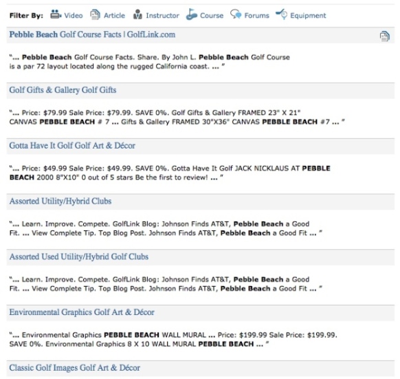
Community search should help users find useful and relevant topics by allowing them to refine faceted searches based on content types, members, topics, recency, and user ratings. For example, a search of a golf community for “Pebble Beach” could return a long list of posts about dream courses, golf tips, pro golfers, and news, like this one on Golflink.com. If a user is simply looking for course information in the community and to read the opinions of members of the community who have played this course, the filters on the search results improve the user experience.
Contributing
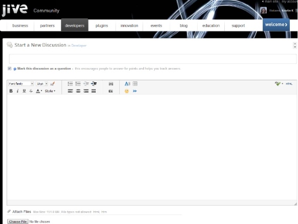
Community contribution depends on the community access. Some communities, especially those requiring paid access, are closed, requiring a login to view content. Others let visitors browse for free, but contribution requires registration. For either scenario, the contribution process must be effortless; otherwise users will leave, thinking it’s not worth the effort. UX designers can use their interaction design skills to ease and encourage the contribution process. This requires strong calls-to-action and prominent buttons plus simple forms that allow a user to input, review, and publish with ease.
Successful communities also embrace rich content contribution, allowing users to personalize their contributions through tagging, emoticons, colors, photos, and videos. The design of the contribution form needs to allow for these options, whether the designer agrees with them or not (e.g., emoticons).
3. A Welcoming Homepage, Before and After Sign-In
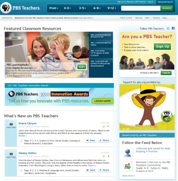
There are two states a of an online community homepage: prior to and after signing in. Unlike typical websites, these homepage states do not have to include the same content, but they do need to have the same visual design for consistency. Prior to signing in, the homepage needs to show the breadth and depth of the content users can expect, supporting the browsing behavior. Since communities thrive on active user interaction, a pre-sign-in homepage needs to have a prominent call-to-action button to invite users into the community, either by signing in or through contributing.
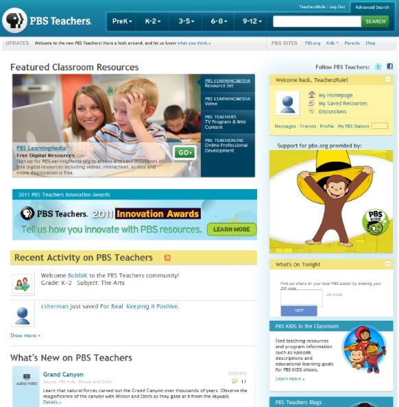
Once the user is signed in, the homepage can show a community activity feed, personalized links, top content, search, and any featured content curated by the company or community. Business managers are often tempted to put everything on the homepage, but clutter makes the user feel overwhelmed. It’s necessary to guide the user with clear messaging and direction by prioritizing content and links based on user and organization goals.
When I do an expert review of a community, I start with the home page and ask: Is it completely clear what a user can do on this home page? If the purpose of the community and how a user can interact with it aren’t clear at first glance, I question whether the home page—the starting point of the community—meets the community goals. I usually recommend the home page be revised to more clearly demonstrate the value of the community.
A personal dashboard is one way that a community home page can be welcoming and help the user browse and contribute to the community. Typical dashboard elements include an activity feed on topics of interest and links to the user’s own contributions near calls to action for contribution. This is an excellent way to personalize a community experience for communities with frequent, repeat visitors. It’s important to remember that a community should have one home page; when users click “Home,” they should be consistently returned to one page, either the community home page or a dashboard focused on that member’s contributions.
4. A Broad and Flexible Information Architecture
Communities are made up of a set of members and content that is constantly changing. A hierarchical site taxonomy and information architecture create a sense of place for the user, but content and contributions are typically not tied to one topic, so the information architecture needs to be flexible. Community information architecture (IA) should account for the big buckets—the high-level categories where all discussion, curation, and collection can take place in a manner that makes sense for the community. Then, at sub-category level, tagging, recency, and ratings can help surface the most valuable content within the category.
A community site’s nomenclature should be consistent with the user’s terminology and not the company’s. Communities can assign their own nomenclature with tagging and categorization that evolve with as discussions in the community grow.
Since the community is a collective of people, a “members” category should be part of the top-level navigation as a place where people can learn about each other and manage their own member profiles. Depending on the topic and realm of the community, consider describing members in more specific terms. For example, a golf community can have a member’s category called “Golfers” and a software community can have a category called “Developers.”
5. Navigation That Works Overtime
Users arrive at the community in a variety of ways: search engine queries, Facebook, LinkedIn, emails, on-site links, off-site links, etc. This means the navigation needs to work hard to consider the user “landing” at multiple places, be it a single post, the home page, or the last post of a discussion thread. The UX designer needs dust off navigation best practices to ensure users can see where they are in the global navigation and what they can do next. Breadcrumbs are essential, but they can’t be relied on for all the heavy lifting; it takes a combination of navigational cues to help a user get a sense of place.
Since a community site’s IA is fluid, placement of related links and top content on the bottom of the page and in the right column of the page can aid a user in understanding context and discovering new content. Tags are organic navigation that are assigned by the contributors of content and they are an additional link in the UI to show the topic of the content. On article pages, the tags should be easily seen and clicked, adding to the user’s sense of place and context.
6. What’s Good for the Community Is Good for Me
Facebook measures the value of community interaction with “likes.” They are valuable because of their inherent social quality, making the user think, “My friends like this, so I probably will, too.” In the voluminous stream of content, this type of social curation helps users find interesting and relevant information. Community functionality should accommodate this model of curation, and UX designers can make it easy for users to recommend content with simple buttons similar to Facebook’s “like” button. A popular convention is “mark this answer as helpful” or “thanks.” The name of this button should be chosen to fit the specific nature of the community and identity of its members.
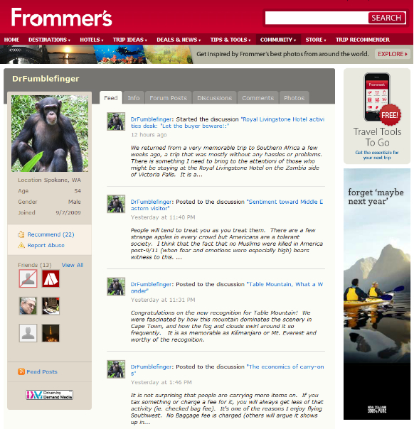
7. Cult of Personality: User Profiles
A community is made up of members and their contributions, so it is essential for a community to provide user profiles that showcase members and their contributions. UX designers can think of a user profile in terms of a member’s online identity. Profile pages should show a snapshot of the member in a meaningful way that gives community members a sense of members’ online personas and how they have contributed. What to show on the profile depends on the community. Community designers can survey domain experts and community members to discover what’s important to their offline identities and then find creative ways for them to share that information online.
When thinking about user profile design, I try to understand what artifacts of identity and credibility describe a member’s personality and status in the community. For sports communities, it’s team affiliations. For golf communities, it’s courses played. For travel communities, it’s places visited. Across all communities, excepting where there are privacy concerns, a photo or avatar of the community member conveys a powerful understanding of the human behind the username. The member’s degree of community engagement can be conveyed using badges awarded for various contribution levels, listings of the member’s activity showing the frequency and value of past contributions, and information about the member’s social connections within the community site.
From a contribution perspective, calls-to-action and profile completeness indicators can be used to encourage users to flesh out their profiles and community identities, thus enriching the community more broadly.
UX designers also need to consider that user profiles will look different depending on who is viewing the profile. For example:
- Looking at one’s own profile: Edit and settings buttons should be available in context, and there should be an easy way to access one’s own contributions.
- Looking at another’s profile: View-only state with and contact/follow buttons.
- Anonymous: This depends wholly on the community’s level of privacy and permissions. Common view-only states include calls-to-action to join the community or login to see content.
Conclusion
Community design challenges organizations because the site design is not the end, it’s the means to the end. A community site is a structure that demonstrates why the community is worth joining, and helps visitors join and to continue to contribute. The community will grow into a valuable resource for current and future members if the user experience allows it to. Community stakeholders and designers can use these best practices to ensure that the site is that valuable and helpful structure.