Save
Experience designers use a wide variety of techniques to represent the interactions between individuals, organizations, and systems. Personas are the go-to tool to aggregate a target audience’s traits, intentions, needs, and behaviors; however, they often leave out one of the most critical elements of interaction design: time. As rich as these snapshots may be, people’s needs and even their traits may change over time, and personas start to burst at the seams when it comes to illustrating a full story of engagement.
To show personas moving through time, we traditionally use task flows, scenarios, and storyboards. Often these models focus on limited experiences or specific interactions between user and system during a fairly short period of time. While interaction design is still a major part of the experience design field, we are currently embroiled in a paradigm shift from systems of transaction to systems of engagement and personal fulfillment that span longer timeframes and numerous channels.
Naturally, UX professionals are adapting traditional techniques and creating new ones to express this greater scope of experience. Many of these activities and deliverables fall into a category we call journey modeling.
What is Journey Modeling?
Journey modeling is the process of illustrating a complete story centered on the relationship that unfolds over time between an individual and a system, service, product, brand, or organization. Through journey modeling, we describe what an individual thinks, feels, says, and does over time, and how these actions and reactions change based on the person’s interactions with the organization and factors that may be beyond the organization’s control. By playing out a user’s experience over time, we build an understanding of connectedness and causality, observing when various forces intersect and alter a person’s emotions, opinions, and actions.
A journey may cover a brief period of time, such as a purchasing experience or a hospital stay, but where journey modeling really shines is in illustrating long-term relationships. At Mad*Pow, we have used them to chronicle nine months of decision-making throughout pregnancy, a year of engagement with a health behavior change platform, and health insurance customer experience across many years.
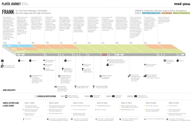
Journey model of the ‘player’ of a health behavior change game.
Sometimes we use journey modeling to examine the present with a critical eye, highlighting pain points and opportunities. Other times it serves as a visioning exercise that helps us explore answers to the “what ifs” that come up throughout research and initial steps of design. You can also model and compare different perspectives, such as an idealized story versus the present day.
Prose-driven journey model demonstrating before and after, and referencing sections of a larger experience strategy report.
What Does a Journey Model Look Like?
This is the hardest question to answer because (of course) it depends.
Ultimately, the form the actual model takes is dependent on the client, and on the type of product and how it will be used. Clients might want a 5’ by 5’ story mounted on foam core to display in the boardroom, or they might want something digital that is easy to consume, share, and modify. Sometimes journeys are portrayed using visual maps in a very “point a to point b” illustration of various touchpoints along the path. Other times they are more like a story—written, audio, or video.
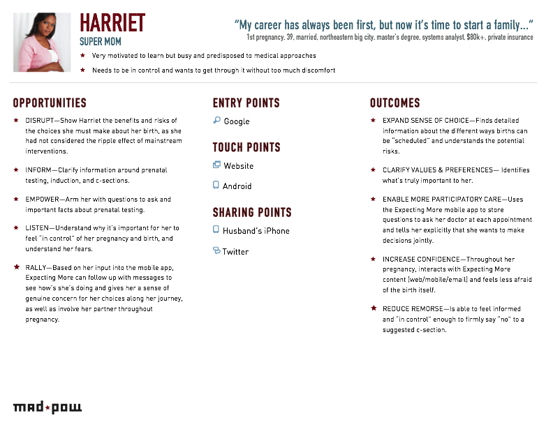
Original design for the pregnancy journey model. We changed course from a long-scroll digital piece created in Illustrator to 8.5×11 pages in Word so that our clients could print easily and be more involved in editing.
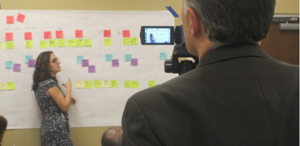
They can be as high- or low-fidelity as you like, and as designer-driven or collaborative as works for your team. We’ve had great success running workshops with clients to map out a vision for their future customer experience, particularly when there is a research-based present-day journey to show in the beginning of the session that helps them “feel the pain” and really empathize with their customers. The models created in these workshops generally take the form of Post-Its and other materials on butcher paper, but we’ve also created highly polished journey models as final deliverables.
What’s the Value of Journey Modeling?
Strategically, journey modeling is an incredibly useful conversation tool for summarizing research, highlighting and prioritizing opportunities, and getting true buy-in from stakeholders.
That last function is extremely important in our work as experience designers. We’ve found that many stakeholders have an understanding of their separate areas of responsibility and how they fit into the bigger organizational picture, but have never seen all of the components illustrated together in such detail from the customer perspective. Through journey modeling, it is possible to see the big picture of how different service touchpoints fit into a person’s life, and where there might be inconsistencies in an existing system. It’s not about creating identical experiences at each touchpoint; it’s about optimizing and connecting communications to deliver a valuable brand experience for the customer across the right channels. The bottom line for the business is that at every touchpoint, the customer’s experience affects the success or failure of the organization.
Seeing or participating in the creation of a journey model is often an “aha” moment for key stakeholders, and a critical milestone to make sure everyone is on the same page before moving forward into design.
Journey modeling is also a form of design exploration that helps to synthesize idea prototypes, which can then be vetted with stakeholders and users for feasibility and desirability. Rather than working within organizational silos or along the lines of established channels, journey models allow us to design directly within the context of user interactions, attitudes, needs, and emotional states.
Creating a Journey Model
There is no silver bullet template or approach for modeling journeys, but there is a reasonably universal process you can follow.
Step 1: Gather your content
The best journey models are grounded in research: interviews, ethnographic observation, contextual inquiry, surveys, and other forms of qualitative and quantitative research. The core research questions should be:
- How does this system, service, product, brand, or organization impact people’s lives?
- How could it impact people in the future?
Unfortunately, the reality is that despite our best efforts, not every client can be convinced to invest in quality research before they understand the problems that research would help them discover (an all-too-common UX Catch-22). As a result, it’s sometimes necessary to do a little guesswork and guerilla research to generate enough interest in the problem to launch a full-scale project. Are you only able to talk with business stakeholders and not actual customers? Fine! Get their opinions, and start modeling something compelling that will inspire them to do customer research to get the details right. You can certainly start journey modeling with only insider insight, but you should never let it be called “finished” without the voice of actual customers who are traveling their own version of that journey.
However you gather your content, these are the elements to look for:
- Personas or real individuals to serve as your main characters
- Supporting characters
- Needs, goals, and motivations
- Thoughts, feelings, opinions, expectations, and pain points
- Physical and information objects
- Actions, interactions, and touchpoints (instances of service)
- Channels (where service takes place), physical place, and other forms of context
- Timeframes, and how all of the above play out and change over time
All of these elements (and possibly others) are the meat of your story that will help you communicate opportunities, solutions, and the ways in which you are impacting or could impact people’s lives.
Step 2: Realign with your project goals
With all this content, it’s now time to take a step back and prioritize based on project needs. What elements will best communicate the story you discovered or are envisioning? What level of detail is appropriate for your stakeholders? How much background will they need? Will it be a standalone piece, or interwoven with other documentation? Is the project actually a good fit for journey modeling? This is perhaps the most important step when creating a polished deliverable, and you’ll likely bounce back here a few times from Step 3.
Step 3: Design and iterate
The final step is to figure out how to string together a compelling story. It will often take a few iterations to find the right approach, but don’t get discouraged. In workshop settings, it’s important to provide participants with a recommended format and set of materials, but also give them the flexibility to communicate in the best way to honor the story they wish to tell.
There are a few formats for journey models that are emerging as common standards, but don’t force your journey models into a preformed template that doesn’t work. You don’t always have to reinvent the wheel, of course, but if you have the time (and budget), take a chance and try designing something new. Take a look at our collection of inspiration, and leave a comment on this article if you have ideas to add.
It’s easy to get caught up in creating a beautiful diagram or cramming all your wonderful research insights into a document, so be mindful of the basic principles of good deliverable design, and run a sanity check every once in a while. A quality journey model should be:
Valuable: relevant to the goals of the project and the organization, delivering clear, usable insights.
Believable: grounded in research and reason. Use them carefully to test prototype concepts with stakeholders, and know when to let go of ideas that just aren’t realistic.
Useful: appropriate format and level of detail. There’s no use handing stakeholders a huge poster to put on the wall when they’d much prefer letter-sized maps that they can print and travel with easily. Usefulness also refers to the long-term value of the journey model as a stand-alone deliverable, part of broader strategy documentation, or a flexible model to be updated over time.
Elegant: pretty with a purpose! If the journey map is a polished deliverable, its elegance is partly aesthetic; you have to gain the attention and respect of your stakeholders. Use visual treatments with care, and don’t underestimate the power of written and visual storytelling to communicate the main character’s experience over the course of his or her journey. Polished or not, the story should be told elegantly, whether through strong information design, writing, or presentation.
The Journey Forward
In her Interaction12 keynote, Intel anthropologist Genevieve Bell challenged designers to shift their perspective on the products and systems they create: “What’s it going to take to imagine this as a relationship instead of an interaction?”
Journey models are emerging as a welcome and valuable refresh of some old and new tools in our UX arsenal. They are not just another deliverable for your checklist; they’re a valuable method for digging deep into problems of long-term engagement, cultivating empathy, and establishing a problem space in which to generate and test ideas. Their output can serve as a backbone for strategic recommendations and more tactical initiatives. Form and function can vary widely depending on the project and stakeholder needs, but at their core, journey models are stories that focus on the meaningful relationships between individuals and organizations, and highlight opportunities to build a better future.
As a Lego-loving child, Jamie dreamed of being an architect. Now, instead of houses, she creates digital structures to support health behavior change, research and decision making, consumer engagement, and more. As an Experience Designer for Mad*Pow in Boston, Jamie looks to change the world through research-driven design. Some of her clients include the Informed Medical Decisions Foundation, Healthrageous, WellPoint, New England Journal of Medicine, and Aetna.
Prior to joining Mad*Pow, she built her research and design chops in Philadelphia working at Digitas Health and Messagefirst, addressing client needs in healthcare, technology and higher education. She holds a B.S. in Information Systems and an M.S. in Library and Information Science from Drexel University. She occasionally tosses around the idea of getting a PhD, but for now work at Mad*Pow is more than educational enough.
When not busy doing design, she can be found thinking, presenting, and chatting about it locally at Boston UPA and Boston CHI, and globally at the IA Summit, Interaction, and other conferences.
Megan Grocki
Megan bakes the best brownies on the planet. The end.
Actually, that's just the beginning. Sassy, smiling and straightforward, Megan’s a senior member of Mad*Pow’s experience design team.
With over 15 years of experience in research and experience design, Megan specializes in helping clients discover the attitudes, intents and behaviors of their users and understand what is truly important to them. By being the ultimate user advocate, she is able to improve the organization and presentation of content and refine the messaging in a way that rings true with the audience(s) and meets business goals.
She has worked with clients including Bank of America, Aetna, Constant Contact and McKesson to sharpen their understanding of their audiences and design new digital experiences steeped in rigorous research and design thinking. She has been able to flex her marketing strategy muscles, creating new brand identities and developing clear and meaningful strategies for evolving brands.
Until recently, Megan was also the mastermind behind Mad*Pow’s marketing strategy. From evaluating market conditions to directing digital marketing and social media strategies, Megan guided the marketing direction for all our events and promotional activities while collaborating with sales to support them in generating maximum buzz. Now that she has passed the Marketing torch, she is happy to wear just one hat as Experience Design Director.
Prior to Mad*Pow, Megan served as marketing manager with Momenta as well as senior product manager and user interface manager at Bottomline Technologies. Megan holds a BA from the University of New Hampshire and is always seeking to continue her education by attending conferences, seminars and reading her weight in UX books.
She is a founding member of the NHUPA. Her speaking gigs have included Refresh Boston, the 2010 IA Summit in Phoenix, the 2010 Usability Professionals' Association International conference in Munich, 2010 UPA Boston and Interaction11 in Boulder. In addition she served as IxDA’s Interaction12 conference program director.
A die-hard tennis fan, Megan enjoys traveling the world, splashing in the waves at her favorite local beach and coffee shop-hopping around town with her husband and two young children.
Megan is on Twitter at @megangrocki.


