Nowadays, content must be developed to be viewed and interacted with across a range of screen sizes, from smartphones to the widest flat-screens. With devices becoming increasingly abundant in our daily lives, people are shifting from device to device, and they expect their products and services to shift with them. Regardless of what size screen your content is on, people expect a delightful experience across devices.
Here is a list of popular resolutions on various devices:
| Resolution | Devices |
|---|---|
| 800 x 480 | Samsung Galaxy S Vibrant
Nexus One/ HTC Incredible HTC EVO/ HTC Desire HD Windows Phone 7 |
| 854 x 480 | Droid/ Droid 2
Droid X |
| 480 x 320 | iPhone 3GS and Lower |
| 960 x 640 | iPhone4 |
| 1024 x 768 | iPad
PC |
| 1024 x 600 | Galaxy Tab
Blackberry Playbook |
| 1920 x 1080 | PC
TV |
Designing for multiple devices involves much more that simply resizing content to display on different screens. It must be truly viewable and usable across screens. We have to determine how our content changes from one screen to the next; more specifically, we have to control how this content gets resized, even to the extreme of accounting for both portrait and landscape orientations. To do this, it’s necessary to develop an effective strategy to target a diverse range of devices and screen sizes.
Different Devices, Different Experiences
Every device does something different. Each device is better at doing certain things, and worse at doing others. So, not all features make sense on all devices. You need to identify how the user will use the product in different contexts. Mobile users want different things from your product than desktop users. As an example, consider a website about movies currently in theatre. On the desktop, users want an immersive experience including trailers and production details. On mobile, they focus on movie listings, nearest theatres, and showtimes. We need to maximize the user experience for all devices so users believe that the application was actually designed for their devices instead of being simply stretched to fit the screen on their devices.
Understand Context of Use
Users consume content from multiple devices throughout the day. It’s important to understand the context in which these devices are being used to craft experiences that specifically suit them. You need to provide the right content, on the right device, at the right time.
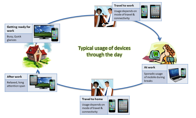
It’s also important to understand how the usage of different devices overlaps and how they complement each other. Here are some interesting findings from a Nielson survey of time spent on different devices for daily tasks:
- 70% of tablet owners and 68% of smartphone owners said they use their devices while watching TV.
- Tablets and TVs complement each other very well; 30% users used tablets for browsing the Web or accessing TV-related apps while watching TV. Only 20% of smartphone owners did the same.
Define Device Groups
Although there’s a myriad of devices with varying screen sizes out there, it’s possible to manage this diversity by defining device groups based the tasks the user is likely to focus on, and by device capabilities.
Here’s an example of device width groupings:
- Featurephones: 128, 160, 176, 220, 240
- Smartphones: 320, 480
- Tablets: 800
- PC: 1024+
- TV: 1600+
Note: This is an arbitrary example; create groups based on your user research.
Identify User Goals for Different Groups
Smartphones are personal; they are used mostly for micro-tasks, acting on locally available info, entertainment, and social sharing. Tablets are shared; they are considered an alternate to laptops and are primarily used for content consumption. Adapt the experience for each context of use.
You need to identify the different scenarios in which your product will be used across the groups of devices, and design an experience suitable for each of those scenarios. For example, to create a good mobile application, keep it simple by focusing on core functions and the activities mobile users require.
Break down the basic interactions and functionality offered by your application, and make combinations suited to each different device group. The information and UI design of each variation should reflect this, with elements repositioned or reorganized accordingly. If you’re designing for mobile, reorder the categories by priority to best suit the needs of the mobile audience. For example, Google’s mobile website focuses on different items in the navigation than in their desktop website.
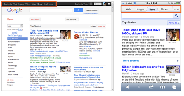
Google News website on PC and mobile
Evernote is a popular note-taking product that’s available on multiple devices. Its PC and tablet versions are optimized for content consumption whereas the smartphone versions are optimized for photo and audio input, and notes are location-tagged.
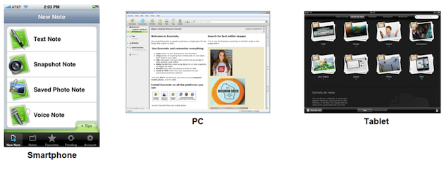
Evernote app on different platforms
Create a Scalable Reference Design for Each Group
Once you’ve identified the features to be supported for each device type group, create a reference design that contains the essential components of the application that will scale across the range of screen sizes across the group of devices by defining a set of principles, patterns and guidelines. Make sure to address different orientations.
Design for Mobile First
Usually applications are designed for PC or desktop and then ported to mobile. However, it’s better to design for mobile first as it has the most constraints and will help you focus.
When designing for PC, we face the “kitchen sink” problem where lots of things get added to the product, especially when multiple stakeholders are involved. This is because adding things is relatively easy when you have a lot of real estate. But when you design for mobile first, it forces you to decide what matters most, giving you practice in applying the same process of judiciousness to the other versions of the product, be it on PC, tablet, or TV.
Luke Wroblewski, who wrote the book Mobile First, discusses some of the ways designing for mobile first can help mitigate some of the thorny issues that have plagued designers for years.
Synchronize
Based on usage scenarios, you might want to ensure that the content consumption on each device is in sync. For example, if you started reading an eBook on your smartphone, when you shift to the tablet you should be taken back to the point where you left off on the smartphone. Amazon’s Kindle handles synchronization of multiple devices very well.
Get the Details Right
Designing for multiple devices involves a lot of complexity. Sweat it out to get the details right to create quality experiences for each group.
You need to understand the strengths and weaknesses of each device and how can be used to design an experience suited for the specific device. Consider such variables as user posture (stationary, mobile, leaning back, leaning forward), device input capabilities, device display capabilities, and navigation style while defining the scenarios in which user may be using the product. Depending on the scenarios, it may be beneficial to design two or three different versions of the product.
Mobile Web vs. Native App
The easiest way to reach multiple devices is mobile web; however, mobile web and native apps offer different benefits and serve different audiences. You need to answer a number of questions:
- What experience does your product need to deliver?
- What you are trying to achieve?
- What is your business model?
- What is your budget?
- Who is your target?
- Et cetera.
Weigh the pros and cons of both the mediums and decide what works best for you.
| Mobile Web | Native App |
|---|---|
| Reach a larger audience
The majority of users don’t own a smartphone and don’t access app stores. They are more likely to use a mobile browser and access the Internet from their mobile phones. The barriers to accessing a site via a browser are lower than those to downloading an app, even for Smartphone owners Lower cost and time to market The biggest benefit mobile web offers is that you design once and it’ll run on all mobile platforms with minimal tweaking. The fragmented nature of the mobile industry means that porting apps to different platform environments costs money, especially when you include maintenance and marketing costs. Instant updates Whatever changes you make become available instantly to users. No censor Mobile web does not censor content and allows you to publish when you want and what you want. Low barrier to entry and no revenue share Mobile web has no entry costs, and you get to keep 100% of the revenue. |
Connectivity
Productivity in a browser depends on constant connectivity, and in the real world data connections can be transient. Native apps can be built to interact with users even if offline. Device-based caching Native apps can cache data persistently, reducing data usage and providing faster access to the data. Richer experience Native apps can tap into the device’s functions and features, providing richer experience and seamless integration with native features such as camera, address book, etc. Users prefer an app that feels like it belongs on the phone rather than a Web app that seems shoehorned into the device. Immersive experiences Immersive apps like games need a lot more horsepower to deliver rich, polished experiences, which the native apps can achieve easily. Stronger engagement Native apps currently present better opportunities for stronger engagement, not only because they offer richer services and experiences, but also because they place the brand icon on the user’s home screen. Discoverability Native apps can be found easily in an app store. It is easier to build great marketing around apps than around mobile web links. |
For further reading on this topic, check out these posts from Mobiletech, Forbes and CMSWire.
Conclusion
When designing for multiple devices, the best strategy is to keep the end-user experience in mind. Ensure that on all devices, users can complete their task with ease and efficiency, and the experience is tuned to their expectations from that device.