Outside the box:
Contemporary web design is a tyranny of boxes. Apps and websites are laid out as a series of obedient little rectangles queuing up top to bottom on the screen. This is understandable. The software for design and prototyping has a bias towards boxes. The frameworks that facilitate responsive design have a bias towards boxes. HTML and CSS retain some of their frame-based bias towards boxes. Even our rectangular screens conspire to create boxy layouts.
And what’s so bad about boxes?
Nothing. Responsive web design, abandoning the tedium of the drop-down menu, needed a new organizing principle, something that could make the user experience simple and intuitive. Boxes brought order to the chaos. Clients only had to say “gimme one of those long scroll websites” and the ordered queue of colored rectangles almost designed itself.
Boxes are a perfectly acceptable way to contain the messiness of text, image and video on a two-dimensional screen. Consider the case of Instagram, a user experience that manages to make an infinity of images viewable and editable on a smartphone screen.
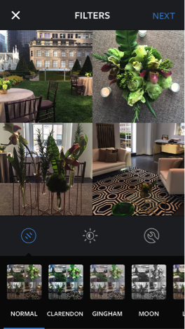
Instagram draws attention to the excellence of its user experience precisely because we are conscious of the difficulty of the task. A smartphone screen would seem entirely sub-optimal for photography, yet users flock to Instagram in ever-increasing numbers.
But what started, as a way of organizing unruly content quickly became a reflexive response to every web design challenge. Boxes have become our unexamined assumption. I realized how much this way of thinking had infected my firm’s work during a recent project to design the digital version of Wiley’s Architectural Graphic Standards. The content in this essential reference work for architects takes a variety of forms: text blocks, images, graphs, diagrams, lists and charts. During early phases of the design process, my team and I kept searching for a typology of boxes that would govern all the content types. Nothing worked. It was only when one member of the design team abandoned the boxes and allowed the content to float that the design came to life, and it became possible for users navigate the content in a natural way.
This experience reminded me of the quote from the German philosopher Novalis:
“In a work of art, chaos must shimmer through the veil of order.”
This sentiment is also applicable to user experience. If we attempt to completely mask the chaos of content with an imposed order, the content is no longer useful. The images are too small. The descriptions are too brief. The sharp edges and round pegs that make the content worth consuming fade into their confining rectangles.
But if we do not at least suggest a veil of order through consistent design and navigation, the content becomes unable to navigate. Users are submerged in randomness when they seek specificity. The simple act of scrolling becomes a fraught decision. Already, we provide our users with arrows and instructions to “scroll down” lest the parallax of shifting images leaves the user confused. Without navigational best practices, websites have all the intuitive practicality of Italian urban planning. Venice is beautiful, but that chaos shimmers a bit too brightly.
Considering user experience as a balance between chaos and order allows us to see the UX debates of the past in proper context. The Apple skeumorphism controversy of 2013 wasn’t really about wood grains. Users were complaining because skeumorphic design used heavy-handed anachronisms to mask innovation. An excess of order can imply contempt for the adaptability of the user. We want to feel the innovation, even if it made us slightly uncomfortable. Technology is most engaging when mastery is just barely achievable. If ease of use were the only goal, our phones would look like my toddler’s Leapfrog touch screen.
The boxes of contemporary web design may be marching towards their own obsolescence. Now that more of our projects integrate elements of the Internet of Things (IoT), we find that the need to integrate a three dimensional reality challenges established “best practice.” The Z-axis can be a real pain in the neck. Colored rectangles lose their utility as the contents of the Internet gradually transform from text, image and video towards three-dimensional models, augmented reality mappings and virtual reality immersive experiences.
The rise of the mobile Internet introduced some necessary chaos into our practice of user experience. That was a comparatively minor change. When a sizable minority of the content of the Internet becomes three dimensional, we may find ourselves pining for this era of order, however monotonous. Consider the fate of something so basic and fundamental as scrolling; after all, a mouse can’t pinch.
User experience is a discipline precisely because we must recognize the need to be simultaneously inside and outside of boxes. We need to allow the content to define the structure and allow the accepted norms of user experience to confine the content. In the balance between chaos and order, we may have become over-focused on order. This is natural. Successful user experience depends on a consistent and coherent set of rules. But innovation will provide a constant source of fresh chaos. Let it shimmer.