Save
For years, I’ve heard some variation of the following lament from clients, collaborators, and friends with startups:
“There’s so many use cases we could solve for, but every user we talk to wants something different, and we just don’t know which ones to focus on.”
or,
“We’ve designed for all the common and important user needs and now we’ve hit a ceiling. How do we grow without bloating our product with minor features?”
Both statements describe what we can call the long-tail problem. It’s very common—I’ve seen the long-tail problem at tiny two-person startups and at Big Tech corporations with billions of users.
In the long-tail problem, all the opportunities in front of you live on the long tail of user needs. Collectively they represent many users, but individually none of them appear important enough to invest time or resources in.
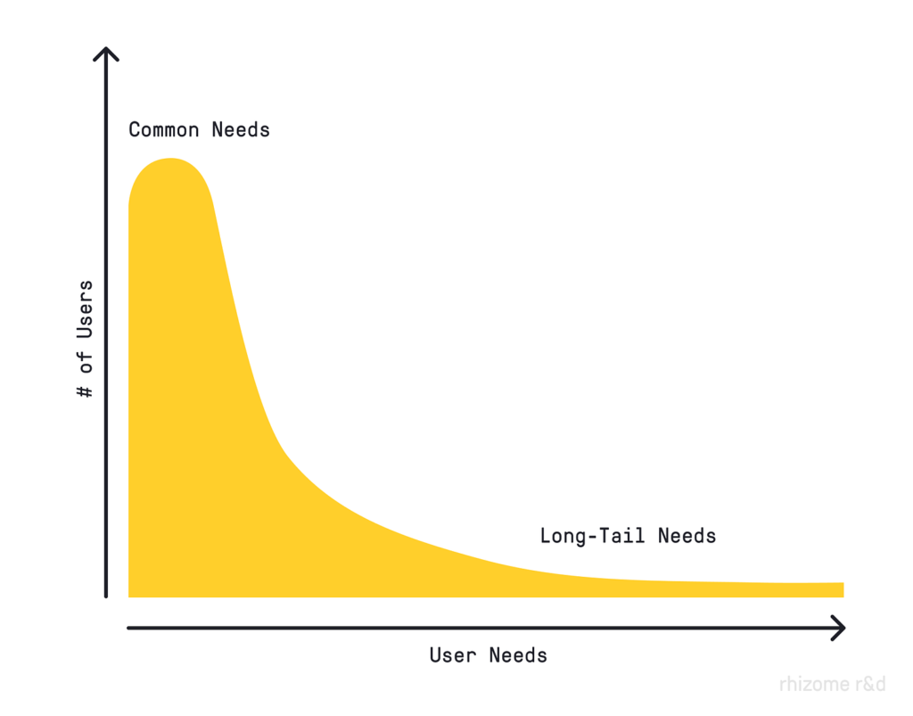
Common needs represent large markets, but the needs are largely met, and competition between solutions is fierce. Long-tail needs are often unmet and come with much less competition, but individually represent markets too small to justify the expense of development.
Let’s look at some example user needs from the world of digital mapping.
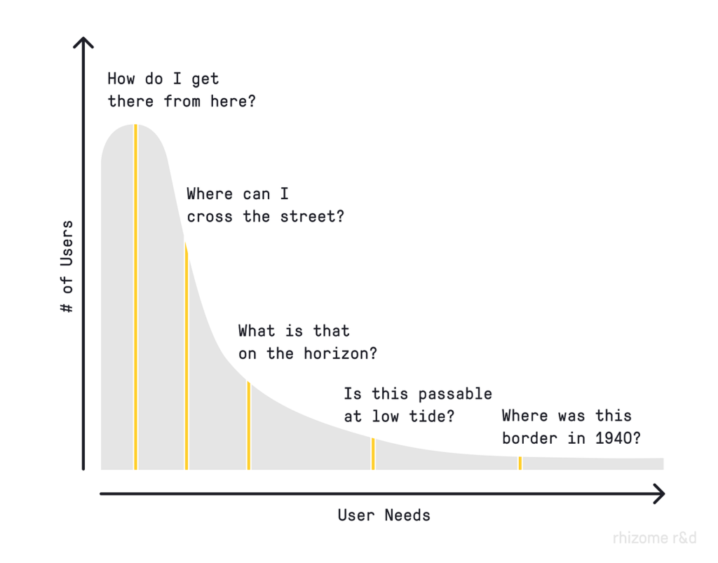
Perhaps the most common user need we see in the mapping space is “How do I get there from here?” Such ubiquitous user needs are experienced by nearly everyone, often many times a day. Purpose-built solutions in the “traditional” style of product development often work well here (if you can hold your own in a crowded market). Long-tail user needs, like “Is this passable at low tide?” represent a comparatively small group of people, yet the investment required to build an adequate solution often remains the same.
There is a way of addressing the long-tail problem, but it requires a very different paradigm for thinking about the way we design products, tools, and services. We can call this paradigm design for emergence.
In complexity science, ‘emergence’ describes the way that interactions between individual components in a complex system can give rise to new behavior, patterns, or qualities. For example, the quality of ‘wetness’ cannot be found in a single water molecule but instead arises from the interaction of many water molecules together. In living systems, emergence is at the core of adaptive evolution.
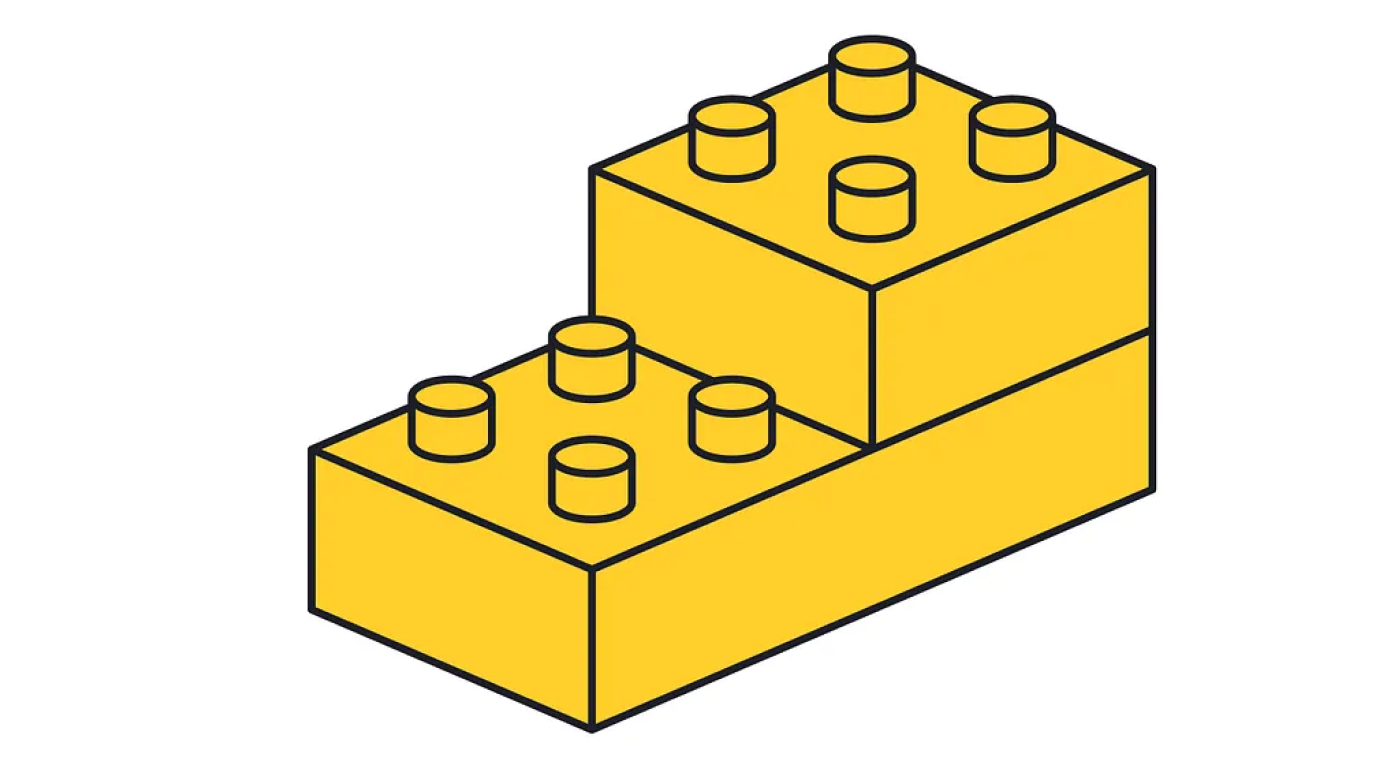
Design for emergence prioritizes open-ended combinatorial possibilities such that the design object can be composed and adapted to a wide variety of contextual and idiosyncratic niches by its end-user. LEGO offers an example — a simple set of blocks with a shared protocol for connecting to one another from which a nearly infinite array of forms can emerge. Yet as we will see, design for emergence can generate value well beyond children’s toys.
In many ways, design for emergence is an evolution of the design paradigms of the past and present. Let’s take a look at the past to place this future in context.
High Modern Design
The mid-20th century saw the apex of high modern design. This paradigm was characterized by a hubristic disregard for context, history, and social complexity in favor of an imposed rational order and universal standardization. “Rational” in this paradigm describes a state of superficial geometric efficiency as conceived by the designer.
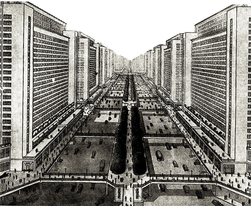

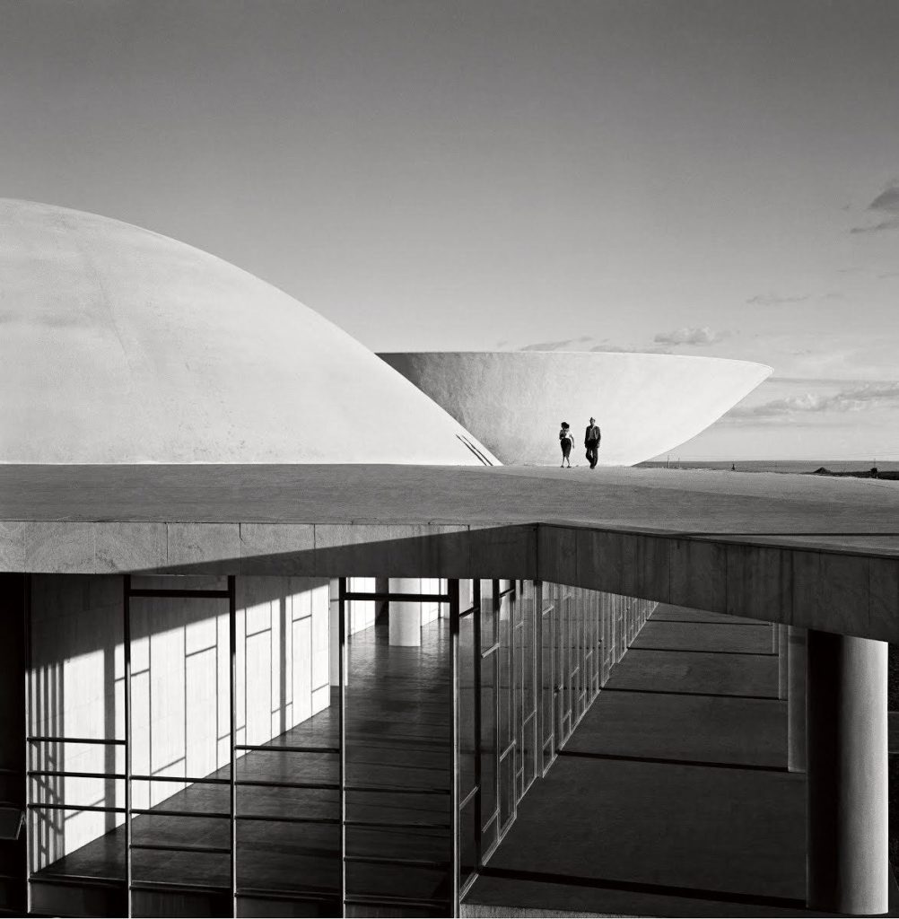
In high modernism, not only does the designer exert near-total control over the design, he also operates under the assumption that he holds all relevant knowledge about the design problem.
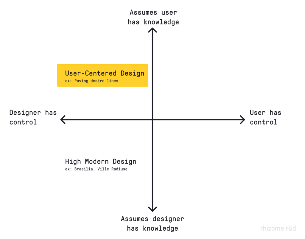
If we plot these two dimensions—knowledge and control—on a simple chart, high modern design occupies a distinct quadrant.
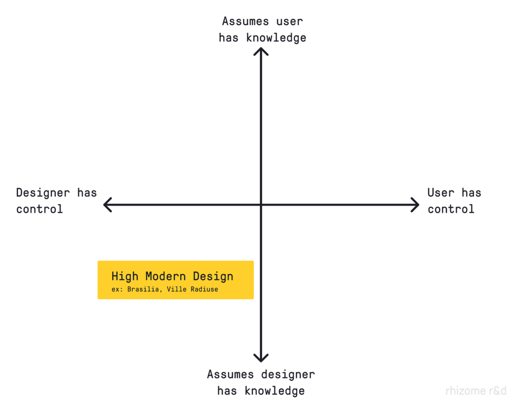
High modern design was widely discredited following a series of high-profile failures in the 1970s and 80s, ranging from the demolition of Pruitt Igoe to the collapse of the Soviet Union. By the end of the 20th century, a new design paradigm had taken its place.
User-Centered Design
In contrast to high modern design, user-centered design takes a more modest position; the designer does not inherently know everything, and therefore she must meticulously study the needs and behaviors of users in order to produce a good design. User-centered design remains the dominant design paradigm today, employed by environmental designers, tech companies, and design agencies around the world.
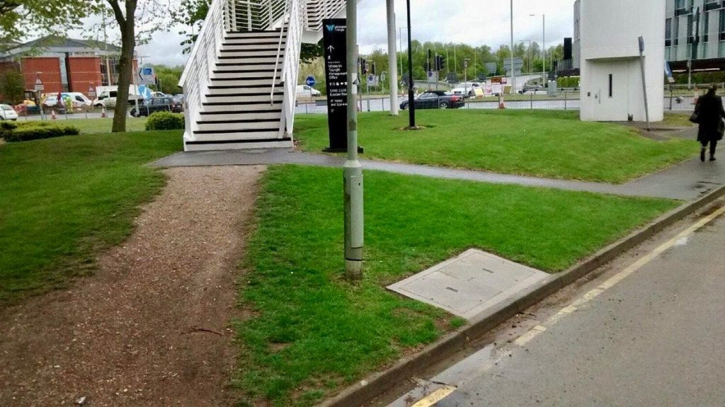
User-centered design suggests identifying well-trodden ‘desire paths’ and designing for them (in this case by paving a new sidewalk).
While user-centered design discards the high modern assumption that the designer always knows best, it retains the idea that the designer should maintain control. In this paradigm, design is about gaining knowledge from the user, identifying desirable outcomes, and controlling as much of the process as possible to achieve those outcomes. ‘Design’ remains synonymous with maximizing control.
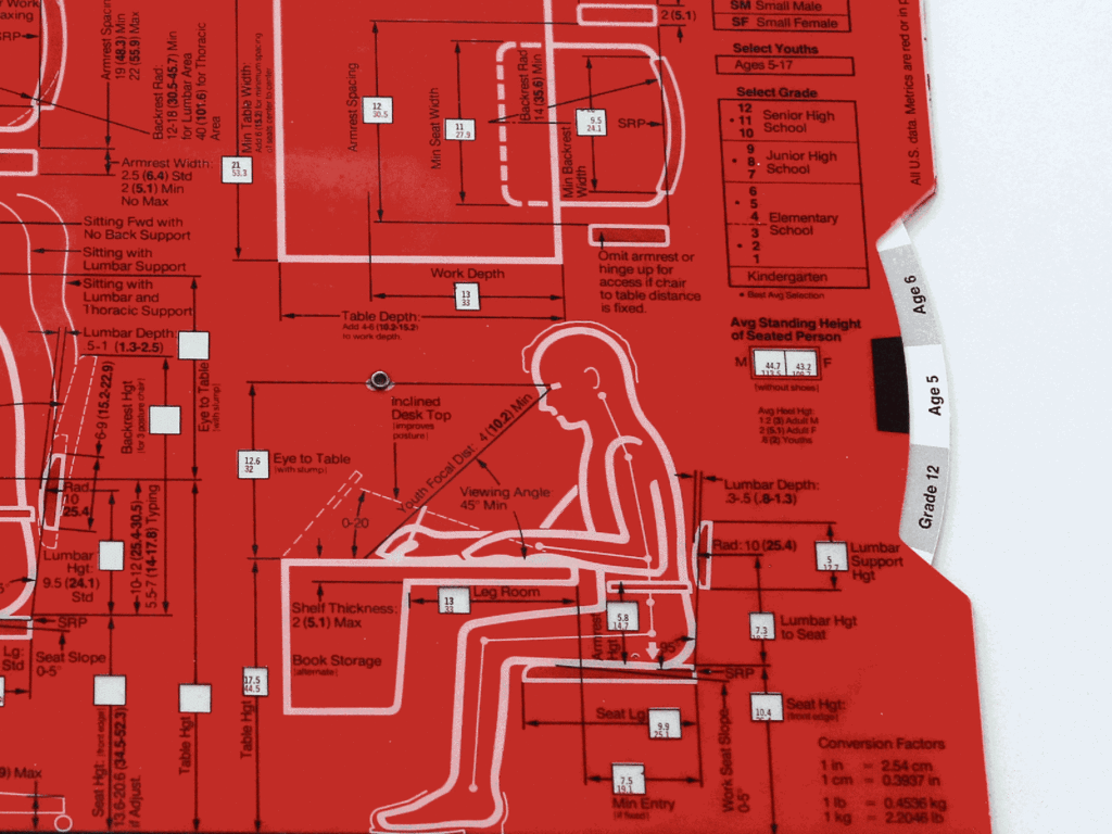
User-centered design has a better track record than high modern design, but it still exerts a homogenizing effect. The needs of the modal user are accommodated and scaled through software or industrial manufacturing, while power users and those with edge cases can do nothing but actively petition the designer for attention. In most cases, diverse users with a wide variety of niche use cases are forced to conform to the behavior of the modal user.
In many cases this is sufficient. Don Norman, who coined the term ‘user-centered design,’ is infamous for his ‘Norman Door’ design example. User-centered design generally works well as an approach to solving common problems like permeable separation between spaces (i.e. the common problem doors solve) or comfortable food preparation.
But consider even the ‘desire path’ example pictured above. The modal user may be well supported by paving the desired path indicated by their behavior, but what good is a paved path leading to stairs for a wheelchair user? In practice, user-centered design tends to privilege the modal user at the expense of the long-tail user whose needs may be just as great.
Long-tail users of user-centered design are not given the degree of control necessary to adapt the design object or tool to their unique needs, and designers are faced with the long-tail problem mentioned earlier.
This is where design for emergence offers an alternative.
Design for Emergence
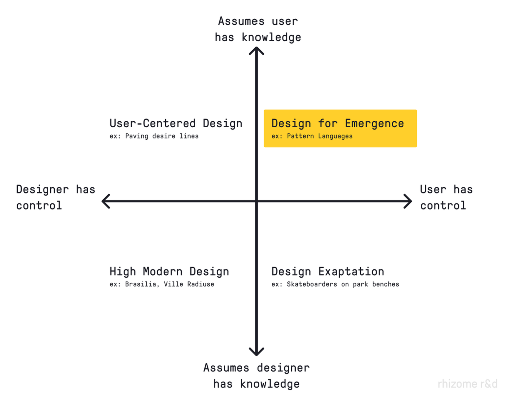
In design for emergence, the designer assumes that the end-user holds relevant knowledge and gives them extensive control over the design. Rather than designing the end result, we design the user’s experience of designing their own end result. In this way, we can think of design for emergence as a form of ‘meta-design.’
What does it mean to give the user control?
Ashby’s Law of Requisite Variety states that enabling control depends on the controlling system (i.e. the tool) having at least as many possible states as the system it controls (i.e. the end-user’s design problem). In Ashby’s words:
In order to deal properly with the diversity of problems the world throws at you, you need to have a repertoire of responses that are (at least) as nuanced as the problems you face.
In other words, to address the long-tail problem, the tool must be flexible enough that it can be adapted to unexpected and idiosyncratic problem spaces—especially those unanticipated by the tool’s designer.
We can draw a useful boundary around design for emergence with the following criteria.
1. The designer can be meaningfully surprised by what the end-user creates with their tool.
Design for emergence is open-ended. There’s no room for surprise in high modern or user-centered design, unless the design is exapted for an unintended use (see “Design Exaptation” in the bottom right quadrant of the 2×2 above). Meanwhile, a key characteristic of design for emergence is that the end design may be something that the original designer never imagined. Whereas exaptation may indicate a design failure, this kind of surprise is an indication that the designer has succeeded in nurturing emergence.
Design for emergence is permissionless. It empowers people by way of its constitution even though it can never know what people will do with that power. In contrast to user-centered design, design for emergence invites the user into the design process not only as a subject of study but as a collaborator with agency and control.
2. The end-user can integrate their local or contextual knowledge into their application of the tool.
Design for emergence is context-adaptable. It leverages distributed local intelligence. In machine learning, a variation of the long-tail problem manifests as an increasing amount of data required to generalize a model across applications (e.g., training a robot to open a particular door versus training a robot to open any door). Data has diminishing returns. The pattern holds true for long-tail problems as approached by user-centered design—the cost of information about users holds steady but satisfies an ever-smaller number of users.
Rather than trying to collect and incorporate all possible relevant information, design for emergence gives form to systems on the basis of general information while letting end-users “finish the job” with their unique on-the-ground knowledge.
3. The end-user doesn’t need technical knowledge or training to create a valuable application of the tool.
Design for emergence is composable. It provides a limited ‘alphabet’ and a generative grammar that’s easy to learn and employ, yet can be extended to create powerful, complex applications. As Seymour Papert once remarked, “English is a language for children,” but this fact, “does not preclude its being also a language for poets, scientists, and philosophers.”
To borrow another metaphor from Papert (and Mitchel Resnick), design for emergence needs:
- Low floors (an easy way to get started)
- Wide walls (many possible paths)
- High ceilings (ways to work on increasingly sophisticated projects)
Low floors are especially important in a market context as most users are not technical. For this reason, design for emergence often looks like a ‘kit of parts,’ with ease of use operating largely as a function of the number of parts and the number of ways they can be joined together. Limiting both quantities keeps the floor low, while the combinatorial explosion of possibilities that even a limited set can generate produces wide walls and high ceilings.
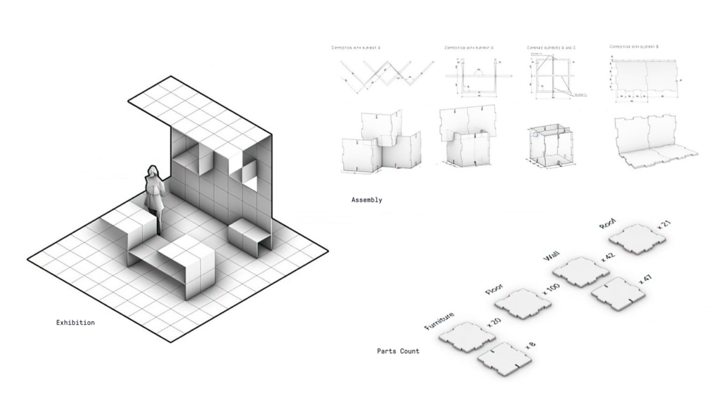
While design for emergence is in the midst of being rediscovered, it is hardly a new paradigm. Christopher Alexander’s A Pattern Language (1977) was a ‘kit of parts in the form of 253 design patterns. His design theory has close theoretical parallels to complexity science, which studies the natural phenomena of emergence. Oskar Hansen diverged from his high modernist roots in the direction of design for emergence with his participatory theory of ‘open form’ in the 1960s. Questions of user control in system design are also central in cybernetics, which goes back at least as far as Norbert Weiner’s 1948 publication of Cybernetics: Control and Communication in the Animal and the Machine.
Perhaps the best historical example of design for emergence in a popular application is HyperCard, released by Apple in 1987. HyperCard could be easily adapted to unanticipated purposes. Children used it to create and organize databases of game cards. Academic researchers used it in psychological studies. Restaurateurs used it to report orders coming through registers. HyperCard was even used to control the lights on two of the world’s tallest buildings, the Petronas Towers in Kuala Lumpur, Malaysia. Creator Bill Atkinson described HyperCard as a programming tool “for the rest of us,” and, “an attempt to bridge the gap between the priesthood of programmers and the Macintosh mouse clickers.”
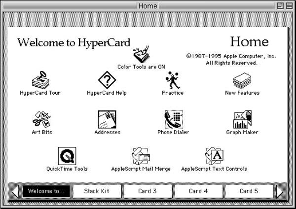
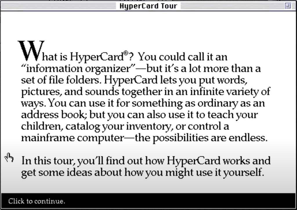
Hypercard was laid to rest in 1998. Despite its adoring user base, Apple executives didn’t believe it could make money. While this may have been true in 1998, the rise of software-as-a-service (SaaS) business models has made design for emergence once again financially viable.
Today, design for emergence—made profitable by SaaS—supports an enormous market of left-behind long-tail users.

Notion is a philosophical descendent of HyperCard (turns out you can even buy a third-party HyperCard-themed Notion template) that offers extremely adaptable information structures built from an alphabet of ‘content blocks’. It’s also worth $10 billion and has 30 million users. I used it to create the first bidirectionally linked note-taking system that matched my own idiosyncratic research needs.
ClickUp is a project management tool that “flexes to your team’s needs” with a modular structure composed of a handful of ‘ClickApps’ and Views. The five-year-old company is growing at a rate that would make most startups blush. Elsewhere, ‘nocode’ tools like Airtable, Webflow, and Zapier have found great commercial success with their composability, interoperability, and extensibility.
Then there’s the great destroyer of would-be single-purpose tools, the software market juggernaut Microsoft Excel. With a small handful of data types and a two-dimensional grid of cells, non-technical users can make simple calculations (low floor) or design massively complex data systems (high ceilings), adapted to their specific needs and without IT support. Generations of enterprise software designers have had to answer the difficult question: “Why wouldn’t our users just do this in Excel?”
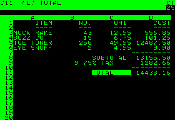
Web-based competitors like Google Sheets leverage yet another tactic for emergence by introducing multiplayer capabilities to the already powerful end-user programming tool. Together these digital spreadsheet tools support billions of monthly active users worldwide.
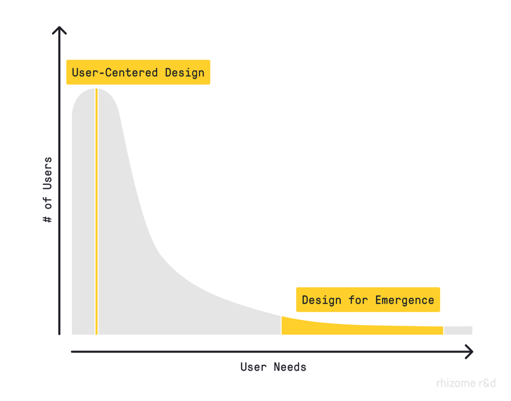
What all these tools have in common is support for open-ended adaptation to highly contextual problems without the need for technical knowledge. Rather than building a static, purpose-built solution to a single common problem with lots of users (and lots of competitors), they’ve won robust user bases by supporting a broad swath of long-tail user needs.
In future posts, we’ll explore tactics for how to design for emergence, but for now, I’ll leave you with a question:
How many markets are currently sitting untapped on the long tail, waiting for tools that empower emergence?
Originally published on rhizome r&d
Kasey Klimes is the founder of Rhizome R&D, a design research and strategy consultancy that supports early-stage ventures as they navigate complex and ambiguous problem spaces. At Google, Kasey led design research for the first world-scale augmented reality experiences in Google Maps, which were listed among Time Magazine’s Best Inventions of 2021. As a city planner and data scientist at Gehl, he led urban transformations in cities around the world and architected the world’s largest public life database. He has since advised industry-leading venture studios, world-class medical research institutions, national digital news media organizations, and numerous startups. Kasey holds a Masters in City Planning from UC Berkeley and a B.A. in political science.
- The author uncovers a very different paradigm for thinking about the way we design products, tools, and services call this paradigm design for emergence.
- The author describes how the following helps put us this future in the context:
- High Modern Design
- User-Centered Design
- In design for emergence, the designer assumes that the end-user holds relevant knowledge and gives them extensive control over the design.
- A useful boundary can be drawn around design for emergence with the following criteria:
- The designer can be meaningfully surprised by what the end-user creates with their tool.
- The end-user can integrate their local or contextual knowledge into their application of the tool.
- The end-user doesn’t need technical knowledge or training to create a valuable application of the tool.
- The author names the best examples of design for emergence and how they’ve won robust user bases by supporting a broad swath of long-tail user needs.


