We UXers want to understand the people that use our products—discern their needs, triggers, motivations, and what barriers obstruct them. Understanding our users helps us create better products.
We also want to make sure that our efforts are not misguided, like a loose cannon that might or (more often) might not tackle the essential needs of the users in the product we are working on.
Contextual inquiry is one of the many tools that help us understand users, their circumstances and how they might deal with our products. UsabilityNet define contextual inquiry as follows:
The contextual inquiry is a specific type of interview for gathering field data from users. It is usually done by one interviewer speaking to one interviewee (person being interviewed) at a time. The aim is to gather as much data as possible from the interviews for later analysis.
In photography, capturing good images through contextual inquiry and ethnography is crucial—it is like catching the essence of the participant and putting it in a box for later use.
After finishing our field sessions and analyzing the data, we can return to these boxes. Once we open them, these images help us empathize with the participant’s situation and feelings.
These images will help not only the people that attended the visits, but also all of the other members in the analysis phase, and, very importantly, your stakeholders.
Why a photo guide is important
In a recent initiative from the UX Research+Design teams, we were visiting small sellers in their homes to better understand their relationship with our service.
As part of the initiative, we have invited stakeholders from the different parts of the business to attend the home visits. For each visit, there are three people present, including the participant: An interviewer from the research team, a note-taker (designer or businessperson) and a photographer (designer or businessperson). It might look like a lot of people when visiting your users, but this way we could assign specific tasks to each part of the team.
It might not feel important, but any photos taken during contextual inquiries are critical, as they have a big impact on the quality of the analysis phase and the project’s outcomes. Design will be better suited as designers are more empathic with the user intricacies.
Bringing stakeholders to the sessions and arming them with a camera will make them more prone to uncovering user details that otherwise would never be thought of in strategy sessions, planning meetings or board gatherings. In short, they will discover things they did not know about their users. These photographs will also help your stakeholders to come up with great ideas, quick-wins or to up-sell their vision, and in turn you will gain more buy-in on the design process.
Photographic requirements
To make sure we had a consistent output, we created a note taking guide and a list of things to photograph, the research team took up the planning of the study and came up with a list of images needed. You can adapt this list to suit your own ethnography sessions.
The participant’s context
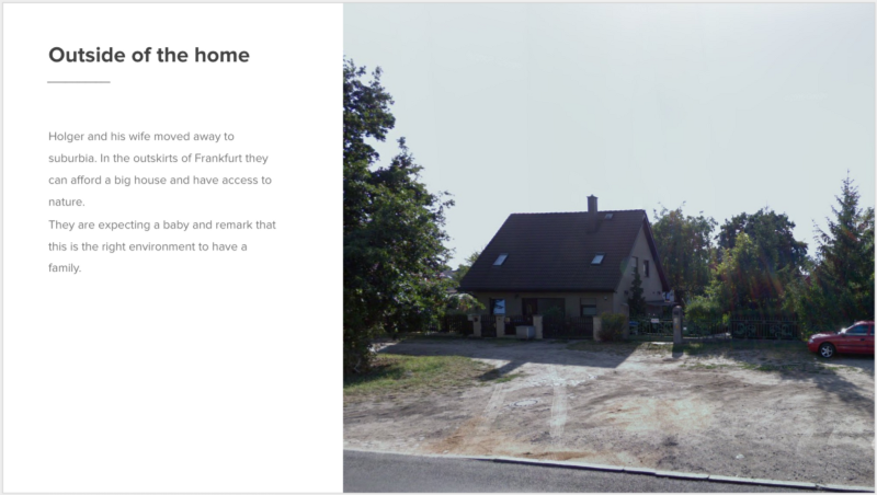
- Outside of home.
- General home environment.
The participant and their world
- Participant headshot.
- Participant animated/gesticulating during conversation.
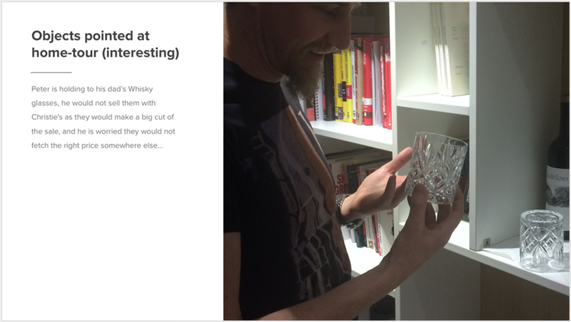
- Objects pointed out on home tour, especially things people care about, don’t care about, or are just interesting.
- Places where items are stored/kept before clear out.
The participant’s relationships with your service, other services and competitors
- Participant using their technology.
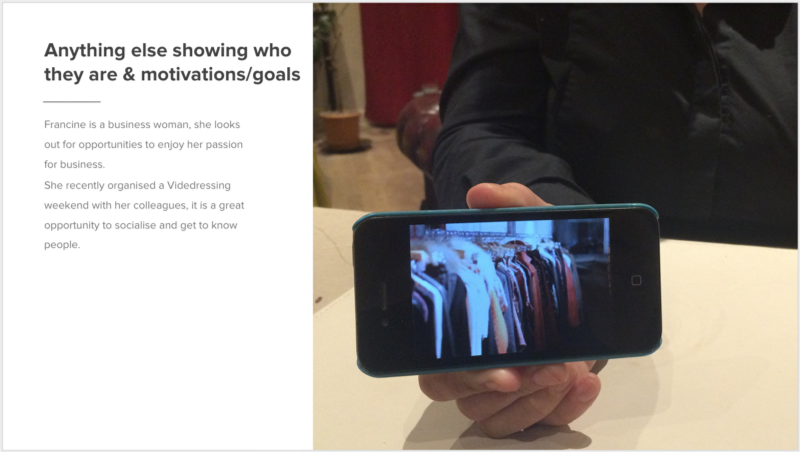
- Anything else that tells you who this person is or illustrates their motivations / goals.
After a few rounds of interviewing it became clear that some people were more suited than others at getting the photos right, and afterwards in the analysis process, we sometimes struggled to find photos that supported the work.
The photo guide
We understood that having a guide with examples would help in raising and leveling the quality of the photos, so we put together a deck featuring some good samples from the sessions done already, to help our stakeholders understand what we are looking for.
Any image that you take should always help you to tell a story about your participant.
In addition to presenting the images, we also highlighted the story that each image triggered, as this is ultimately their purpose
Few samples
We did not want to limit the amount of photos taken, but provide better guidance of what to look for in the images.
Enabling your stakeholders or other non-design team members to come to your ethnography sessions and making them participant of the process will be of great help for your design process:
- Brings stakeholders closer to users.
- Exposes design/research methodologies.
- Shows the way Design people thinks.
- Helps stakeholder, PM, and Dev to think like designers.
So next time you take on contextual inquiry and plan to involve your stakeholders, PM or dev counterparts, a photo guide will help you in preparing them to get exposed to users.