Save
How do UX designers tell their story in a relevant, meaningful way, to audiences who have no exposure to UX? UX practitioners are keenly aware that everything we use in our lives was designed by someone. But outside of our industry (and related ones), most people aren’t aware of the many decisions that were made (or not made) on their behalf when a product or service was designed.
How do UX designers tell their story in a relevant, meaningful way, to audiences who have no exposure to UX? UX practitioners are keenly aware that everything we use in our lives was designed by someone. But outside of our industry (and related ones), most people aren’t aware of the many decisions that were made (or not made) on their behalf when a product or service was designed.
I started exploring this issue about communicating the value of UX a little over a year ago in my podcast, Tea with Teresa. One of the highlights from my show was a conversation with Jesse James Garrett called “What the Heck Is User Experience Design??!! (And Why Should I Care?)” That podcast laid a great foundation for explaining UX to new audiences. But I decided I wanted to push the challenge of communication even further and see if I could explain UX design to a particularly difficult audience: high schoolers. I figured if I could make UX meaningful and relevant to these kids, I could probably explain it to anyone.
So I approached my friend Ben Chun about doing a presentation to his Introduction to Programming class at Galileo High School in San Francisco. He thought this would be a great start to a project they’d embark upon this year: designing an educational computer game for 5th graders. My goal was to prepare them for that project by communicating two key things:
- Make things for people.
- Those people aren’t you.
Before the class, Ben warned me about the attention span of his students, and boy was he right. The thing about high school kids is they won’t pretend to be interested if you’ve lost them. Adults at a conference will gaze forward in your general direction, but high school kids will just put their head on the table and go to sleep. If you ever want to get a real gauge of how interesting a speaker you are (or how well you’re really communicating), I highly recommend it, humbling as it is.
Not everything I tried worked (I got some heads on the table a few times), but a few tactics and explanations seemed to strike a chord with them, and I thought I’d share them here:
1. Funny examples of design failing out in the world (from FailBlog.org)
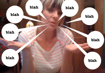
2. Interacting with a product or service should feel like a good conversation. Who wants to deal with a person or thing that ignores you?
Or that is self-absorbed when you interact with it?
For an adult audience I would have used going out on a date as an example (an idea I got from Jesse James Garrett) but since high school kids don’t really go on formal dates (or so their teacher told me!), I changed it to a conversation.
3. Before you make something, learn about the people who will use it. Otherwise, it’ll feel and turn out like:
- Trying to buy a present for someone you don’t know, like your uncle’s boss.
- Making dinner for someone you don’t know. What if they are a vegetarian but you made steak?
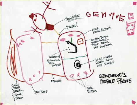
4. People like and need different things. So it’s important to find out what those wants and needs are. For example, during Rachel Hinman’s project “90 Mobiles in 90 Days,” her niece designed a mobile phone with the features she really wanted, like:
- A snail button that turns into Barbie when pushed
- A screen with a swimming pool inside
- Snow White always attached by golden string
- A red button that, when pushed, makes the phone turn into anything
- A Snow White store and a candy store attached
Key point: Not everyone wants a snail button that turns into Barbie!
5. The user is not you, so don’t design for yourself. I ran an activity to show how different we are:
- Three people are asked to leave the room and are not told why.
- One at a time they are invited back in, asked to sit and close their eyes, then asked to describe the room in detail.
- The rest of the class takes note of how each person values/pays attention to very different things.
6. Find out what the user really wants or needs (user research). A sticky note affinity diagramming activity was helpful for this:
- Everyone gets a sticky note pad and has five minutes to write as many questions as they can for the potential users of a pretend product they are making.
- We post all questions on a wall together, cluster questions that are about the same topic, discuss, and agree upon a key set of ten questions.
Turns out the kids loved the race to write as many questions as they could in the time limit. Ben said you almost never have a room of focused, quiet teenagers like we had during that activity. He also wrote about this exercise on his blog, And It Moves: Adventures In Teaching and Technology.
Those are some of the highlights from my attempt to make the complex simple for an audience that had never heard of UX before. As I continue in this exploration of communicating the value of UX, I’d love to expand my tool kit by hearing about exercises, analogies, and other approaches any of you have had success with. Please share here!
As Design Education Strategist for Cooper, Teresa Brazen pulls from her experience across many disciplines (film, design, journalism) to inspire curriculum, teach, and build community. Her passion is teaching others how to cultivate healthy, inspired cultures within projects, teams and organizations—no matter what their role. Through her current work as a trainer (Cooper) and previous experience in program management (Adaptive Path), she's had the unique privilege of collaborating with, nurturing, and empowering teams from a broad range of industries: global financial institutions, Silicon Valley startups, and everything in-between. She also created and programs the Cooper Parlor event series, a monthly gathering of designers and design advocates to exchange ideas and push the potential for design.
In her free time, she also continue her work as an artist. In her short films and artwork, she explores how people navigate experiences like love, secrecy, and judgment. In her podcast series, she interviews people at the edges of industry and culture. She's obsessed with uncovering what makes people tick and exposing our shared humanity…in service of fostering a bit more empathy in the world. More about Teresa at TeresaBrazen.com and @TeresaBrazen.


