Save
LISTEN TO IDEAS IN BRIEF
Humans have both the urge to create and destroy. — Hayao Miyazaki
For the uninitiated, Studio Ghibli is a Japanese Animation studio founded by Hayao Miyazaki. And since 1985, every single movie produced by them has set new standards for storytelling. What’s even more interesting is their movies have found audiences across all age groups, ethnicities, and languages. Isn’t that THE dream for every Product Designer?!
So I decided to go all *designosophical* to see what I could learn from Studio Ghibli movies. And here’s what I came up with:
1. Keep it simple
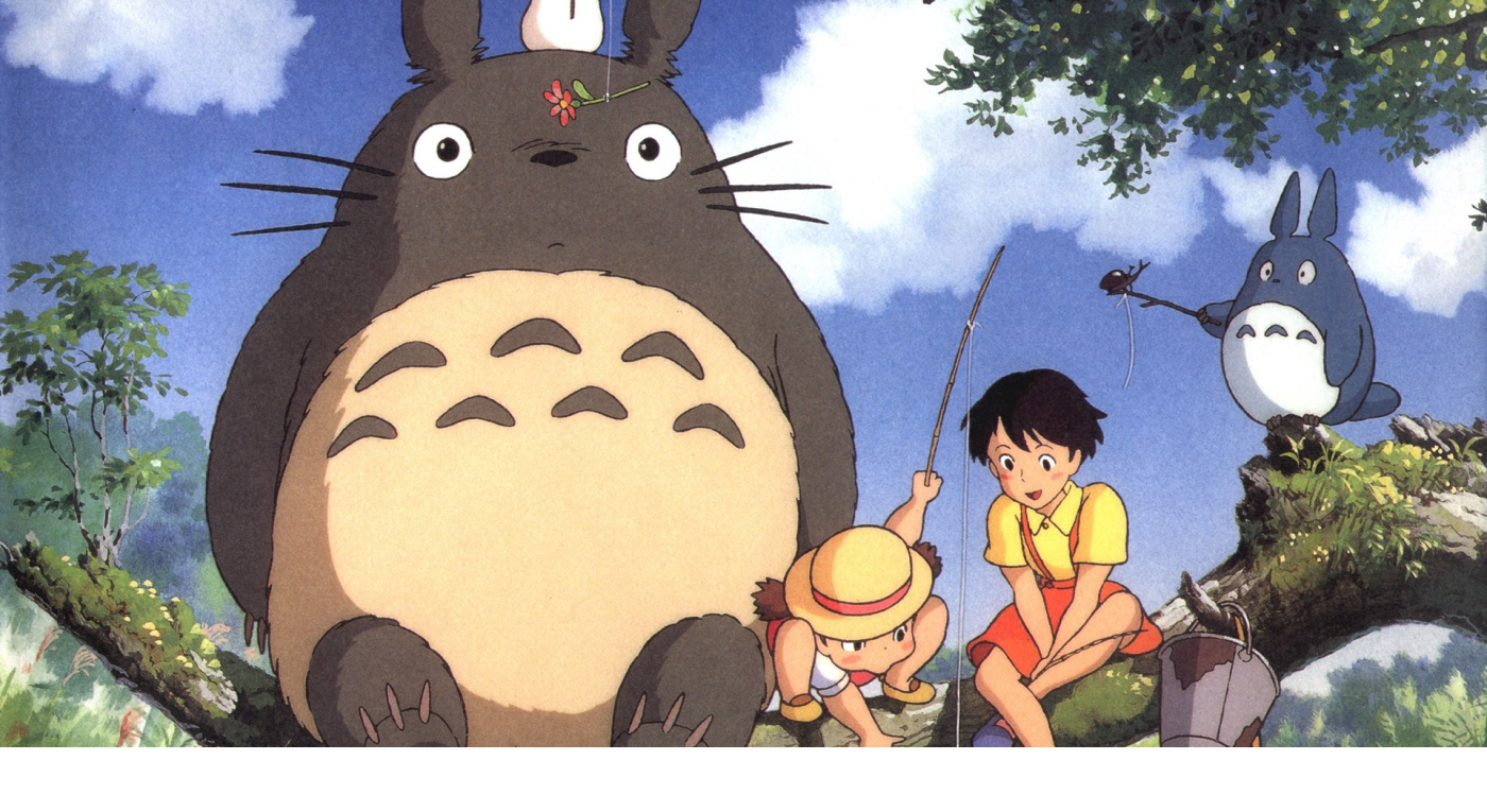
Every Ghibli movie is written and scripted considering a 5-year old child as its core audience. For example, My Neighbor Totoro (movie from which the title image above is taken) has a story which IMDb summarizes as:
The adventures of two girls with wonderous forest spirits
Now that’s a simple story. But wait! There are so many rich layers to it. There’s the emotional background of their ailing mother. There’s the curiosity about growing up and exploring things. There’s the unuttered fear of responsibility. So while a 5-year old can ride along in the girls’ adventures; any adult can associate with its vivid non-melodramatic emotions.
Now let’s take a look at the Fantastical calendar app which applies this principle beautifully.
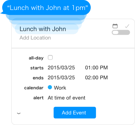
Event Input in Fantastical for Mac
The moment you hit ⌃⌥ Space on your mac, Fantastical takes you straight to the cursor and you can start typing whatever you want to schedule. Also even as you type, it modifies the event/reminder details in real-time in the details pane. So a new user (child) doesn’t require any learning curve whatsoever for accessing its core functionality.
At the same time, for a pro user (adult), Fantastical’s natural language parser will understand pretty much everything s/he can throw at it — when to alert, when to repeat, which calendar to use, event location et al.
Focus on one core functionality. Make it really simple for your user to access, use and become GREAT at that functionality.
Another good example of this is the Instagram app — with its clear and constant focus on the Camera button (Just open your phone and check).
A product that fails miserably at this is Twitter.

The Twitter Quill icon for writing a new tweet
Twitter has invented its own ‘quill’ icon for writing. There’s no focus on it and it gets lost in six or seven other icons on your Twitter app screen. (Or, just maybe, Twitter doesn’t want a new user to tweet!)
2. Give attention to every small detail
Take another Ghibli movie: Howl’s Moving Castle. The castle is so weirdly fantastic with each part sketched out in such granular detail, moving so jestfully and yet together giving the entire castle itself such a charming character.

This gif really doesn’t do justice to the awesome castle in Howl’s Moving Castle (2004)
Similarly,
the character of a product emerges from all the lil’ details thoughtfully put into it.
Airbnb’s web app is an amazing example of putting really useful data detail visually to the user.

Price Range filter in Airbnb
The Price Range histogram helps the user understand average prices in a city instantly and set the filter accordingly.
A good example of catering to user’s behavioral detail is the Chrome browser. Whenever you’re trying to close multiple tabs back-to-back, Chrome keeps the tab width constant — so the Close button remains static. Try closing multiple tabs in Safari/IE with your mouse/trackpad and you’ll understand what I mean.
3. Show your human side

Not just a LOLCat. From The Cat Returns (2002)
A product can show its human side via — the initial tour, the onboarding process, the error message, the offline message, loading screen, etc. Take your pick.
Let your product be your user’s friend; and not just an assistant.
Slack just nailed this part with its Slackbot. Slackbot welcomes you when you sign up, completes all your profile details via a chat conversation & talks to you during any new integration setup. Plus, it does this all in a superbly witty manner. No wonder Medium has so many top stories on Slack!
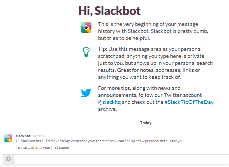
Slackbot: Slack’s very own TARS
4. Tell a story and 5. Make it flow
A good story first induces a curiosity, then introduces the setting + characters, and finally takes you along on an adventure. Too much messing around with this flow and even a great story may turn obscenely mediocre.
I wouldn’t like to ruin any Ghibli movie for you. Never. So am not giving any specific Ghibli example here. But I assume the above principle is pretty universal.
Content is the core to any great design.
Now let’s see how Airbnb executes beautifully on this. (Man, those guys have some great design talent!)
First, there’s the warm welcome page with ‘genuinely happy’ pictures. Second, the catchy story-lines like ‘Belong anywhere’, ‘One less stranger’, ‘Welcome home’ etc.
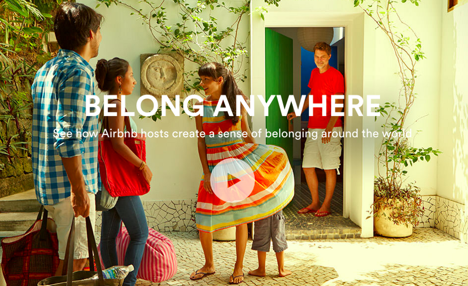
Third, the content flow updates itself to tailor to the user’s behavior. To give an example, when you first visit Airbnb homepage, the Explore section is hidden. Now search n’ click around a few listings and return back to homepage — you start seeing an Explore section with destinations personalized using your browsing history.
Content flow, whether at zero-data state or at tons-of-data-state, is as essential to Product Design as all those animations everyone sweats over.
I have ~ 8 years of experience across Product Design, Product Management and User Experience (UX). I led the product / design of BHIM payments app launched to 10 million downloads in 10 days. BHIM recorded INR 4.8 billion worth of transactions in Mar '18. I also worked on designing the UPI common library currently used on ~100 million devices. Various other Juspay products do about 5 million transactions per day.
Synergistically incubate proactive human capital via client-focused intellectual capital. Professionally reintermediate performance based infomediaries after intuitive initiatives. Credibly supply dynamic architectures.


