Save
We pour over analytics, conduct ethnographic studies, and interview users in order to understand the demographics, goals, and tasks of the people using our product. We create personas, write scenarios, and list use cases. And so we should; understanding who our users are and what they want to achieve is foundational to our job as designers.
But how deep does our understanding of users actually go? Sure, we know their socio-economic bracket, what industry they work in, and the top few tasks they want to achieve on our website. But are there deeper, more innately personal characteristics at work? Can we figure out what really makes them tick?
For over a century, psychologists have been trying to account for the range of individual differences people exhibit when interacting with new information. At the heart of their research lie cognitive styles—the stable attitudes, preferences, and habitual strategies that determine how an individual processes information. Understanding cognitive styles will help us design better experiences for users.
Analytic vs. Holistic Thinkers
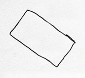
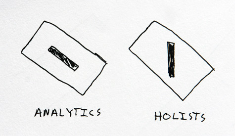
Take a pen and draw a rectangle at a 45-degree angle on a sheet of paper. Next (and here’s the test), draw a vertical line inside the rectangle.
How did you draw the vertical line? If you aligned it with the edges of the rectangle (for example[illustration1]), there’s a good chance you’re an analytical thinker characterized by an external frame of reference. If, on the other hand, you drew the line along the north-south axis of the paper rather than the rectangle, then you are more likely to be a holist, inner-directed with independence from your surroundings. Let’s look at each in detail.
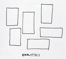
Analytic thinkers: brick-by-brick craftsmen
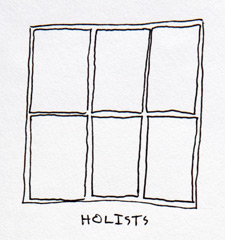
Holistic thinkers: big-picture visionaries
So what?
Analytics and holists approach tasks very differently. When seeking information online, holists are efficient at finding the right answer in a timely manner and with relatively few clicks. Analytics, however, find it difficult to discern relevant information from the irrelevant. A study by Kyung-Sun Kimfound that analytics spend 50% more time, visit almost twice as many pages, and click 50% more links than their holist counterparts searching for the same information.
This may sound gloomy. However, while the performance gap is drastic between analytics and holists who have a low degree of web expertise, the gap virtually disappears amongst analytics and holists who have a greater amount of web experience.
Designing for Cognitive Styles
What do these differences between analytic and holistic thinkers mean for the design of websites and applications? Above all, they should remind us that users are not uniform; there are vast differences between them, and we must design experiences that meet the needs of both types of thinkers.
Design for learnability
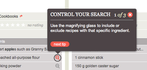
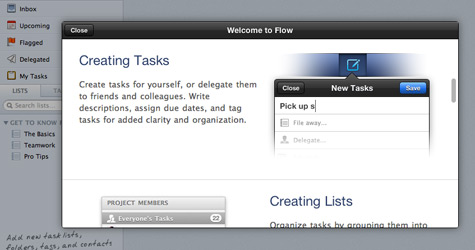
For analytics, a bit of web expertise goes a long way. One goal for effective interfaces should be to help analytic novices improve their proficiency. Put techniques in place that can help users learn how your interface actually works. Make your tools discoverable by discretely calling attention with popovers and offering instruction in blank states.
For first-time visitors, Foodily uses small popovers to introduce users to the most important features unique to their website.
The task manager Flow uses a modal window to present first-time users with an overview of how to use the product.
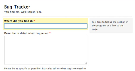
Forms that show help text when the user focuses on an input (such as this example from Wufoo) provide greater context than leaving the user to guess.
Use strong information scent
The fact that analytics click on 50% more links than holists suggests that analytics have trouble distinguishing relevant information and are easily distracted by tangential links. Increasing the amount of information scent present in the linked text can help users better judge the relevancy of the link before actually clicking on it. Jared Spool found that the optimal length of links is between 7 and 12 words that accurately describe the contents of the linked page.
Try to avoid obscure one- or two-word links such as these found on A List Apart.
Longer, descriptive links have much stronger information scent and are less likely to lead users astray.
Design for wayfinding
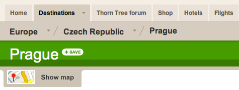
Presenting a clear picture of the breadth of your website and where the user is currently positioned in that global context is vital for both holists and analytics alike. Holists need help distinguishing one part from another, while analytics need help understanding how the parts make up the whole. In addition, analytics often use the browser’s back button or return to the homepage to start over, suggesting that they’re prone to becoming disoriented. Providing signposting that clearly indicates the user’s current position in the site can help analytics keep their bearings.
Lonely Planet’s breadcrumbs and header make the user’s current location within the website clear.
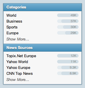
TwigKit’s faceted navigation component not only indicates how many results match each filter, but also visualizes the distribution with a series of bars, helping users instantly understand the lay of the land.
Amazon’s hierarchical navigation makes clear what sub-categories compose the current section and how the current section fits in with the rest of the site.
In Conclusion
Users are not created equal. There are deep divisions between the way people think, from brick-by-brick analytics to big-picture holists. The experiences we design must play to the strengths of each, while at the same time help them overcome their individual weaknesses. In the words of Edward Tufte, “There are some universal cognitive tasks that are deep and profound—indeed, so deep and profound that it is worthwhile to understand them in order to design our displays in accord with those tasks.”
Tyler Tate
Tyler Tate is a user experience designer focused on making the complex feel simple. He's also the founder of Crema.co, empowering you to discover single-origin coffees, get to know the people who grew them, and have the beans delivered to your door. Tyler lives in London with his wife Ruth and son Galileo. You can keep up with him on Twitter.


