Election season offers UX designers lessons and inspiration for helping users understand and explore data.
In addition to following your favorite candidate’s progress during election season, as a UX designer, you can find new inspiration for ways in which to help your users explore data. In this article, I’ll take a look at a couple of the different news and political sites, and see how they’ve used interactive data visualizations to help readers better understand the complex data behind election predictions and results.
There are myriad ways to present election data. As with all information and interaction design, your method of presentation depends on the type of reader you’re trying to reach and the types of questions you’re helping them answer — do you want to help them understand the likelihood of future results or to help them interpret how demographics and behavior influenced votes in the past?
I’ll take a look at several strategies for presenting data, depending on whether the user is looking forward to predict potential results or looking backward to understand how demographics and issues influenced results. During election season, readers want to examine data from several perspectives:
- Looking forward to upcoming primary results
- Understanding election results as they arrive
- Looking back to understand the meaning of what has happened
- Predicting the future
- Playing “what if” scenarios with the data
We’ll look at good and bad examples of each in this election cycle, and then pull out some general principles for data visualization that can be applied for any examination of data.
Looking forward to upcoming primary results
The website fivethirtyeight.com, founded by Nate Silver, does a great job helping users understand the probability of election results based on a weighted average of multiple polls. Nate’s audience has a reputation as data nerds, but fivethirtyeight does a great job of explaining complex statistical analysis to the layperson.
On their primary forecasts page, fivethirtyeight starts by presenting a timeline of the chance for each candidate to win the majority of the state’s votes. This helps the reader understand fivethirtyeight’s overall confidence in the prediction.
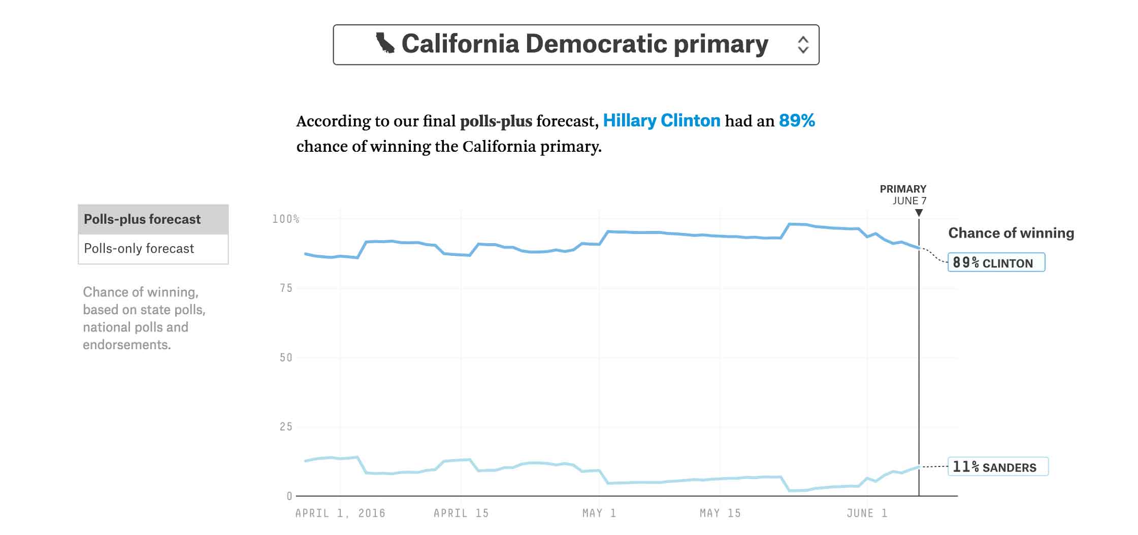
Figure 1: Chance for each candidate to win the California Democratic primary (source: fivethirtyeight.com)
This is followed by a probability chart, showing the range of potential outcomes for the primary candidates. By combining the results of multiple polls, weighted by the poll’s previous track record and methodological standards, Nate Silver and his team are able to assign a probability range for the results. Using the button on the left, the reader can choose to include just state polls (polls-only forecast), or also national polls and endorsements (polls-plus forecast).
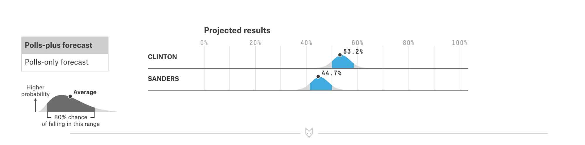
Figure 2: Chart showing probability range for each candidate’s results in the California Democratic primary (source: fivethirtyeight.com)
Finally, the reader can see the predicted final outcome of the state primary vote, based on weighted polling averages. Individual polls appear as data points, with highly weighted polls shown in a darker shade. Note how the chart key, written in sentence form at the top of the chart, helps the reader interpret the chart while gaining an overall understanding of the methodology.
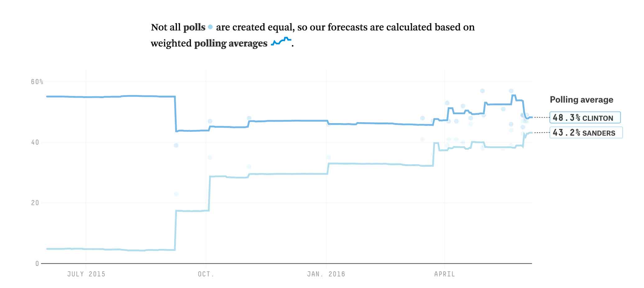
Figure 3: Chart showing weighted polling averages for each candidate in the California Democratic primary (source: fivethirtyeight.com)
As UX designers, what can we learn from fivethirtyeight’s prediction charts?
Give the user a measure of your confidence level in any prediction. Your user doesn’t expect you to always be able to accurately predict the future. Let your user know your confidence level, so she knows the risk she’s taking when making decisions based on your prediction.
Use feedback loops to continually improve your predictions. Fivethirtyeight makes fairly accurate predictions because they are continually updating their models based on past poll performance. When a pollster has poor results or starts using suspect methodologies, their poll weighting is reduced. As a UX designer, you have a responsibility to argue for continually improving data, to better serve your users.
Clearly communicate the data sources you use to make predictions. To build trust in the data you display, explain your calculations to your users and allow them to view the underlying data. Fivethirtyeight shows the list of polls, their sample size, and their weights at the bottom of the page, so readers have a better understanding of how the results were derived. Colored data points on the predicted outcome graph indicate the weighted polls used to calculate the outcome, so the reader can gain a quick visual understanding of the data spread.
Label key data points so users can quickly absorb the key information. On each of the graphs, fivethirtyeight labels the most relevant data points, so the reader knows where to focus. Feel free to provide float-over data when the user clicks or hovers on an individual data point, but make sure to spell out the key data points that most users will want to see at a glance.
Consider using a textual key, so users can quickly grok the meaning of the chart. Fivethirtyeight does a great job of providing a textual description at the top of each chart, which gives a quick overview of the chart’s meaning, while also serving as a key for the notations on the chart. Their readers then get both a textual and visual indicator of the most important takeaways of the data.
And what should we avoid?
Avoid using the same chart to depict different information within the same visual space. Fivethirtyeight uses the same visualization for the two charts that indicate the candidates’ chances of winning and the predicted outcome. This could lead to confusion for readers who are looking to understand the information at a glance.
Understanding data as it arrives
On each day of primary voting, the New York Times has done an excellent job of displaying in-progress election results as they are counted. Any UX designer who has to display real-time data results can learn a thing or two from their example.
For each state, they show the number of delegates at stake, the percentage of the vote received by each candidate, and the total percentage of precincts reporting. Each candidate row shows the candidate’s photo with a color-coded background and the candidate’s name. Before the primary winner is called, the Times colors the leading candidate’s cell with a low-saturation shade of the assigned color. When the winner is declared, the Times adds a checkmark and darkens the cell to full saturation. The chart below shows the results for the primaries and caucuses held on Super Tuesday, March 1st.
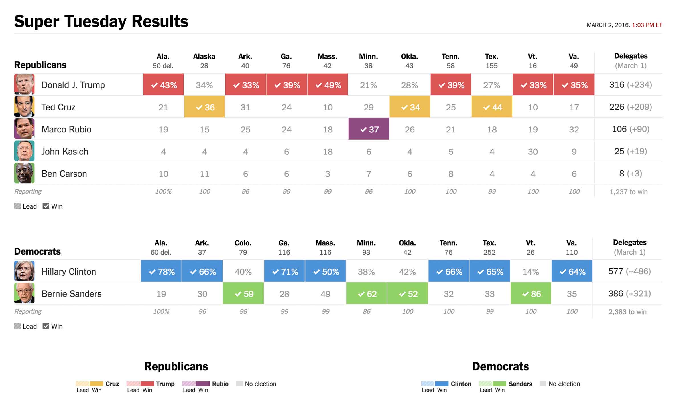
Figure 4: Table showing Super Tuesday primary results and delegate totals for both Republican and Democratic contests (source: nytimes.com)
As UX designers, what can we learn from nytimes’ results tables?
Use different shades to indicate partial data. The nytimes uses different saturation levels to indicate leaders while the vote is still being counted and winners once the final results are clear. Likewise, if you need to represent in-progress collection of data, such as revenue toward a quarterly sales target, then use a lighter saturation to indicate relative progress toward the quarterly goal, and a darker saturation once the final outcome is clear.
Give a clear indication of how much data remains outstanding. The nytimes clearly shows the percentage of votes reporting, so the reader gets a clear sense of the completeness of the data. Likewise, when reporting revenue toward a quarterly sales target, indicate how much time remains before the end of the quarter, or the dollar amount of potential opportunities that could still close in the quarter.
Automatically sort by the most important information. When reporting on a multi-state primary day, the nytimes automatically shows the candidate who is winning the most at the top. Because the number of delegates is the most important outcome of a multi-state primary, the final results are sorted by the overall number of delegates won by each candidate. Make some intelligent assumptions about what sort order is most important for your users to quickly understand the data, and then use that sort order — don’t force the users to make it happen.
Don’t be afraid to call the winners. When you have enough data to pick the winners (or losers) in your data, show that information to the user. Don’t force your users to scan through hundreds of cells in a data table to find the key information that they need.
And what should we strive to do differently?
Try to provide a level of gradation in outcomes. It doesn’t always make sense to call out a single winner. While some nytimes readers may think of the primaries as a horse-race, many of the primaries do not award their delegates winner-take-all. In this case, since the final goal is winning delegates, the Times writers could consider a shading scheme that indicates the relative number of delegates won, rather than the absolute winner. Likewise, in your visualizations, consider using color gradation to help your users better understand the relative status of each participant.
Looking back to understand the meaning of what has happened
On the day after each primary, when the votes are all tabulated, the nytimes looks back to the individual counties to better understand where different candidates were strongest, and to assess the demographic source of their strength.
After the Iowa caucuses, the nytimes provided this set of maps to help readers interpret the results. They start with a state map, showing the winner for each county. Mousing over or clicking on a county shows the actual vote breakdown within the county.
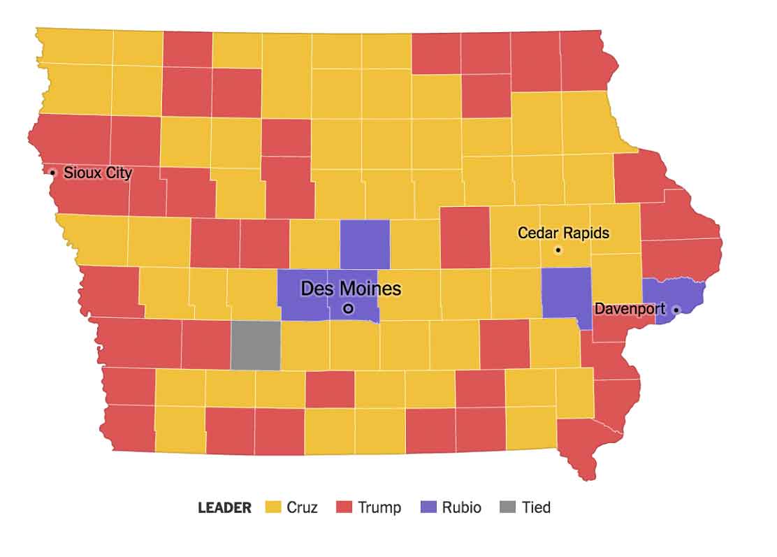
Figure 5: Choropleth map showing county winners for the Iowa Republican caucuses (source:nytimes.com)
Maps can sometimes be misleading, as they plot the land area of each county, rather than the relative size of votes. Large counties that are sparsely populated or that have a narrow margin of victory appear as more visually significant than densely populated counties with wide victory margins. A candidate who wins mostly rural areas will appear to have won the state, but may be much further behind in total votes.
The nytimes accounts for this by providing additional maps to indicate the size of the lead in each county. The proportional symbol map shows circles in each county, sized to indicate the size of the winning vote margin. The circle map gives the reader a better sense of the densely populated counties where a candidate built up huge margins. Individual candidate maps use color gradations to indicate the share of the vote won by each candidate. These choropleth candidate maps give the reader a better sense of the distribution of votes for a candidate across the state, and the strength of second-place finishers in each county.
For readers unfamiliar with the urban and rural distribution of votes within the state, the circle map gives a more accurate sense of the places with high numbers of voters.
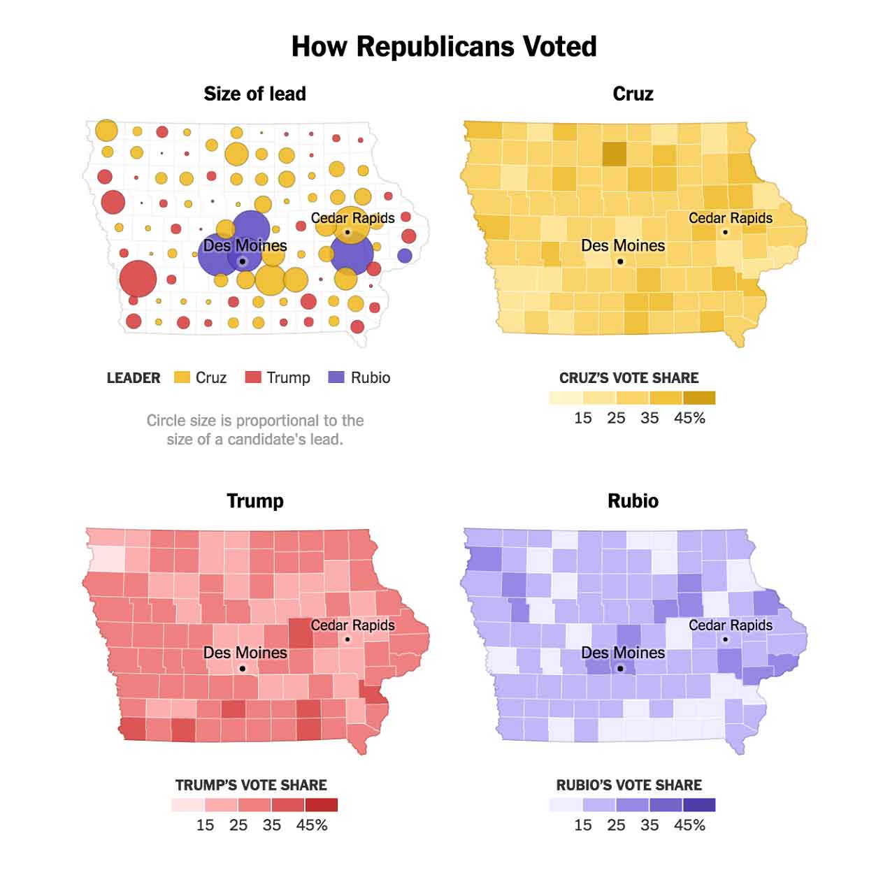
Figure 6: Proportional symbol map showing size of lead for each county in the Iowa Republican caucuses, followed by choropleth maps depicting each of the top three candidates’ vote share in each county. (source: nytimes.com)
The nytimes website provides additional maps showing the county vote margins broken down by demographic information. For example, the next series of maps shows Republican and Democratic voting results with different sides of a spectrum highlighted. For example, the first set of maps distinguishes between densely and sparsely populated counties. For Republicans, the reader can easily see that Rubio and Trump dominated most of the densely populated counties, while Cruz dominated the more rural counties. For Democrats, the distinction between candidates is not as clear for densely populated counties, but Clinton seemed to win more of the rural vote.
The nytimes then shows demographic breakdowns across income for both parties, and then a religious breakdown for Republicans and a college graduation level for Democrats. It’s unclear why they chose not to show religion for both parties, or college graduation rates for both: is it because they found that religion was significant for Republicans and not Democrats, and that college graduation rates were significant for Democrats and not Republicans? Was it because identical demographic data was not collected for each party? It’s hard for the reader to tell.
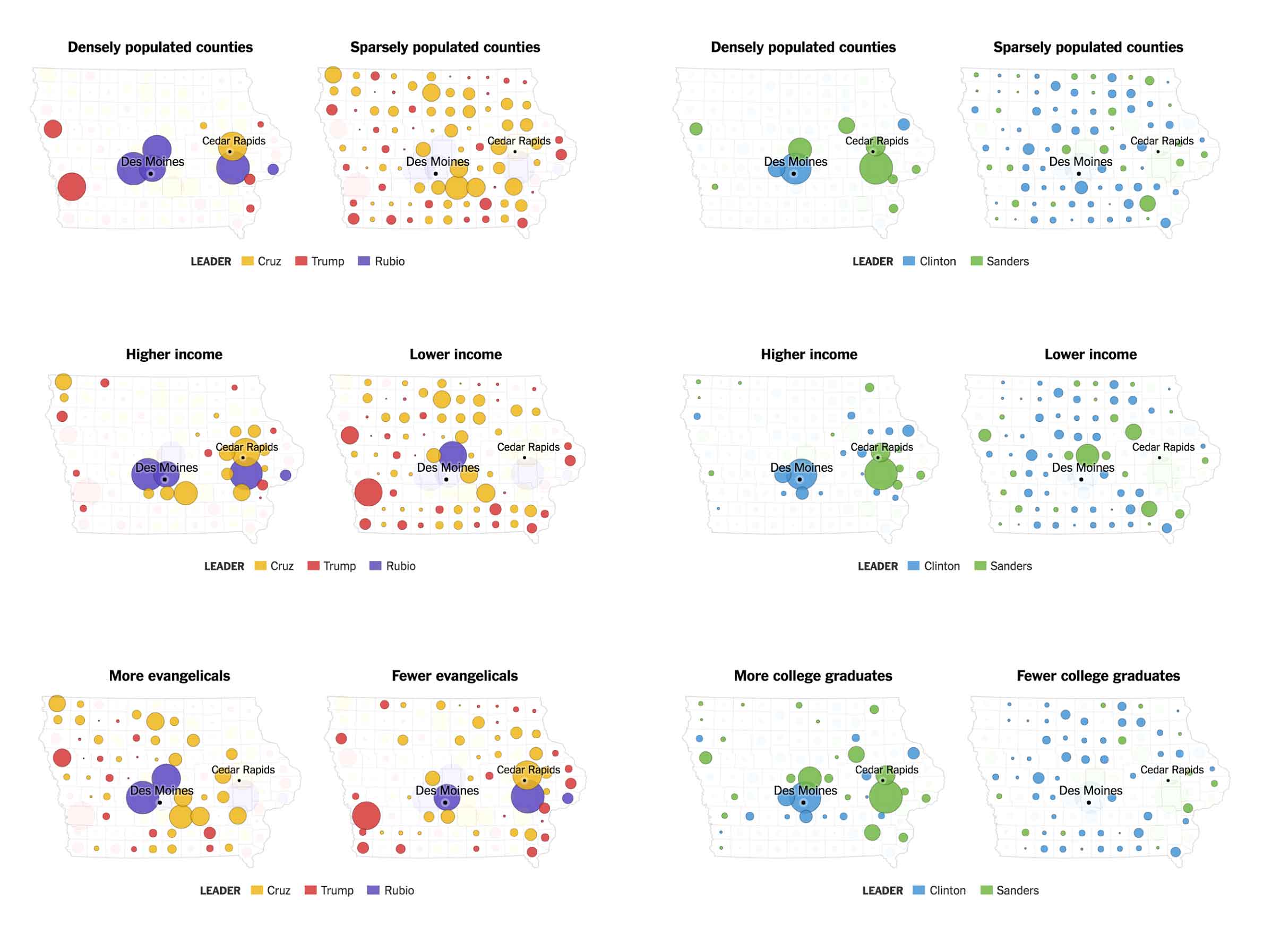
Figure 7: Proportional symbol maps showing size of lead for each county in the Iowa caucuses, with voters broken down by key demographics. (source:nytimes.com)
The nytimes is creating an interface that is primarily intended for reading — their writers choose the data they feel has significance for their readers, and use it to construct a narrative. As UX designers, we’re often called on to design an application that allows our users to dig through data on their own. In this case, we often allow users to pick the demographic parameters to explore, so that they can construct their own understanding of the data. When doing this, we should consider providing our users with a set of key trends that they should consider exploring, rather than leaving them to hunt and peck through the data to find meaningful connections. Since we have access to the data and the processing power of the computer behind us, it’s our responsibility to call out key trends to reduce the possibility of the user missing something that could be important.
As UX designers, what can we learn from the nytimes demographic maps?
Provide maps that let the user understand relative result sizes. Plain land area maps can give a false sense of the relative size of results. Using proportional symbols on top of a regional map gives users a sense of the relative weight of individual results, independent from land mass size.
Help the user identify significant drivers and trends. When particular demographic characteristics are correlated with voting differences within a party, the nytimes includes a map to spell out that demographic trend. For example, the nytimes shows religious background for the Republic results and number of college graduates for Democratic results. Likewise, consider highlighting specific variables that are correlated with big changes in your data, so the user does not need to identify those variables on her own.
In the middle of primary season, the nytimes offered a set of interactive charts showing the issues driving each candidate’s voters to the polls. These charts allow the user to select individual characteristics or issues, and then understand the importance of these characteristics for voters in each state. In a match-up between two primary candidates, the user can view the intensity of support for each candidate across different characteristics.
In the two charts below, you can see how desire for specific nominee characteristics drives candidate preferences in different states. The Republican chart allows the reader to view the voter preferences between Donald Trump and another Republican candidate for the individual characteristics of tells it like it is, change, shares values, and electability. When the user clicks on a quality, blocks representing the different states that have already voted move along a spectrum to indicate the relative candidate preference for voters that value that quality in a candidate.
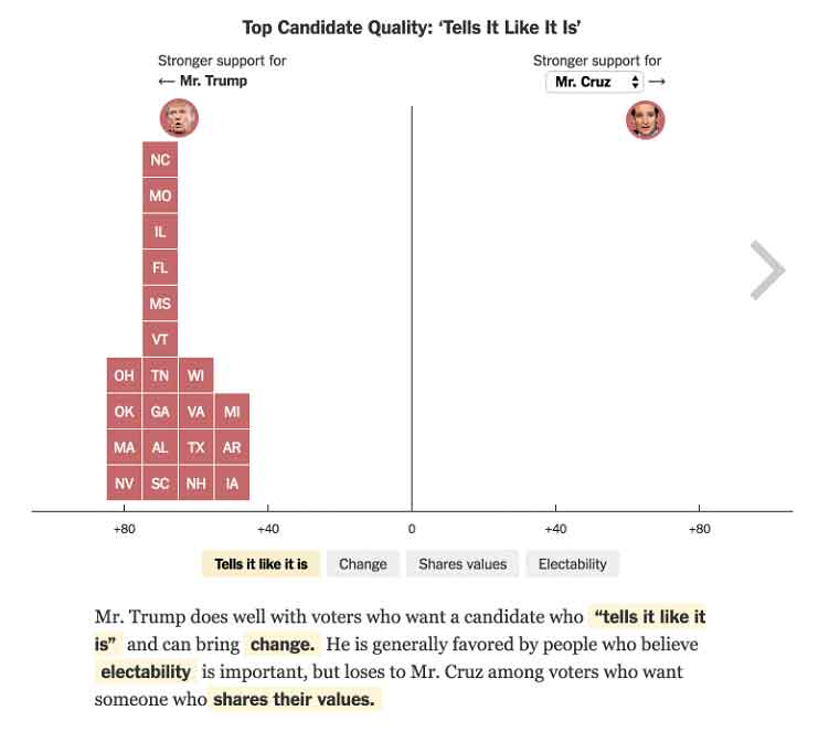
Figure 9: Interactive visualization showing primary result margins for Republican candidates based on voter’s preferred candidate qualities (source: nytimes.com)
The second interactive chart allows the reader to view the voter preferences between Bernie Sanders and Hillary Clinton for the individual characteristics of experience, honest and trustworthy, can win, and cares. Note that nytimes has chosen different characteristics for each party — it is unclear whether these characteristics have been curated to match the differing motifs and themes within each party, or are based on differences in the available questions that were asked by pollsters.
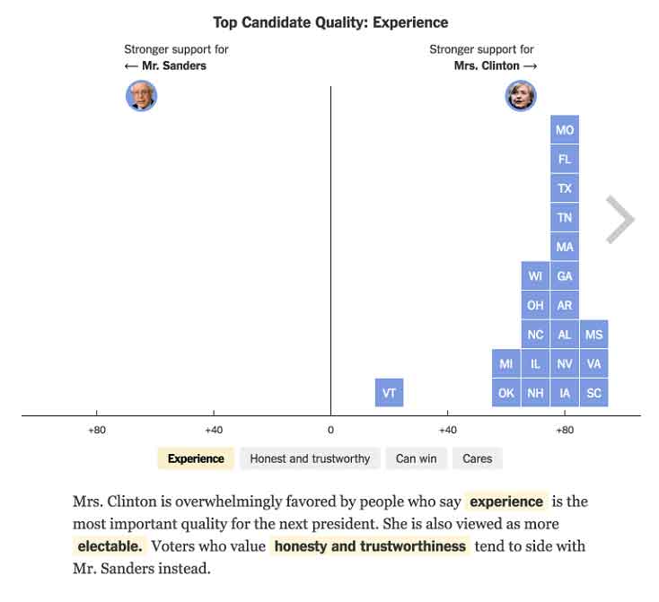
Figure 9: Interactive visualization showing primary result margins for Democratic candidates based on voter’s preferred candidate qualities (source: nytimes.com)
While these charts have captivating animations, the visualizations don’t help the reader interpret the full complexity of the data. Each state is represented with an identical box, which makes it difficult to track the movement of a particular state, or to understand the relative influence or partisanship of individual states. The chart could convey much more context by sizing each state icon by the number of available primary delegates, or by shading the state icons to indicate the relative partisanship of the state party electorate. This would help the reader visually track the movement of states on the graph and to understand the importance of different candidate qualities to more conservative or liberal populations.
As UX designers, what can we learn from nytimes’ example?
Let users explore variations in the data. Pick key variations in your data, and make it easy for users to explore those variations. By highlighting key interactions, you can enable the user to get a stronger sense of the connections between the data without getting lost in an unmanageable set of potential permutations. In the nytimes charts, readers can click through a limited set of key qualities, and use those to surface data connections.
Provide textual interpretations of the data. Whenever you can, provide textual explanations of the data to accompany the visualizations. Providing several ways for the user to integrate the data implications will improve their overall understanding and retention. In the nytimes charts, a textual interpretation of the key qualities at the bottom of the chart helps readers understand the key takeaways.
And what should we try to do differently?
Use animations to convey important information. While animation can capture the user’s attention, make sure you use animation to reinforce the information you’re trying to convey. In the nytimes charts, the animations overwhelm the data presentation, and don’t help the reader to understand data connections.
Predicting the future
After the Iowa caucus and New Hampshire primary, it was clear that Donald Trump, Marco Rubio, and Ted Cruz were the most likely candidates to make it to the Republican nomination. The nytimes published a set of infographics to help readers assess the potential strengths of each of these candidates in the remaining primaries.
The first infographic lays out the primary contests on a timeline. Each state contest is represented by a circle, sized to indicate the number of delegates up for grabs in that state. The shading of the circles indicates the relative partisanship of the primary electorate: states shown in deep red have party voters who swing more conservative, while states shown in deep blue have party voters who lean more moderate.
This infographic presents a dense amount of information in a small space, with key points spelled out textually and supported visually. Contests among conservative voters are front-loaded are more concentrated at the beginning of the calendar, meaning that Ted Cruz, a candidate appealing to more conservative voters, would need to show a strong lead in the primary contests in order to secure the nomination. Contests in more moderate states are more spread across the calendar, with several larger states at the end of the primary calendar. A moderate candidate such as Marco Rubio would need to survive earlier contents in conservative states in order to take advantage of larger moderate states later in the nomination contest.
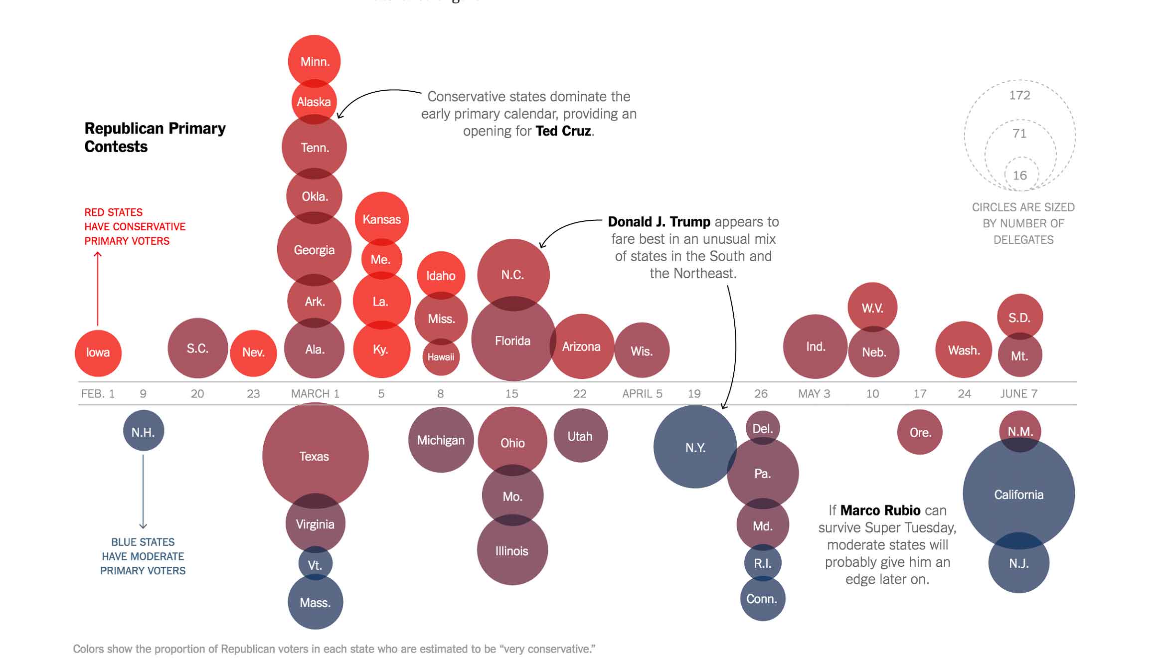
Figure 10: Infographic showing the Republican primary calendar, with visual signals for electorate conservatism and delegate count (source: nytimes.com)
The article continues by showing the states where each candidate is likely to show strength, given the state’s unique voter composition and the candidate’s strengths in among key demographic groups in polls. The first infographic shows states where Trump showed the most popularity in polls, often correlated with the level of racial resentment. Note that this infographic highlights that Trump claimed a broad advantage in states across the Republican spectrum: states on both the top (conservative) and bottom (moderate) ends show strength for Trump.
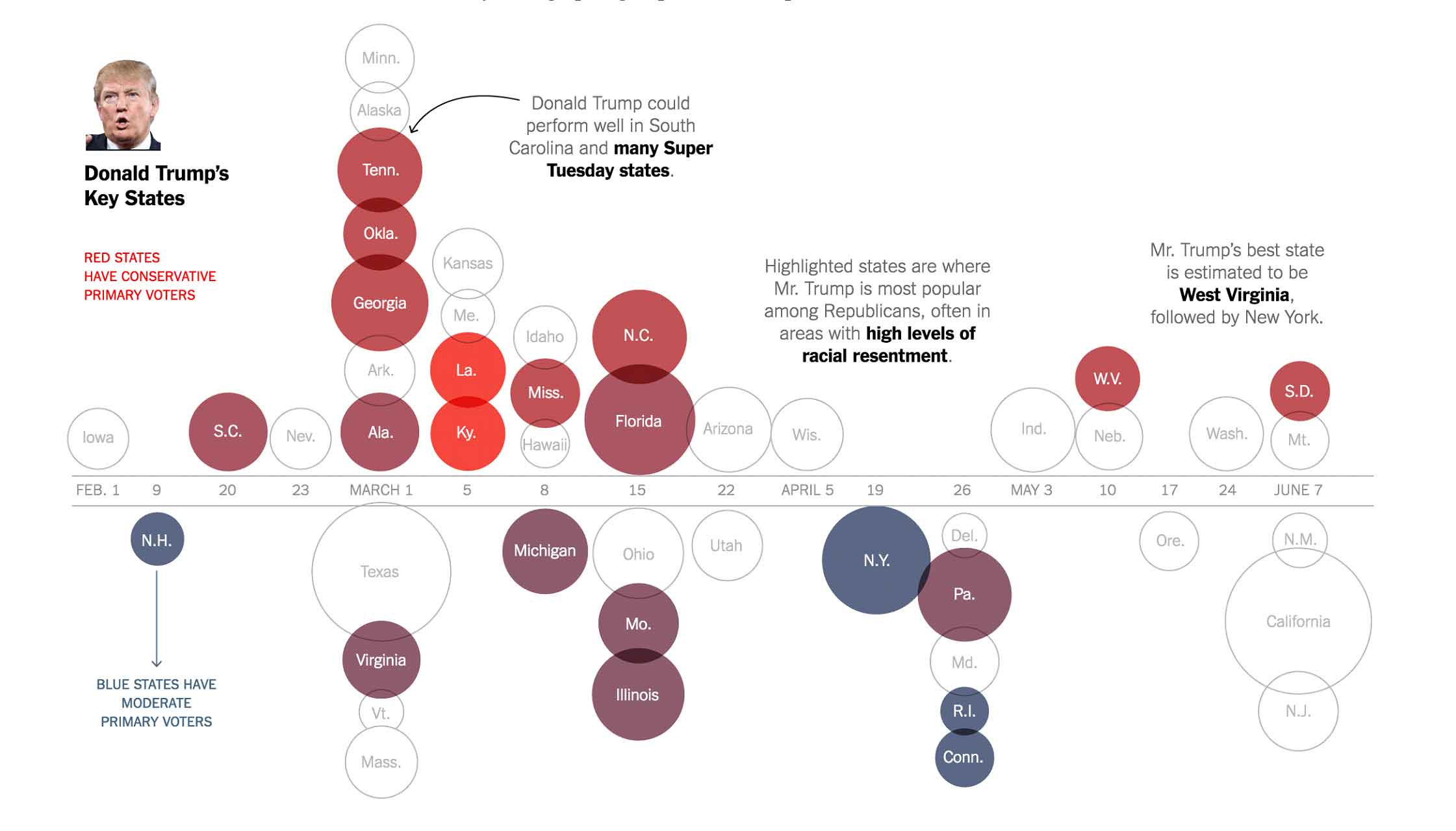
Figure 11: Infographic showing the Republican primary calendar, highlighting states with demographic groups likely to support Donald Trump (source: nytimes.com)
The next infographic highlights the contests where Marco Rubio could be most likely to earn delegates, based on his strength among highly educated voters. For the most part, these states tended to fall on the bottom (moderate) end of the spectrum, and fall later in the primary calendar.
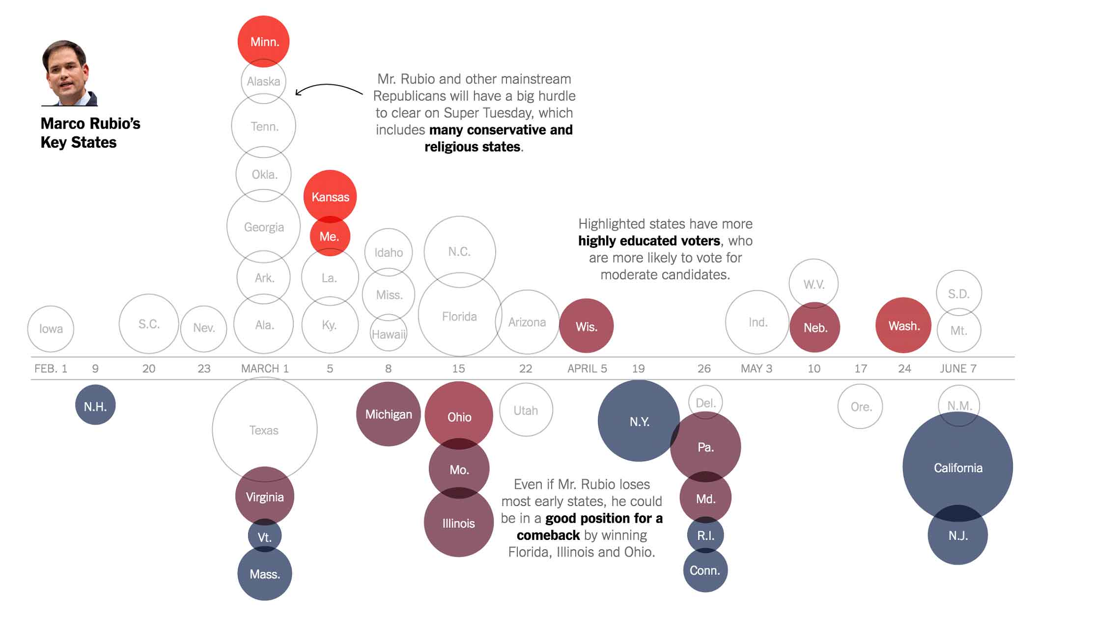
Figure 12: Infographic showing the Republican primary calendar, highlighting states with demographic groups likely to support Marco Rubio (source:nytimes.com)
The final infographic highlights the contests where Ted Cruz had the most strength, based on high percentages of evangelical voters within the state primary electorates. For the most part, these states tended to fall on the top (conservative) end of the spectrum, and have fewer delegates up for grabs, with the exception of Cruz’s home state of Texas.
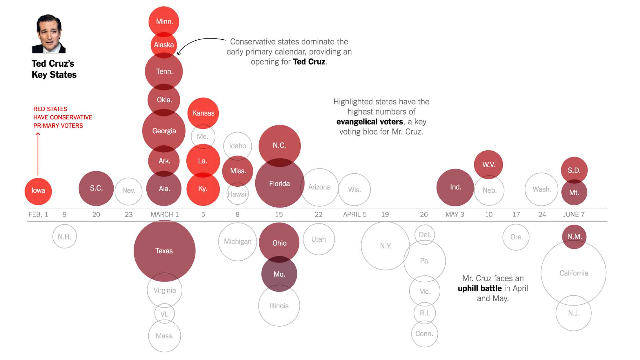
Figure 13: Infographic showing the Republican primary calendar, highlighting states with demographic groups likely to support Ted Cruz (source: nytimes.com)
As UX designers, what can we learn from nytimes’ infographics?
Provide multiple layers of meaning. Make use of multiple visual signals to express complex meaning. The nytimes infographic uses x-axis placement (time), y-axis placement and color shading (partisanship), and size (delegate count) to help the user digest some complex information. Note how much more meaning the reader can pull from this infographic than from the identically sized and colored boxes in the interactive visualization depicting voter preferences for candidate qualities.
Call out important findings. If you want your user to take away key findings, make sure to call them out with text as well as visuals. While astute readers may be able to identify the strategic implications of the primary calendar, the NYTimes’ use of additional textual callouts helps all readers see these implications.
Support storytelling. The series of infographics helps the journalist tell a story about the strategic implications of the primary calendar. While the first infographic sets the stage for interpreting the graphic, each additional infographic helps the reader see the primary calendar from the perspective of each candidate’s campaign. At the end of the series, the reader gets a good sense of the rare nature of Trump’s appeal across the Republican party ideological spectrum, and the difficulty that each of the other Republican candidates will have in piecing together the delegates needed for the nomination.
Note that in many cases, as a UX designer you will create interfaces to allow users to explore data in a specific domain, but without providing narrative interpretation of the data. However, don’t neglect your users’ need to craft their own stories from the data. Even if your system doesn’t automatically generate a narrative for the data, consider providing support for your users to construct their own stories — help them to add annotations and create presentations to stitch together meaningful narratives from the data.
Playing out “what if” scenarios
As the primaries draw to a close and we head into the general election, we move from tracking the candidates’ delegate counts to estimating the nominees’ likelihood of winning the electoral college. Presidential elections are determined by the electoral college, a group of 538 electors who are allocated to states based on their total number of congressional representatives and senators.
So, when we’re voting for president in November, we’re actually voting for our state’s electors to the electoral college, which are allocated on a statewide basis. Nationwide poll numbers don’t give us a complete picture of the potential outcome of the election, because it’s possible for a candidate to win the national popular vote while losing the electoral college (see the 2000 Bush/Gore election).
We can predict the electoral college vote by estimating the partisan split and voter turnout for key demographic groups. Both Real Clear Politics and FiveThirtyEight provide tools for estimating the split and turnout for demographic groups, and seeing the expected impact for each state’s vote in the electoral college.
In Real Clear Politics’ election scenario simulation tool, they allow the reader to enter the Republic-Democratic vote share and the turnout for four different demographic groups: Non-Hispanic White, African-American, Hispanic, and Asian and Other. As the reader changes values in the form, the popular vote for each party’s candidate is calculated, and the electoral college votes are estimated, based on voter demographics within each state.
As the reader changes values in the table, the votes for each state are recalculated, and the each state in the electoral map changes its Republican/Democratic allocation accordingly.
The table and map from Real Clear Politics have some severe interaction challenges for the reader. The use of tabular numbers for entering partisan split and turnout makes it very difficult for the reader to easily compare numbers across demographic groups. And, as the reader types new numbers into the input fields, the map below often flashes solid blue or solid red, making it difficult for the reader to observe the impact of the data changes on the electoral outcome.
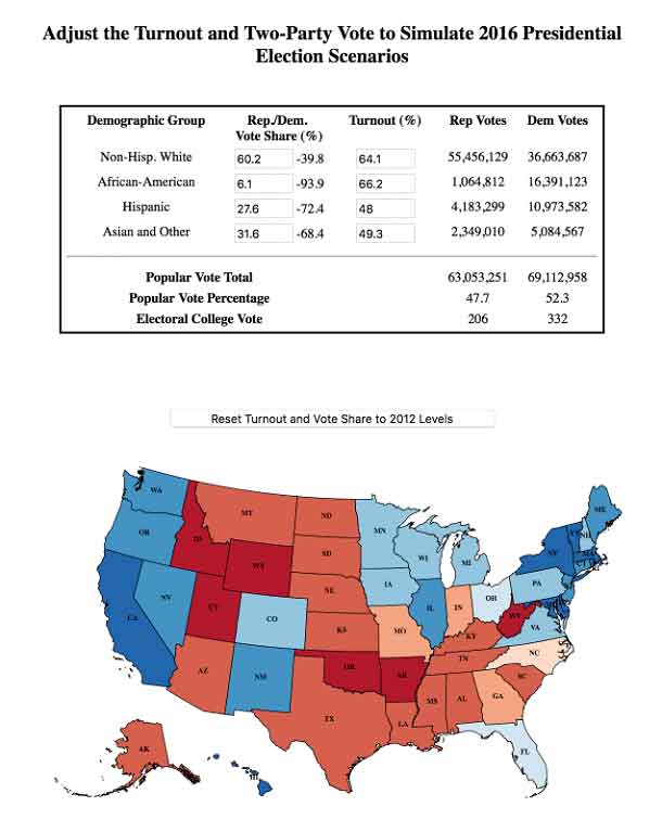
Figure 14: Interactive visualization for simulating election results based on demographic turnout and partisanship (source: realclearpolitics.com)
FiveThirtyEight’s Swing-O-Matic tool does a much better job helping the reader play with the demographic numbers and see how those changes impact results on the electoral map. Using the demographic turnout charts at the bottom, the reader can easily adjust both the partisan split and the turnout for each of the five major demographic groups: College-educated white, Non-college-educated white, Black, Hispanic/Latino, and Asian/Other.
As the reader adjusts the demographic charts, she can see states move between the Democratic and Republican columns in the two maps at the top, and see how the electoral college vote totals change for each candidate. States that move between maps first appear as highlighted in yellow, before changing to their assigned shade of blue or red.
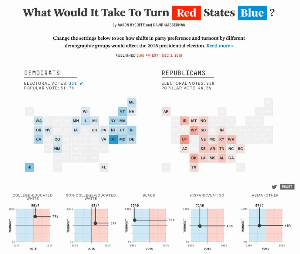
Figure 15: FiveThirtyEight’s Swing-O-Matic: Interactive visualization for simulating election results based on demographic turnout and partisanship (source: fivethirtyeight.com)
FiveThirtyEight does an excellent job of using graphics to help the user easily compare differences across demographic groups. Unlike Real Clear Politics’ tabular data entry, FiveThirtyEight provides an easy way to change both partisan split and turnout simultaneously, to easily see the difference between demographic groups, and to witness the impact of changes on the electoral college maps above.
As UX designers, what can we learn from the examples from Real Clear Politics and fivethirtyeight?
Allow the user to see the results of her changes. When you support “what if” analysis, provide direct visual feedback on the impact of changes. The fivethirtyeight Swing-O-Matic provides clear visual feedback when the user alters the voting characteristics of a given demographic. It’s easy for the reader to play with the model and see the impact of her changes.
Provide tools that allow for easy visual comparison. In the FiveThirtyEight Swing-O-Matic interface, the reader can easily see the voting differences across several demographic groups. The voter turnout charts at the bottom provide a visual depiction of the relative turnouts of different groups, along with an easy way to change the values for “what if” scenarios. It also provides a signal for the original value for each demographic group in the previous election, so it’s easier for the reader to see the size of the changes that she’s made.
And what can we strive to do better?
Shape the results to the goal. The final goal for each party is to win the electoral college. Therefore, neither of the maps gives the reader an accurate understanding of the relative weight of each state in the electoral college. The Real Clear Politics tool shows a geographic map that makes it easy to locate individual states by position, but makes it difficult to understand each state’s impact on the overall electoral college vote. And the FiveThirtyEight map depicts each state with an equivalently sized square, making it difficult for the reader to understand the electoral college impact of the changes, without looking at the small print at the top of the map.
A better solution would be this electoral map published by the New York Times for the 2012 election, which shows states sized by their overall contribution to the electoral college vote:
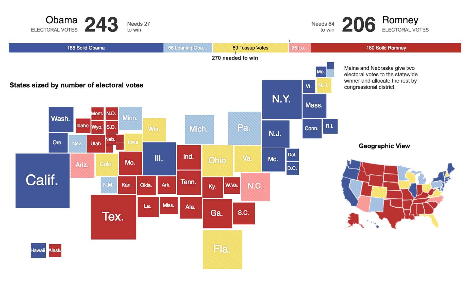
Figure 16: Proportionally sized electoral map for the 2012 Presidential election. Each state is sized by its number of electoral votes (source: nytimes.com)
The electoral map gives the reader a much better understanding of the impact of each state on the electoral college outcome. The small geographic map on the right provides a quick visual grounding for those readers who are unfamiliar with the electoral college map.
Conclusion
Whether you’re designing infographics or interactive visualizations, you can gather inspiration and pointers from the politics page of your national newspaper. The wealth of maps and charts published for the election can help you find new ways to present data in interactive and helpful ways.