Save
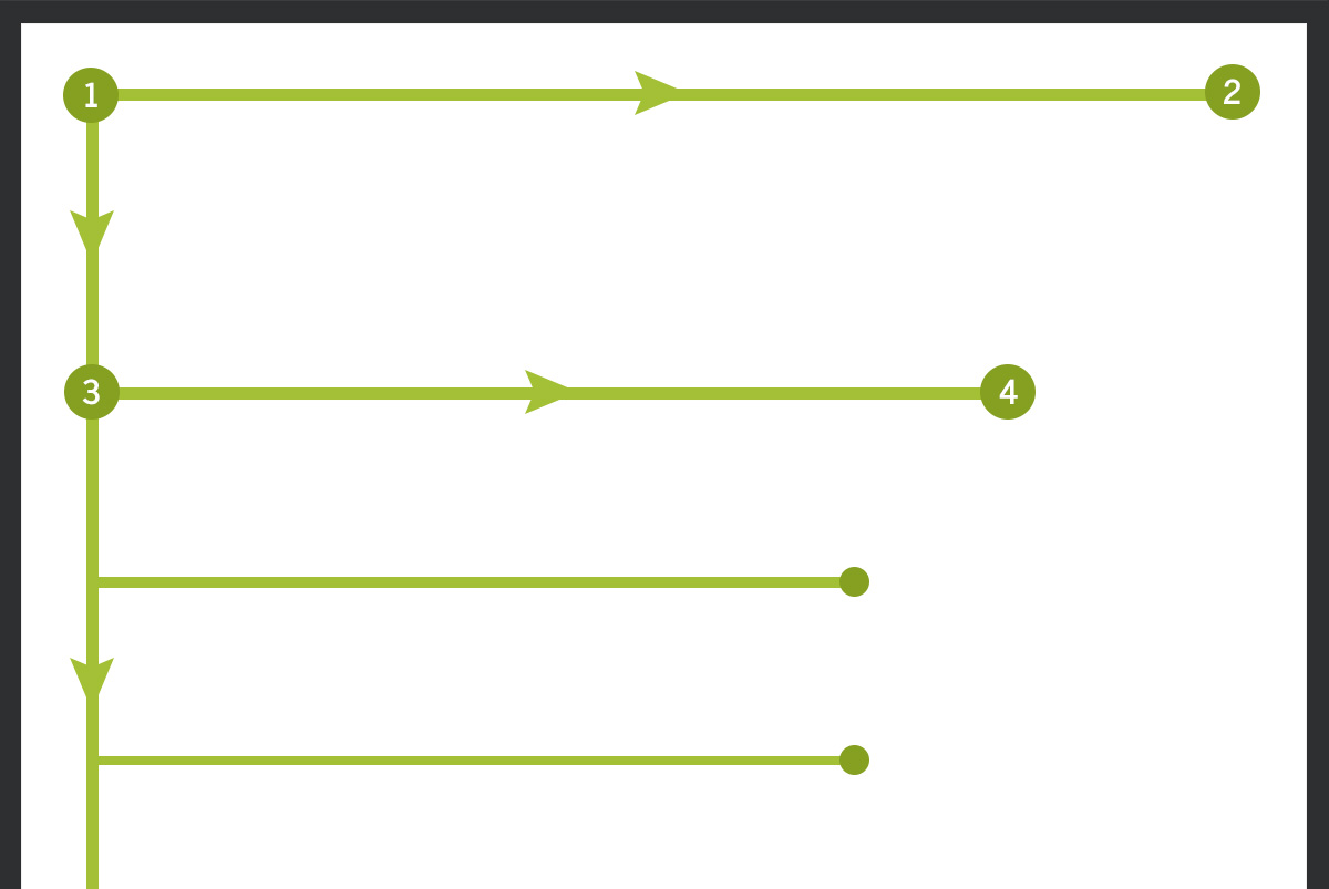
Reading online is a little different than the way you read textbooks high school and college. Today, when people find content on the web they are interested in, they scan it first. Users have grown accustomed to quickly moving through information, only stopping at the parts that are important to them. Eye tracking studies have shown online readers scan information in the shape of the letter “F”. Sound random? Here’s why it isn’t, and why it matters to your business’ website.
What Is the F-Pattern?

The top of the “F” is formed when users start at the top of your page, reading your headline and subsequent description of the article. Readers move their attention back to the left side of the screen and move their eyes down the page until they come across another heading or information that catches their eye. This information is usually the part of the content they were hoping for when they searched the topic and will spend some time reading it, creating the second horizontal line in the “F.”
Once the reader has gotten the bulk of the information they want, they will continue to scan the page, stopping if anything else catches their eye, but they are most likely moving on to another page of your site or leaving.
Why Does It Matter?
Understanding this pattern of website scanning is important to your business and its success. If your website layout and content do not match the F-pattern, users may waste time trying to find what they need. If they feel like they’ve wasted too much time, or that the valuable content they are looking for is impossible to easily scan, they’ll likely move to a site where scanning is easier. When you plan your content with the F-pattern in mind, you give users what they want—even if they don’t know it.
How to Use it for Your Benefit
The F-pattern can not only encourage users to stay on your website, it will also cause them to see what else your site has to offer. The usability of your website will increase as you incorporate this layout into your design.
When using this method, your website will feel more intuitive; you’re giving your users exactly what they need. When you understand this pattern and how to leverage it, you have more control over the message you want to convey. The studies show you exactly where users will spend their time, so you can begin to prioritize your content. Consider this when incorporating the F-pattern into your content.
- Put the most important elements first. You know users will begin at the top of your page, reading across to determine what products, services, or information you are providing. Take the next most important information—or the info you want them to takeaway—and put it a little farther down the page where you know readers will pause and look through the content more slowly.
- Create website expectations. Your readers may not know you are relying on F-pattern scanning methods, but they will feel like your content gives them what they want without them having to work too hard to get it. This expectation of layout allows your users to review your website at their own speed.
- Generate engagement with your sidebar. Your sidebar can have anything in it, from related articles, links to social pages, or ads. This breaks up the content for your users and gives them something else to consider about your business while they are scanning the content on the current page.
F-Pattern Design Elements
The F-pattern is not just beneficial for text and articles. This method should be considered in the entire design of your website. Eye-tracking studies have shown users consistently keep their eyes to the left of the page after they have scanned the heading. This means the header of your website is one the most important features.
Your header should be eye catching. This is the first thing users look at when they arrive on your site. This area should show readers who you are as a business, show off your brand, and incorporate your color scheme. The main navigation bar should be located just below the header to show readers exactly how to move to another page.
After the header, load the rest of the design elements to the left side of the page. Create small breaks to incorporate text and images, and then draw the reader back to a catchy headline or page heading to which they should navigate.
Don’t ignore the bottom of your page just because of the F-pattern, however. Even if you have already utilized both key horizontal lines, you still want to break up the page for users who have continued farther down. Images or subheadings can break up lengths of text and will make the website more visually appealing.
How It Affects Business
The layout of your site and ease of use strongly affect conversions. Taking advantage of a pattern or layout that is proven to work can ensure you get the most viewers to your site, and that they stick around once they are there. Once the viewers are at your site, the F-pattern makes sure they are viewing the most important information first, and you are the one who decides what information is most crucial. Some of the most successful websites have incorporated three major factors that have proven success:
- Top-left logo, which draws the eye to the top of the page and reminds viewers of your brand.
- Top-right phone number or contact information showing your users exactly where to find you.
- F-pattern for the content on the page, giving the readers a proven guide to their website.
A Working Guideline
No one knows your customers and target audience better than you do. The F-pattern was developed after eye-tracking studies showed where most people look when they scan a website. Use this information as a guideline to develop your website and content. It doesn’t need to be a strict template, but see it rather as a starting point to make sure your most significant content is being noticed.
Stephen is an online marketer, designer and avid tech-savvy blogger at Los Angeles web design agency - SPINX Digital. He is a creative learner at heart with a strong passion for writing blogs on web design & development, UX, online marketing, entrepreneurship, social media and much more. He is a professional blogger and therefore he likes to read a lot of online and print stuff. He is a design enthusiast too and love every bit of art, music and nature. He enjoys user Interface design and loves to explore more on the subject. In his leisure time, Stephen is either traveling or doing photography of natural surroundings. Being a blogger, he always likes to listen to people to know what’s on their minds. You can follow & subscribe to his company's blog at SPINX Digital Blog.


