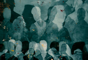
Right now we are at the precipice of yet another period of transformation, a period that will give birth to new products with new interfaces, new interactions and a new behavior around them. I think it is a perfect time to talk about a design tool-set for the human condition. Not design for mobile, not design for wearables and not UIs for IoT, but rather a holistic tool-set for designing products that are to be used by humans — a reminder of what design is and what it takes to design products for each of us.
Dissecting the human condition.
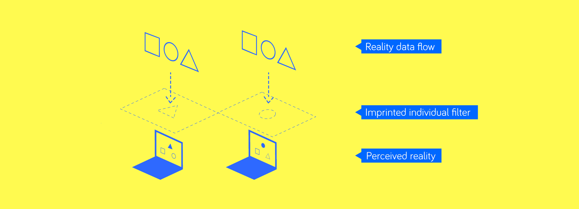
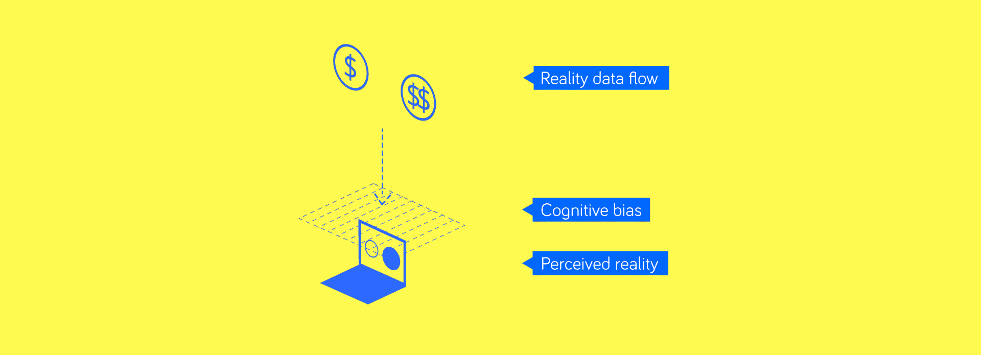
You may have heard the term Human Condition in various contexts. Broadly, it is a vague and all-inclusive notion about being human. If we, however, want to arrive at a design tool-set, I suggest we work on those aspects of being human that affect and are affected by the interactions with the world. First such aspect is the perception of reality.
- Perception of reality and thus — needs.
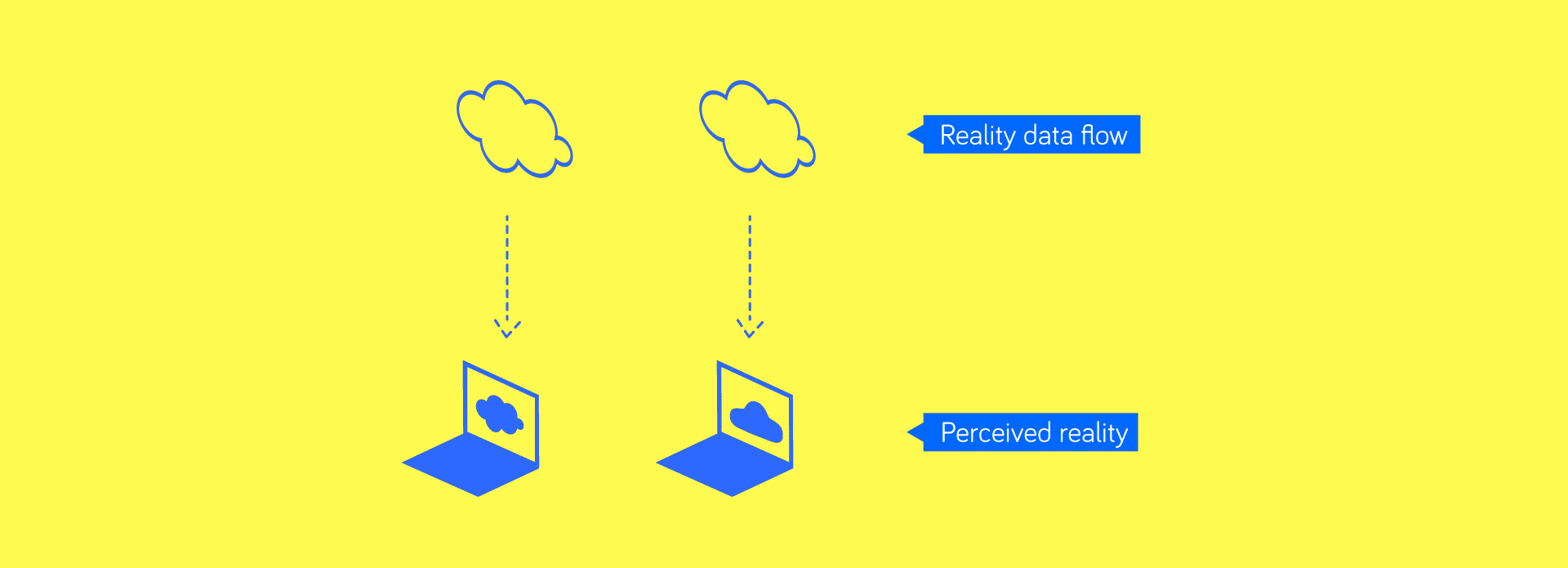
One take on the perception of reality is to think of a web page that gets rendered on your computer:
-
That page is from the internet but is not the internet itself;
-
That page may look very different on the computers of other people, but for you what you see on your computer = the internet.
-
Everything that you see on that browser window would be exactly how the internet is in your perception, even if your provider blocked certain photos or changed some text.
This is important because where a problem solving approach may find no problems, our ‘browser window’ may render needs and pains that only exist in our subjective reality.
Renowned Japanese designer Masayuki Kurokawa puts it this way: ‘Tokyo is not something seen from a bird’s eye view. Tokyo is what someone in Tokyo sees from where he stands now. All of Tokyo is concentrated into that small portion of Tokyo.’
We usually think that design answers problems, like medicine addresses pain. That statement is only true if we understand that problems and pain are to be found inside individual perceptions of reality and not based on the external signals or data. The biggest challenge here is to work with the real users of your product yet rely on observation and not on what they say.
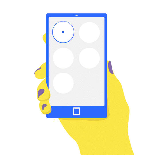
The first tool for designers is thus a simple mirror that doubles as a magnifying glass, allowing a designer to examine themselves in critical detail. A designer should look inside true, subjective needs of a future user, and the best way is to do that is to start with you. When designing products that are not meant for oneself, conducting interviews and working with real users, rather than generating artificial personas, is the way to go. What we want to focus on is a self-expression of a user’s needs throughout their interactions, but remember that users may have a hard time communicating their perceived needs.
Examples
It is easier to understand perceived needs if we take a look at some products that have well pronounced design choices around them. I chose Instagram and Ello. Both are targeted at a creative crowd. As a creative myself, I can testify that the perceived need for publicity and outreach is very real and that getting even an illusion of it via design is a gratifying experience.
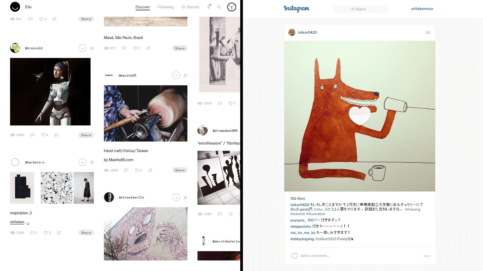
Ello on the left, and Instagram on the right. (circa 2016)
ELLO has an interesting design around following other users. On the top of each post there are two calls to action — a Star and a Plus. You can follow a user and add them to your Favorites list by clicking a Star, or choosing to just follow by clicking Plus. Now here is the gratification trick used in this design — the user does not know if you are actually paying attention to his/her posts, you are counted as a follower whether you added them to your favorites or simply followed. One can follow hundreds of users and only read ten favorite ones — the UI, unlike Twitter, allow you to switch clearly between everyone you follow and your favorites. When Ello launched, users whom you just followed without adding to favorites were called ‘Noise’; you could add a person into your Noise list and still be counted as if you followed them.
Instagram is playing a slightly different game with its design – first it lets everyone be creative and generate content out of nothing, and then it focuses on ‘likes’. ‘Likes’ can be given by a well elaborated call to action — the only button-like UI element, or simply by tapping on the content itself. That second design choice allows for browsing without even paying attention to what you see, and encourages quickly liking the content. This is effectively saying— ‘I saw you’ve posted something, cool :)’, but this action does not detail what you saw or why it was cool; often one cannot even recall what they saw on Instagram or how many likes they gave in any given day. On the other side of this interaction is a gratified content creator, and their perceived need is being addressed via design alone.
Those are examples of UX design that works well, but not necessarily good product design.
It is important to understand that a good design does not need to address the perceived need itself, but rather WHY that perceived need is occurring. This is where a magnifying glass and a mirror come in handy as we need to look for meaningful solutions for real people and not ideas that simply fit or gratify.
Behance and Flickr also address the same needs as Ello and Instagram while allowing for real community interactions and professional growth. Minecraft is also worth mentioning as a game that lets everyone create content and be engaged, but it is also an educational world simulation that teaches players about various systems derived from the real world.
- Perception of value & function.
Let’s go back to our metaphor of rendering a web page for a human perceiving a reality. Imagine that your service provider, computer software or government filter some words and pictures out, and some are replaced with others.
This is exactly how an individual imprinted perception filter works, filtering out and changing the data we receive in accordance to one’s perceived reality. Some of these filters are imprinted into our perception by parents, church, school, and we add some during the course of our lives. Unlike cognitive biases (that’s part 3) imprinted filters are not how the human brain works, they are how we ‘teach’ ourselves to see things, their meanings and values.
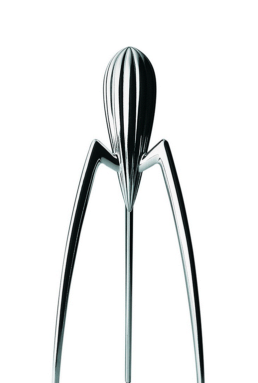
JUICY SALIF — Philippe Starck for Alessi
In his book ‘Emotional Design: Why We Love (or Hate) Everyday Things’, Don Norman chooses a juicer by Philippe Stark that is terrible at its utilitarian function of juicing and yet absolutely wonderful at functions and values that are perception driven, such as being a conversation starter or a home decor sculpture, or even a memory provoking gift. This is a great example of how certain values can be purely perceptional, yet still get imprinted into one’s mind thus make an object functional.
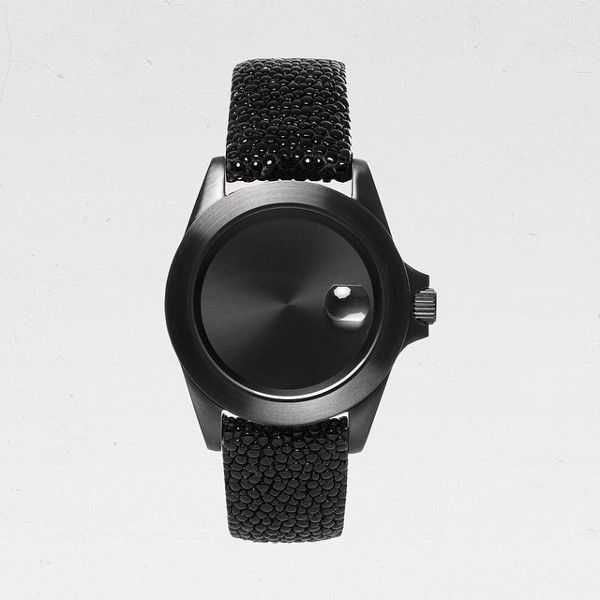
Infinity Piece by Becomb, “Movement: This piece contains no movement. It is not a watch.”
“Movement: This piece contains no movement. It is not a watch.”
I personally like to show the Infinity Piece by Becomb when touching on value and function perception. This is a watch that does not show time, does not have hands or sensors, yet works very well as a wearable object. I would even argue that Infinity Piece is a better wearable than the Apple Watch or any of the currently available Google Wear watches. I am a strong believer in smart wearables, and designed my fair share, like the KeiKei / Uni Watch, however we have yet to see or design a new meaningful wearable that would address the human condition of today.
There are many ways a product or a category can get a subjective value imprinted towards them, however there is one notion that is particularly interesting for designers to explore, especially in the context of making new interactions or designing new product categories, and that notion is Qualia. When you experience something for the first time in your life, a taste of a certain wine, a first kiss, or an amazing view from an airplane and you consciously understand your experience — then you are consuming a qualia. Human brain is hardwired to seek new qualia. That is the reason we travel, try new food and participate in various activities.
The famous Japanese brain scientist Kenichiro Mogi wrote: ‘The qualia of the Grand Canyon cannot be experienced unless you actually go there. It cannot be felt otherwise. People travel in pursuit of such qualia…The yearning for new qualia, for fresh, unknown qualia, is in everybody’s hearts. This is the universal desire for qualia shared by all human beings.’.
Even without touching on the subject of Virtual Reality I would argue that digital products could be filled with qualia.
Producing Qualia in the interface or functions allows us to imprint perceived value and brand the interaction, making this an extremely powerful differentiator for companies and products.
Here is our tool for the perception of value — a journey map. A ‘One day / week / month in life’ and where the product you are designing would have its place. A Journey map requires a real human from the first tool (the mirror), as one should be cautious of making journey maps for artificial personas.
- Perception of quality.
The human mind is subjected to what is usually called ‘perception biases’. Similar to optical illusions, these are characteristics that are perceived regardless of their presence in the product — a more expensive bottle of water tastes better even if both bottles are filled from a tap in a back room.
The human mind also perceives things that are viscerally pleasing and polished as better performing: there is a direct correlation between how something looks and how its working performance would be appreciated. In studies where the same product was disguised as two different ones, and one was given more attention to visual design, respondents always claim that the better looking product worked better and even performed its functions faster. The success of Apple versus PC and iOS versus Android has a lot to do with this perception.
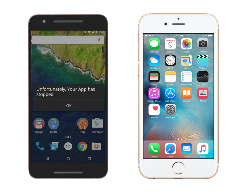
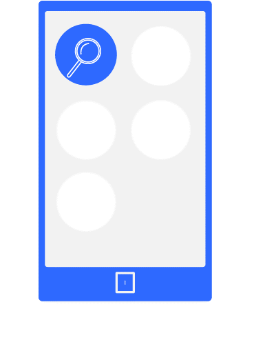
Android device (left) shows an error message when an app crashes while iOS (right) pretends that everything is perfectly fine.
iOS for instance never tells a user that a certain app has crashed, providing a design language that viscerally suggests reliability. But do apps really not crash on iOS? Were other phones inferior in performance when Apple released the iPhone? Of course, iOS apps do crash and the iPhone was no miracle—it was merely designed to feel like one. The first iPhone during its first months on the market was not even a smartphone: there was no ecosystem in place. There was no app store and not even an SDK, a flaw that Steve Jobs sold as a feature. Consumer perception was very well manipulated by design, and because we now know that there is no objective reality, the perceived characteristics of speed and reliability actually became real in each and every subjective bubble.

Another example is UBER. Uber started as a luxury brand using only black limousines, without any low-cost options such as UberX. Luxury was also communicated in the logotype and the app design. So what changed when Uber started to compete with traditional taxis and offered UberX? Unsurprisingly, nothing has changed – now users get Uber’s perceived qualities but at a competitive price. Every time someone summons an UberX they get a perceived quality of a limo service even though it may be delivered in a fairly old and at times not entirely reliable car. It is highly likely that for some, Uber had managed to brand a qualia—the experience of riding a limo that is now forever linked with the brand.
By understanding the perception of quality we can derive another tool — a design language, a tone, transitions and visceral elements of our future product combined with the brand and pricing strategy can amplify certain qualities and even communicate non-existent ones.
- The state of FLOW.
Our mood or how we feel at every given moment greatly influences our performance, creativity and the energy we have. There are ways to influence the mood and promote certain states of mind. One state of mind referred to as Flow is of biggest interest to us.
When in the state of flow one is at their pinnacle of energy and engagement level, concentrated and focused, yet not stressed or burned out after. This state is great for education, work and office environments, sports and lifestyle management, which is why we as designers have to examine it very closely when creating any products or experiences.
To create a state of Flow we need to perfectly balance several components:
- Learning curve: rules have to be clear and easy to understand, and rules introduced later should rely on previous experiences and established foundations.
- Challenge: it has to be challenging enough to progress but not unbearably hard or boringly easy, the challenge curve should have accidental depressions and surprises.
- Sense of progress: there should be a visually clear and constant communication of accumulated progress.
- Reward: rewards that vary in size or amount, and reoccur during the process of interaction are known to be the best to maintain the state of flow.
- Finally, Failure should be communicated in a fun way, and be perceived as a learning experience.
A careful reader may have recognized that all five components are usually present in a very familiar product — games. Our fourth tool is thus a gamification technique. One should remember that this tool is optional, and does not fit every product category; not every app or activity should be turned into a game to drive retention or excite users. An awareness of exploiting design and its consequences bring us to the final part.
- Longevity & Mortality.
I strongly believe that every designer has to remember one very peculiar fact about human nature— humans have a limited lifespan, and time is their most important resource. This simple calculation is a good example: imagine you have designed an app or a game that takes around 15 minutes of a user’s time in the morning and in the evening, and gives nothing meaningful back. In just one month the app would have taken 15 hours away from the user. Factor in 9 hours of sleep and that brings it to a full day, time that someone could have spent reading a book, playing with their children or freeing time for something else later. We one full day by designing for retention, by designing for perceived relief of perceived pains and so on. Good design decisions for bad products are neither ethical nor professional. There is little difference between drawing cute cigarette packaging or selling meth to kids and making a free to play game that takes hours of one’s life that just exploits instant gratification.
Which is why the final tool everyone needs when designing for humans is a strong moral compass.
The five tools we have arrived at are not the only ones a designer would need, there are many more wonderful techniques and observations to apply when designing for the human condition; however, these five tools will provide a good starting point for any designer.
- Illustrations by Ori.
Thanks to Andy Pratt & Danien Chee