What considerations need to be made when designing tools for UX practitioners? The same ones when creating for any other client.
As a UX Designer that spends a lot of time prototyping (or creating designs that are HTML-based), I started wondering if I could design tools that would make a UX Designers job easier.
One issue that comes up often with design-in-the-browser is that it’s difficult to annotate live html deliverables. When I began working at Usability Matters, a UX Design studio, I attempted to try and solve this problem by developing my little solution.
Just a Note
There are a lot of different web-based tools allowing people to add comments to websites, most of them involved downloading a plugin or browser add-on. While they did a reasonably good job, these tools often treated webpages as static images— as though they were simply screenshots to be marked up with notes a la Adobe Acrobat.
This would be fine for static webpages designed for one breakpoint, but not for anything built using responsive design. If one were to add a note to a responsive site, the note would stay in the same position despite the fact that the elements on the page were changing size and position depending on the width of the screen.
Having a bit of development experience, I took it upon myself to create a tool to address this. My idea: notes would be attached, not to a fixed position on the screen, but to html elements themselves so that they followed the object wherever it went. When in ‘feedback mode’, elements would become highlighted in yellow and clients could then double click on them to affix a note marker, leave a comment and move on.
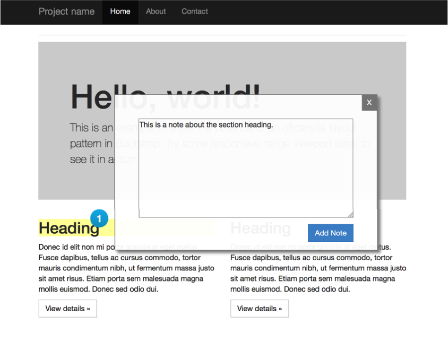
When I presented this idea to the rest of the team here at Usability Matters, there was some enthusiasm about now having a method to either annotate or receive feedback on an HTML prototype. And yet when asked how it could be used, and I explained that it was “simply a matter of adding a link to the script along with the css file in the html”, the response was “What if someone else in the studio not familiar with html needs to do this?”
While it was tempting to just say, “they can learn how to do it”, they had a point. While I often immerse myself in the world of web development and its various tools, not everyone is as keen. I forgot a principle of UX design: design for your user—even when your user is a user experience designer. Creating a tool (even for seasoned digital practitioners) should be, for lack of a better term, skill agnostic.
While I used the tool for my own html prototype, it’s been languishing on my hard drive ever since.
Keep it Simpler, Stupid.
Several months later I worked on a new tool to save time editing video recordings from usability testing sessions. Having learned a valuable lesson, I went about things a slightly different way.
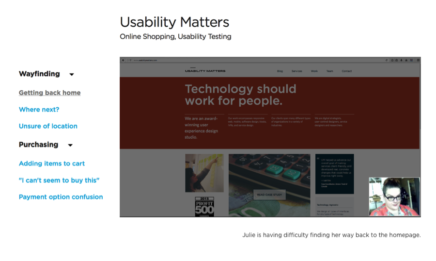
The videos we record during test sessions provide a way for clients to see first-hand how participants respond. Rather than simply present our clients with multiple hour-long videos, we create smaller clips that highlight various problems or successes. For such a simple thing, making the clips can be more time consuming than I thought it needed to be.
Why not simplify the process by leaving the video editing to a script instead? Wouldn’t it be nice to just create a list of start and end times and have the clips created for you? I built a fairly simple web-based video viewer with a sidebar containing the titles of the clips, organized by category. Clips faded in and out seamlessly, and captions appeared underneath each one to help give additional context.
Now, the fun part: everything appearing on the page is generated using a good old-fashioned Excel file.
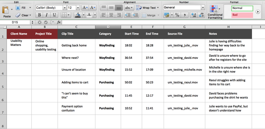
Using Excel as a basic CMS ensures that no additional skillset is required. It’s a technology agnostic solution and it’s also skill agnostic. It also ensures the viewer can be created and viewed without an internet connection, which is always an advantage.
Hack the Apps
More recently, I’ve begun work on a library of widgets for the prototyping tool, Axure. Despite its somewhat steep learning curve, Axure does a good job of creating html prototypes without requiring any coding skills. On the other hand, one of its faults is how easily one can get bogged down when trying to create relatively simple things. Things like form error messages have to be created manually and depending on the complexity of the prototype can eat up several hours worth of production time.
Fortunately, there’s a way to get around shortcomings like this. While not an official feature of Axure, one can ‘inject’ JavaScript into the html pages it generates. This seemingly insignificant detail actually opens up a world of possibilities for adding more functionality to the software.
Validating form items in Axure is a multi-step process that starts to feel tedious when you have to do it more than once. By adding custom JavaScript to the mix, you can indicate that an item is mandatory simply by adding an asterisk to the end of its label. When the page is previewed in a browser, the script detects the asterisk and if the field is left empty users receive a message saying ‘fieldname is required.’
As we see in the video above, by simply adding one character, we’ve decreased the amount of time required to create two error messages from about three minutes fifteen seconds. The usefulness of a feature like this is diminished if it isn’t versatile enough to meet the needs of a prototype, so I also added an advanced settings panel to indicate default messages, font styles, positions, and other properties like how incomplete forms get highlighted.
It might seem like an obvious thing, but solutions to problems should be logical and not involve patterns of behavior that stray far from what people are familiar with. For example, adding an asterisk to a required form item feels natural because it’s a symbol we’re used to seeing on the web. Filling out an Excel file with text and numbers to drive a video player (while unconventional) works because it’s a file format that people (at least in our studio) are used to working with.
Sometimes we tend to forget that seasoned digital folks require the same approach when creating tools as anyone else. Desiging for simplicity, ease of use, and ensuring you get feedback from your users sooner rather than later will mean your efforts to solve a problem won’t be done in vain.